Page 1 of 34

Greater China [Quenched] (thanks Widowmakers)

PostPosted: Sun Jan 14, 2007 5:37 pm
by Wisse
edit: My email if I am ever needed for a revamp: wisse @ essiw.nl

well i got 2 ideas that weren't good idea's (gelderland & revamp on middle east) so i thought a china map would be good, i've got this map:
http://www.lib.utexas.edu/maps/middle_east_and_asia/china_ling_90.jpg
can someone say if the lines are good and names, and what the country is with the black & white lines?


--------
stamps:
ImageImageImageImageImageImage

XML:
http://www.fileden.com/files/2007/6/15/ ... inaV11.xml

Large:
http://img341.imageshack.us/img341/9960 ... 10lds8.png
Small:
http://img183.imageshack.us/img183/7730 ... 10sbe8.png


Greater China by Wisse
Map Creation Thread: viewtopic.php?t=11235
Number of Territories: 29
Number of Continents: 7
Gameplay Features: One Way Borders / Bombardment / Collections / Neutrals

Recommended Gameplay Settings:
3 - 4 players

Gameplay Feature Associations:
    One Way Borders-Gansu attacks Nei Mongol over the Great Wall & E. Xizang attacks W. Xizang over mountians
    Bombardment-Chinese Kashmir can bombard E. Xizang
    Collections-Territories with political emblems are part of a bonus group collection. +1 for holding any 3 and +3 for holding all of them.
    Neutral-Shandong starts the game neutral with 2 armies
Map Description: This is a small political/geographical map of China.


Image
Image

Image
Image

PostPosted: Mon Jan 15, 2007 9:35 am
by onbekende
That black and white is Chinese Kashmir.

PostPosted: Mon Jan 15, 2007 9:45 am
by nyg5680
all i hafta say is good luk lol

PostPosted: Mon Jan 15, 2007 10:04 am
by Lone.prophet
Image

maybe u can use this

PostPosted: Mon Jan 15, 2007 10:06 am
by Guiscard
I think china is sort of covered with the maps currently available / in development. Specifically the asia map but also the yellow sea(?) map which is in development.

edit: OR give it a historical focus, maybe the three kingdoms period.

PostPosted: Mon Jan 15, 2007 10:14 am
by Wisse
thnx lone.p the only thing is wich ones are the good names, is it now tibet or xizang? (etc.)
the only thing i have to search for now are the continents (bonuses)


edit: found a map for the continents: Image
and i think as i have seen much more maps with the names of your map lone.p i will use those

PostPosted: Mon Jan 15, 2007 2:07 pm
by reverend_kyle
this has been started a couple of times

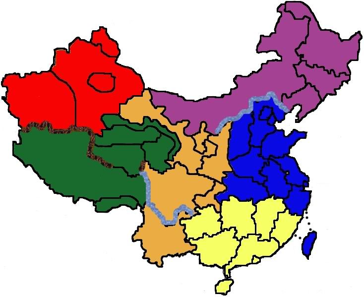
Image


theres one I drafted up a while back you can use, everything needs fixed on it but still.

PostPosted: Mon Jan 15, 2007 3:03 pm
by Lone.prophet
i like the 1 wisse has

now try 2 implant something special

PostPosted: Mon Jan 15, 2007 3:13 pm
by Wisse
srry kyle but i want to make something diferent than other maps, so you will see when i have filled in all the spaces of my map

PostPosted: Sun Jan 21, 2007 9:17 am
by Wisse
srry for waiting you so long, but i was ill so here is what i've done today:
Image
click on it to enlarge it, it was to big to put here, because i didn't want to resize it yet

next update will be:
the next continents colored and the 2 ilands colored

PostPosted: Sun Jan 21, 2007 9:19 am
by Lone.prophet
its looking good so far

PostPosted: Sun Jan 21, 2007 10:13 am
by Wisse
yeah, the only thing i don't know are the names for the continents :S but i can always change continents :P if someone know good names for it

PostPosted: Tue Jan 23, 2007 8:40 am
by Wisse
i ahve found a region map: http://www.lib.utexas.edu/maps/middle_e ... lreg96.jpg

i will use that for the bonusis


and can someone tell me how big the large map must be? then i can do the borders better

PostPosted: Tue Jan 23, 2007 11:24 am
by Wisse
new update:
Image
(click on the image to enlarg it)
can someone please say how big the large one must be?
than i can change the borders

next update will be:
sea & other countrys than china colored

PostPosted: Tue Jan 23, 2007 12:50 pm
by Marvaddin
I personally dont like continents with 2 countries, but they are becoming very popular... :?

Beyond that, most areas have too many borders.
And, you have some tiny and some huge territories, you could make better use of space.

PostPosted: Tue Jan 23, 2007 12:57 pm
by Wisse
Marvaddin wrote:I personally dont like continents with 2 countries, but they are becoming very popular... :?

Beyond that, most areas have too many borders.
And, you have some tiny and some huge territories, you could make better use of space.


yeah i know about the borders, i haven't had time to make impossible borders, and the huge territories is for a reason i think, because there are much mountains in the west.

here comes anather update:
Image
(click to enlarg)

PostPosted: Sat Jan 27, 2007 8:03 am
by Wisse
i have updated the map, but i don't know what you like more, withour or with lines, post wich one you like more:

A:
Image

B:
Image

PostPosted: Sat Jan 27, 2007 8:18 am
by boberz
without lines

PostPosted: Sat Jan 27, 2007 8:40 am
by Guiscard
Without, and I like the visual style. The sea texture is wonderful. I don;t know whther these are your actual territory boundaries but the two little ones in the darker blue continent and the little one in red probably need to be merged, else on the small version they'll barely be visable. Also one of the yellows needs to be changed in my opinion as they are very similar. Maybe a darker green?

PostPosted: Sat Jan 27, 2007 8:42 am
by Wisse
thats what i thought too, but here is anather something:
i have made sea routes, they are not ready yet (i don't know how to make them good) but here are where they will come:
Image
does someone know how to make them good? and i coudn't found a picture of a bridge because when i typ that in google i get 5mil things...
lone.phropet can i use the brown bridges u tryed for your map but didn't used? (if i can can you post the image here)

PostPosted: Sat Jan 27, 2007 8:44 am
by Wisse
Guiscard wrote:Without, and I like the visual style. The sea texture is wonderful. I don;t know whther these are your actual territory boundaries but the two little ones in the darker blue continent and the little one in red probably need to be merged, else on the small version they'll barely be visable. Also one of the yellows needs to be changed in my opinion as they are very similar. Maybe a darker green?


i will merge them and eum the litte one in the red is big enough i think,
and i think i will change the color of the yellow in the right above

But what should i do with the little one in light blue, because thats a very important "state"

PostPosted: Sat Jan 27, 2007 8:45 am
by Guiscard
I wouldn't bother with sea routes yet. Get the territory boundaries right first and some names up there so we can talk about it properly.

PostPosted: Sat Jan 27, 2007 9:08 am
by Wisse
ok i've merged some country's:
Image

But what should i do with shanghai?, because thats a very important "state"

PostPosted: Sat Jan 27, 2007 9:11 am
by Lone.prophet
my bridges where just a line with a gradient over it. though u can use em ill post 1 soon

PostPosted: Sat Jan 27, 2007 9:13 am
by Lone.prophet
ok heres a bridge for u
Image