- Click image to enlarge.
- Click image to enlarge.
Moderator: Cartographers
![]() by gimil on Wed Dec 09, 2009 4:55 am
by gimil on Wed Dec 09, 2009 4:55 am
natty_dread wrote:I was wrong


![]() by yeti_c on Wed Dec 09, 2009 2:06 pm
by yeti_c on Wed Dec 09, 2009 2:06 pm
porkenbeans wrote:The adjustments that I made were very slight, and will not produce any problems with the army numbers.


![]() by thenobodies80 on Wed Dec 09, 2009 2:23 pm
by thenobodies80 on Wed Dec 09, 2009 2:23 pm


![]() by Jace22 on Wed Dec 09, 2009 2:38 pm
by Jace22 on Wed Dec 09, 2009 2:38 pm


![]() by MrBenn on Wed Dec 09, 2009 2:40 pm
by MrBenn on Wed Dec 09, 2009 2:40 pm


![]() by gimil on Wed Dec 09, 2009 3:34 pm
by gimil on Wed Dec 09, 2009 3:34 pm
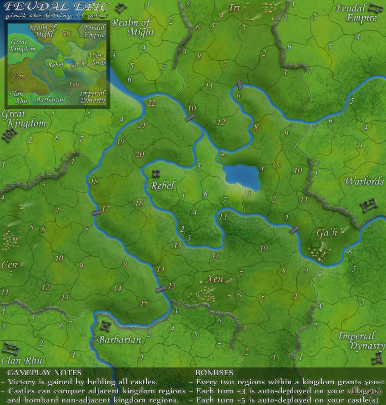
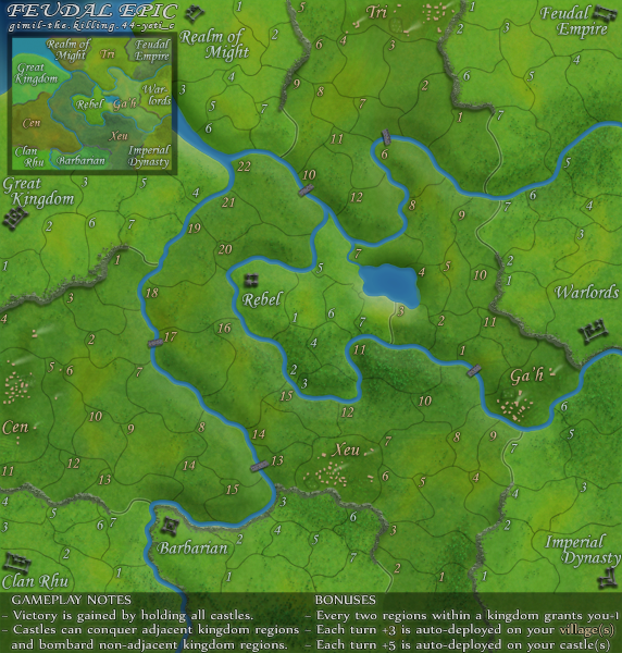
thenobodies80 wrote:http://i25.photobucket.com/albums/c64/Gimil_01/FeudalEpicS-5.png - small version
http://i25.photobucket.com/albums/c64/Gimil_01/FeudalEpicL-4.png - large version
http://h1.ripway.com/killing44/Feudal.xml - xml
If those are the current images and xml you have to fix Ga'h 6,7,8 and 9, everything else is ok
Nobodies
natty_dread wrote:I was wrong
![]() by the.killing.44 on Wed Dec 09, 2009 3:42 pm
by the.killing.44 on Wed Dec 09, 2009 3:42 pm


![]() by porkenbeans on Wed Dec 09, 2009 4:05 pm
by porkenbeans on Wed Dec 09, 2009 4:05 pm


![]() by the.killing.44 on Wed Dec 09, 2009 4:18 pm
by the.killing.44 on Wed Dec 09, 2009 4:18 pm
gimil wrote:This is them here benn. Thanks nobodies.thenobodies80 wrote:http://i25.photobucket.com/albums/c64/Gimil_01/FeudalEpicS-5.png - small version
http://i25.photobucket.com/albums/c64/Gimil_01/FeudalEpicL-4.png - large version
http://h1.ripway.com/killing44/Feudal.xml - xml
If those are the current images and xml you have to fix Ga'h 6,7,8 and 9, everything else is ok
Nobodies
![]() by gimil on Wed Dec 09, 2009 4:26 pm
by gimil on Wed Dec 09, 2009 4:26 pm
porkenbeans wrote:gimil it does look better. Here is a tip that you may want to consider, When you turn up the contrast levels it will tend to get oversaturated and the colors will become a little "glowy". The way that I fine tune these levels is this. First set your contrast levels. You are basicly just looking at the black intensity. In this case that is your borders. After you get them to the desired blackness, then jump over to the saturation levels. They will probably need to come down a bit so as to reduce that glow effect. You can then play with the brightness and such, and jump back and forth until you get what you want.
Here is the biggest tip that I can offer on fine tuning. When you are adjusting a certain level, Do NOT do it in a manner, that only moves the bar in small increments. Instead, Grab a hold of that bar and swing it all the way up, and then all the way down. With a "rocking motion" just keep swinging it back and forth. As you do this let your swing get smaller and smaller. Your eyes will tell you exactly where the optimum point is. The main point here is not to be shy with the slider bar, by only move it a notch or two at a time. Your eyes are not able to dial it in this way, and you will have to keep returning to fart with it again. Hope this helps.
natty_dread wrote:I was wrong
![]() by MrBenn on Wed Dec 09, 2009 5:13 pm
by MrBenn on Wed Dec 09, 2009 5:13 pm


![]() by grifftron on Wed Dec 09, 2009 5:36 pm
by grifftron on Wed Dec 09, 2009 5:36 pm


![]() by captainwalrus on Wed Dec 09, 2009 5:46 pm
by captainwalrus on Wed Dec 09, 2009 5:46 pm

![]() by Bruceswar on Wed Dec 09, 2009 5:47 pm
by Bruceswar on Wed Dec 09, 2009 5:47 pm


![]() by porkenbeans on Wed Dec 09, 2009 6:19 pm
by porkenbeans on Wed Dec 09, 2009 6:19 pm
I was trying to help.gimil wrote:porkenbeans wrote:gimil it does look better. Here is a tip that you may want to consider, When you turn up the contrast levels it will tend to get oversaturated and the colors will become a little "glowy". The way that I fine tune these levels is this. First set your contrast levels. You are basicly just looking at the black intensity. In this case that is your borders. After you get them to the desired blackness, then jump over to the saturation levels. They will probably need to come down a bit so as to reduce that glow effect. You can then play with the brightness and such, and jump back and forth until you get what you want.
Here is the biggest tip that I can offer on fine tuning. When you are adjusting a certain level, Do NOT do it in a manner, that only moves the bar in small increments. Instead, Grab a hold of that bar and swing it all the way up, and then all the way down. With a "rocking motion" just keep swinging it back and forth. As you do this let your swing get smaller and smaller. Your eyes will tell you exactly where the optimum point is. The main point here is not to be shy with the slider bar, by only move it a notch or two at a time. Your eyes are not able to dial it in this way, and you will have to keep returning to fart with it again. Hope this helps.
Thanks pork, but I don't need a Photoshop lesson.
![]() by gimil on Wed Dec 09, 2009 7:04 pm
by gimil on Wed Dec 09, 2009 7:04 pm
porkenbeans wrote:I thought that the whole reason behind the Foundry, was to give each other a helping hand, and offer tips and suggestions.
natty_dread wrote:I was wrong
![]() by cairnswk on Wed Dec 09, 2009 7:22 pm
by cairnswk on Wed Dec 09, 2009 7:22 pm


![]() by Jace22 on Wed Dec 09, 2009 7:30 pm
by Jace22 on Wed Dec 09, 2009 7:30 pm
![]() by porkenbeans on Wed Dec 09, 2009 9:03 pm
by porkenbeans on Wed Dec 09, 2009 9:03 pm
Thanks gimil. I am glad that you are starting to get me. I just want to be a helpful and useful member of the Foundry. I do not want to be perceived as a know-it-all or something. I will be the first to say out loud, that I have a whole lot to learn about photoshop. I am just an artist trying to learn this medium myself.gimil wrote:porkenbeans wrote:I thought that the whole reason behind the Foundry, was to give each other a helping hand, and offer tips and suggestions.
Your right porker, that sounded a little harsher than I intended. My apologies.
Benn, no XML stamp?
![]() by The Neon Peon on Wed Dec 09, 2009 9:16 pm
by The Neon Peon on Wed Dec 09, 2009 9:16 pm

![]() by the.killing.44 on Wed Dec 09, 2009 9:23 pm
by the.killing.44 on Wed Dec 09, 2009 9:23 pm
![]() by cairnswk on Wed Dec 09, 2009 9:24 pm
by cairnswk on Wed Dec 09, 2009 9:24 pm
The Neon Peon wrote:Sorry about bringing this up after quench, and it is probably me seeing something that is not there, but...
It seems to me that there are two shades of color going on in the map, and they are separated by straight vertical lines. Take a look at:
- Tri 12
- Barbarians 2
- Cen 15
....
Users browsing this forum: No registered users
|
|||||||
| Conquer Club is not associated with RISK online in any way. Copyright © 2006-2025 by Big Wham LLC | |||||||


