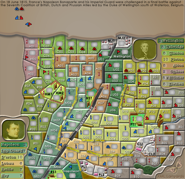
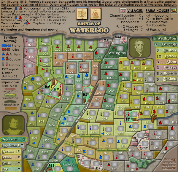
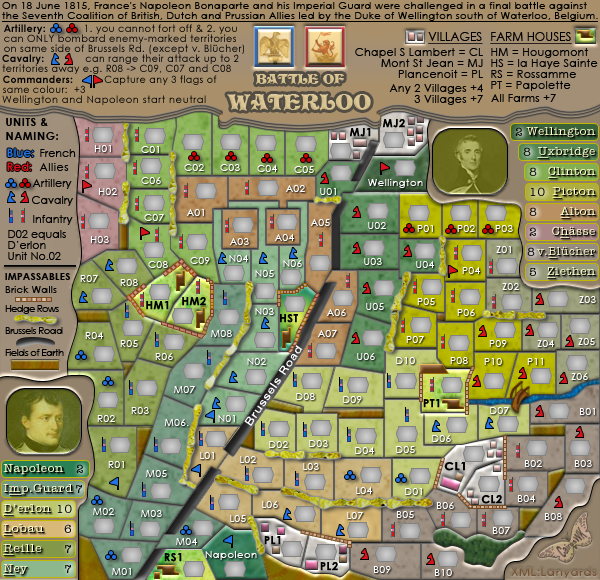
ManBungalow wrote:cairns, you know I love you, but I prefer this image:
...
Gee thanks MB

Yes no doubt some will have preferences...
The new one looks too shiny. Colours are good though.
Yes on the old map, there wasn't enough distinction between D'erlon and Lobau for CB

plus there was a call to lighten the farm areas so that troop icons for bombardment could be more easily identified....i hope that is achieved!
and the old textures from FW3 don't translate as well into PS5...
some excuses i know...but I think it a lot more clear and visible...
PS. you're missing the U01-A05 impassable.
Fixed now on my computer for next upload. Thanks


