Conquer Club

Italy [Quenched]

Care to peruse completed maps? Take a stroll through the Atlas.

Moderator: Cartographers

Forum rules
Please read the Community Guidelines before posting.

Postby RjBeals on Fri Dec 15, 2006 3:43 pm

Thanks for the feedback Ruben. I will use the Italian names use provided. I also considered using Palermo as the divided country for Sicily, but then thought it would be too small. But I could make it larger like Milano / Roma...

I want to start considering game play. The territories are placed (as close as possible) to actual borders. They may need to be slightly "re-divided" :? in order to keep a challenging fair game. Seeing as how I just got demoted to a private :cry: I might not be the best at determining this.

Most likely no updates this weekend. Will continue with editing next week.
User avatar
Private RjBeals
 
Posts: 2506
Joined: Mon Nov 20, 2006 5:17 pm
Location: South Carolina, USA

Postby happysadfun on Fri Dec 15, 2006 6:17 pm

Eh.... the bonuses are horrible.
ImageChildren, this is what happens to hockey players, druggies, and Hillary Clinton.

Rope. Tree. Hillary. Some assembly required.
User avatar
Cadet happysadfun
 
Posts: 1251
Joined: Mon Jul 10, 2006 9:06 pm
Location: Haundin at DotSco, Being Sad that Mark Green Lost in Suburban Wisconsin

Postby RjBeals on Fri Dec 15, 2006 6:22 pm

happysadfun wrote:Eh.... the bonuses are horrible.


Un-constructive feedback. What do you suggest?
User avatar
Private RjBeals
 
Posts: 2506
Joined: Mon Nov 20, 2006 5:17 pm
Location: South Carolina, USA

Postby happysadfun on Fri Dec 15, 2006 6:29 pm

Pink- 5
Bluegrey- 5
Insular- 5
Orange- 5
Green- 5 (Or 4, if you must)

It works! Include the cities (Milan, Turin, and Rome) in their respective continents as well as their own city +1 bonus. BTW, the Turin-Milan gap between them needs a name. Let's call it Monferatto, that's a decent city and range of Alpsian mountians...

And how about at least one "major city" for each continent. Palermo, Venice, Naples... these are ideas here.
ImageChildren, this is what happens to hockey players, druggies, and Hillary Clinton.

Rope. Tree. Hillary. Some assembly required.
User avatar
Cadet happysadfun
 
Posts: 1251
Joined: Mon Jul 10, 2006 9:06 pm
Location: Haundin at DotSco, Being Sad that Mark Green Lost in Suburban Wisconsin

Postby cowshrptrn on Fri Dec 15, 2006 6:38 pm

Youv'e done a pretty good job trying to get rid of bottlenecks, but i tihnk Campania-Molise should be a bit wider. Maybe campania-pantalerria or something like that
Image
User avatar
Private cowshrptrn
 
Posts: 838
Joined: Thu Aug 17, 2006 1:15 pm
Location: wouldn't YOU like to know....

Postby Marvaddin on Sat Dec 16, 2006 12:15 am

Much better. But I dislike those bridges (ok, I know they arent, I just dont know the right word in English). And I think we could still have some readjust about countries. Some are very small, but there is still room for more, like in Sardinia, or Veneto. But like I said, 32 is ok to me.

2 Italy maps? Haha! Its an important country, and it deserves a decent map, but not 2. Should I design a 2nd Brazil map?? :)

Ruben Cassar wrote:I don't particularly like the Brazil map though (that huge huge ENORMOUS country)! :P

Its not the right place, mate. Post your point, I will change the graphics anyway, so I think there is a good oportunity to complain about playability.
Image
User avatar
Major Marvaddin
 
Posts: 2545
Joined: Thu Feb 09, 2006 5:06 pm
Location: Belo Horizonte, Brazil

Postby Lupo on Sat Dec 16, 2006 3:07 am

Feedbacks:

1.As i suggest you in a previous post, I would have preffered you splitted central and southern Italy in 3 continents instead of only 2.

2. the Po river idea works very well, but if possible, in the border between Liguria and Lombardia, could you use as unpassable border the Appenino mountains? in this way you could let the Po in its true position, without force it to follow Lombardia south-west border.

3. About bridges and harbours i would like you to make them different. There are many harbours in Italy, maybe you could use or a pretty harbour draft or you could put a monument or something peculiar with the city where the harbour is located.

4. Since Rome and Milan are the 2 main italian airports, you could give them the property to be linked by an airport connection.

5. you could take some ideas from the space map: if you add some more sea way connection between the harbours, you could transform the harbours into little territories and consider them as a continent.
The same it could be done with Rome and Milan (and maybe with some other airport you would like to introduce)...

6. you have to invert Trentino with South Tirol (you made a little mistake with names)

7. i would like you add Garda lake at the Veneto-Trentino-Lombardia border and use Mincio river as the natural border between Veneto and Lombardia.

8. i would llike to put some more unpassable border such as the Alps and the Appenino

9. Honeslty i dislike the way how you split Sicily...maybe you could let Sicily as it was before, adding only Palermo harbour and or airport.
the same i would say about Toscana, i would prefer if you added Florence airport, instead of spliting the whole region.

10. I still think that Corsica would work better in map playability than Pantelleria. Moreover, you placed Pantelleria in a complitely wrong position in order to make it in inside your map. I suggest you to consider Ustica in the place of Pantelleria, in the case you dislike corsica option.

11. i would like you added naples in the map if it were possible

12. you could add also Venice and togheter with Trieste transform them into harbours. Moreover, why did you linked Puglia with Friulli and not with Trieste? i would like you added also Genoa as harbour, inside Liguria.

13. So, at the end, you could have at least 3 more continents, made up by italian main cities: Adriatic harbours system, Tyrrenian harbours system and italian airport system. you could aso think about to divide Tyrrenian harbours system in 2 continents.

I have many others feedbacks, but for now let's see your opinion about these...
Last edited by Lupo on Sun Dec 17, 2006 5:05 am, edited 1 time in total.
"Nature is a temple in which living pillars
Sometimes emit confused words;
Man crosses it through forests of symbols
That observe him with familiar glances."
User avatar
Sergeant 1st Class Lupo
 
Posts: 180
Joined: Fri Sep 15, 2006 1:33 pm

Postby Ruben Cassar on Sat Dec 16, 2006 4:37 am

Whoaaa Lupo you are asking for a lot from the poor guy! Hehe. However I think that on some points I agree with you. The Garda and the mountains should be in the map for sure.

About the piers or bridges whatever they are he could keep the graphics for the two that are crossing the Po in Lombardia and Torino and change the other ones to harbours or something similar.
ImageImageImageImageImage
User avatar
Colonel Ruben Cassar
 
Posts: 2160
Joined: Thu Nov 16, 2006 6:04 am
Location: Civitas Invicta, Melita, Evropa

Postby Balsiefen on Sun Dec 17, 2006 2:52 pm

just one thing, that map is on a really wierd slant, its almost on its side

Image
italy's more at this angle
User avatar
Sergeant 1st Class Balsiefen
 
Posts: 2299
Joined: Wed Aug 30, 2006 6:15 am
Location: The Ford of the Aldar in the East of the Kingdom of Lindissi

Postby Wisse on Sun Dec 17, 2006 3:10 pm

Balsiefen wrote:just one thing, that map is on a really wierd slant, its almost on its side

Image
italy's more at this angle

read before you post -.-"
this is done by himslelf to make the look better
Image Image
User avatar
Sergeant Wisse
 
Posts: 4448
Joined: Fri Oct 13, 2006 2:59 pm
Location: The netherlands, gelderland, epe

Postby RjBeals on Sun Dec 17, 2006 6:00 pm

I didn't want to angle the map, but it works better for displaying on computer monitors. Less 'scrolling'. I will put a directonal compass on the map once I start fixing it up.
User avatar
Private RjBeals
 
Posts: 2506
Joined: Mon Nov 20, 2006 5:17 pm
Location: South Carolina, USA

Postby RjBeals on Tue Dec 19, 2006 3:33 pm

Image


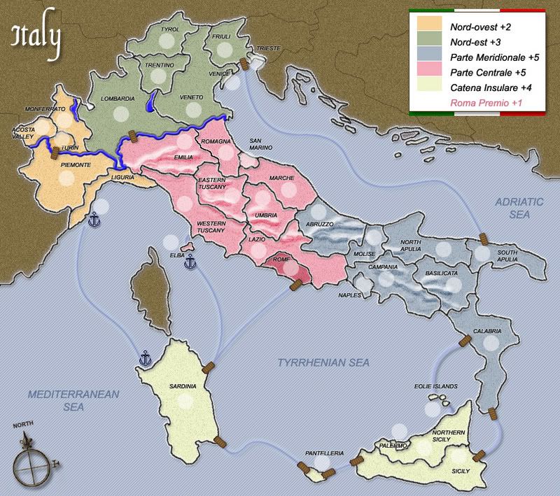
Changed:
1. Added "Parte" in front of Meridionale
2. Added Garda Lake
3. Added mountain range to landscape background. This was hard and I'm still not totally satisfied with the results.
4. Added Compass showing true north to lower left side
5. Added "Monferrato" between Turin-Lombardy gap. This gave an extra territory, so I removed Milano as it looked out of place.
6. Added more cities to make a total of 36 countries.
7. Increased bonus values
8. Inverted South Tyrol & Trentino (Removed word "south")
9. Fixed spelling of several regions


NOT Changed:
1) Ustica is very small, I think only about 1,000 people live there - I feel that positioning island of Pantelleria more north (so it's included in the mapped area) works better.

3) I still didn't make Corsica a part of the map because it's officially not a part of Italy. I read the arguments on earlier posts, and it would flow nicely with the water routes - but didn't feel it should be there.

2) I tried my hardest to keep the Po river flowing across Lombardia region, instead of following the southern border, but I could not get an impassable border (Mountain) I was happy with. If this really bothers people, I will keep trying.

3) I looked at moving territory boundaries so "Central & Southern Italy were split into 3 continents instead of only 2" - I feel it works best the way it is since there are only 36 countries.

4) I'm having trouble replacing the piers with harbour symbols. I don't know what symbols or monuments represent these harbours, other than a small anchor or ship - which I tried, I didn't feel it looked right, and it looses it's shape when it is so small. I have a few anchors placed in the map, do you like these?

5) I linked Puglia (Southern Apulia) with Friulli and not the true port state of Trieste only because the pier symbol would not fit in Trieste. I can fix if it's really wanted

6) Personally I didn't like the idea of airports being connectors, or groups of harbors being countries. I know it's been done on other maps, but I prefer playing for regions only. I had to add a few cities (Turin, Palermo, Rome, Venice, Naples & San Marino) to make 36 countries. The city boundaries are way bigger on my map than in real life because I had to allow room for the numbers & titles.

Whew - This is taking longer than I thought !!
User avatar
Private RjBeals
 
Posts: 2506
Joined: Mon Nov 20, 2006 5:17 pm
Location: South Carolina, USA

Postby wicked on Tue Dec 19, 2006 3:56 pm

what are the anchors for?
User avatar
Major wicked
 
Posts: 15787
Joined: Thu Jan 26, 2006 1:23 pm

Postby RjBeals on Tue Dec 19, 2006 4:00 pm

wicked wrote:what are the anchors for?


Several people didn't like the wooden piers linking the waterways. Just a sample of a harbour symbol of sorts.... I need some suggestions if the wooden piers are not to be used.
User avatar
Private RjBeals
 
Posts: 2506
Joined: Mon Nov 20, 2006 5:17 pm
Location: South Carolina, USA

Postby Ruben Cassar on Tue Dec 19, 2006 4:43 pm

I will give my feedback about the piers/anchor debate. I prefer the piers and I didn't find anything wrong with them in the first place. They are quite 'picturesque'. :)

What I would like to see is the names of the regions/cities in Italian but you already told me you would look into that in a previous post so I am assuming you didn't have time to implement that change.

On Monferrato. I actually think it makes the Piemonte region a bit too cluttered. I cannot understand why you removed Milano as I think it was better that way. Was there any particular reason?

On Sicilia. I would remove Northern Sicily and replace it with the city of Messina which is actually located in that region. I think that makes more sense.
ImageImageImageImageImage
User avatar
Colonel Ruben Cassar
 
Posts: 2160
Joined: Thu Nov 16, 2006 6:04 am
Location: Civitas Invicta, Melita, Evropa

Postby happysadfun on Tue Dec 19, 2006 4:57 pm

I'm assuming that the raised section is ariver but right now it looks like a varicose vein.


Man, I love using metaphors.


I like thae sandy look, though. It draws attention to the map, rather than the water. Good job!
ImageChildren, this is what happens to hockey players, druggies, and Hillary Clinton.

Rope. Tree. Hillary. Some assembly required.
User avatar
Cadet happysadfun
 
Posts: 1251
Joined: Mon Jul 10, 2006 9:06 pm
Location: Haundin at DotSco, Being Sad that Mark Green Lost in Suburban Wisconsin

Postby AndyDufresne on Tue Dec 19, 2006 8:02 pm

Well this map is surely coming along RJ! Looking much nicer than many of the previous versions...

Right now I'll just comment on the visuals...

  • I really like the overall look you have going, it's unique and a 'lighter map', something we haven't had lately.
  • I would suggest perhaps changing Parte Meridionale's color from blue to a light purple, that still blends with the map, might be something to look into. Right now, Parte M. looks a little water logged like a swamp.
  • The rest of the colors I like quite fine, though perhaps make Roma Premio stand out a little more.
  • The water in the rivers and lake looks a little odd, have you tried experimenting with various shades? Just something to play with.
  • Regarding the anchor or the pier...I like the pier. No map currently has a 'pier'...and I think it works rather well with the style and tone of the map. I'd change all to them. Perhaps you could darken the connecting lines a little so they don't get lost in the seas.
  • Regarding the compass, have you considered perhaps drawing a compass that corresponds with the feel and tone of light and soft colors the map has? Just a little something that could add some effect.
  • I do strongly suggest you make the names a little bigger. You might have to play with the positioning, but I think they are on the small side and could use a bump up. You also have to consider how small the names will be on the small map, when you shrink it down.
  • And one last thing...regarding the Bonus Legend. Perhaps you could remove the white background, and have a light, near transparent version the of the Italian flag in the background, or something similar to that. I'm not a big fan of the strong white background.

Looking good! I'll check in later.


--Andy
User avatar
Corporal 1st Class AndyDufresne
 
Posts: 24935
Joined: Fri Mar 03, 2006 8:22 pm
Location: A Banana Palm in Zihuatanejo

Postby RjBeals on Tue Dec 19, 2006 8:58 pm

AndyDufresne wrote:I do strongly suggest you make the names a little bigger... You also have to consider how small the names will be on the small map, when you shrink it down.


Great feedback from the few posts above. Give me a day or two to work on some revisions. Also, I was not going to just simply reduce the image down. I was going to resize just the map, while keeping the text the same size. But I will look at font. Thanks !!
User avatar
Private RjBeals
 
Posts: 2506
Joined: Mon Nov 20, 2006 5:17 pm
Location: South Carolina, USA

Postby Bad Speler on Tue Dec 19, 2006 9:43 pm

It looks like you have your text layer below the army shadow layer, this is noticible on turin and rome. Great map otherwise!
Highest Score: 2532
Highest Position: 69 (a long time ago)
User avatar
Sergeant 1st Class Bad Speler
 
Posts: 1027
Joined: Fri Jun 02, 2006 8:16 pm
Location: Ottawa

Postby RjBeals on Tue Dec 19, 2006 10:25 pm

Bad Speler wrote:It looks like you have your text layer below the army shadow layer
Correct. It will be changed. Thanks.
User avatar
Private RjBeals
 
Posts: 2506
Joined: Mon Nov 20, 2006 5:17 pm
Location: South Carolina, USA

Postby gavin_sidhu on Wed Dec 20, 2006 12:48 am

Sorry if some of these have been mentioned already but here is what i think needs to be changed:

Treste, Venice, Palermo and to a lesser extent Naples, Turin and San Marino need to be made bigger, they are too small currently and i doubt anybody would mind if these territories took the area of other territories.

Rome should be connected to a Parte Meridionale territory, to make it harder to sercure and for more fights over them to occur.

The outside border of Lombardia looks screwed up at one place which is all white. the lake in lombardia also does not look too good.
Highest Score: 1843 Ranking (Australians): 3
User avatar
Lieutenant gavin_sidhu
 
Posts: 1428
Joined: Mon May 22, 2006 6:16 am
Location: Brisbane, Australia

Postby RjBeals on Thu Dec 21, 2006 4:54 pm

Most recent update. Still lots I need to do, but thought & would show the new bonus's I'm thinking of. Also, I need help with Italian names. All I could find is what I have.

Image
User avatar
Private RjBeals
 
Posts: 2506
Joined: Mon Nov 20, 2006 5:17 pm
Location: South Carolina, USA

Postby insertnamehere on Sun Dec 24, 2006 6:31 am

thats a prettty good map , has some unique features which other maps dont have . i would enjoy playing that .
User avatar
Private 1st Class insertnamehere
 
Posts: 99
Joined: Sun Nov 05, 2006 12:56 pm
Location: Stoke Holy Cross, east anglia , UK

Postby KEYOGI on Sun Dec 24, 2006 7:25 am

Great map. I've tried to find something I don't like, but I can't. Look forward to playing it.
Sergeant 1st Class KEYOGI
 
Posts: 1632
Joined: Tue Oct 10, 2006 6:09 am

Postby Bad Speler on Sun Dec 24, 2006 9:02 am

As with Italian names, i remember from the olympics that turin is torino in italian, and rome is roma.
Highest Score: 2532
Highest Position: 69 (a long time ago)
User avatar
Sergeant 1st Class Bad Speler
 
Posts: 1027
Joined: Fri Jun 02, 2006 8:16 pm
Location: Ottawa

PreviousNext

Return to The Atlas

Who is online

Users browsing this forum: No registered users