Conquer Club

Feudal War [Quenched]

Care to peruse completed maps? Take a stroll through the Atlas.

Moderator: Cartographers

Forum rules
Please read the Community Guidelines before posting.

Postby gimil on Sat Oct 27, 2007 1:14 pm

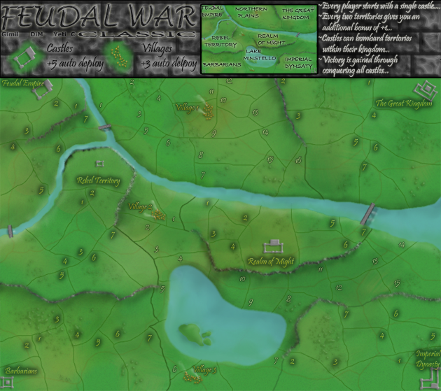
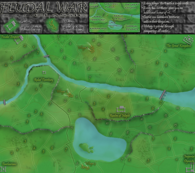
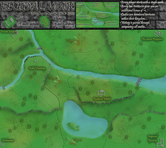
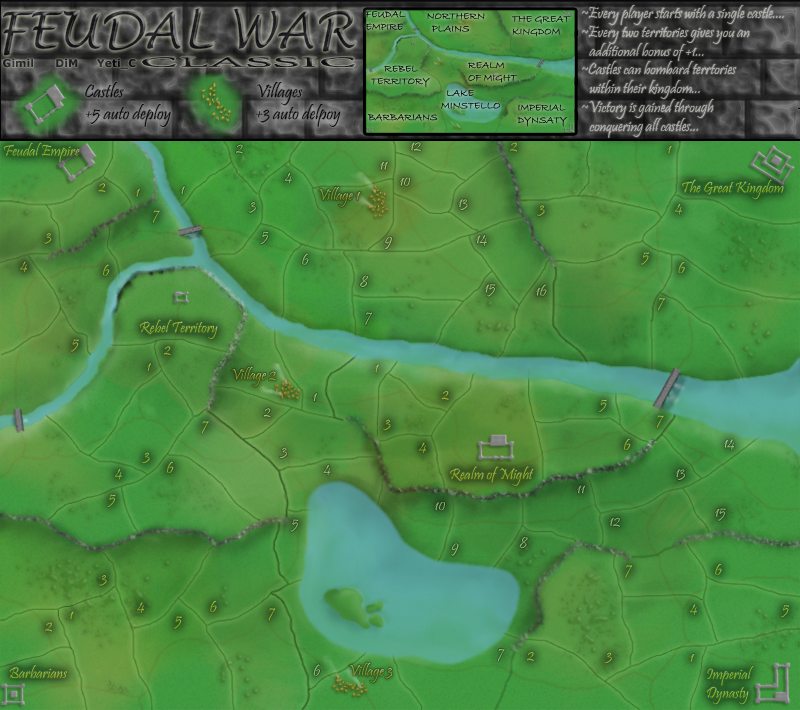
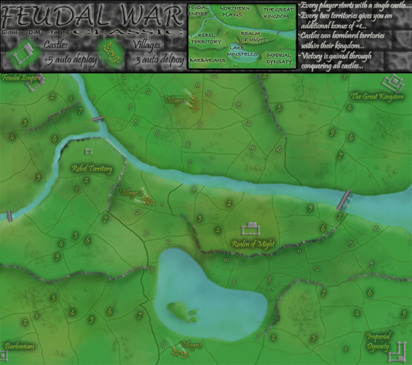
Gnome wrote:It's not that they aren't readable...
I just think you have to lower the intensity of the colour red and blue.
I like the font, but the red and blue are 'eye catchers'.
the colour looks to much the same as army numbers...
so when you play this map you will see a lot of numbers and than your beautifull graphics get lost...


yeah the problem with red and blue are they are the primary mid and low tones of the color spectrum, so they generally bolden black lines more than a lighter color would. But ill see what i do,

p.s im using the lightest stronged red and blue i can :wink:
What do you know about map making, bitch?

natty_dread wrote:I was wrong


Top Score:2403
User avatar
Corporal 1st Class gimil
 
Posts: 8599
Joined: Sat Mar 03, 2007 12:42 pm
Location: United Kingdom (Scotland)

Postby gimil on Sat Oct 27, 2007 1:16 pm

cairnswk wrote:Gimil...two quick things...the font....
1. the gray brick work doesn't help behind the gray outlilne font in legend...can you change this so it is more legible
2. i can hardly read the text on map!


1. I was unhappy with the legends legability after i uploaded it, i will work on it for the next update.

2. Is it jsut the small or teh large as well? p.s. are you wearing your glasses :P
What do you know about map making, bitch?

natty_dread wrote:I was wrong


Top Score:2403
User avatar
Corporal 1st Class gimil
 
Posts: 8599
Joined: Sat Mar 03, 2007 12:42 pm
Location: United Kingdom (Scotland)

Postby cairnswk on Sat Oct 27, 2007 1:30 pm

gimil wrote:
cairnswk wrote:Gimil...two quick things...the font....
1. the gray brick work doesn't help behind the gray outlilne font in legend...can you change this so it is more legible
2. i can hardly read the text on map!


1. I was unhappy with the legends legability after i uploaded it, i will work on it for the next update.

2. Is it jsut the small or teh large as well? p.s. are you wearing your glasses :P


Aye...e have me eyes in :)

Small map:
1. the white outlines on the legend textblends in too much with the gray stone wall.
2. canno' read any names on map
3. can read some numbers but they need to be brightened somewhat or lifted

Large:
1. Same issue in legend
2. Same issue with names
3. can read the red, purple and blue numbers, but others just don't standout.

I understand you wanting possibly subtlety here...but i think others may also have this issue.
Sorry. mate. :)
Image
* Pearl Harbour * Waterloo * Forbidden City * Jamaica * Pot Mosbi
User avatar
Private cairnswk
 
Posts: 11510
Joined: Sat Feb 03, 2007 8:32 pm
Location: Australia

Postby gimil on Sat Oct 27, 2007 1:34 pm

cairnswk wrote:
gimil wrote:
cairnswk wrote:Gimil...two quick things...the font....
1. the gray brick work doesn't help behind the gray outlilne font in legend...can you change this so it is more legible
2. i can hardly read the text on map!


1. I was unhappy with the legends legability after i uploaded it, i will work on it for the next update.

2. Is it jsut the small or teh large as well? p.s. are you wearing your glasses :P


Aye...e have me eyes in :)

Small map:
1. the white outlines on the legend textblends in too much with the gray stone wall.
2. canno' read any names on map
3. can read some numbers but they need to be brightened somewhat or lifted

Large:
1. Same issue in legend
2. Same issue with names
3. can read the red, purple and blue numbers, but others just don't standout.

I understand you wanting possibly subtlety here...but i think others may also have this issue.
Sorry. mate. :)


the legends will be geting reworked

I have space to increase the nulber sizes in the small.

And it the large i will rework the numbers colors.

and for the names i can incrase the opacity.

sound good?
What do you know about map making, bitch?

natty_dread wrote:I was wrong


Top Score:2403
User avatar
Corporal 1st Class gimil
 
Posts: 8599
Joined: Sat Mar 03, 2007 12:42 pm
Location: United Kingdom (Scotland)

Postby Telvannia on Sat Oct 27, 2007 1:40 pm

I came.
I saw.
I had to complain :lol:


castle names should have the colour of their territories numbers

the legend, try a sandstone look, i will see if i can find a image.

castles, im still not happy with them, the rest of your map is meant to look realistic make the castles look real :)

I dont like the way in hte legend 'classic' is stretched

text on mini map should be coloured with territory colour, and smaller

river bluer in the middle :x

maybe colour the village text to make it stand out :)


that should do for now :P
User avatar
Sergeant 1st Class Telvannia
 
Posts: 1331
Joined: Mon Apr 24, 2006 7:19 am

Postby gimil on Sat Oct 27, 2007 1:45 pm

Telvannia wrote:I came.
I saw.
I had to complain :lol:


castle names should have the colour of their territories numbers

the legend, try a sandstone look, i will see if i can find a image.

castles, im still not happy with them, the rest of your map is meant to look realistic make the castles look real :)

I dont like the way in hte legend 'classic' is stretched

text on mini map should be coloured with territory colour, and smaller

river bluer in the middle :x

maybe colour the village text to make it stand out :)


that should do for now :P


bite me tel . . .
What do you know about map making, bitch?

natty_dread wrote:I was wrong


Top Score:2403
User avatar
Corporal 1st Class gimil
 
Posts: 8599
Joined: Sat Mar 03, 2007 12:42 pm
Location: United Kingdom (Scotland)

Postby gimil on Sat Oct 27, 2007 1:50 pm

Telvannia wrote:I came.
I saw.
I had to complain :lol:


castle names should have the colour of their territories numbers

Will do

the legend, try a sandstone look, i will see if i can find a image.

No, your teh only one who doesnt like hte brickwall :wink:

castles, im still not happy with them, the rest of your map is meant to look realistic make the castles look real :)

And what do tehy need to be MORE realistic

I dont like the way in hte legend 'classic' is stretched

Will see what i can do

text on mini map should be coloured with territory colour, and smaller

Will recolor, make it any smaller it wont be legable, ill change the font

river bluer in the middle :x

forgot to do it in the last update.

maybe colour the village text to make it stand out :)

Will do

that should do for now :P
What do you know about map making, bitch?

natty_dread wrote:I was wrong


Top Score:2403
User avatar
Corporal 1st Class gimil
 
Posts: 8599
Joined: Sat Mar 03, 2007 12:42 pm
Location: United Kingdom (Scotland)

Postby rebelman on Sat Oct 27, 2007 2:01 pm

Well done on the latest update gimil.

I have a concern about your territory numbers -

can you try and avoid the 6 colors used in our games for army deployment as the same issue which arose on d day could happen here again.
Don't now why people on here don't like being cooks, remember under siege: A former SEAL, now cook, is the only person who can stop a gang of terrorists when they sieze control of a US Navy battleship.
User avatar
Private rebelman
 
Posts: 2968
Joined: Thu Aug 02, 2007 5:24 pm
Location: People's Republic of Cork

Postby militant on Sat Oct 27, 2007 2:24 pm

I dislike the brick also, althought this map is looking really good otherwise and i really like the gameplay

Telvannia wrote:the legend, try a sandstone look, i will see if i can find a image.

:D
User avatar
Sergeant 1st Class militant
 
Posts: 923
Joined: Mon Jul 30, 2007 1:25 pm
Location: Playing Mafia

Postby gimil on Sat Oct 27, 2007 2:37 pm

Get me a desent sansstone image and ill make a compromise :wink:
What do you know about map making, bitch?

natty_dread wrote:I was wrong


Top Score:2403
User avatar
Corporal 1st Class gimil
 
Posts: 8599
Joined: Sat Mar 03, 2007 12:42 pm
Location: United Kingdom (Scotland)

Postby gimil on Sat Oct 27, 2007 2:38 pm

rebelman wrote:Well done on the latest update gimil.

I have a concern about your territory numbers -

can you try and avoid the 6 colors used in our games for army deployment as the same issue which arose on d day could happen here again.


The problem is it need to be 6 diffirent colors, diffirent enought to standout, but because of te font they also need to be bright. there sint really much space for choice. Unless i pick one color for castle terrs and 2 color for the bulkd of land
What do you know about map making, bitch?

natty_dread wrote:I was wrong


Top Score:2403
User avatar
Corporal 1st Class gimil
 
Posts: 8599
Joined: Sat Mar 03, 2007 12:42 pm
Location: United Kingdom (Scotland)

Postby Qwert on Sat Oct 27, 2007 2:51 pm

Hmm,from where to start:
1.Yours Title is very modern for these map,try to create title who will better present Feudal wars
2.You have 2 colours who present 99% of colours of map,please put more colours.
3.Im afraid that these map will be second Mibi Castle
4.Borders and names is very dificulty to recognise
5.From mine point of view,you must to create better map,and i belive that you know how to do these,so keep with good work.
Image
NEW REVOLUTION-NEW RANKS PRESS THESE LINK viewtopic.php?f=471&t=47578&start=0
User avatar
Major Qwert
SoC Training Adviser
 
Posts: 9262
Joined: Tue Nov 07, 2006 5:07 pm
Location: VOJVODINA

Postby gimil on Sat Oct 27, 2007 3:07 pm

qwert wrote:Hmm,from where to start:
1.Yours Title is very modern for these map,try to create title who will better present Feudal wars
2.You have 2 colours who present 99% of colours of map,please put more colours.
3.Im afraid that these map will be second Mibi Castle
4.Borders and names is very dificulty to recognise
5.From mine point of view,you must to create better map,and i belive that you know how to do these,so keep with good work.


1. The whole legends had a modern feel at one point, i was hopeing to get a balance with the new font and the old title.

2. Thats not so easy with the realistic approach im taking,

3. Its a completly diffirent concept from mimb's map.

4. Names are already under going some work. ill look into te boarders
What do you know about map making, bitch?

natty_dread wrote:I was wrong


Top Score:2403
User avatar
Corporal 1st Class gimil
 
Posts: 8599
Joined: Sat Mar 03, 2007 12:42 pm
Location: United Kingdom (Scotland)

Postby Telvannia on Sat Oct 27, 2007 3:25 pm

gimil wrote:
Telvannia wrote:I came.
I saw.
I had to complain :lol:


castle names should have the colour of their territories numbers

Will do

the legend, try a sandstone look, i will see if i can find a image.

No, your teh only one who doesnt like hte brickwall :wink:
Im not any more :P

castles, im still not happy with them, the rest of your map is meant to look realistic make the castles look real :)

And what do tehy need to be MORE realistic
Larger range of colours

I dont like the way in hte legend 'classic' is stretched

Will see what i can do

text on mini map should be coloured with territory colour, and smaller

Will recolor, make it any smaller it wont be legable, ill change the font

river bluer in the middle :x

forgot to do it in the last update.

maybe colour the village text to make it stand out :)

Will do

that should do for now :P


Image
sandstone

castle wall:
Image
User avatar
Sergeant 1st Class Telvannia
 
Posts: 1331
Joined: Mon Apr 24, 2006 7:19 am

Postby gimil on Sat Oct 27, 2007 3:32 pm

to many colors also make te text a little less legiable, i also cant get a sandstone color to fit with the map.

and for your talk of castles, again at the scale the maps at you WOULDNT see a large range of colors.
What do you know about map making, bitch?

natty_dread wrote:I was wrong


Top Score:2403
User avatar
Corporal 1st Class gimil
 
Posts: 8599
Joined: Sat Mar 03, 2007 12:42 pm
Location: United Kingdom (Scotland)

Postby gimil on Sat Oct 27, 2007 7:17 pm

Image
Image
What do you know about map making, bitch?

natty_dread wrote:I was wrong


Top Score:2403
User avatar
Corporal 1st Class gimil
 
Posts: 8599
Joined: Sat Mar 03, 2007 12:42 pm
Location: United Kingdom (Scotland)

Postby rebelman on Sat Oct 27, 2007 7:25 pm

gimil i give this latest update a big thumbs up

just a couple of tiny things

dynasty is misspelled in the legend map

Imperial Dynasty needs to be moved a tiny bit left on the map itself as its right up against the edge.


these are tiny points and this map needs to be in the final forge at this stage
Don't now why people on here don't like being cooks, remember under siege: A former SEAL, now cook, is the only person who can stop a gang of terrorists when they sieze control of a US Navy battleship.
User avatar
Private rebelman
 
Posts: 2968
Joined: Thu Aug 02, 2007 5:24 pm
Location: People's Republic of Cork

Postby gimil on Sat Oct 27, 2007 7:46 pm

Image
Image
What do you know about map making, bitch?

natty_dread wrote:I was wrong


Top Score:2403
User avatar
Corporal 1st Class gimil
 
Posts: 8599
Joined: Sat Mar 03, 2007 12:42 pm
Location: United Kingdom (Scotland)

Postby Coleman on Sat Oct 27, 2007 8:04 pm

Wonderful Update! =D>
Warning: You may be reading a really old topic.
User avatar
Sergeant Coleman
 
Posts: 5402
Joined: Tue Jan 02, 2007 10:36 pm
Location: Midwest

Postby gimil on Sat Oct 27, 2007 8:26 pm

Coleman wrote:Wonderful Update! =D>


just what i wanted to hear :D
What do you know about map making, bitch?

natty_dread wrote:I was wrong


Top Score:2403
User avatar
Corporal 1st Class gimil
 
Posts: 8599
Joined: Sat Mar 03, 2007 12:42 pm
Location: United Kingdom (Scotland)

Postby cairnswk on Sat Oct 27, 2007 9:14 pm

Gimil...you'll think i am being hard....but not really.

Your large map is safe.

Your small map is 630 px wide.
Are you able to downsize this please to 600....i think there is room there to accommodate this!?
Image
* Pearl Harbour * Waterloo * Forbidden City * Jamaica * Pot Mosbi
User avatar
Private cairnswk
 
Posts: 11510
Joined: Sat Feb 03, 2007 8:32 pm
Location: Australia

Postby gimil on Sat Oct 27, 2007 9:16 pm

cairnswk wrote:Gimil...you'll think i am being hard....but not really.

Your large map is safe.

Your small map is 630 px wide.
Are you able to downsize this please to 600....i think there is room there to accommodate this!?


I know but i chose to keep the extra 30px to accomodate for the text comfortable. I really dont want to increase the size of the text.

EDIT: ive check it and its not so great but if you can read it anyone can, ill have the image up in a minute.
What do you know about map making, bitch?

natty_dread wrote:I was wrong


Top Score:2403
User avatar
Corporal 1st Class gimil
 
Posts: 8599
Joined: Sat Mar 03, 2007 12:42 pm
Location: United Kingdom (Scotland)

Postby gimil on Sat Oct 27, 2007 9:25 pm

cairns are you happy with this?

Image
What do you know about map making, bitch?

natty_dread wrote:I was wrong


Top Score:2403
User avatar
Corporal 1st Class gimil
 
Posts: 8599
Joined: Sat Mar 03, 2007 12:42 pm
Location: United Kingdom (Scotland)

Postby cairnswk on Sat Oct 27, 2007 9:36 pm

Gimil...almost...

1. size is good...thank you. :)

2. Legend text....gray behind FEUDAL WAR is still blending with that text, although it is legible. i can read the legend areas, and the instructions are a little blurry, perhaps this is because of the downsizing? is there anyway to make that clearer?

3. i still don't know about the text on the map....you have used a different font there from the one in the legend inidaction areas....it is very hard to discern and i think the numbers still have to be emphasized more.

I guess my main concern is for the colour blind who may have a great deal of trouble with this if everything is in such subtle colours and near shades to green. i am not saying change to brilliant different colours, but i don't think this extent of minimalism is good idea.
Image
* Pearl Harbour * Waterloo * Forbidden City * Jamaica * Pot Mosbi
User avatar
Private cairnswk
 
Posts: 11510
Joined: Sat Feb 03, 2007 8:32 pm
Location: Australia

Postby gimil on Sat Oct 27, 2007 9:41 pm

cairnswk wrote:Gimil...almost...

1. size is good...thank you. :)

2. Legend text....gray behind FEUDAL WAR is still blending with that text, although it is legible. i can read the legend areas, and the instructions are a little blurry, perhaps this is because of the downsizing? is there anyway to make that clearer?

3. i still don't know about the text on the map....you have used a different font there from the one in the legend inidaction areas....it is very hard to discern and i think the numbers still have to be emphasized more.

I guess my main concern is for the colour blind who may have a great deal of trouble with this if everything is in such subtle colours and near shades to green. i am not saying change to brilliant different colours, but i don't think this extent of minimalism is good idea.


Can i have the extra 30px? for the white text in the legends?

I can tweek the colors a little more on the map, but the black glow currelty behind the number should be enought for teh colorblind. As for hte title i could have a black glow to darken out te grey a little like ive dont with the white text.
What do you know about map making, bitch?

natty_dread wrote:I was wrong


Top Score:2403
User avatar
Corporal 1st Class gimil
 
Posts: 8599
Joined: Sat Mar 03, 2007 12:42 pm
Location: United Kingdom (Scotland)

PreviousNext

Return to The Atlas

Who is online

Users browsing this forum: No registered users