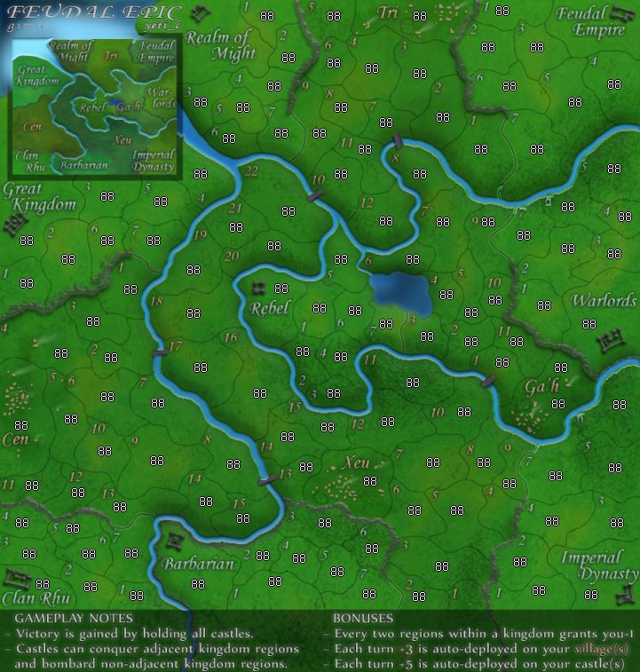
--Andy
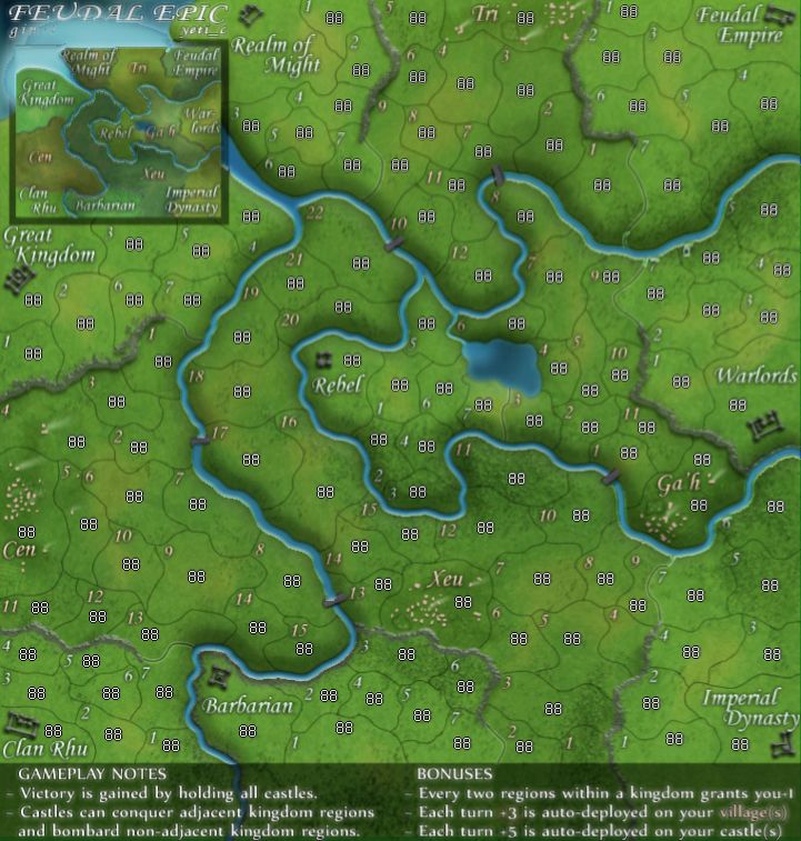
Feudal Epic, L&S, Pg. 49 [D, Gp, Gr]
Moderator: Cartographers
Re: Feudal Epic, L&S, Pg. 28 [I, Gp]
If there should be any rule---it should be against so much bright red on green! 
--Andy
--Andy
-

 AndyDufresne
- Posts: 24935
- Joined: Fri Mar 03, 2006 8:22 pm
- Location: A Banana Palm in Zihuatanejo


Re: Feudal Epic, L&S, Pg. 28 [I, Gp, Gr]
Thank you benn.
What do you know about map making, bitch?
Top Score:2403
natty_dread wrote:I was wrong
Top Score:2403
-

 gimil
gimil
- Posts: 8599
- Joined: Sat Mar 03, 2007 12:42 pm
- Location: United Kingdom (Scotland)


Re: Feudal Epic, L&S, Pg. 28 [I, Gp]
AndyDufresne wrote:If there should be any rule---it should be against so much bright red on green!
--Andy
I agree ...i have been looking forward to this map for months. Please change the bright red ...YeeeCh

-

 jackin_u_up
- Posts: 711
- Joined: Mon Nov 19, 2007 11:04 pm
- Location: Behind Enemy lines in Communist California


Re: Feudal Epic, L&S, Pg. 28 [I, Gp]
jackin_u_up wrote:AndyDufresne wrote:If there should be any rule---it should be against so much bright red on green!
--Andy
I agree ...i have been looking forward to this map for months. Please change the bright red ...YeeeCh
The new CC Christmas Map?

-

 phantomzero
- Posts: 827
- Joined: Fri Dec 28, 2007 7:13 pm
- Location: 2742 high score 122710


Re: Feudal Epic, L&S, Pg. 28 [D, Gp, Gr]
yo, whitestazn88 here for the map review.
gotta say, i'm not a big feudal fan. i'm bad at it and got no strategy. but it looks good. move it on
gotta say, i'm not a big feudal fan. i'm bad at it and got no strategy. but it looks good. move it on
-
 whitestazn88
- Posts: 3128
- Joined: Mon Feb 05, 2007 2:59 pm
- Location: behind you


Re: Feudal Epic, L&S, Pg. 28 [D, Gp, Gr]
Its ready, lets get this quenched
-

 sailorseal
- Posts: 2735
- Joined: Sun May 25, 2008 1:49 pm
- Location: conquerclub.com


Re: Feudal Epic, L&S, Pg. 28 [D, Gp, Gr]
ew, this map is all... sticky!
Nice work to date. Just sent out a review call, so let the criticism begin!
Nice work to date. Just sent out a review call, so let the criticism begin!

-

 oaktown
- Posts: 4451
- Joined: Sun Dec 03, 2006 9:24 pm
- Location: majorcommand


Re: Feudal Epic, L&S, Pg. 28 [D, Gp, Gr]
I will play on it and pm you or post in here if I see any issues or flaws with it
looks great though from what i see, a larger version of feudal, i am quite sure it will be very popular, also, you can set up quads games on this one, correct?
looks great though from what i see, a larger version of feudal, i am quite sure it will be very popular, also, you can set up quads games on this one, correct?

-

 Blitzaholic
- Posts: 23050
- Joined: Wed Aug 09, 2006 11:57 pm
- Location: Apocalyptic Area


Re: Feudal Epic, L&S, Pg. 28 [D, Gp, Gr]
Blitzaholic wrote:you can set up quads games on this one, correct?
Correct!
What do you know about map making, bitch?
Top Score:2403
natty_dread wrote:I was wrong
Top Score:2403
-

 gimil
gimil
- Posts: 8599
- Joined: Sat Mar 03, 2007 12:42 pm
- Location: United Kingdom (Scotland)


Re: Feudal Epic, L&S, Pg. 28 [D, Gp, Gr]
I just started learning feudal last week, and won my first game. So I guess you can say that I'm a virgining fan. I saw something that I thought might be an improvement, but instead of trying to explain it, I hope that you don't mind, that I just went ahead and punched out an example of my idea. It is crude because I do not have the file and had only one layer to work with but here it is. If you like it I will be more than happy to tweak it for you if you can supply me with the full file.

-

 porkenbeans
- Posts: 2546
- Joined: Mon Sep 10, 2007 4:06 pm


Re: Feudal Epic, L&S, Pg. 28 [D, Gp, Gr]
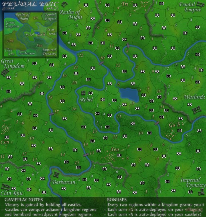
I guess I will throw in my final 2 cents, which I have thrown in before. It is way too day glow green. This causes the lanscape to seem unnatural. Also the rivers looked better darker.
-

 mibi
mibi
- Posts: 3350
- Joined: Thu Mar 01, 2007 8:19 pm
- Location: The Great State of Vermont


Re: Feudal Epic, L&S, Pg. 28 [D, Gp, Gr]
I agree with mibi, the greens are definitely too bright. Some darker areas and some paler areas would make the map feel much more realistic. But a general softening of the all the green will go a long way.
-

 sully800
- Posts: 4978
- Joined: Wed Jun 14, 2006 5:45 pm
- Location: Bethlehem, Pennsylvania


Re: Feudal Epic, L&S, Pg. 28 [D, Gp, Gr]
Thats funny, The very first thing that struck me about this map, was, how colorful and vibrant it was in comparison to the old feudal. I like it VERY much. 
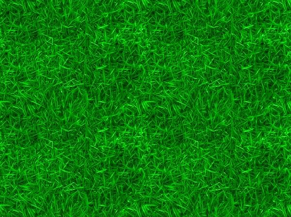
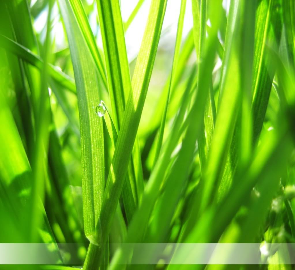
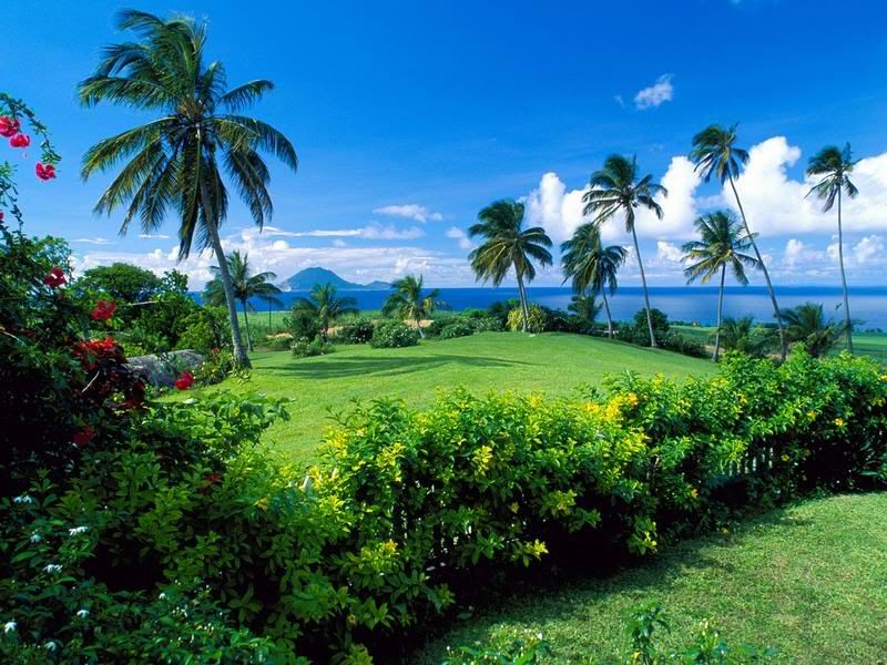
As a matter of fact, I dare you to go out to your yard and grab a handful of grass.Bring it in to and hold it up to the monitor. You will see just how colorful "nature" is.
As a matter of fact, I dare you to go out to your yard and grab a handful of grass.Bring it in to and hold it up to the monitor. You will see just how colorful "nature" is.

-

 porkenbeans
- Posts: 2546
- Joined: Mon Sep 10, 2007 4:06 pm


Re: Feudal Epic, L&S, Pg. 28 [D, Gp, Gr]
porkenbeans wrote:Thats funny, The very first thing that struck me about this map, was, how colorful and vibrant it was in comparison to the old feudal. I like it VERY much.
As a matter of fact, I dare you to go out to your yard and grab a handful of grass.Bring it in to and hold it up to the monitor. You will see just how colorful "nature" is.
I highly doubt the grass in my yard is a out of the CMYK gamut as this map is.
-

 mibi
mibi
- Posts: 3350
- Joined: Thu Mar 01, 2007 8:19 pm
- Location: The Great State of Vermont


Re: Feudal Epic, L&S, Pg. 28 [D, Gp, Gr]
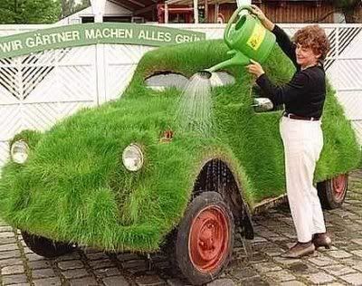
Something called lighting and perspective. This map is different in both except your middle image, which is wildly unrealistic.
.44
.44
-

 the.killing.44
- Posts: 4724
- Joined: Thu Oct 23, 2008 7:43 pm
- Location: now tell me what got two gums and knows how to spit rhymes


Re: Feudal Epic, L&S, Pg. 28 [D, Gp, Gr]
C'mon kill,the.killing.44 wrote:Something called lighting and perspective. This map is different in both except your middle image, which is wildly unrealistic.
.44
Lighting ?
the sun is natural light.
perspective ?
that only means "where the viewer is standing. and unless he is standing behind a dirty window, grass is green. and exceptionally so, if it is a sunny day, and your not in the Majavi dessert in August. lol.

-

 porkenbeans
- Posts: 2546
- Joined: Mon Sep 10, 2007 4:06 pm


Re: Feudal Epic, L&S, Pg. 28 [D, Gp, Gr]
Amount of sunlight = lighting.
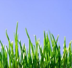
Those are from the same perspective?
.44


Those are from the same perspective?
.44
-

 the.killing.44
- Posts: 4724
- Joined: Thu Oct 23, 2008 7:43 pm
- Location: now tell me what got two gums and knows how to spit rhymes


Re: Feudal Epic, L&S, Pg. 28 [D, Gp, Gr]
Look, I'll say it straight out. Bird's-eye view. Zoomed out pretty far, so buildings are ye small. Lighting isn't great, probably a cloudy day. Now find grass that green.
.44
.44
-

 the.killing.44
- Posts: 4724
- Joined: Thu Oct 23, 2008 7:43 pm
- Location: now tell me what got two gums and knows how to spit rhymes


Re: Feudal Epic, L&S, Pg. 28 [D, Gp, Gr]
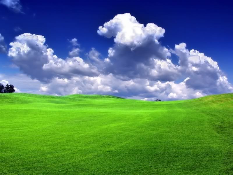
As kill pointed out, sunlight behind the blades of grass makes those images very different from an aerial view.
I'd prefer to see greens taken from these images:
I'd prefer to see greens taken from these images:
-

 sully800
- Posts: 4978
- Joined: Wed Jun 14, 2006 5:45 pm
- Location: Bethlehem, Pennsylvania


Re: Feudal Epic, L&S, Pg. 28 [D, Gp, Gr]
The last 2 are not grass.sully800 wrote:As kill pointed out, sunlight behind the blades of grass makes those images very different from an aerial view.
I'd prefer to see greens taken from these images:
The first 2 are more colorful than the map, and the 2nd. is a shot on an overcast day with no sun. but it is still brighter and more colorful than the map.
I think that his map and the color of the green grass is just perfect.

-

 porkenbeans
- Posts: 2546
- Joined: Mon Sep 10, 2007 4:06 pm


Re: Feudal Epic, L&S, Pg. 28 [D, Gp, Gr]
The ones you mention are lighter than the map, not brighter.
And yes I understand that the last two are not grass. They are trees, which are included throughout the map that we are discussing.
And yes I understand that the last two are not grass. They are trees, which are included throughout the map that we are discussing.
-

 sully800
- Posts: 4978
- Joined: Wed Jun 14, 2006 5:45 pm
- Location: Bethlehem, Pennsylvania


Re: Feudal Epic, L&S, Pg. 28 [D, Gp, Gr]
I like it gimil.. The shading of the green is great,, Lets get this map beta bound already 


-
 danfrank
- Posts: 611
- Joined: Mon Dec 24, 2007 1:19 am


Re: Feudal Epic, L&S, Pg. 28 [D, Gp, Gr]
I just wanted to show my idea for the water, now here I am messin with the land. lol. Hey this is not my map, why the heck am I working on this ?
Anyways its gmils' baby, and if he wants to make any changes, its his choice. Personaly I like it with the bright green, but here is an option that may be more in line with what Sully has mentioned. I think that it looks pretty cool, a bit more like late summer or early fall.
...I'm done.

-

 porkenbeans
- Posts: 2546
- Joined: Mon Sep 10, 2007 4:06 pm


Who is online
Users browsing this forum: No registered users

