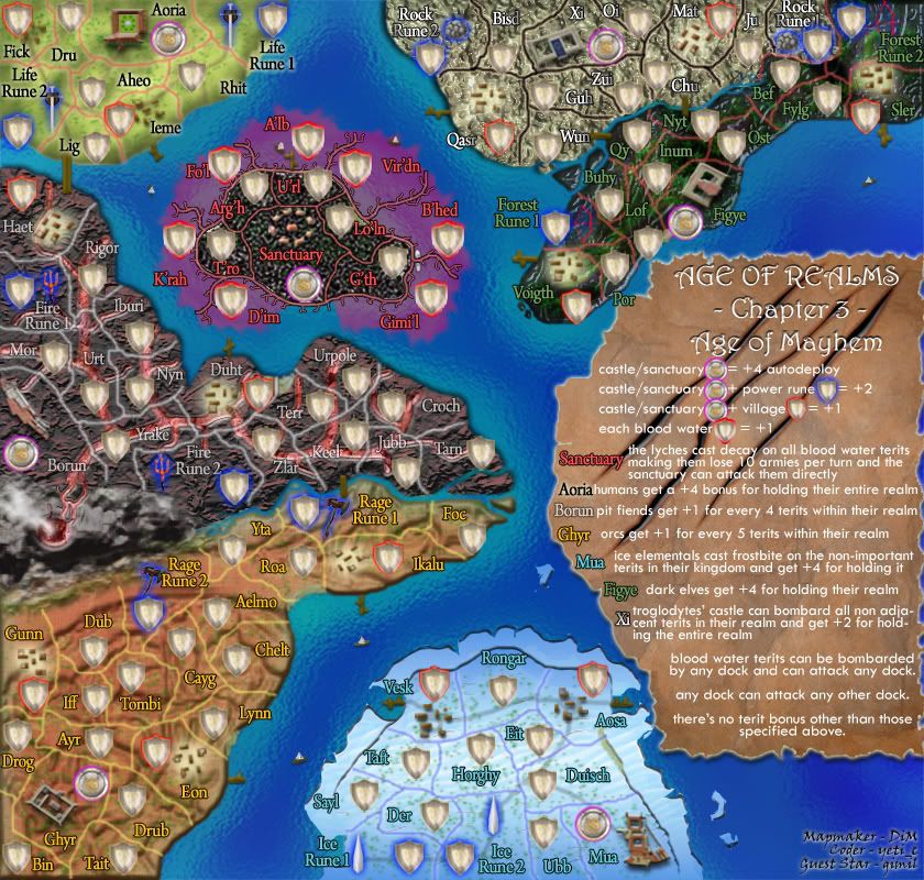
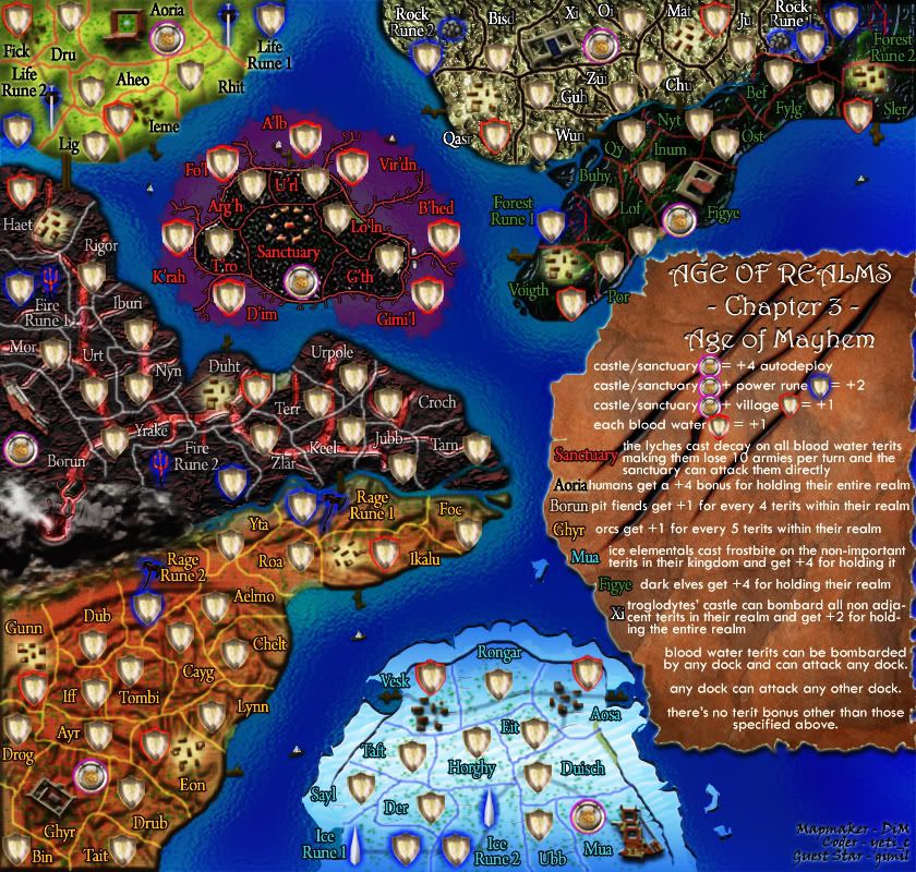
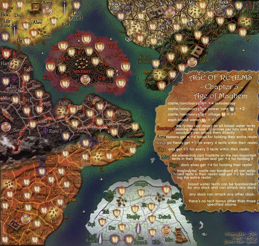
mibi wrote:DiM,
I think the colors are too bright and cheery for an 'age of mayhem'. I think you should unify the your pallet with some darker hues. here are some suggestions.
thanks for the input. i'd like a version between the 2 you suggested and if other people are happy with a darker map then i can do it. will update on monday.
mibi wrote:I also don't like the tears in the legend background, as the text does not conform to them so it stands out as inauthentic.
yeah i know and i tried making them more realistic but then the readability is very poor.
there are 2 options.
1. tears were made after the text was written in which case parts of text should be missing.
2. text was written over the tears in which case some letters should be skewed to follow the bumps left by the tears. i tried this but it was still very poor to read.
so i decided to sacrifice realism for readability.
“In the beginning God said, the four-dimensional divergence of an antisymmetric, second rank tensor equals zero, and there was light, and it was good. And on the seventh day he rested.”- Michio Kaku


