Labyrinth [Quenched]
Moderator: Cartographers
Re: Labyrinth [22/12] Pg 1/22 map / xml fixed.
![]() by koontz1973 on Fri Jan 11, 2013 12:35 pm
by koontz1973 on Fri Jan 11, 2013 12:35 pm
So what you are saying Manb is that a part of the map that is unique all over the map (no two spots are the same) looks like a tiled image to you.  You would prefer a jpeg found and used.
  Go and find one if you like and post it. If I like it I will use it.
  The rocks have been discussed at great length in the thread and have been changed multiple times in development. But as this is a personal opinion of yours and not graphically relevant I will reserve the right to not do it.

-

 koontz1973
- Posts: 6960
- Joined: Thu Jan 01, 2009 10:57 am


Re: Labyrinth [22/12] Pg 1/22 map / xml fixed.
![]() by ManBungalow on Fri Jan 11, 2013 12:59 pm
by ManBungalow on Fri Jan 11, 2013 12:59 pm
Okay, sure.
Nevermind.
Keep at it, koontz!
Just my opinion.
Nevermind.
Keep at it, koontz!
Just my opinion.

-
ManBungalow
- Posts: 3431
- Joined: Sun Jan 13, 2008 7:02 am
- Location: On a giant rock orbiting a star somewhere


Re: Labyrinth [22/12] Pg 1/22 map / xml fixed.
![]() by nolefan5311 on Fri Jan 11, 2013 1:26 pm
by nolefan5311 on Fri Jan 11, 2013 1:26 pm
ManBungalow wrote:Okay, sure.
Nevermind.
Keep at it, koontz!
Just my opinion.
No offense to koontz, but you are not the only one who feels this way
-

nolefan5311
- Posts: 1768
- Joined: Mon Nov 22, 2010 11:51 am
- Location: Florida


Re: Labyrinth [22/12] Pg 1/22 map / xml fixed.
![]() by koontz1973 on Sat Jan 12, 2013 7:43 am
by koontz1973 on Sat Jan 12, 2013 7:43 am
Before this explodes into another Mags thread, let me try and make a post to explain fuller to ManB and nole over the rocks.
The rocks in this map for the first 10 pages or so of this thread changed almost every draft. Around draft 12 0r so, the final rocks where put into place but not finished. A lot of players and other map makers commented on them. It was Andy who came into the thread and gave suggestions about adding the small rocks to provide better playability. Lots or time was spent on doing the rocks and the few players that came into the thread and asked for them to be looked either accepted my reasoning for not doing it like they asked or I did it as they asked for as it was a new and fresh idea.
Like these:
What ManB asked for was for me to take another look at the rocks. To this I said no as this is opinionated. As I said to him, if I change it for you, who is to say someone else may come in and say they are bad and change them again. After the amount of work put into the current rock by myself and a few others who helped I feel that I have the right to say no to this type of request. Not one part of the post was based on any merit graphically. What I also said to ManB also was that I would be willing to look again at the rocks if he went and found something that he thought was better. So, even though I said no to him, I also said yes as well.
Each and every little change now takes a lot of time to do and to try and play lets guess what you want is not a game I am willing to play.
The rocks in this map for the first 10 pages or so of this thread changed almost every draft. Around draft 12 0r so, the final rocks where put into place but not finished. A lot of players and other map makers commented on them. It was Andy who came into the thread and gave suggestions about adding the small rocks to provide better playability. Lots or time was spent on doing the rocks and the few players that came into the thread and asked for them to be looked either accepted my reasoning for not doing it like they asked or I did it as they asked for as it was a new and fresh idea.
Like these:


What ManB asked for was for me to take another look at the rocks. To this I said no as this is opinionated. As I said to him, if I change it for you, who is to say someone else may come in and say they are bad and change them again. After the amount of work put into the current rock by myself and a few others who helped I feel that I have the right to say no to this type of request. Not one part of the post was based on any merit graphically. What I also said to ManB also was that I would be willing to look again at the rocks if he went and found something that he thought was better. So, even though I said no to him, I also said yes as well.
Each and every little change now takes a lot of time to do and to try and play lets guess what you want is not a game I am willing to play.
-
koontz1973
- Posts: 6960
- Joined: Thu Jan 01, 2009 10:57 am
Re: Labyrinth [22/12] Pg 1/22 map / xml fixed.
![]() by ManBungalow on Sat Jan 12, 2013 1:54 pm
by ManBungalow on Sat Jan 12, 2013 1:54 pm
koontz1973 wrote:What I also said to ManB also was that I would be willing to look again at the rocks if he went and found something that he thought was better. So, even though I said no to him, I also said yes as well.
Could you send the .xcf to manbungalow@yahoo.co.uk and I'll try to demonstrate what I'm thinking ?
You don't have to, of course.
-
ManBungalow
- Posts: 3431
- Joined: Sun Jan 13, 2008 7:02 am
- Location: On a giant rock orbiting a star somewhere
Re: Labyrinth [22/12] Pg 1/22 map / xml fixed.
![]() by koontz1973 on Sat Jan 12, 2013 11:55 pm
by koontz1973 on Sat Jan 12, 2013 11:55 pm
ManBungalow wrote:koontz1973 wrote:What I also said to ManB also was that I would be willing to look again at the rocks if he went and found something that he thought was better. So, even though I said no to him, I also said yes as well.
Could you send the .xcf to manbungalow@yahoo.co.uk and I'll try to demonstrate what I'm thinking ?
You don't have to, of course.
ManB, I am sorry but I will not send you my xcf files. You are more than welcome to describe, post a picture, jump up and down screaming, send smoke signals or any other form of communication.
While you are at it, can you go and tell nobodies what your problem is with Madrid so we can get it into beta.
-
koontz1973
- Posts: 6960
- Joined: Thu Jan 01, 2009 10:57 am
Re: Labyrinth [22/12] Pg 1/22 map / xml fixed.
![]() by deantursx on Sun Feb 03, 2013 4:00 pm
by deantursx on Sun Feb 03, 2013 4:00 pm
Is this map going to go into Beta soon? I'm looking forward to playing lots of 1v1 on it.

Highest Score: 3047 - 2/11/13
-

deantursx
- Posts: 1219
- Joined: Thu Apr 15, 2010 2:23 pm


Re: Labyrinth [22/12] Pg 1/22 map / xml fixed.
![]() by koontz1973 on Sun Feb 03, 2013 11:34 pm
by koontz1973 on Sun Feb 03, 2013 11:34 pm
Sorry for the delay dean, something cropped up. Should be in play soon I hope.
-
koontz1973
- Posts: 6960
- Joined: Thu Jan 01, 2009 10:57 am
Re: Labyrinth [22/12] Pg 1/22 map / xml fixed.
![]() by nolefan5311 on Sat Feb 16, 2013 11:12 pm
by nolefan5311 on Sat Feb 16, 2013 11:12 pm
I've attached the updated XML in this thread, with the correct code for the collection bonuses. I will post another updated copy once a decision has been made on how to name the collections. Think we can get this one in play soon?
http://www.fileden.com/files/2012/5/13/3303803/Labyrinth%2016Feb.xml
The above URL has also been edited into the post on the XML Check Thread.
http://www.fileden.com/files/2012/5/13/3303803/Labyrinth%2016Feb.xml
The above URL has also been edited into the post on the XML Check Thread.
-
nolefan5311
- Posts: 1768
- Joined: Mon Nov 22, 2010 11:51 am
- Location: Florida
Re: Labyrinth [22/12] Pg 1/22 map / xml fixed.
![]() by deantursx on Sat Feb 16, 2013 11:32 pm
by deantursx on Sat Feb 16, 2013 11:32 pm
nolefan5311 wrote:I've attached the updated XML in this thread, with the correct code for the collection bonuses. I will post another updated copy once a decision has been made on how to name the collections. Think we can get this one in play soon?
http://www.fileden.com/files/2012/5/13/3303803/Labyrinth%2016Feb.xml
The above URL has also been edited into the post on the XML Check Thread.
Awesome! So pumped
Highest Score: 3047 - 2/11/13
-
deantursx
- Posts: 1219
- Joined: Thu Apr 15, 2010 2:23 pm
Re: Labyrinth [22/12] Pg 1/22 map / xml fixed.
![]() by thenobodies80 on Sun Feb 17, 2013 7:47 am
by thenobodies80 on Sun Feb 17, 2013 7:47 am
XML looks good!

Nobodies
Nobodies
-

thenobodies80
- Posts: 5400
- Joined: Wed Sep 05, 2007 4:30 am
- Location: Milan


Re: Labyrinth [22/12] Pg 1/22 map / xml fixed.
![]() by thenobodies80 on Sun Feb 17, 2013 7:50 am
by thenobodies80 on Sun Feb 17, 2013 7:50 am
The map has been sitting for awhile, so let me boost it a bit now! 
Last Call
The map has passed through rigorous gameplay and graphics examinations and all major concerns have been addressed. The XML has been written, checked and stamped, so if you have any other concerns, please make your voice heard.
If after a reasonable amount of time there has not been any reasonable objection or protest, the map will be stamped and submitted for the Beta period.
Please, post questions and concerns if any.
thenobodies80
-
thenobodies80
- Posts: 5400
- Joined: Wed Sep 05, 2007 4:30 am
- Location: Milan
Re: Labyrinth [22/12] Pg 1/22 map / xml fixed.
![]() by ManBungalow on Mon Feb 18, 2013 6:55 am
by ManBungalow on Mon Feb 18, 2013 6:55 am
The texture on the wall around the edge still sucks and I'm not a fan of the font in the legend.
Try using auto-hinter or something to make it look, uh, more ... good. I think I mentioned something about fonts in one of the other threads.
Try using auto-hinter or something to make it look, uh, more ... good. I think I mentioned something about fonts in one of the other threads.
-
ManBungalow
- Posts: 3431
- Joined: Sun Jan 13, 2008 7:02 am
- Location: On a giant rock orbiting a star somewhere
Re: Labyrinth [22/12] Pg 1/22 map / xml fixed.
![]() by Armandolas on Mon Feb 18, 2013 7:01 am
by Armandolas on Mon Feb 18, 2013 7:01 am
Gameplay looks pretty cool indeed.
But how does this have the Graphics Stamp on It??????
But how does this have the Graphics Stamp on It??????
-

Armandolas
- Posts: 1761
- Joined: Fri Jun 06, 2008 6:32 am
- Location: Lisbon


Re: Labyrinth [22/12] Pg 1/22 map / xml fixed.
![]() by koontz1973 on Mon Feb 18, 2013 7:03 am
by koontz1973 on Mon Feb 18, 2013 7:03 am
Armandolas wrote:Gameplay looks pretty cool indeed.
But how does this have the Graphics Stamp on It??????
What part of the graphics do you mean? Let me know what part you feel needs looking into and I will get it sorted.
-
koontz1973
- Posts: 6960
- Joined: Thu Jan 01, 2009 10:57 am
Re: Labyrinth [22/12] Pg 1/22 map / xml fixed.
![]() by Armandolas on Mon Feb 18, 2013 7:26 am
by Armandolas on Mon Feb 18, 2013 7:26 am
Well i dont even know where to start, but i will try 
First, the main Grey surrounding area, work on it. Use a different texture, play around with it to see what u can get from it. Also make it a bit darker, and the letters a bit lighter(A to N), so the map gets a bit more contrast and gets easier to the eye
Second, Slve entrances. It took me a few days to try to understand what the hell is that(without reading the legend)
It looks a bit of cardbox rippen apart...do something like a bridge ,gate or something that can be easier to identify as an entrance of
something
Then the icons, like medusa rings etc...i can say u can find some stuff prettier than that
The prometheus in the center, make it more beautifull and proeminent
Finally The legend. That font has a bold version?if so try it out. Letters are to thin, and in that orange background they tend to fade a bit
Thats it, hope it helps
Cheers
-
Armandolas
- Posts: 1761
- Joined: Fri Jun 06, 2008 6:32 am
- Location: Lisbon
Re: Labyrinth [22/12] Pg 1/22 map / xml fixed.
![]() by koontz1973 on Mon Feb 18, 2013 7:38 am
by koontz1973 on Mon Feb 18, 2013 7:38 am
Armandolas wrote:Well i dont even know where to start, but i will try
First, the main Grey surrounding area, work on it. Use a different texture, play around with it to see what u can get from it. Also make it a bit darker, and the letters a bit lighter(A to N), so the map gets a bit more contrast and gets easier to the eye
Looks like the walls will have to go the way before. Will get them changed.
Second, Slve entrances. It took me a few days to try to understand what the hell is that(without reading the legend)
It looks a bit of cardbox rippen apart...do something like a bridge ,gate or something that can be easier to identify as an entrance of
something
Top down wooden roof. Perfectly fine and it needs to show the numbers off as well so these will stay as is.
Then the icons, like medusa rings etc...i can say u can find some stuff prettier than that The prometheus in the center, make it more beautifull and proeminent
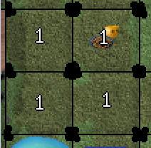
Icons will stay as is as well. These where gone over in great detail. remember, they have to be different ebough from each other, hold an army number on top and be colour blind friendly.
Finally The legend. That font has a bold version?if so try it out. Letters are to thin, and in that orange background they tend to fade a bit
Legend font, will look at the bolded version but size is a key factor here. I have very little room on the small map. Will have a look at it and see what can be done. No promises though.
Thats it, hope it helps
Cheers
Will work on the walls today, should still have the old file for that.
-
koontz1973
- Posts: 6960
- Joined: Thu Jan 01, 2009 10:57 am
Re: Labyrinth [22/12] Pg 1/22 map / xml fixed.
![]() by koontz1973 on Wed Feb 20, 2013 5:39 am
by koontz1973 on Wed Feb 20, 2013 5:39 am
This should solve the concerns by Armandolas. As I said, the rocks can change as he pointed out, their was a need graphically for them to do so. Icons have stayed the same. As explained, these ones are proven to show up behind all numbers and sizes, even with the CB issues. Decided to redo the slave entrances. After all, why not when I worked on the rest. A lot of the smaller eliments have had to be redone as they all tied into each other. Looked at the font, the bolded font for this one makes it to large and when taken down a pixel or two to allow it to fit, it becomes completely unreadable. Looked at another font but again, the same issue. I do not see it as such as no one else has said they cannot read it but will keep it in mind when in beta.

- Click image to enlarge.

-
koontz1973
- Posts: 6960
- Joined: Thu Jan 01, 2009 10:57 am
Re: Labyrinth [20/2] Pg 1/23
![]() by nolefan5311 on Wed Feb 20, 2013 8:51 am
by nolefan5311 on Wed Feb 20, 2013 8:51 am
I have to admit koontz, this looks much, much cleaner. Will the coordinates needs to be changed in the xml?
-
nolefan5311
- Posts: 1768
- Joined: Mon Nov 22, 2010 11:51 am
- Location: Florida
Re: Labyrinth [20/2] Pg 1/23
![]() by koontz1973 on Wed Feb 20, 2013 11:53 am
by koontz1973 on Wed Feb 20, 2013 11:53 am
No, checked the cords before posting.
It is cleaner, but not as fluid. More of a man made place than something that has been carved out by natural forces. More man than other world.
It is cleaner, but not as fluid. More of a man made place than something that has been carved out by natural forces. More man than other world.
-
koontz1973
- Posts: 6960
- Joined: Thu Jan 01, 2009 10:57 am
Re: Labyrinth [20/2] Pg 1/23
![]() by Gilligan on Wed Feb 20, 2013 12:05 pm
by Gilligan on Wed Feb 20, 2013 12:05 pm
koontz1973 wrote:No, checked the cords before posting.
It is cleaner, but not as fluid. More of a man made place than something that has been carved out by natural forces. More man than other world.
I like the other version much better. The massive blocks of grey on the left and right hand sides just looks weird to me. When I hear "maze of death" I don't expect it to be so neat.

-

Gilligan
- Posts: 12478
- Joined: Thu May 11, 2006 4:59 pm
- Location: Providence, RI


Re: Labyrinth [20/2] Pg 1/23
![]() by koontz1973 on Wed Feb 20, 2013 12:11 pm
by koontz1973 on Wed Feb 20, 2013 12:11 pm
Gilligan wrote:koontz1973 wrote:No, checked the cords before posting.
It is cleaner, but not as fluid. More of a man made place than something that has been carved out by natural forces. More man than other world.
I like the other version much better. The massive blocks of grey on the left and right hand sides just looks weird to me. When I hear "maze of death" I don't expect it to be so neat.
I just cannot seem to please anyone lately.
Sorry Gilligan, like you I loved my version of the map, but I am just fed up of having to argue my point. Enough people now have asked for the change and I just have no energy for this map any more. Considering I will never even play it, enough time has been spent on it. Let the people have what they want.
-
koontz1973
- Posts: 6960
- Joined: Thu Jan 01, 2009 10:57 am
Re: Labyrinth [20/2] Pg 1/23
![]() by nolefan5311 on Wed Feb 20, 2013 12:41 pm
by nolefan5311 on Wed Feb 20, 2013 12:41 pm
Why would you never play it?
-
nolefan5311
- Posts: 1768
- Joined: Mon Nov 22, 2010 11:51 am
- Location: Florida
Re: Labyrinth [20/2] Pg 1/23
![]() by koontz1973 on Wed Feb 20, 2013 12:49 pm
by koontz1973 on Wed Feb 20, 2013 12:49 pm
nolefan5311 wrote:Why would you never play it?
Never liked playing these types of maps (Feudals etc). Over five thousand games, less than 100 have been played on these types of maps.
-
koontz1973
- Posts: 6960
- Joined: Thu Jan 01, 2009 10:57 am
Re: Labyrinth [20/2] Pg 1/23
![]() by IcePack on Wed Feb 20, 2013 12:54 pm
by IcePack on Wed Feb 20, 2013 12:54 pm
Omg - haven't been here in awhile. Koontz I know you feel like you can't please anyone and I know it must be hard to be a map maker here.
But wtf is that? The old rocks were 1000% better and fit thr theme! These look like cast in place concrete walls. What is it, a Disney theme park map? Seriously that last graphic change was terrible and a shame. The others looked great.
I'm looking forward to playing the map but was shocked w these new walls. Terrible (not ur work, just they do not fit!)
IcePack

fac vitam incredibilem memento vivere
Knowledge Weighs Nothing, Carry All You Can
-

IcePack
- Multi Hunter

- Posts: 16667
- Joined: Wed Aug 04, 2010 6:42 pm
- Location: California


Who is online
Users browsing this forum: No registered users
|
|||||||
| Conquer Club is not associated with RISK online in any way. Copyright © 2006-2025 by Big Wham LLC | |||||||