The Texan Wars [Quenched]
Moderator: Cartographers
![]() by oaktown on Mon Feb 18, 2008 2:24 am
by oaktown on Mon Feb 18, 2008 2:24 am
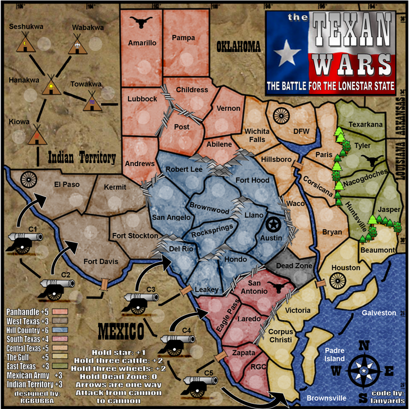
I never much liked the colors of the compass or the flag (mentioned it using a completely different color palette weeks ago) but my more immediate color concern is that the regions just became hard to distinguish again... just as we had made a breakthough!
Bonuses look better. Sort out the color and I'll stamp it.
Bonuses look better. Sort out the color and I'll stamp it.
-

 oaktown
- Posts: 4451
- Joined: Sun Dec 03, 2006 9:24 pm
- Location: majorcommand


![]() by rgbubba on Tue Feb 19, 2008 12:19 am
by rgbubba on Tue Feb 19, 2008 12:19 am
oaktown wrote:I never much liked the colors of the compass or the flag (mentioned it using a completely different color palette weeks ago) but my more immediate color concern is that the regions just became hard to distinguish again... just as we had made a breakthough!
Bonuses look better. Sort out the color and I'll stamp it.
Ok sorry about that I thought thats what you needed. Whitch one did you like the best. I know that the Texas Flag has to be red, white and blue.
I can change the compass colors.
-

rgbubba
- Posts: 282
- Joined: Sun Oct 22, 2006 2:04 pm
- Location: USA


![]() by oaktown on Tue Feb 19, 2008 12:51 am
by oaktown on Tue Feb 19, 2008 12:51 am
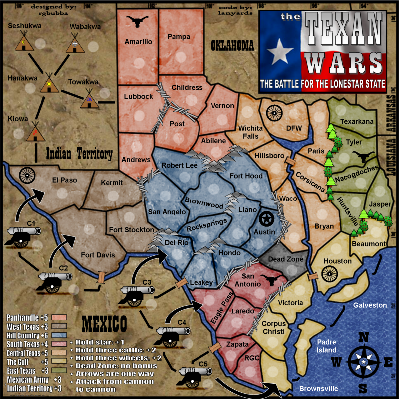
This one, which you post just week or so ago, looked more readable... or are my eyes playing tricks on me? The water does look nicer in the newer versions, though.
And I honestly couldn't care less what the compass and flag look like. It's your map, you do what you think looks best with that kinda thing.
-
oaktown
- Posts: 4451
- Joined: Sun Dec 03, 2006 9:24 pm
- Location: majorcommand


![]() by Incandenza on Wed Feb 20, 2008 3:32 am
by Incandenza on Wed Feb 20, 2008 3:32 am
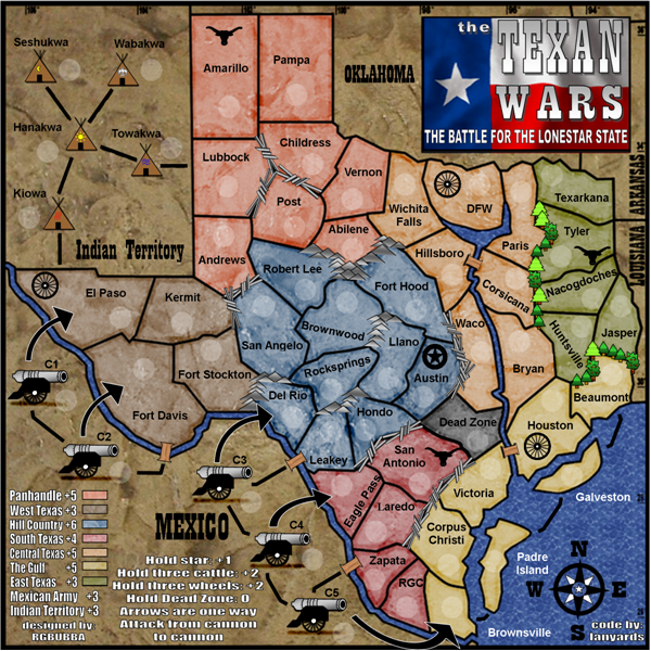
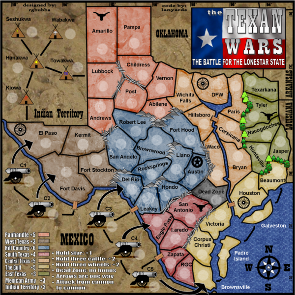
I'm unthrilled with the -1 for the dead zone. It just kinda seems arbitrary, and the fact that it's not in a continent seems to be punishment enough without loading on a -1. Someone's going to get it on the drop and get screwed. If it starts neutral, than of course that part doesn't matter. But the -1 doesn't work for me.
As far as colors, I'd say oaktown has the best bead on things given his..., um, chromatic perception difficulties.
The compass does look a bit bright, but the flag doesn't really bother me much. Altho, if you wanted to put some work in, you could replace it with a weathered battle flag, sorta like cairnswk has in pearl harbor. I know this is a bit late in the game for big graphics changes, so do please feel free to ignore me.
THOTA: dingdingdingdingdingdingBOOM
Te Occidere Possunt Sed Te Edere Non Possunt Nefas Est
Te Occidere Possunt Sed Te Edere Non Possunt Nefas Est
-

Incandenza
- Posts: 4949
- Joined: Thu Oct 19, 2006 5:34 pm
- Location: Playing Eschaton with a bucket of old tennis balls


![]() by rgbubba on Wed Feb 20, 2008 8:47 pm
by rgbubba on Wed Feb 20, 2008 8:47 pm
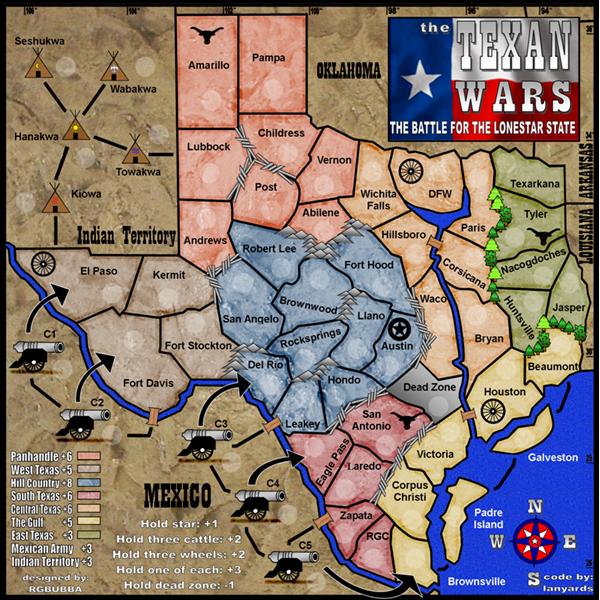
600x600 dead zone -1 darker yellow
800x800 dead zone -1 darker yellow
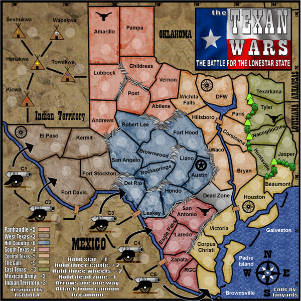
600x600 dead zone 0 lighter yellow

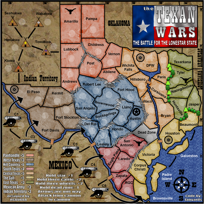
800x800 dead zone 0 light yellow
____________________________________________________________

I BELIEVE!
800x800 dead zone -1 darker yellow
600x600 dead zone 0 lighter yellow
800x800 dead zone 0 light yellow
____________________________________________________________
I BELIEVE!
-
rgbubba
- Posts: 282
- Joined: Sun Oct 22, 2006 2:04 pm
- Location: USA
![]() by oaktown on Wed Feb 20, 2008 10:36 pm
by oaktown on Wed Feb 20, 2008 10:36 pm
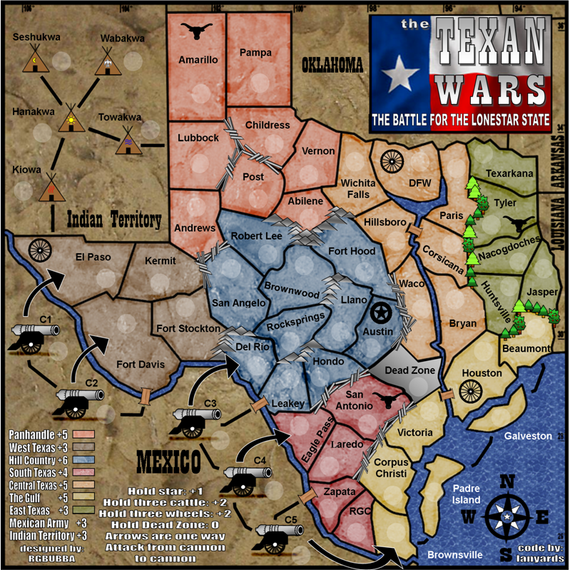
I vote lighter yellow option.
clear up the final bonus stuff and you're good to go as far as I can tell. I'd say that the -1 for dead zone is fine, especially if it can start neutral - I hate starting a game with a neg. Making it no bonus is also fine.
From a graphics standpoint, is there a reason you haven't added the marble texture to the dead zone? The grey color is fine, but it looks like it belongs on another map.
-
oaktown
- Posts: 4451
- Joined: Sun Dec 03, 2006 9:24 pm
- Location: majorcommand
![]() by rgbubba on Wed Feb 20, 2008 11:16 pm
by rgbubba on Wed Feb 20, 2008 11:16 pm
oaktown wrote:I vote lighter yellow option.
clear up the final bonus stuff and you're good to go as far as I can tell. I'd say that the -1 for dead zone is fine, especially if it can start neutral - I hate starting a game with a neg. Making it no bonus is also fine.
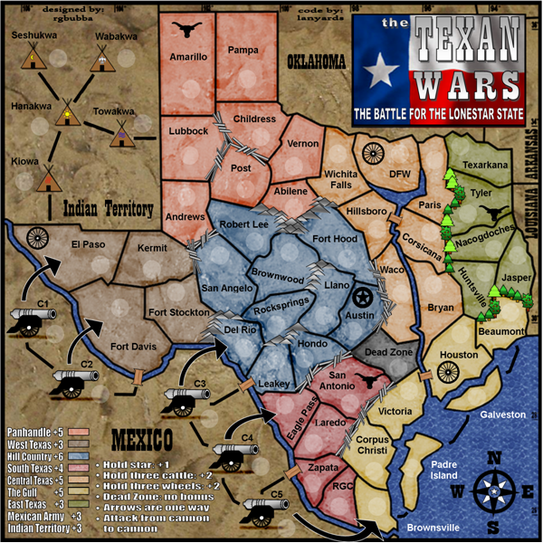
OK Lighter yellow will be it. Final
We will start the Dead zone as Neutral.
-
rgbubba
- Posts: 282
- Joined: Sun Oct 22, 2006 2:04 pm
- Location: USA
![]() by rgbubba on Wed Feb 20, 2008 11:17 pm
by rgbubba on Wed Feb 20, 2008 11:17 pm
oaktown wrote:From a graphics standpoint, is there a reason you haven't added the marble texture to the dead zone? The grey color is fine, but it looks like it belongs on another map.
Here you GO!
-
rgbubba
- Posts: 282
- Joined: Sun Oct 22, 2006 2:04 pm
- Location: USA
![]() by oaktown on Thu Feb 21, 2008 12:07 am
by oaktown on Thu Feb 21, 2008 12:07 am
Okey dokey!

This is minor, but the dead zone line might sound better if just said
"Dead Zone: no bonus"
The border south of the dead zone looks different than the rest, but that's for Gimil to approve!
This is minor, but the dead zone line might sound better if just said
"Dead Zone: no bonus"
The border south of the dead zone looks different than the rest, but that's for Gimil to approve!
-
oaktown
- Posts: 4451
- Joined: Sun Dec 03, 2006 9:24 pm
- Location: majorcommand
![]() by rgbubba on Thu Feb 21, 2008 12:53 am
by rgbubba on Thu Feb 21, 2008 12:53 am
oaktown wrote:Okey dokey!
This is minor, but the dead zone line might sound better if just said
"Dead Zone: no bonus"
The border south of the dead zone looks different than the rest, but that's for Gimil to approve!
Will do! Thanks Oaktown for all your help. You have made my game board better. Again I Thank You!
What is the next stage?
-
rgbubba
- Posts: 282
- Joined: Sun Oct 22, 2006 2:04 pm
- Location: USA


![]() by gimil on Thu Feb 21, 2008 10:46 am
by gimil on Thu Feb 21, 2008 10:46 am
Could you perhaps move your signature to the top left of the page and change the font slightly? Just so it doesnt look part of the legends Also rather than center aligning the legends text, could you perhaps left align it with bullet points? Should make it a little easier to read and understand.
Apart form that I think im happy I will stamp it after about a day if no major cocerns come up
Apart form that I think im happy I will stamp it after about a day if no major cocerns come up
What do you know about map making, bitch?
Top Score:2403
natty_dread wrote:I was wrong
Top Score:2403
-

gimil
- Posts: 8599
- Joined: Sat Mar 03, 2007 12:42 pm
- Location: United Kingdom (Scotland)


![]() by rgbubba on Thu Feb 21, 2008 2:20 pm
by rgbubba on Thu Feb 21, 2008 2:20 pm
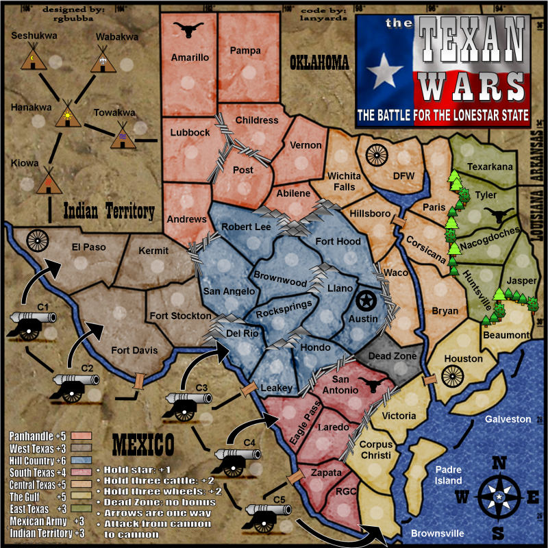
gimil wrote:Could you perhaps move your signature to the top left of the page and change the font slightly? Just so it doesnt look part of the legends
Apart form that I think im happy I will stamp it after about a day if no major cocerns come up
Sweet I will work on it.
-
rgbubba
- Posts: 282
- Joined: Sun Oct 22, 2006 2:04 pm
- Location: USA
![]() by rgbubba on Thu Feb 21, 2008 2:54 pm
by rgbubba on Thu Feb 21, 2008 2:54 pm
gimil wrote:Could you perhaps move your signature to the top left of the page and change the font slightly? Just so it doesnt look part of the legends
Apart form that I think im happy I will stamp it after about a day if no major cocerns come up
Here are the changes:
600x600
800x800

-
rgbubba
- Posts: 282
- Joined: Sun Oct 22, 2006 2:04 pm
- Location: USA
![]() by gimil on Thu Feb 21, 2008 8:34 pm
by gimil on Thu Feb 21, 2008 8:34 pm
You PM'ed me about army circles,
Army circles should be an EVEN number of pixels in diameter with a minimum size of 22px
Army circles should be an EVEN number of pixels in diameter with a minimum size of 22px
What do you know about map making, bitch?
Top Score:2403
natty_dread wrote:I was wrong
Top Score:2403
-
gimil
- Posts: 8599
- Joined: Sat Mar 03, 2007 12:42 pm
- Location: United Kingdom (Scotland)

![]() by laci_mae on Sat Feb 23, 2008 3:48 pm
by laci_mae on Sat Feb 23, 2008 3:48 pm
I'm really looking forward to playing this map. And, I hope I'm not stepping on any toes this late in development.
That said, I was wondering about the plus signs in the legend. On the small map, it is somewhat hard to determine whether they are all plus signs. They are slightly blurry and could be interpreted as negatives. I see, on the large map, that they are all indeed additions for holding said bonuses. You might consider removing these all together because they don't really serve a purpose, yet could potentially be confusing.
Best,
Laci
-

laci_mae
- Posts: 404
- Joined: Tue Jan 08, 2008 6:08 pm
- Location: Arkansas


![]() by rgbubba on Sat Feb 23, 2008 10:31 pm
by rgbubba on Sat Feb 23, 2008 10:31 pm
laci_mae wrote:I'm really looking forward to playing this map. And, I hope I'm not stepping on any toes this late in development.
That said, I was wondering about the plus signs in the legend. On the small map, it is somewhat hard to determine whether they are all plus signs. They are slightly blurry and could be interpreted as negatives. I see, on the large map, that they are all indeed additions for holding said bonuses. You might consider removing these all together because they don't really serve a purpose, yet could potentially be confusing.
Best,
Laci
You could be right. I will talk to Gimil about it. Thank you.
-
rgbubba
- Posts: 282
- Joined: Sun Oct 22, 2006 2:04 pm
- Location: USA
Who is online
Users browsing this forum: No registered users
|
|||||||
| Conquer Club is not associated with RISK online in any way. Copyright © 2006-2025 by Big Wham LLC | |||||||