Conquer Club

Dust Bowl [Quenched]

Care to peruse completed maps? Take a stroll through the Atlas.

Moderator: Cartographers

Forum rules
Please read the Community Guidelines before posting.

Do you want to have the map changed so Dust territories are given out evenly?

Yes
36
69%
No
16
31%
 
Total votes : 52

Postby Coleman on Wed Dec 26, 2007 2:04 pm

Should i remove the drought penalty?

Yes - I would prefer you slightly lower the state bonus, and remove the drought (negative) penalty.
    18% [ 16 ]
No - The drought will not serioulsy throw a game, and it's a good twist on standard gameplay.
    76% [ 67 ]
Don't Care - I am not bothered by the negative drought penalties, and don't care if they are there or not.
    5% [ 5 ]
Total Votes : 88
Warning: You may be reading a really old topic.
User avatar
Sergeant Coleman
 
Posts: 5402
Joined: Tue Jan 02, 2007 10:36 pm
Location: Midwest

Postby Optimus Prime on Wed Dec 26, 2007 4:35 pm

So is there anything else left to do on this map? It is beautiful, and I would really like to play it.....soon! :D
User avatar
Cadet Optimus Prime
 
Posts: 9665
Joined: Mon Mar 12, 2007 9:33 pm

Postby RjBeals on Wed Dec 26, 2007 5:49 pm

Optimus Prime wrote:So is there anything else left to do on this map? It is beautiful, and I would really like to play it.....soon! :D
Me Too !


Image
User avatar
Private RjBeals
 
Posts: 2506
Joined: Mon Nov 20, 2006 5:17 pm
Location: South Carolina, USA

Postby RjBeals on Fri Dec 28, 2007 10:57 pm


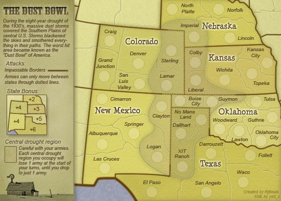
* Moved "Boise City" name 3 pixels to the right on the small map.
* Moved Boise City Army Circle about 5 pixels to the left on the large map.
* Edited XML to reflect large map change above

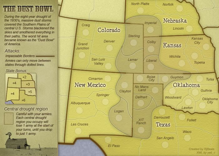
Here are the final images / xml posted again.
(Make sure to refresh browser as I used the same file names)

Image

SMALL MAP
http://img.photobucket.com/albums/v450/ ... _small.jpg

Image
Image
Image

LARGE MAP
http://img.photobucket.com/albums/v450/ ... _large.jpg

Image
Image
Image

Image

http://www.rjbeals.com/dustbowl/finals/dustbowl.xml

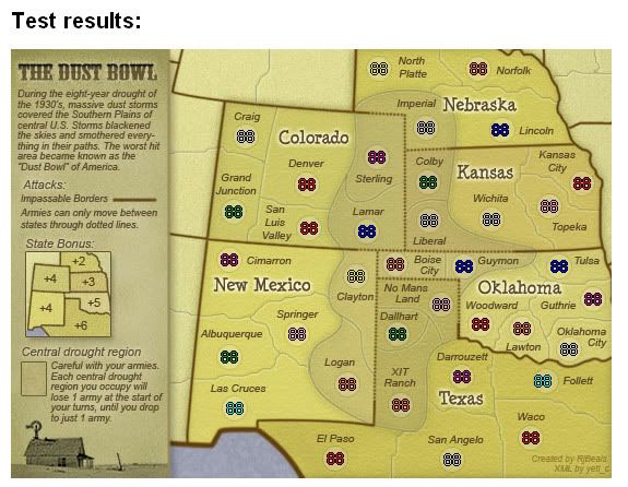
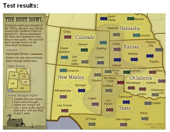
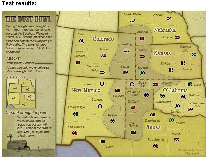
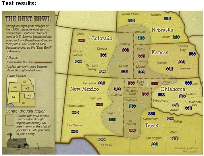
Test results:

Summary: 0 errors and 0 warnings detected in dustbowl.xml (6 continents, 36 territories)
User avatar
Private RjBeals
 
Posts: 2506
Joined: Mon Nov 20, 2006 5:17 pm
Location: South Carolina, USA

Postby Coleman on Fri Dec 28, 2007 11:01 pm

I'm not sure how you got zero errors and zero warnings. For me it says the largex is in an unexpected place.

The reason is the site doesn't like it unless small coordinates come before large coordinates, so it's seeing a largex where it wants to see a smallx.
Warning: You may be reading a really old topic.
User avatar
Sergeant Coleman
 
Posts: 5402
Joined: Tue Jan 02, 2007 10:36 pm
Location: Midwest

Postby RjBeals on Fri Dec 28, 2007 11:06 pm

Coleman wrote:I'm not sure how you got zero errors and zero warnings. For me it says the largex is in an unexpected place.

The reason is the site doesn't like it unless small coordinates come before large coordinates, so it's seeing a largex where it wants to see a smallx.


Sorry Coleman - I realized that after I posted that prev post, so I deleted the post. I updated an older xml that was before I switched the small to be before the large... And I just forgot to replace the xml... Give me 5 minutes and I'll put the correct xml there :oops:
Image
User avatar
Private RjBeals
 
Posts: 2506
Joined: Mon Nov 20, 2006 5:17 pm
Location: South Carolina, USA

Postby Coleman on Fri Dec 28, 2007 11:07 pm

RjBeals wrote:
Coleman wrote:I'm not sure how you got zero errors and zero warnings. For me it says the largex is in an unexpected place.

The reason is the site doesn't like it unless small coordinates come before large coordinates, so it's seeing a largex where it wants to see a smallx.


Sorry Coleman - I realized that after I posted that prev post, so I deleted the post. I updated an older xml that was before I switched the small to be before the large... And I just forgot to replace the xml... Give me 5 minutes and I'll put the correct xml there :oops:


Will that have the coordinates right for the new position of that circle you moved?
Warning: You may be reading a really old topic.
User avatar
Sergeant Coleman
 
Posts: 5402
Joined: Tue Jan 02, 2007 10:36 pm
Location: Midwest

Postby RjBeals on Fri Dec 28, 2007 11:14 pm

Yes. I had to boot up my laptop to upload it.. but the correct xml file is there with the correct placement for all armies, and the small before the large coords. Sorry for that - I was rushing though it.

I also am going to nudge the small map "Guymon" name 1 or 2 px's to the right to allow just a tad more room for the 3-digits to appear. Right now, there are barley touching the name. If I don't fix it, it will always bug me.

Sorry again for the confusion.

edit.. and i might move a couple other names on the small map as well to allow for just a bit more room for the 3-digits, although I can't image 3-digits ever coming into play with this map.. I'll try to update tomorrow.
User avatar
Private RjBeals
 
Posts: 2506
Joined: Mon Nov 20, 2006 5:17 pm
Location: South Carolina, USA

Postby AndyDufresne on Fri Dec 28, 2007 11:19 pm

Maybe look at Tulsa on the small map too. ;)


--Andy
User avatar
Corporal 1st Class AndyDufresne
 
Posts: 24935
Joined: Fri Mar 03, 2006 8:22 pm
Location: A Banana Palm in Zihuatanejo

Postby RjBeals on Fri Dec 28, 2007 11:23 pm

I'll have to look at that xml again tomorrow also. Looks like large map Tulsa / Lincoln are not centered :?: Damn this xml!
User avatar
Private RjBeals
 
Posts: 2506
Joined: Mon Nov 20, 2006 5:17 pm
Location: South Carolina, USA

Postby edbeard on Fri Dec 28, 2007 11:25 pm

anyone know how decay works with missed turns?

will they decay once their turn is missed or does it just happen doubly (or triply) once they return?


edit: also...

for anyone that uses the colour codes (like me!) triple digits come into play on every single map.
Last edited by edbeard on Fri Dec 28, 2007 11:35 pm, edited 2 times in total.
User avatar
Lieutenant edbeard
 
Posts: 2501
Joined: Thu Mar 29, 2007 12:41 am

Postby Coleman on Fri Dec 28, 2007 11:30 pm

Not a clue.
Warning: You may be reading a really old topic.
User avatar
Sergeant Coleman
 
Posts: 5402
Joined: Tue Jan 02, 2007 10:36 pm
Location: Midwest

Postby yeti_c on Sat Dec 29, 2007 6:36 am

edbeard wrote:anyone know how decay works with missed turns?

will they decay once their turn is missed or does it just happen doubly (or triply) once they return?


edit: also...

for anyone that uses the colour codes (like me!) triple digits come into play on every single map.


That is a damn fine point... You could test with Conquer man...

C.
Image
Highest score : 2297
User avatar
Lieutenant yeti_c
 
Posts: 9624
Joined: Thu Jan 04, 2007 9:02 am

Postby RjBeals on Sat Dec 29, 2007 4:44 pm

K... Adjusted what I mentioned above. This should be it it. I'm happy with all the names on the 3-digit maps now. ;)

http://www.rjbeals.com/dustbowl/finals2 ... rge_R1.jpg
Image

Image
Image


http://www.rjbeals.com/dustbowl/finals2 ... all_R2.jpg
Image

Image
Image

New and good xml.
http://www.rjbeals.com/dustbowl/finals2/dustbowl.xml

I hope the quenching mood is still hovering around..
User avatar
Private RjBeals
 
Posts: 2506
Joined: Mon Nov 20, 2006 5:17 pm
Location: South Carolina, USA

Postby AndyDufresne on Sat Dec 29, 2007 5:02 pm

Looks good. The only perhaps minor problem is that on the small map Guthrie's coordinates are extremely close to the border with 3 digits. Consider it isn't such a huge problem, but now with a wide more spread use of color codes, 3 number digits plus the letter code will be seen slightly more often. If a quick fix can be done to swap the name and the coordinates, similar to the Large Map, that would solve it I think. It's really only a minor issue that doesn't have a direct impact on most real game play.


--Andy
User avatar
Corporal 1st Class AndyDufresne
 
Posts: 24935
Joined: Fri Mar 03, 2006 8:22 pm
Location: A Banana Palm in Zihuatanejo

Postby Anarkistsdream on Sat Dec 29, 2007 5:08 pm

I kind of agree with Andy. The Guthrie circle should be moved to the left some to accommodate the colour name prefix.
virus90 wrote: I think Anarkist is a valuable asset to any game.
User avatar
Cook Anarkistsdream
 
Posts: 7567
Joined: Wed Jan 10, 2007 11:57 am

Postby RjBeals on Sat Dec 29, 2007 5:31 pm

k.
User avatar
Private RjBeals
 
Posts: 2506
Joined: Mon Nov 20, 2006 5:17 pm
Location: South Carolina, USA

Postby RjBeals on Mon Dec 31, 2007 9:05 am

Well... I don't like it, but how's this?

Image
User avatar
Private RjBeals
 
Posts: 2506
Joined: Mon Nov 20, 2006 5:17 pm
Location: South Carolina, USA

Postby AndyDufresne on Mon Dec 31, 2007 4:46 pm

It looks like it'll work better. Mind posting coordinates images (2 and 3 numbers) for the small? (The large are fine).

And supplying us with the TEXT links to the large and small maps, along with the XML?


--Andy
User avatar
Corporal 1st Class AndyDufresne
 
Posts: 24935
Joined: Fri Mar 03, 2006 8:22 pm
Location: A Banana Palm in Zihuatanejo

Postby RjBeals on Mon Dec 31, 2007 7:02 pm

Are you sure that it has to be this way? I think it looks cramped and not pleasing to the eye.
Image
User avatar
Private RjBeals
 
Posts: 2506
Joined: Mon Nov 20, 2006 5:17 pm
Location: South Carolina, USA

Postby Coleman on Mon Dec 31, 2007 8:25 pm

Guthrie looks to me to be enough above the circle that you could pull it back towards the edge a little. Otherwise yeah.
Warning: You may be reading a really old topic.
User avatar
Sergeant Coleman
 
Posts: 5402
Joined: Tue Jan 02, 2007 10:36 pm
Location: Midwest

Postby RjBeals on Mon Dec 31, 2007 8:39 pm

I think I'll readjust the borders when I get the time. I'm not happy with the circle touching the border like that, when it doesn't have to. The territory borders are not real anyway.
User avatar
Private RjBeals
 
Posts: 2506
Joined: Mon Nov 20, 2006 5:17 pm
Location: South Carolina, USA

Postby Optimus Prime on Tue Jan 01, 2008 12:09 pm

You could slide the "Oklahoma" text up just a tick as well, RjBeals, that would help give you another pixel or two of room for the circle, right? I don't know much about these things, but it looks like there is just enough room to move "Oklahoma" straight up just a smidgen.

OR, what if you switched "Guthrie" and the army circle? "Guthrie" would fit underneath "Oklahoma" easily enough wouldn't it, and then you could have the circle over to the right hand side?
User avatar
Cadet Optimus Prime
 
Posts: 9665
Joined: Mon Mar 12, 2007 9:33 pm

Postby AndyDufresne on Tue Jan 01, 2008 2:36 pm

Optimus Prime wrote:OR, what if you switched "Guthrie" and the army circle? "Guthrie" would fit underneath "Oklahoma" easily enough wouldn't it, and then you could have the circle over to the right hand side?

That's what it was originally, but the army numbers were close to going off the map, so he switched them to the current position.


--Andy
User avatar
Corporal 1st Class AndyDufresne
 
Posts: 24935
Joined: Fri Mar 03, 2006 8:22 pm
Location: A Banana Palm in Zihuatanejo

Postby oaktown on Tue Jan 01, 2008 2:52 pm

Optimus Prime wrote:You could slide the "Oklahoma" text up just a tick as well, RjBeals, that would help give you another pixel or two of room for the circle, right? I don't know much about these things, but it looks like there is just enough room to move "Oklahoma" straight up just a smidgen.

I would agree, and say you could bump "Oklahoma" up a few pixels, and to the right a few pixels. It may cover the spot where the three border lines intersect, but who cares? It's still clear who can attack whom.

Scratch that: I would move it up and a few pixels to the LEFT, because I have a new concern: by dropping the state names (Kanses, Colorado, etc) cleanly in the middle of a territory it is unclear which territories are a part of the that state, since the dust bowl territories are a different color. Only Nebraska gives users an indication that the state includes the dustbowl.

In fact, I would suggest you move all state titles so that they straddle some borders.
1. move "Oklahoma" up and redraw the Guymon border further south so that Guymon is clearly a part of Oklahoma.
2. move "Texas"about 20 pixels to the left.
3. move "New Mexico" down and to the right so it straddles the Springer border and touches Clayton.
4. move "Colorado" over to the right so the "do" are in Sterling.

I would then suggest that the outer glow of the state names are made more transparent so that you can see a hint of the territory borders through the glow.

Have I mentioned lately how much I like this map? It should make for some interesting play!
User avatar
Captain oaktown
 
Posts: 4451
Joined: Sun Dec 03, 2006 9:24 pm
Location: majorcommand

PreviousNext

Return to The Atlas

Who is online

Users browsing this forum: No registered users