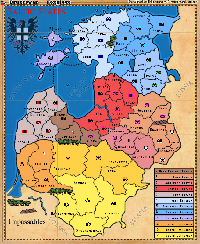
What is new:
- Poland has been moved and Impassables fixed
- Army numbers and territories have been fixed
- Other minor fixes
Lets talk bonus names?
Moderator: Cartographers


Bruceswar wrote:Version 19:
What is new:
[list=][*]Poland has been moved and Impassables fixed
[*]Army numbers and territories have been fixed
[*]Other minor fixes[/list]
Lets talk bonus names?


 3
3


 2
2


Seamus76 wrote:Not to take you a step back, but I kind of see what Duk is saying about the names being over the borders. And trust me, I see you making a lot of progress so the last thing I want to do is set you back, but one thing you might be able to do which will also help with the small version is to redraw a few of those borders. I don't know how you do your borders, or how hard it would be/how much time it would take, but Ludza, Kraslava, Rezekne, and Jekabpils in particular could have one or two sides just slightly redraw to allow a better fit. It wouldn't be exact to the real world but might make your life easier down the road. Also, Liepaja and Balvi can be moved up and down respectively to fit better as well.
Great work going back the original colors, I think it looks much better.


Dukasaur wrote:west central latvia = zemigallia /zemgale
east latvia = lettigalia /letgale
southeast latvia
central latvia = riga
west latvia = courland
west estonia = old livonia / vireland
central estonia = estonia /estheland
southeast estonia = dorpat / tartu
island estonia = osel
west lithuania = samogitia
north lithuania = auks'tatia
south lithuania = really difficult that one... vilnius and kaunas are historical rivals and won't really be comfortable in the same region, and marjampole is the historical region of suvalkija. It's almost tempting to suggest that you redraw the border to put kaunas up into auks'tatia and let marjampole/suvalkija have its own little 1-tert bonus.


cairnswk wrote:Hi Brueswar.
Nice and clear as to what is what.
1. you seem to have the longittude line over the top of the region legend...perhaps move some layers there so that lines are noit running through the middle of the legend.
2. the outside edge (thick black line) of the regions around the land in the south and east seems very jaggered in places compared to the smoothness of the sea edges...very visible compared to internal region borders.
Hope this helps.





greenoaks wrote:i see you picked up on my reference to the blown blob by labelling it Russia, Poland & Belarus. most of us don't know of the Baltic states but having Russia and Poland on the map really helps us to get a feel for where we are in the world, geographically.
i'm not a fan of the line down the centre of the index or through Southeast Estonia. what would it look like if the lines were on the map only and not through the legend.


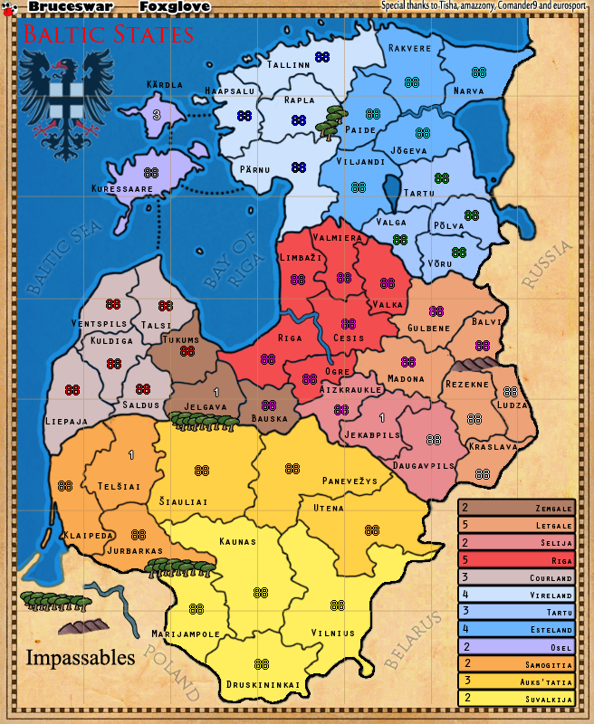


waauw wrote:Why does North Lithuania get +3 with only 3 territories and all bordering outside, when all the other bonuses with 3 territories give only +2?
Same goes for Central Estonia with West-Latvia and West Estonia with South-east Estonia. To me these bonuses seem inconsistent. I'm probably overlooking something that has been discussed already, but is there a reason for this? These have all the same number of territories and the same number of borders, but different bonuses.
Also panevezys seems to have an 88 overlapping a neutral
But I love the map, looks great!


greenoaks wrote:on the right between the legend and the border is a small gap, but there isn't one on the bottom. if you moved the legend up a fraction, it might look better?


greenoaks wrote:the numbers in the legend don't line up.
the top field has the number much closer than the bottom one is. they seem to slowly move further from the left edge of the box as you go down.


Bruceswar wrote:Next Version should be out soon. I will have some other minor fixes plus a few big ones. Also I have a special guest helper.


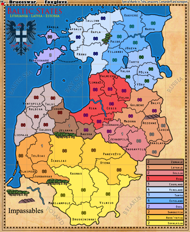


Bruceswar wrote:Besides the small map what is left to do?


 2
2


 2
2


lanyards wrote:Bruceswar wrote:Besides the small map what is left to do?
Just focus on improving the map as much as you can
- Lat/long lines should go under all the black land and region borders. Also under all the text labels such as "Baltic Sea," and under the bird symbol. These don't actually seem necessary to me at all.
- Some of the region name labels are awkwardly positioned. I feel these and the troop locations could be arranged better still.
- All text will fit horizontally.
- Is there some reason there appears to be top/middle/bottom sections divided by similar colors? Like are these nation states? And also is that why some borders look thicker than others?
- Left edge of the map has more space between the line then the right edge.
- Move Sigs and Special Thanks inside the border. might look better
- The example river has a weird color which is not the same as what is found on the map


lanyards wrote:Okay colors do appear to be representative of the 3 states. In that case maybe you could make the "Baltic States" title a more neutral color not used on the map and make the three countries names under the title the same colors used in the countries on the map. Make Estonia first and Lituania last.
Also it looks like the thicker borders separate the different states also. I think all borders should be the same smaller size (including the borders between land and water and between the playable regions and the dead space areas.
- The legend is pretty plain now, but other than that I think maybe you could just list em north to south


Users browsing this forum: No registered users