Really looking forward to this map - simple and original idea well executed
Chinese Checkers [Quenched] May '07 re-opener?
Moderator: Cartographers
![]() by RenegadePaddy on Sat Feb 10, 2007 1:37 pm
by RenegadePaddy on Sat Feb 10, 2007 1:37 pm
Ditto on the green.
Really looking forward to this map - simple and original idea well executed
Really looking forward to this map - simple and original idea well executed
Wether you think you can, or think you can't - you're right
Won 3 : 5 Lost
Won 3 : 5 Lost
-

 RenegadePaddy
- Posts: 110
- Joined: Wed Jan 31, 2007 12:33 pm
- Location: Birmingham Uni (UK)
![]() by everywhere116 on Sat Feb 10, 2007 1:41 pm
by everywhere116 on Sat Feb 10, 2007 1:41 pm
Personally I like the circles in the red triangle.
"Disease, suffering, hardship...that is what war is all about."-Captain Kirk, from "A Taste of Armageddon"
-

everywhere116
- Posts: 1718
- Joined: Sat Sep 16, 2006 9:37 am
- Location: Somewhere on this big blue marble.


![]() by AndyDufresne on Sat Feb 10, 2007 3:17 pm
by AndyDufresne on Sat Feb 10, 2007 3:17 pm
I like the original...only because the other ones feel 'too deep' and don't quite mesh with the feel and look of the map.
--Andy
--Andy
-

AndyDufresne
- Posts: 24935
- Joined: Fri Mar 03, 2006 8:22 pm
- Location: A Banana Palm in Zihuatanejo


![]() by KEYOGI on Sat Feb 10, 2007 3:47 pm
by KEYOGI on Sat Feb 10, 2007 3:47 pm
I think the original ones are best. They look the cleanest if that makes any sense. Red and orange are definately a no go, but the green one's are okay. However, I don't like how the look on the centre part of the board and I guess we'd need to see them on every part of the board to make a final call.
-
KEYOGI
- Posts: 1632
- Joined: Tue Oct 10, 2006 6:09 am


![]() by Enigma on Sat Feb 10, 2007 4:33 pm
by Enigma on Sat Feb 10, 2007 4:33 pm
Wisse wrote:the ones in the red and the normal ones
agreed. i like the depth ones in blue the best because you erased all of the original outline, some of that is still on the red circles.
but my second choice would just be the original
Do you need an excuse to have a war? I mean, who for? Can't you just say "You got lots of cash and land, but I've got a big sword, so divy up right now, chop chop."
Terry Pratchet
Terry Pratchet
-

Enigma
- Posts: 367
- Joined: Mon Jul 03, 2006 10:23 pm
- Location: Classified


![]() by oaktown on Sat Feb 10, 2007 9:20 pm
by oaktown on Sat Feb 10, 2007 9:20 pm
Enigma wrote:i like the depth ones in blue the best because you erased all of the original outline, some of that is still on the red circles.
but my second choice would just be the original
I did this version the easy way - just laid circles on top of existing circles, so I didn't get all of them right. Call it a beta.
I could play with the depth circles, but ultimately I don't think they're as good for game play. I have som other ideas to make the original white circles fit better with the map around them, the first being to change the shadow from the grey to a color that is already in the palette of the background, so the circles don't seem out of place. That's probably the way it'll go.

-

oaktown
- Posts: 4451
- Joined: Sun Dec 03, 2006 9:24 pm
- Location: majorcommand


![]() by Enigma on Sun Feb 11, 2007 12:54 am
by Enigma on Sun Feb 11, 2007 12:54 am
oaktown wrote:Enigma wrote:i like the depth ones in blue the best because you erased all of the original outline, some of that is still on the red circles.
but my second choice would just be the original
I did this version the easy way - just laid circles on top of existing circles, so I didn't get all of them right. Call it a beta.
I could play with the depth circles, but ultimately I don't think they're as good for game play. I have som other ideas to make the original white circles fit better with the map around them, the first being to change the shadow from the grey to a color that is already in the palette of the background, so the circles don't seem out of place. That's probably the way it'll go.
that sounds good too, either way the map will look good. but the more i look at the depth ones the more they grow on me- not the ones in orange, because you took out the texture. but the ones in blue are perfect.
sorry, i realize that was "beta", i didnt mean to criticise.
Do you need an excuse to have a war? I mean, who for? Can't you just say "You got lots of cash and land, but I've got a big sword, so divy up right now, chop chop."
Terry Pratchet
Terry Pratchet
-
Enigma
- Posts: 367
- Joined: Mon Jul 03, 2006 10:23 pm
- Location: Classified
![]() by oaktown on Mon Feb 12, 2007 9:18 pm
by oaktown on Mon Feb 12, 2007 9:18 pm
OK, I don't like the deep circles. I don't think they work with the board, it doesn't make sense to give them texture, and I think it makes it harder to read the army counts. Below are two versions I'd like opinions on. Please continue to ignore any out of place army counts - the coordinates aren't anywhere near finalized.
1. Original white circles... much the same as before, but with some little things cleaned up.

2. Slightly softer circles, using colors drawn from the surrounding palette.
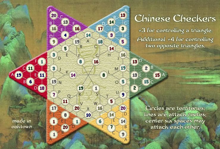
1. Original white circles... much the same as before, but with some little things cleaned up.
2. Slightly softer circles, using colors drawn from the surrounding palette.
Last edited by oaktown on Wed Feb 14, 2007 1:18 am, edited 2 times in total.
-
oaktown
- Posts: 4451
- Joined: Sun Dec 03, 2006 9:24 pm
- Location: majorcommand
![]() by Sargentgeneral on Mon Feb 12, 2007 9:23 pm
by Sargentgeneral on Mon Feb 12, 2007 9:23 pm
I think that the second one works better with the overall soft feeling you are trying to give this map so i choose that one.
Highest score: 1910
Highest rank: 188
Battle of the bands #1 champion: ACDC
Highest rank: 188
Battle of the bands #1 champion: ACDC
-

Sargentgeneral
- Posts: 379
- Joined: Thu Nov 16, 2006 11:55 pm
- Location: On Conquerclub, duh!


![]() by Guiscard on Mon Feb 12, 2007 10:41 pm
by Guiscard on Mon Feb 12, 2007 10:41 pm
The second for the same reason.
qwert wrote:Can i ask you something?What is porpose for you to open these Political topic in ConquerClub? Why you mix politic with Risk? Why you not open topic like HOT AND SEXY,or something like that.
-

Guiscard
- Posts: 4103
- Joined: Fri Dec 08, 2006 7:27 pm
- Location: In the bar... With my head on the bar

![]() by Enigma on Tue Feb 13, 2007 12:23 am
by Enigma on Tue Feb 13, 2007 12:23 am
yup, second.
just fyi- this version of the map doesnt have the circle in the middle. not sure if that was removed on purpose or just an older version of the map.
just fyi- this version of the map doesnt have the circle in the middle. not sure if that was removed on purpose or just an older version of the map.
Do you need an excuse to have a war? I mean, who for? Can't you just say "You got lots of cash and land, but I've got a big sword, so divy up right now, chop chop."
Terry Pratchet
Terry Pratchet
-
Enigma
- Posts: 367
- Joined: Mon Jul 03, 2006 10:23 pm
- Location: Classified
![]() by oaktown on Tue Feb 13, 2007 1:22 am
by oaktown on Tue Feb 13, 2007 1:22 am
Enigma wrote:just fyi- this version of the map doesnt have the circle in the middle. not sure if that was removed on purpose or just an older version of the map.
Oops! Good catch Enigma. Sometime I go back a step when I want to rework something - in this case the circles, which i wanted to work on pre-texture - but the danger is that I sometimes forget a change that happened along the way. The circle will be replaced.
-
oaktown
- Posts: 4451
- Joined: Sun Dec 03, 2006 9:24 pm
- Location: majorcommand
![]() by everywhere116 on Tue Feb 13, 2007 3:43 pm
by everywhere116 on Tue Feb 13, 2007 3:43 pm
First version for the triangles, second for the center.
"Disease, suffering, hardship...that is what war is all about."-Captain Kirk, from "A Taste of Armageddon"
-
everywhere116
- Posts: 1718
- Joined: Sat Sep 16, 2006 9:37 am
- Location: Somewhere on this big blue marble.
![]() by oaktown on Tue Feb 13, 2007 10:27 pm
by oaktown on Tue Feb 13, 2007 10:27 pm
OK, softer circles in large and small versions... no numbers, but take a look and make sure I haven't lost any changes we've made along the way.
Large, 740x500:
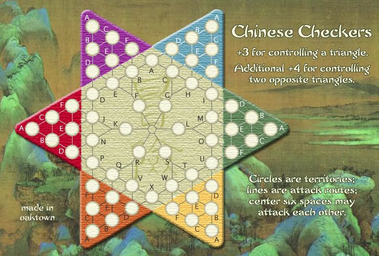
and small, 600x405:
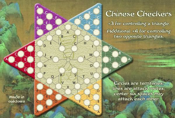
I really will take one more crack at giving the circles the illusion of depth, but if it doesn't produce the desired effect I'm sticking with the circles above. I'd rather have flat circles that are easy for game play than throw in a cool effect that makes the numbers hard to read.
Large, 740x500:
and small, 600x405:
I really will take one more crack at giving the circles the illusion of depth, but if it doesn't produce the desired effect I'm sticking with the circles above. I'd rather have flat circles that are easy for game play than throw in a cool effect that makes the numbers hard to read.
Last edited by oaktown on Wed Feb 14, 2007 1:19 am, edited 1 time in total.
-
oaktown
- Posts: 4451
- Joined: Sun Dec 03, 2006 9:24 pm
- Location: majorcommand
depth
![]() by EvilOtto on Tue Feb 13, 2007 11:49 pm
by EvilOtto on Tue Feb 13, 2007 11:49 pm
I think we've all grown accustomed to the 'flat' circles. And they're fine. But I like the circles with depth more. Maybe not quite as deep as your mock-up (a page or two ago), a little less contrast maybe?
To me, the board is made of wood, and painted, so the holes for the marbles might not have the same texture, and they might not have the color (maybe they were cut out after the surface was painted).
I'd be happy to play on the flat circles as shown above, but if you put it to a vote I'm going for the circles with depth.
-

EvilOtto
- Posts: 132
- Joined: Wed Dec 06, 2006 9:39 pm
- Location: San Francisco
![]() by gavin_sidhu on Wed Feb 14, 2007 2:18 am
by gavin_sidhu on Wed Feb 14, 2007 2:18 am
whats gung hay fat choi
Highest Score: 1843 Ranking (Australians): 3
-

gavin_sidhu
- Posts: 1428
- Joined: Mon May 22, 2006 6:16 am
- Location: Brisbane, Australia
Chinese Checkers Board
![]() by icettee on Thu Feb 15, 2007 4:41 am
by icettee on Thu Feb 15, 2007 4:41 am
I remember looking at this map awhile ago. It looks great, I like all the changes you made since I last glanced upon it. It looks so much different compared to the first and second version I saw. I really like the background, the softer tones and the wooden board feel that it now has been given. I agree the white with gray gravitating or outlining looks good.
Anyway, it looks like you put a lot of t.l.c. into making it and the result shows...can't wait to play it someday.
Anyway, it looks like you put a lot of t.l.c. into making it and the result shows...can't wait to play it someday.
-
icettee
- Posts: 3
- Joined: Thu Dec 28, 2006 9:03 pm
Re: depth
![]() by AndyDufresne on Thu Feb 15, 2007 5:23 pm
by AndyDufresne on Thu Feb 15, 2007 5:23 pm
EvilOtto wrote:I think we've all grown accustomed to the 'flat' circles. And they're fine. But I like the circles with depth more. Maybe not quite as deep as your mock-up (a page or two ago), a little less contrast maybe?
To me, the board is made of wood, and painted, so the holes for the marbles might not have the same texture, and they might not have the color (maybe they were cut out after the surface was painted).
I'd be happy to play on the flat circles as shown above, but if you put it to a vote I'm going for the circles with depth.
I agree with EvilOtto on all his points.
One thing to consider, enlarging the title a little (though I see there isn't much room), or perhaps making the bonus description slightly smaller, to better differentiate between the two visually. Maybe, add an interesting themed lined seperating the two? Perhaps that'd be better.
Also, is the font you used for signing the same as the opposite side? I noticed the right side has the black outline, but I'm curious to see how that and the title and such would look if it was similar to your name.
Also, one more thing bugging me. I like symmetry in some things. Could you make the lines in purple more similar to that of blue? As then you could have the bottom triangles having the same color lines, the middle trianges, and the top.
--Andy
-
AndyDufresne
- Posts: 24935
- Joined: Fri Mar 03, 2006 8:22 pm
- Location: A Banana Palm in Zihuatanejo
Who is online
Users browsing this forum: No registered users
|
|||||||
| Conquer Club is not associated with RISK online in any way. Copyright © 2006-2025 by Big Wham LLC | |||||||