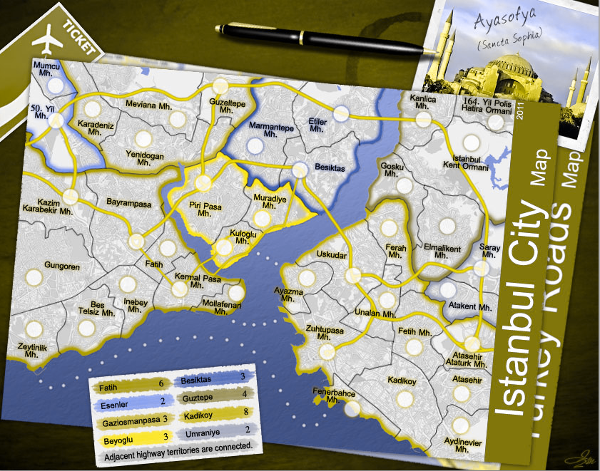
sannemanrobinson wrote:The ticket and postcard are nice to make it a more tourist feel. Some remarks to make it even more pleasing:
- The pen writing at the Hagia Sophia postcard doesn't add anything in my taste. A note of where it is located (mollafenari) brings the map more alive.
- Could the bonus legend become some kind of checklist that you have visited? Like seen that done that. Then the pen has some connection with the legend and the map.
- An other idea to make a legend could be a postcard for every bonus area with a corresponding border colour and bonus name.
- There is a lot of unused space at the bottom. If the legend would move to the top behind the pen, 1/10th could be cropped.
The pen is just an object to make it more look like a desk, it adds the feel of "Hey this is a desk!" to the image and I believe adding anything more like notes and etc really makes the image kinda noisy in view ...
Since this is the desk of someone who didn't travel to Istanbul yet and is willing to do, he didn't visit anywhere, so checklist idea is out and about postcard idea there is no space and view noise problem could be there too if you mean exactly a postcard for each continent which makes it 8 postcards!
I tried moving legend/note to the top but it cant' be placed there cause it's bigger and making texts smaller will make it hard to read in small map. But I did a change in placing Note and did cut 40px from bottom of image.
ironsij0287 wrote:It's looking really nice. The map overall still appears very neat and pristine though. Not necessarily one that has been used for traveling. I don't know, maybe it needs some creases or map folds. Also a coffee cup stain might add some character to a map that's seen some use.
http://www.brusheezy.com/Brushes/2168-C ... op-Brushes
The fold idea is a real good idea but I tried some and could not make anything out of it, when I used fake fold methods (using light and shadow to make it look like a fold) they didn't get beautiful since in middle of the map there are both dark and light colors covering large areas and a shadow/light fold looks bad and unnatural there. Real folds with transform methods also made the map really bad looking and lowered text qualities a lot since I had to break the map from middle into 2 different angles.
koontz1973 wrote:ISN2, some things that I have noticed with the map, and you can take it or leave it as you wish but these things have been bugging me...

Bottom map - words are really crisp but the little bit of map that is showing is very blurred.
The pen has an inconsistent light source on it. The top of the pen would show much more of the light source and not have it stop like that.
You have really crisp map and tickets but the postcard looks like it came from a bin.

The sea route from Zeytinlik to Fenerbache goes between the legend now. Can you move it so it goes above it.
You have inconsiistant shading behind the territ names. Some areas are thicker than others.
The light source on the table is not consistent with the maps. You have the maps, ticket and postcard brightly lit but the table seems to be in darkness.
The left side of the map is very jagged on the edge, this is not carried around to all the other sides and does not fit the crispness of the map.
Great work by the way.

I really liked some of your points.
About the blue thing, if you meant the map under the main map, I blurred it so people would know it's not part of the main map, anyway I changed it's angle a little to be seen less. If you meant the name of sea in white then I already removed it in this version.
The pen has not really an inconsistent light source on it. Try putting a pen like that on your desk when light is from Top Right and see the light on pen, it's exactly like the one I have. The Top piece of the pen is more bold specially after the golden ring piece. So in that piece it reflexes light the most like a point and then going to more top the pen gets less bold so less light get's to it since it's in back of the middle bold part. The bottom piece of pen is less bold and in front of that middle bold part, so it get's more light and reflexes more. Test it with a real pen and you will see

About the postcard I tried to make it look an old one, but yeah you are right, I removed the texture on it which was making it look dirty!
About the sea route I fixed it but it was really funny for myself, how the hell creator of that map knew that this person is going to put a note on bottom left of the map, so route is just changing path exactly around the note!!!?

So I just re-fixed my fix again, hope it's less funny!
I did also some very little changes in shading behind the territory names. They were all same, same color with same style but some were looking different because of colors around maybe!
About the light on Desk vs Map/Ticket/etc ... it's an effect to make the focus on map, That's my own wooden desk in which is this color and the corners with dark effect are exactly to make the middle more visible and beautiful. It's called "vignette" in photo editing techniques which add shadow and blur to corners of a photo/image to make the focus on middle ...
Look here:
http://en.wikipedia.org/wiki/VignettingI recused jagged sides a little, but since it's a paper, it still has to have some.
natty_dread wrote:Good points koontz, all of those should be addressed.
All of these edges are jagged: left side of the top map, all sides of the legend, right side of the bottom map. These need to be fixed.
The sea texture on the main map doesn't quite fit, it looks too 3d when it's supposed to be printed on a 2d map - try a flatter type of texture on it.
I fixed the sea texture. No more 3D

tokle wrote:A couple of minor comments.
Santa Sophia sounds a bit strange to me, would it not be better to use the Greek Ayia Sofia (Aγία Σοφία) or the Turkish Ayasofya?
Secondly, it should be possible to add the special Turkish letters? It looks a bit strange without them.
I'm not sure but personally I heard Santa Sophia more but looking at Wikipedia it says "Hagia Sophia" (
http://en.wikipedia.org/wiki/Hagia_Sophia) and the Turkish name "Ἁγία Σοφία" I got no proper font to write it! So I used this name: "Ayasofya (Sancta Sophia)" as wiki says "Latin: Sancta Sophia/Turkish: Ayasofya".
// \\ // // \\ // // \\ // // \\ // // \\ //
Here is the result:
- Click image to enlarge.

If it's cool let me know to start the Small and XML and also a preview with numbers on it!?


 not so good i think.


