New Zealand [Quenched]
Moderator: Cartographers
Re: New Zealand [4.8.12] V17-P14 GFX?
Comments anyone?

* Pearl Harbour * Waterloo * Forbidden City * Jamaica * Pot Mosbi
-

 cairnswk
- Posts: 11510
- Joined: Sat Feb 03, 2007 8:32 pm
- Location: Australia


Re: New Zealand [4.8.12] V17-P14 GFX?
cairnswk wrote:isaiah40 wrote:Just one little thing, the mountains in the Nelson bonus and between North Canterbury and Marlborough are a hard to see. I can actually see them better on your color blind test. ...
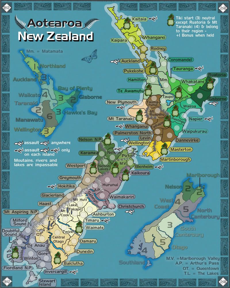
thanks for comments isaiah40...is this better.
Sorry yes much better!
-
 isaiah40
- Posts: 3990
- Joined: Mon Aug 27, 2007 7:14 pm


Re: New Zealand [4.8.12] V17-P14 GFX?
isaiah40 wrote:cairnswk wrote:isaiah40 wrote:Just one little thing, the mountains in the Nelson bonus and between North Canterbury and Marlborough are a hard to see. I can actually see them better on your color blind test. ...
thanks for comments isaiah40...is this better.
Sorry yes much better!
Thanks isaiah40+

* Pearl Harbour * Waterloo * Forbidden City * Jamaica * Pot Mosbi
-

 cairnswk
- Posts: 11510
- Joined: Sat Feb 03, 2007 8:32 pm
- Location: Australia


Re: Re: New Zealand [4.8.12] V17-P14 GFX?
thehippo8 wrote:When can we play it?
when the foundry agains gains some momentum

* Pearl Harbour * Waterloo * Forbidden City * Jamaica * Pot Mosbi
-

 cairnswk
- Posts: 11510
- Joined: Sat Feb 03, 2007 8:32 pm
- Location: Australia


Re: Re: New Zealand [4.8.12] V17-P14 GFX?
I think I've run out of critiques, and you'll probably need some fresh eyes to help further. Best of luck!
--Andy
--Andy
-

 AndyDufresne
- Posts: 24935
- Joined: Fri Mar 03, 2006 8:22 pm
- Location: A Banana Palm in Zihuatanejo


Re: New Zealand [4.8.12] V17-P14 GFX?
AndyDufresne wrote:I think I've run out of critiques, and you'll probably need some fresh eyes to help further. Best of luck!
--Andy
Maybe it is time for it to be stamped
-
 Nola_Lifer
- Posts: 819
- Joined: Mon Oct 13, 2008 4:46 pm
- Location: 雪山


Re: New Zealand [4.8.12] V17-P14 GFX?
Nola_Lifer wrote:AndyDufresne wrote:I think I've run out of critiques, and you'll probably need some fresh eyes to help further. Best of luck!
--Andy
Maybe it is time for it to be stamped
I agree, any further improvement is likely to happen in final forge ...all a bit ethereal until then!
-

 thehippo8
- Posts: 1025
- Joined: Fri Feb 19, 2010 5:32 pm


Re: New Zealand [4.8.12] V17-P14 GFX?
i think this deserves to be stickied at least 

* Pearl Harbour * Waterloo * Forbidden City * Jamaica * Pot Mosbi
-

 cairnswk
- Posts: 11510
- Joined: Sat Feb 03, 2007 8:32 pm
- Location: Australia


Re: Re: New Zealand [4.8.12] V17-P14 GFX?
I don't know if it is me or just possibly the color combination. But do the mountains in the North section of the lower island look a bit off. Specifically the ones that border Picton. I get the feeling that they are pyramids rather than mountains, but it could also be the color combination as well since I really can't see the extra detail in the ridges (as shown in the boarders between the bonus's of West Coast and South Canterbury).
It might also occur in the Southland bonus. I didn't have any issue with them when I first looked at the map but after I saw that in the other location it kinda looks like the same thing happened.
Anyway just my novice opinion
Skill
It might also occur in the Southland bonus. I didn't have any issue with them when I first looked at the map but after I saw that in the other location it kinda looks like the same thing happened.
Anyway just my novice opinion
Skill

Place: 267 Score: 2630
-

 skillfusniper33
- Posts: 835
- Joined: Thu Jul 19, 2007 12:48 pm
- Location: Washington


Re: New Zealand [4.8.12] V17-P14 GFX?
I like the look and overall feel of the map and looking forward to playing it.
But given that there was a call out for Graphic Input I thought I would have a look...
1. The mountains could do with some white Snow caps to make them stand out more. Especially the Southern Island around "Queenstown" as it is renowned for its Snow. Please note you have it as "Queentown" on the map bottom right.
2. The ocean can do with some sort of rendering or perhaps even a background image (ie Kiwi bird) similar to what we are starting to see in new or revamped maps (ie USA Maps)
Anyway that's my pennies worth.
Great work cairnswk
-

 nudge
nudge
- Posts: 145
- Joined: Tue Nov 28, 2006 8:05 am
- Location: Perth, Australia


Re: Re: New Zealand [4.8.12] V17-P14 GFX?
I don't know...the backdrop seems kind of flat to me...maybe a center to edge gradient from the map?
-rd
-rd
-

 rdsrds2120
- Posts: 6274
- Joined: Fri Jul 03, 2009 3:42 am


Re: New Zealand [4.8.12] V17-P14 GFX?
As a new zealander, awesome.
-
 jbcb
jbcb
- Posts: 13
- Joined: Wed May 21, 2008 1:39 am


Re: New Zealand [4.8.12] V17-P15 GFX?
Just bumpiong this so i can see what is going on...
Version 17
Version 17
Last edited by cairnswk on Wed Aug 15, 2012 5:16 pm, edited 1 time in total.

* Pearl Harbour * Waterloo * Forbidden City * Jamaica * Pot Mosbi
-

 cairnswk
- Posts: 11510
- Joined: Sat Feb 03, 2007 8:32 pm
- Location: Australia


Re: Re: New Zealand [4.8.12] V17-P14 GFX?
skillfusniper33 wrote:I don't know if it is me or just possibly the color combination. But do the mountains in the North section of the lower island look a bit off. Specifically the ones that border Picton. I get the feeling that they are pyramids rather than mountains, but it could also be the color combination as well since I really can't see the extra detail in the ridges (as shown in the boarders between the bonus's of West Coast and South Canterbury).
It might also occur in the Southland bonus. I didn't have any issue with them when I first looked at the map but after I saw that in the other location it kinda looks like the same thing happened.
Anyway just my novice opinion
Skill
Skill. thanks for your opinion...
yes those mountains do look like pyramids and it has partly to do with the colouring, but i have altered their shape now in V18, and also the ones in Southland.

* Pearl Harbour * Waterloo * Forbidden City * Jamaica * Pot Mosbi
-

 cairnswk
- Posts: 11510
- Joined: Sat Feb 03, 2007 8:32 pm
- Location: Australia


Re: New Zealand [4.8.12] V17-P14 GFX?
nudge wrote:I like the look and overall feel of the map and looking forward to playing it.
But given that there was a call out for Graphic Input I thought I would have a look...
1. The mountains could do with some white Snow caps to make them stand out more. Especially the Southern Island around "Queenstown" as it is renowned for its Snow. Please note you have it as "Queentown" on the map bottom right.
2. The ocean can do with some sort of rendering or perhaps even a background image (ie Kiwi bird) similar to what we are starting to see in new or revamped maps (ie USA Maps)
Anyway that's my pennies worth.
Great work cairnswk
Thanks nudge and for your opinion
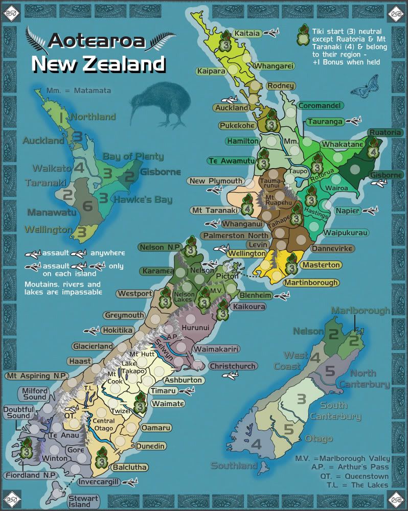
I have re-done the Alps with snow, beefed up the Alps, and fixed the Queenstown spelling
As to the ocean, i have also redone the areas around the mini-map and added your kiwi in the background.
Last edited by cairnswk on Wed Aug 15, 2012 5:10 pm, edited 1 time in total.

* Pearl Harbour * Waterloo * Forbidden City * Jamaica * Pot Mosbi
-

 cairnswk
- Posts: 11510
- Joined: Sat Feb 03, 2007 8:32 pm
- Location: Australia


Re: Re: New Zealand [4.8.12] V17-P14 GFX?
rdsrds2120 wrote:I don't know...the backdrop seems kind of flat to me...maybe a center to edge gradient from the map?
-rd
rdsrds2120, thanks also for your opinion.
i do realise the ocean is a bit flat, and have experimented several times now with some kind of gradient, but i seem to always get the wrong thing and don't like it. a radial gradient from the centre makes it look like someone has shone a great big light on it and it si quiet distracting.
For now, i'll leave it as is but if someone else should mention it, i'll have another go later.

* Pearl Harbour * Waterloo * Forbidden City * Jamaica * Pot Mosbi
-

 cairnswk
- Posts: 11510
- Joined: Sat Feb 03, 2007 8:32 pm
- Location: Australia


Re: New Zealand [16.8] V18-P15 GFX?
So here is version 18 with the changes mentioned above.

* Pearl Harbour * Waterloo * Forbidden City * Jamaica * Pot Mosbi
-

 cairnswk
- Posts: 11510
- Joined: Sat Feb 03, 2007 8:32 pm
- Location: Australia


Re: Re: New Zealand [4.8.12] V17-P14 GFX?
cairnswk wrote:rdsrds2120 wrote:I don't know...the backdrop seems kind of flat to me...maybe a center to edge gradient from the map?
-rd
rdsrds2120, thanks also for your opinion.
i do realise the ocean is a bit flat, and have experimented several times now with some kind of gradient, but i seem to always get the wrong thing and don't like it. a radial gradient from the centre makes it look like someone has shone a great big light on it and it si quiet distracting.
For now, i'll leave it as is but if someone else should mention it, i'll have another go later.
I think the flat back is a good fit for the map to be honest.
-

 Nola_Lifer
- Posts: 819
- Joined: Mon Oct 13, 2008 4:46 pm
- Location: 雪山


Re: New Zealand [16.8.12] V18-P15 GFX?
 Can you do these mountains the same way you did the ones above them?
-
 isaiah40
- Posts: 3990
- Joined: Mon Aug 27, 2007 7:14 pm


Re: New Zealand [16.8.12] V18-P15 GFX?
isaiah40 wrote:Can you do these mountains the same way you did the ones above them?
PLease advise which mtns you're talking about pls

* Pearl Harbour * Waterloo * Forbidden City * Jamaica * Pot Mosbi
-

 cairnswk
- Posts: 11510
- Joined: Sat Feb 03, 2007 8:32 pm
- Location: Australia


Re: New Zealand [16.8.12] V18-P15 GFX?
cairnswk wrote:isaiah40 wrote:Can you do these mountains the same way you did the ones above them?
PLease advise which mtns you're talking about pls
The ones on the north side of Nelson Lakes.
-
 isaiah40
- Posts: 3990
- Joined: Mon Aug 27, 2007 7:14 pm


Re: New Zealand [16.8.12] V18-P15 GFX?
isaiah40 wrote:cairnswk wrote:isaiah40 wrote:Can you do these mountains the same way you did the ones above them?
PLease advise which mtns you're talking about pls
The ones on the north side of Nelson Lakes.
north side of Nelson lakes...they have already been re-done
as were the ones on the north side of M.V.
and the ones between Karamea and Nelson N.P.
yoy're not meening da ones on da sout' side of Nelson Loikes are ye?

* Pearl Harbour * Waterloo * Forbidden City * Jamaica * Pot Mosbi
-

 cairnswk
- Posts: 11510
- Joined: Sat Feb 03, 2007 8:32 pm
- Location: Australia


Who is online
Users browsing this forum: No registered users

