Conquer Club

USA 2.1 [10 Mar 2013] Beta Baby!!

Care to peruse completed maps? Take a stroll through the Atlas.

Moderator: Cartographers

Forum rules
Please read the Community Guidelines before posting.

Re: Mega USA Map [17 Nov 2011] V14 pg 12

Postby isaiah40 on Mon Nov 21, 2011 10:08 am

The Bison King wrote:
An inset won't work because where would I put it? With the mini-map there is no room.


By closing the gaps you would actually create more room.

While I agree that I will have more room, it would be a negligible amount. Not enough to place an insert. Besides if I were to remove the gaps I would do it as natty suggested here:
natty_dread wrote:Or you could just do like I suggested -

Don't move the states to close the gaps, just keep the states where they are now & simply fill the gaps. It will distort the geography somewhat, but it doesn't really matter because it will be clearer and you don't have to do any insets.


As seeing as there is an agreement to keep the gaps - yes as koontz mentioned, make them more uniform - the gaps will be staying. I will be working on the gaps to make them more uniform - including TBK's Illinois outline - as this is a gameplay issue it will get done here sometime soon. I can't promise when, as this week I will be home for my wedding anniversary and Thanksgiving, so it probably won't be until next week. Though I will have an update dealing with the Interstate colors here shortly.
Lieutenant isaiah40
 
Posts: 3990
Joined: Mon Aug 27, 2007 7:14 pm

Re: Mega USA Map [17 Nov 2011] V14 pg 12

Postby AndyDufresne on Mon Nov 21, 2011 3:29 pm

Look forward to seeing the next version. I'll get a better judge of the gap debate at that time I think.


--Andy
User avatar
Corporal 1st Class AndyDufresne
 
Posts: 24935
Joined: Fri Mar 03, 2006 8:22 pm
Location: A Banana Palm in Zihuatanejo

Re: Mega USA Map [17 Nov 2011] V14 pg 12

Postby The Bison King on Mon Nov 21, 2011 3:46 pm

Honestly the gaps aren't my primary issue. The gaps can stay so long as you can make the states look decent.
Image

Hi, my name is the Bison King, and I am COMPLETELY aware of DaFont!
User avatar
Sergeant 1st Class The Bison King
 
Posts: 1957
Joined: Thu Aug 27, 2009 5:06 pm
Location: the Mid-Westeros

Re: Mega USA Map [17 Nov 2011] V14 pg 12

Postby lostatlimbo on Mon Nov 21, 2011 10:37 pm

The Bison King wrote:Also the states just need to look better. period. There's no good justification for having them look like bizarre ill=proportioned blobs instead of what they actually look like.


Actually there is a good justification. Its called "continuation of theme".

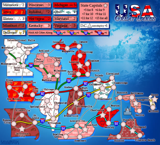
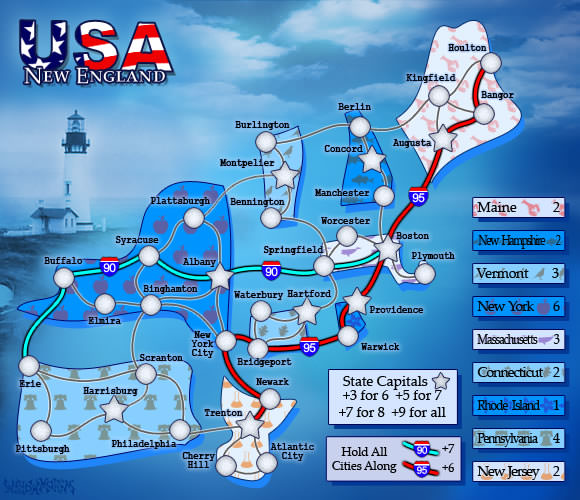
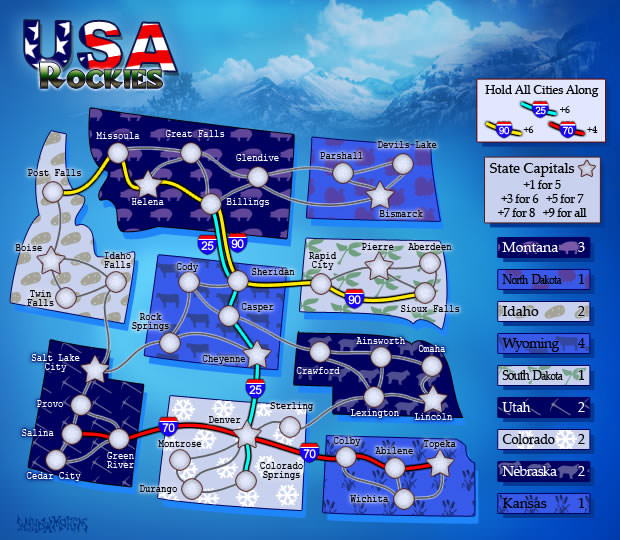
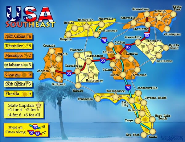
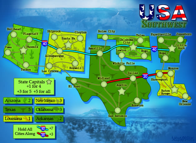
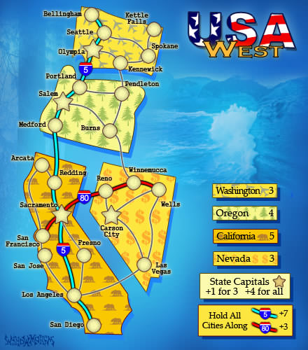
You may have seen the following maps being played on Conquer Club:
Image
Image
Image
Image
Image
Image
User avatar
Sergeant 1st Class lostatlimbo
 
Posts: 1386
Joined: Wed Mar 28, 2007 3:56 pm
Location: Portland, OR

Re: Mega USA Map [17 Nov 2011] V14 pg 12

Postby lostatlimbo on Mon Nov 21, 2011 10:38 pm

natty_dread wrote:Sorry I'm bugging you with this, but I just get the feeling that most other commenters in this thread are just so psyched to get a new USA map, probably because they live in the USA, and thus are ignoring many aspects of the map...


You make a lot of assumptions
User avatar
Sergeant 1st Class lostatlimbo
 
Posts: 1386
Joined: Wed Mar 28, 2007 3:56 pm
Location: Portland, OR

Re: Mega USA Map [17 Nov 2011] V14 pg 12

Postby Geger on Tue Nov 22, 2011 5:21 am

Amazing!!

Where is Smallville? (Just Kidding) :mrgreen:

I have 2 suggestions, you can accept if you like, if not it's okay

1. Can you add an outline for every regions? It's hard to see which states belong to which regions without scrolling up the mouse to read the Minimap. Maybe you can remove the gasps between states in same region and keep the gasps between them. Or you can add unique background for every region.

2. I know your main focus is in USA-Mainland, and seem to ignore Hawaii. I don't like the idea every Cities in Hawaii can attack each other. With 6 Cities there are total 30 connections in Hawaii. California with 10 Cities (I think CA is the State with the most Cities) has only 15 or 16 connections. What do you think to add dot-lines between Cities in Hawaii (like the dot-line between Anchorage and Juneau), to make less connections.

.
Major Geger
 
Posts: 325
Joined: Tue Sep 16, 2008 11:29 am
Location: Sumatra

Re: Mega USA Map [17 Nov 2011] V14 pg 12

Postby porkenbeans on Sun Nov 27, 2011 4:51 pm

Very nice work Isaiah,
I think that you are doing a pretty good job at keeping with the style of the "Map Packs". I see that a couple of nitwits just can not understand your stated goals in this respect. Oh well (there always seems to be a nat in the ointment). lol.

BK, I really do not understand your compulsion about keeping true to the exact shape of the states. Especially when you consider what you did to the shape of California in your map, (and with no GOOD reason I might add). hahaha.

I think that a very light blue would work better for the background, and would help in keeping to "The Pack". Also try a drop shadow on the states like the rest of "The Pack".

Keep the gaps, there is nothing wrong with them. =D>
Image
User avatar
Lieutenant porkenbeans
 
Posts: 2546
Joined: Mon Sep 10, 2007 4:06 pm

Re: Mega USA Map [5 Nov 2011] V11 pg 10

Postby porkenbeans on Mon Nov 28, 2011 11:24 am

isaiah40 wrote:
Gillipig wrote:Just put a maximum of 15 troops gained through holding territs without bonuses and keep it to 3 troops for 1 region, 4 for 12, 5 for 15 etc. 45 regions gives you 15 troops and 48 or 108 does not give you more. That way 1v1 will be all about holding bonuses not taking down random territs and total number of territs still matters in large games.


So basically a minimum of 3 and a max of 15? I'm thinking this is along what I was thinking of. Anyways here is a small update. I moved the instructions that were up withe the mini-map down to the bottom left corner and placed a border around it. I also put a border around the Interstate bonus. Will update OP later.

Click image to enlarge.
image

I like this version the best Isaiah. The background only needs to be desaturated so that the color is not equal to the foreground. This will help to separate the two, and make the whole thing easier on the eyes. Do not darken it though, it is best to have it a lighter shade to contrast the foreground. The color just needs to be turned way down.

Then throw in a drop shadow on the States like the rest of the Pack has.
Image
User avatar
Lieutenant porkenbeans
 
Posts: 2546
Joined: Mon Sep 10, 2007 4:06 pm

Re: Mega USA Map [17 Nov 2011] V14 pg 12

Postby lostatlimbo on Tue Nov 29, 2011 2:08 am

porkenbeans wrote:Very nice work Isaiah,
I think that you are doing a pretty good job at keeping with the style of the "Map Packs". I see that a couple of nitwits just can not understand your stated goals in this respect. Oh well (there always seems to be a nat in the ointment). lol.

BK, I really do not understand your compulsion about keeping true to the exact shape of the states. Especially when you consider what you did to the shape of California in your map, (and with no GOOD reason I might add). hahaha.

I think that a very light blue would work better for the background, and would help in keeping to "The Pack". Also try a drop shadow on the states like the rest of "The Pack".

Keep the gaps, there is nothing wrong with them. =D>


I disagree on the drop shadows. I think that will make some of the text too hard to read, but I agree with the rest.
User avatar
Sergeant 1st Class lostatlimbo
 
Posts: 1386
Joined: Wed Mar 28, 2007 3:56 pm
Location: Portland, OR

Re: Mega USA Map [17 Nov 2011] V14 pg 12

Postby porkenbeans on Tue Nov 29, 2011 9:37 am

lostatlimbo wrote:
porkenbeans wrote:Very nice work Isaiah,
I think that you are doing a pretty good job at keeping with the style of the "Map Packs". I see that a couple of nitwits just can not understand your stated goals in this respect. Oh well (there always seems to be a nat in the ointment). lol.

BK, I really do not understand your compulsion about keeping true to the exact shape of the states. Especially when you consider what you did to the shape of California in your map, (and with no GOOD reason I might add). hahaha.

I think that a very light blue would work better for the background, and would help in keeping to "The Pack". Also try a drop shadow on the states like the rest of "The Pack".

Keep the gaps, there is nothing wrong with them. =D>


I disagree on the drop shadows. I think that will make some of the text too hard to read, but I agree with the rest.
The text already has an outer glow, so if there are places where the drop shadow on the States make them hard to read, then you could just turn up the outer glow a bit on those words.

I think that nat and Co. are wrong. They are trying every way they can to change the style from "The Pack". I on the other hand am advocating that the only changes should be ones of necessity. ;)
Image
User avatar
Lieutenant porkenbeans
 
Posts: 2546
Joined: Mon Sep 10, 2007 4:06 pm

Re: Mega USA Map [17 Nov 2011] V14 pg 12

Postby natty dread on Tue Nov 29, 2011 8:16 pm

porkenbeans wrote:I think that nat and Co. are wrong. They are trying every way they can to change the style from "The Pack".


"They" aren't really trying to change the style from "the pack" per se, but to make the map less cluttered and easier to read. That would be accomplished by simplifying the style.

I mean, look at the current image, and add army numbers on that... lines criss-crossing everywhere, clutter... The problem with the gaps between the states is that it doubles the amount of lines on the map, which just means more clutter. Without the gaps, there'd be only one black line between 2 states, whereas with them there is two.

Gameplay clarity is first priority, before any aesthetic/stylistic concerns. That's just the way it is. Now I'm not saying that the gaps have to be removed, it's just my suggestion for fixing the current situation. If there's another way to simplify the visual look of the map and reduce the clutter, that'd be good as well.

Also, look at the map images in "the pack"... there, the outlines of the states are very faint, not strong black lines like you have here. If you can do something like that here, it might help with the situation. The territory connections, and army circle outlines are also a less intense than the interstate lines, which creates a contrast, helps to tell them apart. Whereas on this map, all the lines are the same thickness and strength... which contributes to the clutter.

Click image to enlarge.
image
Image
User avatar
Sergeant 1st Class natty dread
 
Posts: 12877
Joined: Fri Feb 08, 2008 8:58 pm
Location: just plain fucked

Re: Mega USA Map [17 Nov 2011] V14 pg 12

Postby porkenbeans on Wed Nov 30, 2011 11:29 am

natty_dread wrote:
porkenbeans wrote:I think that nat and Co. are wrong. They are trying every way they can to change the style from "The Pack".


"They" aren't really trying to change the style from "the pack" per se, but to make the map less cluttered and easier to read. That would be accomplished by simplifying the style.

I mean, look at the current image, and add army numbers on that... lines criss-crossing everywhere, clutter... The problem with the gaps between the states is that it doubles the amount of lines on the map, which just means more clutter. Without the gaps, there'd be only one black line between 2 states, whereas with them there is two.

Gameplay clarity is first priority, before any aesthetic/stylistic concerns. That's just the way it is. Now I'm not saying that the gaps have to be removed, it's just my suggestion for fixing the current situation. If there's another way to simplify the visual look of the map and reduce the clutter, that'd be good as well.

Also, look at the map images in "the pack"... there, the outlines of the states are very faint, not strong black lines like you have here. If you can do something like that here, it might help with the situation. The territory connections, and army circle outlines are also a less intense than the interstate lines, which creates a contrast, helps to tell them apart. Whereas on this map, all the lines are the same thickness and strength... which contributes to the clutter.

Click image to enlarge.
image
The last paragraph makes perfect sense, and is along the same lines as my feelings about this project. Try to get closer to, not further from, the original style. 8-)
Image
User avatar
Lieutenant porkenbeans
 
Posts: 2546
Joined: Mon Sep 10, 2007 4:06 pm

Re: Mega USA Map [17 Nov 2011] V14 pg 12

Postby isaiah40 on Wed Nov 30, 2011 1:05 pm

HA!!! I'm one step ahead of you natty!! :lol: I am currently working on the gaps and outlines. Also the interstates are being worked on as I am kind of stuck on colors for a couple of them.
Lieutenant isaiah40
 
Posts: 3990
Joined: Mon Aug 27, 2007 7:14 pm

Re: Mega USA Map [17 Nov 2011] V14 pg 12

Postby Gillipig on Wed Nov 30, 2011 3:02 pm

I've probably said this a hundred times before but I can't wait to play this map! Good work so far!
AoG for President of the World!!
I promise he will put George W. Bush to shame!
User avatar
Lieutenant Gillipig
 
Posts: 3565
Joined: Fri Jan 09, 2009 1:24 pm

Re: Mega USA Map [17 Nov 2011] V14 pg 12

Postby isaiah40 on Sat Dec 03, 2011 9:22 am

New update.

Things done:
1. Changed the colors for the Southwest region because of color blind issues.
2. Changed some of the Interstate colors.
3. Redid the gaps and put on a slight outline to the states.
4. Changed the colors of New England back to the originals
5. Changed the background color so that all the bonuses can be seen easier.

Click image to enlarge.
image
Lieutenant isaiah40
 
Posts: 3990
Joined: Mon Aug 27, 2007 7:14 pm

Re: Mega USA Map [3 Dec 2011] V15 pg 15

Postby natty dread on Sat Dec 03, 2011 11:37 am

Ok, the land edges are a step in the right direction... However you could make the gaps (if you insist on keeping them) smaller and more uniform.

On that note though... you have the superbonus structure on the map. How about removing the gaps from between the single bonuses and only having them between the superbonus areas? This way you could keep the gaps, and make the structure of the map clearer.

Or, if you keep the gaps, then why do you need to have different, unique colours for single bonuses? If you make the bonuses same colour or only 2-3 different colours per superbonus, it makes the superbonuses clearer and you can choose a few colours that are easily distinguishable from the background.

Because the current background doesn't really work, it doesn't have a consistent contrast with all the bonus areas. Reducing the amount of colours makes it easier to find a good contrast between the land and bg. Also, you should avoid dark colours (ie. the dark blues you have now) for the land colours, since they make the black lines hard to see. UT, NE and LA are worst.

Regarding MI, why is it in two pieces? It's a single bonus, so having it in 2 pieces is confusing, since you use the gaps between the pieces to differentiate the borders of the bonuses...
Image
User avatar
Sergeant 1st Class natty dread
 
Posts: 12877
Joined: Fri Feb 08, 2008 8:58 pm
Location: just plain fucked

Re: Mega USA Map [3 Dec 2011] V15 pg 15

Postby porkenbeans on Sat Dec 03, 2011 11:53 am

It is beautiful Isaiah. I am really digging the rainbow of color going on. :D

I would like to see you try one thing. See what it looks like with a White background instead of that darker blue. It may work if you just went back to the blue background, but throw a white color overlay on it to lighten it up to an off/white shade of blue.

fast posted-
I agree with this, but it would mean a whole lot of work. Almost like starting over.-
How about removing the gaps from between the single bonuses and only having them between the superbonus areas? This way you could keep the gaps, and make the structure of the map clearer.


I also agree with this-
Because the current background doesn't really work, it doesn't have a consistent contrast with all the bonus areas. Reducing the amount of colours makes it easier to find a good contrast between the land and bg.
Image
User avatar
Lieutenant porkenbeans
 
Posts: 2546
Joined: Mon Sep 10, 2007 4:06 pm

Re: Mega USA Map [3 Dec 2011] V15 pg 15

Postby Victor Sullivan on Sat Dec 03, 2011 5:38 pm

Hm, so New England is back to its original light blue, but now Southwest is brown? It should stay green. And with so many blues and greens, perhaps Pacific (Alaska and Hawaii) would do best in purple? And the white territory names look out-of-place - I think the black text with white glow would work fine (it works fine for Louisiana, which is quite dark). Also, make sure you update the colors of the interstates in the legend.

Anywho, that's pretty minor stuff at the moment. Let's get down and dirty with the gameplay:

  • State Bonuses
    • Maine (ME): 2 borders + 2 (additional) regions + one connection per border + peripheral location = +1
    • New Hampshire (NH): 2 borders + 1 region + multiple connections per border = +2
    • Vermont (VT): 3 borders + 0 regions + one connection per border = +2
    • Massachusetts (MA): 3 borders + 1 region = +3
    • Rhode Island (RI): 2 borders + 0 regions + one connection per border = +1
    • Connecticut (CT): 2 borders + 1 region = +2
    • New York (NY): 5 borders + 2 regions = +5
    • New Jersey (NJ): 2 borders + 2 regions = +2
    • Pennsylvania (PA): 4 borders + 1 region = +4
      • It is not clear that Erie is a Pennsylvanian city. If I didn't happen to know Erie was in Pennsylvania, I would have guessed that it was in New York, considering it doesn't connect to any Pennsylvanian city. There needs to be an Erie-Scranton connection.
      • Also, it looks as if Pennsylvania doesn't have a drop shadow like the rest of the states.
    • Delaware (DE): 2 borders + 0 regions + one connection per border + peripheral location = +1
    • Maryland (MD): 3 borders + 1 region + exclusive access to Delaware (DE) = +2
    • Virginia (VA): 3 borders + 1 region = +3
    • West Virginia (WV): 2 borders + 1 region = +2
    • Ohio (OH): 4 borders + 1 region = +4
      • <3
    • Kentucky (KY): 4 borders + 0 regions + multiple connections per border = +4
    • Indiana (IN): 2 borders + 2 regions = +2
    • Michigan (MI): 3 borders + 5 regions + one connection per border = +4
    • Wisconsin (WI): 4 borders + 1 region + essentially one connection per border = +3
      • The Green Bay-Milwaukee connection has a piece missing right above the "Milwaukee" region label.
    • Illinois (IL): 3 borders + 2 regions = +3
    • Missouri (MO): 2 borders + 2 regions = +2
    • Iowa (IA): 3 borders + 1 region = +3
    • Minnesota (MN): 3 borders + 2 regions = +3
    • North Carolina (NC): 4 borders + 2 regions = +4
    • Tennessee (TN): 4 borders + 1 region = +4
    • South Carolina (SC): 3 borders + 1 region = +3
    • Georgia (GA): 4 borders + 2 regions = +4
    • Florida (FL): 3 borders + 7 regions + one connection per border + peripheral location = +4
    • Alabama (AL): 3 borders + 2 regions = +3
    • Mississippi (MS): 3 borders + 1 region = +3
    • Arkansas (AR): 2 borders + 2 regions = +2
    • Louisiana (LA): 4 borders + 0 regions + nearly one connection per border = +3
    • Texas (TX): 5 borders + 4 regions = +6
    • Oklahoma (OK): 3 borders + 2 regions = +3
    • New Mexico (NM): 3 borders + 3 regions = +3
    • Arizona (AZ): 4 borders + 1 region + one connection per border = +3
    • Kansas (KS): 3 borders + 1 region + essentially one connection per border = +2
    • Nebraska (NE): 3 borders + 2 regions = +3
    • South Dakota (SD): 2 borders + 2 regions = +2
    • North Dakota (ND): 1 border + 2 regions = +1
    • Montana (MT): 5 borders + 1 region + one connection per border = +4
    • Wyoming (WY): 4 borders + 1 region = +4
    • Colorado (CO): 4 borders + 1 region = +4
    • Utah (UT): 3 borders + 2 regions = +3
    • Idaho (ID): 4 borders + 0 regions + nearly one connection per border = +3
    • Washington (WA): 3 borders + 3 regions = +3
    • Oregon (OR): 4 borders + 1 region + one connection per border = +3
    • Nevada (NV): 4 borders + 1 region + nearly one connection per border = +3
    • California (CA): 5 borders + 5 regions + nearly one connection per border = +6
    • Hawaii (HI): 1 border + 5 regions = +2
    • Alaska (AK): 3 borders + 4 regions = +4
  • "Mega Bonuses"
    • New England: state bonuses (+22) + 4 borders + 31 (additional) regions = +24
    • Great Lakes: state bonuses (+36) + 14 borders + 43 regions = +40
    • Southeast: state bonuses (+25) + 8 borders + 32 regions = +27
    • Southwest: state bonuses (+20) + 8 borders + 25 regions = +22
    • Rocky Mountains: state bonuses (+26) + 12 borders + 29 regions = +29
    • West: state bonuses (+15) + 8 borders + 18 regions = +17
    • Pacific: state bonuses (+6) + 4 borders + 9 regions = +7
  • Interstates
    • Interstate 5: 8 borders + 2 (additional) regions + 3 shared regions = +10
    • Interstate 10: 14 borders + 3 regions + 8 shared regions = +18
    • Interstate 15: 11 borders + 1 region + 6 shared regions = +14
    • Interstate 20: 10 borders + 0 regions + 4 shared regions = +12
    • Interstate 25: 8 borders + 0 regions + 5 shared regions = +10
    • Interstate 35: 10 borders + 0 regions + 7 shared regions = +13
    • Interstate 40: 14 borders + 0 regions + 6 shared regions = +17
    • Interstate 55: 7 borders + 0 regions + 5 shared regions = +9
    • Interstate 70: 14 borders + 2 regions + 6 shared regions = +17
    • Interstate 75: 11 borders + 2 regions + 6 shared regions = +14
    • Interstate 80: 19 borders + 0 regions + 9 shared regions = +23
    • Interstate 90: 20 borders + 1 region + 11 shared regions = +24
    • Interstate 94: 9 borders + 0 regions + 4 shared regions = +11
    • Interstate 95: 17 borders + 6 regions + 6 shared regions = +22
  • Other
    • Don't forget to include capital bonuses and D.C.'s auto-deploy +1 in a/the legend.
*Phew!*

-Sully
User avatar
Corporal Victor Sullivan
 
Posts: 6010
Joined: Mon Feb 08, 2010 8:17 pm
Location: Columbus, OH

Re: Mega USA Map [3 Dec 2011] V15 pg 15

Postby isaiah40 on Sun Dec 04, 2011 12:03 am

natty_dread wrote:1.On that note though... you have the superbonus structure on the map. How about removing the gaps from between the single bonuses and only having them between the superbonus areas? This way you could keep the gaps, and make the structure of the map clearer.

2.Or, if you keep the gaps, then why do you need to have different, unique colours for single bonuses? If you make the bonuses same colour or only 2-3 different colours per superbonus, it makes the superbonuses clearer and you can choose a few colours that are easily distinguishable from the background.

3.Regarding MI, why is it in two pieces? It's a single bonus, so having it in 2 pieces is confusing, since you use the gaps between the pieces to differentiate the borders of the bonuses...


1. This I possibly can do.
2. The colors came from the original map pack, so I would like to keep them, but see point 1.
3. This is because it IS in two pieces.
Image
Lieutenant isaiah40
 
Posts: 3990
Joined: Mon Aug 27, 2007 7:14 pm

Re: Mega USA Map [3 Dec 2011] V15 pg 15

Postby natty dread on Sun Dec 04, 2011 3:26 pm

isaiah40 wrote:3. This is because it IS in two pieces.


Well but see, gameplay clarity > geographical accuracy... ;)

isaiah40 wrote:2. The colors came from the original map pack, so I would like to keep them, but see point 1.


And for that matter, see point 1. (The thing I wrote last was point 1, but I didn't number it). The original map pack didn't need to present all of those bonus areas on the same image, so it's a bit different. Kinda like if I made a map of all the maps of european countries on this site, and tried to stay faithful to the style of each, it would become a total mess.

I realize you want to stay true to the style of the original, but rather than adhere to it dogmatically, you should take the elements that best represent the style of the original (the line connections, interstates, army circles, etc) and give your own spin on them... You should put gameplay clarity and graphical elegance first, and only adhere to the style of the original pack when it doesn't hinder either.

Even if you don't use the exact colours from the original pack, the influence in style will still be recognizable.
Image
User avatar
Sergeant 1st Class natty dread
 
Posts: 12877
Joined: Fri Feb 08, 2008 8:58 pm
Location: just plain fucked

Re: Mega USA Map [3 Dec 2011] V15 pg 15

Postby AndyDufresne on Mon Dec 05, 2011 11:05 am

natty_dread wrote:
isaiah40 wrote:3. This is because it IS in two pieces.


Well but see, gameplay clarity > geographical accuracy... ;)

I think it is clear. I think his geographical accuracy already is gameplay clarity. ;)


--Andy
User avatar
Corporal 1st Class AndyDufresne
 
Posts: 24935
Joined: Fri Mar 03, 2006 8:22 pm
Location: A Banana Palm in Zihuatanejo

Re: Mega USA Map [3 Dec 2011] V15 pg 15

Postby cairnswk on Mon Dec 05, 2011 3:34 pm

isaiah40, i don't want to be a wet blanket, but probably will with this comment - have you done a colour blind test with this map?
I feel with your "coat of many colours" version there is great challenge for any CB player. :?:
Image
* Pearl Harbour * Waterloo * Forbidden City * Jamaica * Pot Mosbi
User avatar
Private cairnswk
 
Posts: 11510
Joined: Sat Feb 03, 2007 8:32 pm
Location: Australia

Re: Mega USA Map [3 Dec 2011] V15 pg 15

Postby isaiah40 on Mon Dec 05, 2011 3:58 pm

cairnswk wrote:isaiah40, i don't want to be a wet blanket, but probably will with this comment - have you done a colour blind test with this map?
I feel with your "coat of many colours" version there is great challenge for any CB player. :?:


Yes and I have to change a few of the colors. Though I probably will go natty's route to help negate that problem. Thta is each bonus region will be one color, and then I can find colors for the interstates easier so they don't blend in so much.
Lieutenant isaiah40
 
Posts: 3990
Joined: Mon Aug 27, 2007 7:14 pm

Re: Mega USA Map [3 Dec 2011] V15 pg 15

Postby lostatlimbo on Tue Dec 06, 2011 1:20 am

isaiah40 wrote:Yes and I have to change a few of the colors. Though I probably will go natty's route to help negate that problem. Thta is each bonus region will be one color, and then I can find colors for the interstates easier so they don't blend in so much.


I agree that is the way to go, though I do like the brown for SW. Very fitting. :)

And at any rate, leave MI separate. Its silly to combine them. For one, its clear in the legend, for another, theres some level of clarity that just gets ridiculous, imo.
User avatar
Sergeant 1st Class lostatlimbo
 
Posts: 1386
Joined: Wed Mar 28, 2007 3:56 pm
Location: Portland, OR

Re: Mega USA Map [3 Dec 2011] V15 pg 15

Postby isaiah40 on Fri Dec 16, 2011 11:42 am

For now I would like this put on vacation as I have a few RL projects I need to focus on. No worries, I'll still be working on this from time to time to address a couple of gameplay clarity issues.
Lieutenant isaiah40
 
Posts: 3990
Joined: Mon Aug 27, 2007 7:14 pm

PreviousNext

Return to The Atlas

Who is online

Users browsing this forum: No registered users