Re: RAIL ASIA [1.11.12] QUENCHED
Moderator: Cartographers
Re: RAIL ASIA [6.1.12] V20-P12 Stn GFX?
![]() by ender516 on Fri Jan 06, 2012 3:27 pm
by ender516 on Fri Jan 06, 2012 3:27 pm
Is the front of the arch on the roof flat or curved out toward the viewer? Just looking at the B&W model, it looks flat, but with the supports in place in the original image, it appears to curve, probably because the supports appear closer together at the sides than they are at the centre of the arch.
-

 ender516
- Posts: 4455
- Joined: Wed Dec 17, 2008 6:07 pm
- Location: Waterloo, Ontario


Re: RAIL ASIA [6.1.12] V20-P12 Stn GFX?
![]() by cairnswk on Fri Jan 06, 2012 5:20 pm
by cairnswk on Fri Jan 06, 2012 5:20 pm
ender516 wrote:Is the front of the arch on the roof flat or curved out toward the viewer? Just looking at the B&W model, it looks flat, but with the supports in place in the original image, it appears to curve, probably because the supports appear closer together at the sides than they are at the centre of the arch.
ender516, the supports of the arch in the image are centered under those lines that segment together the arch.
in the model, the black area is the under the roof part that is kinda obscured by the RAIL ASIA text.
I can asure you that having taken a whole day to get this correct, and i did tech drawing in earlier years, that the perspective is correct to the center of image. the whole model has a vanishing point centered on x line at the base of the footpath just under the green plaque next to the indonesian window.

* Pearl Harbour * Waterloo * Forbidden City * Jamaica * Pot Mosbi
-

cairnswk
- Posts: 11510
- Joined: Sat Feb 03, 2007 8:32 pm
- Location: Australia


Re: RAIL ASIA [6.1.12] V20-P12 Stn GFX?
![]() by cairnswk on Fri Jan 06, 2012 8:48 pm
by cairnswk on Fri Jan 06, 2012 8:48 pm
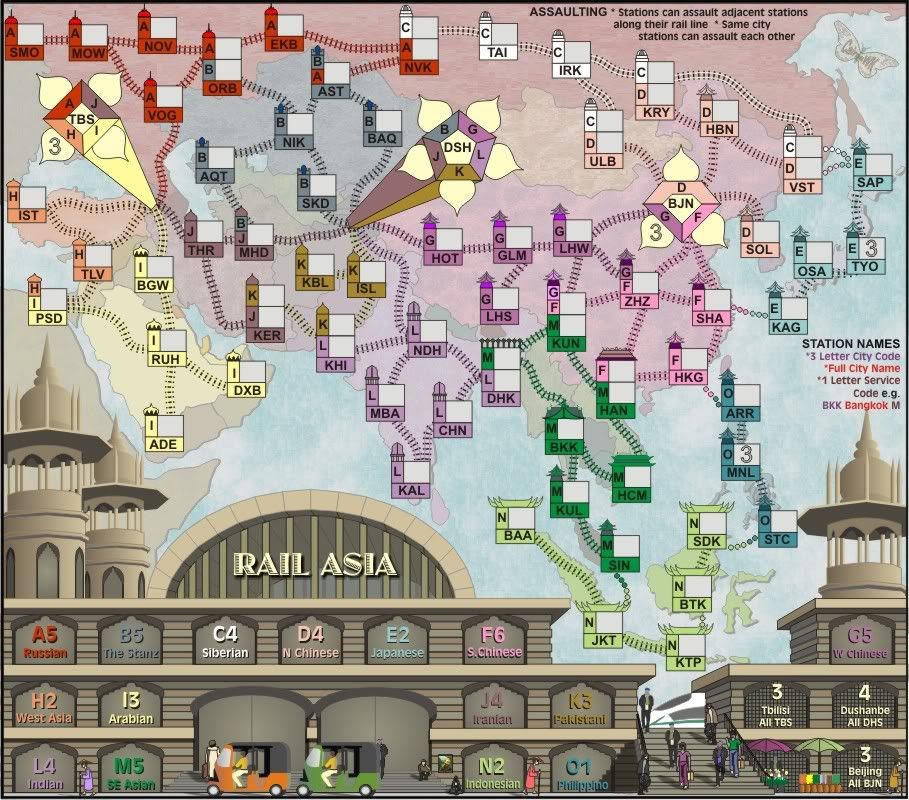
Version 20...almost complete...except for a couple more people....but the station museum should be now complete.

* Pearl Harbour * Waterloo * Forbidden City * Jamaica * Pot Mosbi
-
cairnswk
- Posts: 11510
- Joined: Sat Feb 03, 2007 8:32 pm
- Location: Australia
Re: RAIL ASIA [10.1.12] V21-P14 GFX updated
![]() by cairnswk on Tue Jan 10, 2012 2:51 am
by cairnswk on Tue Jan 10, 2012 2:51 am
Version 21- small
Large
Large
- Click image to enlarge.
Last edited by cairnswk on Tue Jan 10, 2012 2:59 am, edited 1 time in total.
* Pearl Harbour * Waterloo * Forbidden City * Jamaica * Pot Mosbi
-
cairnswk
- Posts: 11510
- Joined: Sat Feb 03, 2007 8:32 pm
- Location: Australia
Re: RAIL ASIA [10.1.12] V21-P14 GFX updated
![]() by cairnswk on Tue Jan 10, 2012 2:54 am
by cairnswk on Tue Jan 10, 2012 2:54 am
* Added some more people - a couple of beggars on steps
* centered the title
* treated the chinese train
* flatness rtemoved from the fruit buckets
* flatness removed from the umbrellas
I don't think i want to add anymore otherwise it becomes too cluttered.
* centered the title
* treated the chinese train
* flatness rtemoved from the fruit buckets
* flatness removed from the umbrellas
I don't think i want to add anymore otherwise it becomes too cluttered.
* Pearl Harbour * Waterloo * Forbidden City * Jamaica * Pot Mosbi
-
cairnswk
- Posts: 11510
- Joined: Sat Feb 03, 2007 8:32 pm
- Location: Australia
Re: RAIL ASIA [10.1.12] V21-P14 GFX updated
![]() by natty dread on Tue Jan 10, 2012 4:00 am
by natty dread on Tue Jan 10, 2012 4:00 am
Nice. Maybe you could add some shading to the motor vehicles? They seem a bit flat.

-

natty dread
- Posts: 12877
- Joined: Fri Feb 08, 2008 8:58 pm
- Location: just plain fucked


Re: RAIL ASIA [10.1.12] V21-P14 GFX updated
![]() by cairnswk on Tue Jan 10, 2012 10:24 am
by cairnswk on Tue Jan 10, 2012 10:24 am
natty_dread wrote:Nice. Maybe you could add some shading to the motor vehicles? They seem a bit flat.
natty, f5 and those images should be fixed above.
* Pearl Harbour * Waterloo * Forbidden City * Jamaica * Pot Mosbi
-
cairnswk
- Posts: 11510
- Joined: Sat Feb 03, 2007 8:32 pm
- Location: Australia
Re: RAIL ASIA [11.1.12] V21-P14 GFX updated
![]() by natty dread on Tue Jan 10, 2012 10:43 am
by natty dread on Tue Jan 10, 2012 10:43 am
Ok, it looks like you added a shadow on the ground, which is good... maybe you could add some slight gradient to the surfaces of them as well? You know, to make them look a bit less like cardboard cutouts...
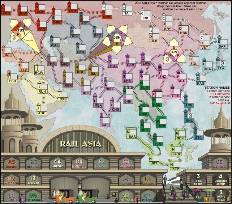
Another thing... The Stanz? Why the z? Shouldn't it be The Stans?
Another thing... The Stanz? Why the z? Shouldn't it be The Stans?
-
natty dread
- Posts: 12877
- Joined: Fri Feb 08, 2008 8:58 pm
- Location: just plain fucked
Re: RAIL ASIA [11.1.12] V21-P14 GFX updated
![]() by cairnswk on Tue Jan 10, 2012 12:22 pm
by cairnswk on Tue Jan 10, 2012 12:22 pm
natty_dread wrote:Ok, it looks like you added a shadow on the ground, which is good... maybe you could add some slight gradient to the surfaces of them as well? You know, to make them look a bit less like cardboard cutouts...
Not sure what you mean there.
Another thing... The Stanz? Why the z? Shouldn't it be The Stans?
Because most of those countries have z in their names, not s...creativity.
* Pearl Harbour * Waterloo * Forbidden City * Jamaica * Pot Mosbi
-
cairnswk
- Posts: 11510
- Joined: Sat Feb 03, 2007 8:32 pm
- Location: Australia
Re: RAIL ASIA [11.1.12] V21-P14 GFX updated
![]() by natty dread on Tue Jan 10, 2012 12:31 pm
by natty dread on Tue Jan 10, 2012 12:31 pm
cairnswk wrote:Because most of those countries have z in their names, not s...creativity.
On the other hand, it reminds me of the kind of marketing tactics, where clueless middle-aged people impotently try to add "youth appeal" to their products by making them "totally radical"... bratz dolls are a good example.
I was mainly wondering if there was an actual rail line somewhere called "The Stanz", or something... but if that's not the case, I'd much prefer it to be spelled with a s.
cairnswk wrote:Not sure what you mean there.
Well, the kind of gradient shading you have on the towers to make them look round... you could add some of that on the cars, to make them less flat.
-
natty dread
- Posts: 12877
- Joined: Fri Feb 08, 2008 8:58 pm
- Location: just plain fucked
Re: RAIL ASIA [11.1.12] V21-P14 GFX updated
![]() by cairnswk on Tue Jan 10, 2012 5:38 pm
by cairnswk on Tue Jan 10, 2012 5:38 pm
natty_dread wrote:cairnswk wrote:Because most of those countries have z in their names, not s...creativity.
On the other hand, it reminds me of the kind of marketing tactics, where clueless middle-aged people impotently try to add "youth appeal" to their products by making them "totally radical"... bratz dolls are a good example.
I was mainly wondering if there was an actual rail line somewhere called "The Stanz", or something... but if that's not the case, I'd much prefer it to be spelled with a s.
Well i'd much prefer it stays as it is since it's been that way for quite some time now and you appear only to have brought it up as perhaps an after-thought. I also think it fits well otherwise i would not have done it, and i had no thought of marketing campaigns when i did it. Clearly your thoughts and mine don't correspond at times.
As i said, it was used simply because those countries in that area have z in them. Sorry.
cairnswk wrote:Not sure what you mean there.
Well, the kind of gradient shading you have on the towers to make them look round... you could add some of that on the cars, to make them less flat.
Done.
A small gradient has also been added to the windows and doors.
please refresh the map above.
* Pearl Harbour * Waterloo * Forbidden City * Jamaica * Pot Mosbi
-
cairnswk
- Posts: 11510
- Joined: Sat Feb 03, 2007 8:32 pm
- Location: Australia
Re: RAIL ASIA [10.1.12] V21-P14 GFX updated
![]() by cairnswk on Tue Jan 10, 2012 5:39 pm
by cairnswk on Tue Jan 10, 2012 5:39 pm
Bumped to this page.
Version 21- small
Large
Version 21- small
Large
- Click image to enlarge.
* Pearl Harbour * Waterloo * Forbidden City * Jamaica * Pot Mosbi
-
cairnswk
- Posts: 11510
- Joined: Sat Feb 03, 2007 8:32 pm
- Location: Australia
Re: RAIL ASIA [11.1.12] V21-P14 GFX updated
![]() by natty dread on Tue Jan 10, 2012 5:45 pm
by natty dread on Tue Jan 10, 2012 5:45 pm
Looks much better. I'd still prefer Stans though, but if no one else feels the same way then I guess you can keep it...
-
natty dread
- Posts: 12877
- Joined: Fri Feb 08, 2008 8:58 pm
- Location: just plain fucked
Re: RAIL ASIA [11.1.12] V21-P14 GFX updated
![]() by cairnswk on Tue Jan 10, 2012 5:54 pm
by cairnswk on Tue Jan 10, 2012 5:54 pm
natty_dread wrote:Looks much better. I'd still prefer Stans though, but if no one else feels the same way then I guess you can keep it...
Thank you for your permission...God!
* Pearl Harbour * Waterloo * Forbidden City * Jamaica * Pot Mosbi
-
cairnswk
- Posts: 11510
- Joined: Sat Feb 03, 2007 8:32 pm
- Location: Australia
Re: RAIL ASIA [11.1.12] V21-P14 GFX updated
![]() by natty dread on Tue Jan 10, 2012 6:07 pm
by natty dread on Tue Jan 10, 2012 6:07 pm
Heyyy, stop taking my name in vain.
-
natty dread
- Posts: 12877
- Joined: Fri Feb 08, 2008 8:58 pm
- Location: just plain fucked
Re: RAIL ASIA [11.1.12] V21-P14 GFX updated
![]() by gimil on Thu Jan 12, 2012 5:00 pm
by gimil on Thu Jan 12, 2012 5:00 pm
Hi cairns,
Sorry for leaving you hanging a couple of days. The only thing I want to suggest is that maybe you can put a subtle texture on the buildings just to give them a little more rugged building feel...as oppose to the flat, almost plastic feel to them at the moment.
Cheers,
gimil
Sorry for leaving you hanging a couple of days. The only thing I want to suggest is that maybe you can put a subtle texture on the buildings just to give them a little more rugged building feel...as oppose to the flat, almost plastic feel to them at the moment.
Cheers,
gimil
What do you know about map making, bitch?
Top Score:2403
natty_dread wrote:I was wrong
Top Score:2403
-

gimil
- Posts: 8599
- Joined: Sat Mar 03, 2007 12:42 pm
- Location: United Kingdom (Scotland)


Re: RAIL ASIA [11.1.12] V21-P14 GFX updated
![]() by cairnswk on Fri Jan 13, 2012 7:23 pm
by cairnswk on Fri Jan 13, 2012 7:23 pm
gimil wrote:Hi cairns,
Sorry for leaving you hanging a couple of days. The only thing I want to suggest is that maybe you can put a subtle texture on the buildings just to give them a little more rugged building feel...as oppose to the flat, almost plastic feel to them at the moment.
Cheers,
gimil
Gimil, as requested, textures applied.
1. i've appliled a plaster texture to the main sandy coloured facures
2. mortar lines have been added to simulate brickwork on the in-between layers of the main building

* Pearl Harbour * Waterloo * Forbidden City * Jamaica * Pot Mosbi
-
cairnswk
- Posts: 11510
- Joined: Sat Feb 03, 2007 8:32 pm
- Location: Australia
Re: RAIL ASIA [14.1.12] V22-P15 Stn Texture applied
![]() by natty dread on Fri Jan 13, 2012 8:02 pm
by natty dread on Fri Jan 13, 2012 8:02 pm
Looks good!
-
natty dread
- Posts: 12877
- Joined: Fri Feb 08, 2008 8:58 pm
- Location: just plain fucked
Re: RAIL ASIA [11.1.12] V21-P14 GFX updated
![]() by Victor Sullivan on Sat Jan 14, 2012 9:08 pm
by Victor Sullivan on Sat Jan 14, 2012 9:08 pm
natty_dread wrote:Heyyy, stop taking my name in vain.
But I agree with natty, looks pretty swell! One thing I might suggest is trying out some different fonts for the title; Jazz LET (I think it is) just isn't really doing it for me
-Sully
Beckytheblondie: "Don't give us the dispatch, give us a mustache ride."
Scaling back on my CC involvement...
Scaling back on my CC involvement...
-

Victor Sullivan
- Posts: 6010
- Joined: Mon Feb 08, 2010 8:17 pm
- Location: Columbus, OH


Re: RAIL ASIA [11.1.12] V21-P14 GFX updated
![]() by cairnswk on Sat Jan 14, 2012 11:43 pm
by cairnswk on Sat Jan 14, 2012 11:43 pm
Victor Sullivan wrote:natty_dread wrote:Heyyy, stop taking my name in vain.
Sorry, that was funny.
But I agree with natty, looks pretty swell! One thing I might suggest is trying out some different fonts for the title; Jazz LET (I think it is) just isn't really doing it for me
-Sully
I'm pretty happy with it
* Pearl Harbour * Waterloo * Forbidden City * Jamaica * Pot Mosbi
-
cairnswk
- Posts: 11510
- Joined: Sat Feb 03, 2007 8:32 pm
- Location: Australia
Re: RAIL ASIA [14.1.12] V22-P15 Stn Texture applied
![]() by ender516 on Sun Jan 15, 2012 1:02 pm
by ender516 on Sun Jan 15, 2012 1:02 pm
You could try curving the title to match the roof line, but if it doesn't look good to you, don't even bother to post it, I'll take your word for it.
-
ender516
- Posts: 4455
- Joined: Wed Dec 17, 2008 6:07 pm
- Location: Waterloo, Ontario
Re: RAIL ASIA [14.1.12] V22-P15 Stn Texture applied
![]() by gimil on Sun Jan 15, 2012 3:42 pm
by gimil on Sun Jan 15, 2012 3:42 pm
[stickied]
The new texture look fantastic cairns and has really finished the map off. I agree that there is something wrong with the title. It isn't doing it for me either...just doesn't seem to fit. If you can can up with a more fitting title I would say you are done!
The new texture look fantastic cairns and has really finished the map off. I agree that there is something wrong with the title. It isn't doing it for me either...just doesn't seem to fit. If you can can up with a more fitting title I would say you are done!
What do you know about map making, bitch?
Top Score:2403
natty_dread wrote:I was wrong
Top Score:2403
-
gimil
- Posts: 8599
- Joined: Sat Mar 03, 2007 12:42 pm
- Location: United Kingdom (Scotland)
Re: RAIL ASIA [14.1.12] V22-P15 Stn Texture applied
![]() by cairnswk on Sun Jan 15, 2012 4:08 pm
by cairnswk on Sun Jan 15, 2012 4:08 pm
ender516 wrote:You could try curving the title to match the roof line, but if it doesn't look good to you, don't even bother to post it, I'll take your word for it.
gimil wrote:[stickied]
The new texture look fantastic cairns and has really finished the map off. I agree that there is something wrong with the title. It isn't doing it for me either...just doesn't seem to fit. If you can can up with a more fitting title I would say you are done!
Guys, i'm pretty happy with this title font where and as it is now...i've grown accustomed to it.
I don't want it curved, i don't want to put fireworks on it, i want it as is.
* Pearl Harbour * Waterloo * Forbidden City * Jamaica * Pot Mosbi
-
cairnswk
- Posts: 11510
- Joined: Sat Feb 03, 2007 8:32 pm
- Location: Australia
Re: RAIL ASIA [14.1.12] V22-P15 Stn Texture applied
![]() by koontz1973 on Mon Jan 16, 2012 1:15 pm
by koontz1973 on Mon Jan 16, 2012 1:15 pm
cairnswk, one thing you can do to the title without really changing it would be to put a backing on it. Right now the lettering looks perfect but it is hanging of the posts coming down. Either put each letter on a separate post so it looks like it has been attached or as I said, put a backing on it. Something very simple.

-

koontz1973
- Posts: 6960
- Joined: Thu Jan 01, 2009 10:57 am


Re: RAIL ASIA [14.1.12] V22-P15 Stn Texture applied
![]() by cairnswk on Mon Jan 16, 2012 3:02 pm
by cairnswk on Mon Jan 16, 2012 3:02 pm
koontz1973 wrote:cairnswk, one thing you can do to the title without really changing it would be to put a backing on it. Right now the lettering looks perfect but it is hanging of the posts coming down. Either put each letter on a separate post so it looks like it has been attached or as I said, put a backing on it. Something very simple.
thanks koont1973 for the feedback, but i'll reiterate,,,,
Guys, i'm pretty happy with this title font where and as it is now...i've grown accustomed to it.
I don't want it curved, i don't want to put fireworks on it, i want it as is.
Has everyone got the message...
* Pearl Harbour * Waterloo * Forbidden City * Jamaica * Pot Mosbi
-
cairnswk
- Posts: 11510
- Joined: Sat Feb 03, 2007 8:32 pm
- Location: Australia
Who is online
Users browsing this forum: No registered users
|
|||||||
| Conquer Club is not associated with RISK online in any way. Copyright © 2006-2025 by Big Wham LLC | |||||||