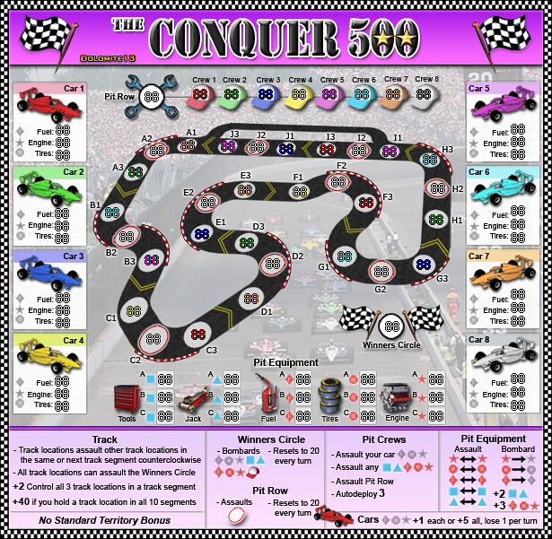
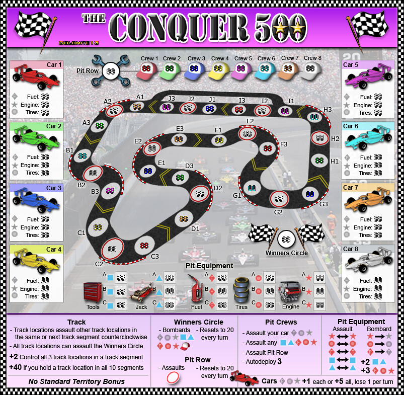
natty_dread wrote:I like the yellow arrows. The red/white curve things look a bit rushed at some places (C2-C3 for example.)
Agreed I will try and clean up the red/white curve things.
RedBaron0 wrote:All of the checkered flags are missing a white block near the top by the flag pole.
Ah I hadn't really noticed that before I will fix that.
RedBaron0 wrote:The background is showing through the title block on the top.
I intended the title block to be somewhat transparent. I might make a slightly more transparent so you can see a little more track graphics thru it.
Industrial Helix wrote:I'd like to see some desaturation on the hats and cars, maybe the red and white corner things. The colors are abnormally strong and look unrealistic.
I started working on that last evening and think I can soften it all a bit and bring the colors down a little.
Victor Sullivan wrote:I'm not so crazy about the blue-outlined track territories. I just think it doesn't quite stand out as much as I'd like, and I'm not so sure the shade matches with the rest of the map. I thought the red was okay. You could try using the same red that's used in the railings.
I changed it to red in my psd and it looks good ... especially when I desaturate the red/white curve things a bit.
I will have another update soon... thanx for all the great feedback.
=D=


