Conquer Club

New Zealand [Quenched]

Care to peruse completed maps? Take a stroll through the Atlas.

Moderator: Cartographers

Forum rules
Please read the Community Guidelines before posting.

Re: New Zealand [22.6.12] V14-P12 GFX?

Postby AndyDufresne on Fri Jun 22, 2012 8:37 am

isaiah40 wrote:Looking at this again, and was going to suggest reducing the opacity on the minimaps. 14a is where it should be!


I like them both, but maybe 14b more so slightly. Cairnswk, if you prefer one or the other, I'd go with whatever you have a preference for probably.

Keep up the good work. Glad to see this getting down in the final stretches.


--Andy
User avatar
Corporal 1st Class AndyDufresne
 
Posts: 24935
Joined: Fri Mar 03, 2006 8:22 pm
Location: A Banana Palm in Zihuatanejo

Re: Re: New Zealand [23.6.12] V15-P12 GFX?

Postby cairnswk on Fri Jun 22, 2012 12:36 pm

koontz1973 wrote:Either would be good but 14a does have a nice look to it.


isaiah40 wrote:Looking at this again, and was going to suggest reducing the opacity on the minimaps. 14a is where it should be!


AndyDufresne wrote:...
I like them both, but maybe 14b more so slightly. Cairnswk, if you prefer one or the other, I'd go with whatever you have a preference for probably.
Keep up the good work. Glad to see this getting down in the final stretches.
--Andy


There seems to be a bit of support for V14a, so here is v15.

Click image to enlarge.
image
Image
* Pearl Harbour * Waterloo * Forbidden City * Jamaica * Pot Mosbi
User avatar
Private cairnswk
 
Posts: 11510
Joined: Sat Feb 03, 2007 8:32 pm
Location: Australia

Re: New Zealand [23.6.12] V15-P12 GFX?

Postby cairnswk on Fri Jun 22, 2012 8:39 pm

Is everyone happy with the bridges?
Image
* Pearl Harbour * Waterloo * Forbidden City * Jamaica * Pot Mosbi
User avatar
Private cairnswk
 
Posts: 11510
Joined: Sat Feb 03, 2007 8:32 pm
Location: Australia

Re: Re: New Zealand [23.6.12] V15-P12 GFX?

Postby ender516 on Fri Jun 22, 2012 11:16 pm

Ooh, I like V15 with the faded minimaps with their modified coastal waters. In fact, softening the boundary of the water colours might be a nice addition to the main map.

As for the bridges, they look a little too much like Catdog for my tastes. Would they show up if they were just a framework of cables like a suspension bridge, not filled with colour?
User avatar
Sergeant 1st Class ender516
 
Posts: 4455
Joined: Wed Dec 17, 2008 6:07 pm
Location: Waterloo, Ontario

Re: Re: New Zealand [23.6.12] V15-P12 GFX?

Postby cairnswk on Fri Jun 22, 2012 11:26 pm

ender516 wrote:Ooh, I like V15 with the faded minimaps with their modified coastal waters. In fact, softening the boundary of the water colours might be a nice addition to the main map.

As for the bridges, they look a little too much like Catdog for my tastes. Would they show up if they were just a framework of cables like a suspension bridge, not filled with colour?

mmm, i don't think so ender516..it's too small and too fine
i'm thinking i might simply have to revert to something very simple.
Image
* Pearl Harbour * Waterloo * Forbidden City * Jamaica * Pot Mosbi
User avatar
Private cairnswk
 
Posts: 11510
Joined: Sat Feb 03, 2007 8:32 pm
Location: Australia

Re: Re: New Zealand [23.6.12] V15-P12 GFX?

Postby thehippo8 on Fri Jun 22, 2012 11:33 pm

They are bridges? I thought they were skateboards! :lol:
ImageImageImage
show
User avatar
Corporal 1st Class thehippo8
 
Posts: 1025
Joined: Fri Feb 19, 2010 5:32 pm

Re: Re: New Zealand [23.6.12] V15-P12 GFX?

Postby cairnswk on Fri Jun 22, 2012 11:36 pm

thehippo8 wrote:They are bridges? I thought they were skateboards! :lol:


Come into my web said the spider to the fly ;)
Image
* Pearl Harbour * Waterloo * Forbidden City * Jamaica * Pot Mosbi
User avatar
Private cairnswk
 
Posts: 11510
Joined: Sat Feb 03, 2007 8:32 pm
Location: Australia

Re: New Zealand [23.6.12] V15-P12 GFX?

Postby Nola_Lifer on Sat Jun 23, 2012 12:30 am

Sorry for the delay in response, but yes 14a and 15 are good :!:
Image
User avatar
Major Nola_Lifer
 
Posts: 819
Joined: Mon Oct 13, 2008 4:46 pm
Location: é›Ŗå±±

Re: Re: New Zealand [23.6.12] V15-P12 GFX?

Postby cairnswk on Sat Jun 23, 2012 5:44 pm

ender516 wrote:Ooh, I like V15 with the faded minimaps with their modified coastal waters. In fact, softening the boundary of the water colours might be a nice addition to the main map.


ender516, i have just tried a PS 24px brush with 72% hardness as the main continent edge...to my mind this does not sit as well as the existing style i have...the faded style blends too much with the mini-map style and distorts the boundary between the two sorts of maps...it looks OK, but not as good as the harsh edge that it there now...so i think i will stick with the existing style for the main map. :)
Image
* Pearl Harbour * Waterloo * Forbidden City * Jamaica * Pot Mosbi
User avatar
Private cairnswk
 
Posts: 11510
Joined: Sat Feb 03, 2007 8:32 pm
Location: Australia

Re: Re: New Zealand [23.6.12] V15-P12 GFX?

Postby ender516 on Sat Jun 23, 2012 10:51 pm

cairnswk wrote:
ender516 wrote:Ooh, I like V15 with the faded minimaps with their modified coastal waters. In fact, softening the boundary of the water colours might be a nice addition to the main map.

As for the bridges, they look a little too much like Catdog for my tastes. Would they show up if they were just a framework of cables like a suspension bridge, not filled with colour?

mmm, i don't think so ender516..it's too small and too fine
i'm thinking i might simply have to revert to something very simple.

I expected as much, but thought it couldn't hurt to ask.
cairnswk wrote:ender516, i have just tried a PS 24px brush with 72% hardness as the main continent edge...to my mind this does not sit as well as the existing style i have...the faded style blends too much with the mini-map style and distorts the boundary between the two sorts of maps...it looks OK, but not as good as the harsh edge that it there now...so i think i will stick with the existing style for the main map. :)

Okay, fair enough.
User avatar
Sergeant 1st Class ender516
 
Posts: 4455
Joined: Wed Dec 17, 2008 6:07 pm
Location: Waterloo, Ontario

Re: Re: New Zealand [23.6.12] V15-P12 GFX?

Postby cairnswk on Sun Jun 24, 2012 5:30 pm

ender516 wrote:
cairnswk wrote:
ender516 wrote:Ooh, I like V15 with the faded minimaps with their modified coastal waters. In fact, softening the boundary of the water colours might be a nice addition to the main map.

As for the bridges, they look a little too much like Catdog for my tastes. Would they show up if they were just a framework of cables like a suspension bridge, not filled with colour?

mmm, i don't think so ender516..it's too small and too fine
i'm thinking i might simply have to revert to something very simple.

I expected as much, but thought it couldn't hurt to ask.
cairnswk wrote:ender516, i have just tried a PS 24px brush with 72% hardness as the main continent edge...to my mind this does not sit as well as the existing style i have...the faded style blends too much with the mini-map style and distorts the boundary between the two sorts of maps...it looks OK, but not as good as the harsh edge that it there now...so i think i will stick with the existing style for the main map. :)

Okay, fair enough.

Thanks ender516 :)
Image
* Pearl Harbour * Waterloo * Forbidden City * Jamaica * Pot Mosbi
User avatar
Private cairnswk
 
Posts: 11510
Joined: Sat Feb 03, 2007 8:32 pm
Location: Australia

Re: Re: New Zealand [23.6.12] V15-P12 GFX?

Postby cairnswk on Tue Jul 03, 2012 3:18 pm

here is v15....just bumping to next page. :)

Click image to enlarge.
image
Image
* Pearl Harbour * Waterloo * Forbidden City * Jamaica * Pot Mosbi
User avatar
Private cairnswk
 
Posts: 11510
Joined: Sat Feb 03, 2007 8:32 pm
Location: Australia

Re: Re: New Zealand [23.6.12] V15-P12 GFX?

Postby AndyDufresne on Tue Jul 03, 2012 3:36 pm

Everything looks pretty clear to my eyes. I am not sure I have any new suggestions or critiques. I could say that the blue around the mini-maps looks more fuzzy compared to the blue around the gameboard islands, but the fuzzy look probably works since the all the mini-maps are toned down in visual strength.

Keep up the good work.


--Andy
User avatar
Corporal 1st Class AndyDufresne
 
Posts: 24935
Joined: Fri Mar 03, 2006 8:22 pm
Location: A Banana Palm in Zihuatanejo

Re: New Zealand [23.6.12] V15-P12 GFX?

Postby Arama86n on Tue Jul 03, 2012 3:50 pm

Nice to see a map of NZ. I lived there once upon of time.
I won't say much about the actual map, as for me, carinwk's maps have always taken some getting used to. But hey, some of the best people I know I didn't like on first impression, and that goes for many things in life, including CC maps ;)

Keep up the brilliant work cairnswk. =D>
User avatar
Major Arama86n
 
Posts: 2275
Joined: Thu Jul 23, 2009 1:32 pm
Location: Gothenburg, Sweden

Re: Re: New Zealand [23.6.12] V15-P12 GFX?

Postby thehippo8 on Tue Jul 03, 2012 4:14 pm

AndyDufresne wrote:Everything looks pretty clear to my eyes. I am not sure I have any new suggestions or critiques. I could say that the blue around the mini-maps looks more fuzzy compared to the blue around the gameboard islands, but the fuzzy look probably works since the all the mini-maps are toned down in visual strength.

Keep up the good work.


--Andy


I suspect that it's a vidual effect brought about by the contrast in blues.
ImageImageImage
show
User avatar
Corporal 1st Class thehippo8
 
Posts: 1025
Joined: Fri Feb 19, 2010 5:32 pm

Re: Re: New Zealand [23.6.12] V15-P12 GFX?

Postby ender516 on Tue Jul 03, 2012 9:19 pm

thehippo8 wrote:
AndyDufresne wrote:Everything looks pretty clear to my eyes. I am not sure I have any new suggestions or critiques. I could say that the blue around the mini-maps looks more fuzzy compared to the blue around the gameboard islands, but the fuzzy look probably works since the all the mini-maps are toned down in visual strength.

Keep up the good work.


--Andy


I suspect that it's a vidual effect brought about by the contrast in blues.

No, the mini-maps use a gradient on their coastal waters that the main map does not.
See the earlier discussion here: viewtopic.php?f=241&p=3801765#p3787890
User avatar
Sergeant 1st Class ender516
 
Posts: 4455
Joined: Wed Dec 17, 2008 6:07 pm
Location: Waterloo, Ontario

Re: Re: New Zealand [23.6.12] V15-P12 GFX?

Postby RedBaron0 on Thu Jul 05, 2012 8:14 pm

The outer border, why doesn't it continue under the land surface? It doesn't make sense that whole blocks disappear just because some of the land or territory names invades its space.

The Mm. abbreviation, why not just list it off to the one side? South Island has a list of abbreviations, I know Mm. is just 1 thing to deal with, but it overly clutters the North Island minimap area.

The bridges are awful, they've already been jokingly described as "skateboards." Think you can do better?

The impassible part of the legend. "except where indicated" Indicated by... what exactly? I assume its the bridges, but bridges only go over water, usually. Please include the "indicator" in the legend.
ImageImage
User avatar
Sergeant 1st Class RedBaron0
 
Posts: 2657
Joined: Sun Aug 19, 2007 12:59 pm
Location: Pennsylvania

Re: Re: New Zealand [23.6.12] V15-P12 GFX?

Postby cairnswk on Fri Jul 06, 2012 1:23 am

RedBaron0 wrote:The outer border, why doesn't it continue under the land surface? It doesn't make sense that whole blocks disappear just because some of the land or territory names invades its space.

the same reason that isaiah40 asked me to remove the outer edging on the Sydney map under some of the names...it causes too many visisbility issues...i beleive it looks better without those blocks and it is the way i have designed the borders. to me it makes perfect sense. :)

The Mm. abbreviation, why not just list it off to the one side? South Island has a list of abbreviations, I know Mm. is just 1 thing to deal with, but it overly clutters the North Island minimap area.

i actually don't beleive it clutters the north island that much...it would be different if there were severl there...however, i will move to somewhere more appropriate :)

The bridges are awful, they've already been jokingly described as "skateboards." Think you can do better?

Yes the bridges are already on the bucket list....when i get time. ;)

The impassible part of the legend. "except where indicated" Indicated by... what exactly? I assume its the bridges, but bridges only go over water, usually. Please include the "indicator" in the legend.

OK i will include the new bridges in the impassables legend. :)
Image
* Pearl Harbour * Waterloo * Forbidden City * Jamaica * Pot Mosbi
User avatar
Private cairnswk
 
Posts: 11510
Joined: Sat Feb 03, 2007 8:32 pm
Location: Australia

Re: New Zealand [8.7.12] V16-P12 GFX?

Postby cairnswk on Sat Jul 07, 2012 9:51 pm

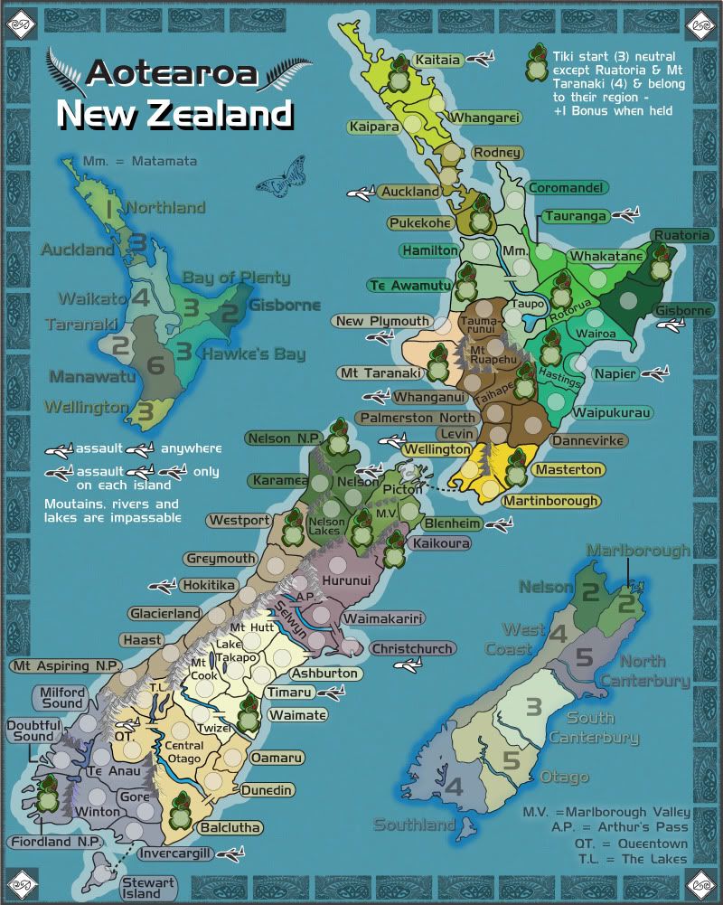
Version 16.

1. the Mm. has been moved.
2. Bridges have been re-done in a very simple style...so there is no mistake as to what crossings are there.
3. the impassable legend has been simply altered to remove the extraneous text.

Image
Image
* Pearl Harbour * Waterloo * Forbidden City * Jamaica * Pot Mosbi
User avatar
Private cairnswk
 
Posts: 11510
Joined: Sat Feb 03, 2007 8:32 pm
Location: Australia

Re: New Zealand [8.7.12] V16-P13 GFX?

Postby isaiah40 on Wed Aug 01, 2012 9:27 am

Just one little thing, the mountains in the Nelson bonus and between North Canterbury and Marlborough are a hard to see. I can actually see them better on your color blind test. Can you lighten them up a bit please? Also, in the impassable area of the legend, you can remove lakes as I don't see any lakes that serve as an impassable.
Lieutenant isaiah40
 
Posts: 3990
Joined: Mon Aug 27, 2007 7:14 pm

Re: New Zealand [8.7.12] V16-P13 GFX?

Postby x-raider on Wed Aug 01, 2012 9:52 am

isaiah40 wrote:Also, in the impassable area of the legend, you can remove lakes as I don't see any lakes that serve as an impassable.


FYI There's just one down the bottom: between Winton and Fiordland.
User avatar
Corporal 1st Class x-raider
 
Posts: 248
Joined: Tue Nov 17, 2009 5:32 am
Location: Lost in the Complexities of the Undiscovered Universe

Re: New Zealand [8.7.12] V16-P13 GFX?

Postby isaiah40 on Wed Aug 01, 2012 10:15 am

x-raider wrote:
isaiah40 wrote:Also, in the impassable area of the legend, you can remove lakes as I don't see any lakes that serve as an impassable.


FYI There's just one down the bottom: between Winton and Fiordland.

Ah so there is, fell free to ignore my post cairns :D
Lieutenant isaiah40
 
Posts: 3990
Joined: Mon Aug 27, 2007 7:14 pm

Re: Re: New Zealand [8.7.12] V16-P13 GFX?

Postby ender516 on Wed Aug 01, 2012 12:17 pm

Strictly speaking, a lake forms part of the boundary between Te Anau and Doubtful Sound, as well.
User avatar
Sergeant 1st Class ender516
 
Posts: 4455
Joined: Wed Dec 17, 2008 6:07 pm
Location: Waterloo, Ontario

Re: Re: New Zealand [8.7.12] V16-P13 GFX?

Postby thehippo8 on Wed Aug 01, 2012 3:22 pm

ender516 wrote:Strictly speaking, a lake forms part of the boundary between Te Anau and Doubtful Sound, as well.

Lakes are only mountains that go downwards :lol:
Image
Image
Image
ImageImageImage
show
User avatar
Corporal 1st Class thehippo8
 
Posts: 1025
Joined: Fri Feb 19, 2010 5:32 pm

Re: New Zealand [4.8.12] V17-P14 GFX?

Postby cairnswk on Fri Aug 03, 2012 3:11 pm

isaiah40 wrote:Just one little thing, the mountains in the Nelson bonus and between North Canterbury and Marlborough are a hard to see. I can actually see them better on your color blind test. ...

thanks for comments isaiah40...is this better.
Version 17
Click image to enlarge.
image
Image
* Pearl Harbour * Waterloo * Forbidden City * Jamaica * Pot Mosbi
User avatar
Private cairnswk
 
Posts: 11510
Joined: Sat Feb 03, 2007 8:32 pm
Location: Australia

PreviousNext

Return to The Atlas

Who is online

Users browsing this forum: No registered users