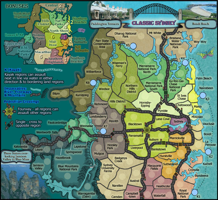
iancanton wrote:i missed one in the last round of spelling checks: mossman ought to be mosman.
http://www.mosman.nsw.gov.au/
ian.
ian, sorry i missed this on the map, it is fixed, i'll put it up as soon as photobucket gets up again.
Moderator: Cartographers
iancanton wrote:i missed one in the last round of spelling checks: mossman ought to be mosman.
http://www.mosman.nsw.gov.au/
ian.


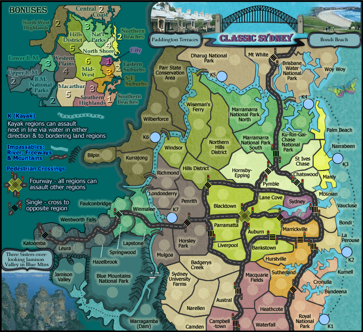
isaiah40 wrote:A few things:
1. Some of the Territory names such as Mosman, Manly, Woy Woy go over the outline. Remove the outline under the names for an easier read.
2. The outer glow around the text in the legend and mini-map. I don't think it is really needed considering that the background is a light enough color. You can either remove the outer glow or tone it down a couple of notches.
3. The out glow around the text in the landmark areas, I think you can remove the glow all together.
4. The cross walks on the small look good, but on the large they are all messed up. Probably from enlarging them.
5. There is what looks like a smudge here down by Jamison Valley:


isaiah40 wrote:Looking better. Woy Woy, I think ti would be better if you move the circle down and move the name up above it, as some people would think it reads Wo"V" Woy.


cairnswk wrote:3 - On the mini-map, can you place the bonus value beside the word City, and have the line going more to the center of that area?
i prefer it have it where it is as it fits better with the consistency of the others in the mini-map i.e. all on their territories where possible; the only reason northern beaches is off its territory is because it would be too close to the North Shore bonus number and there is very little room on northern beaches for it.


Doneisaiah40 wrote:Getting there cairns!!
A couple of things:
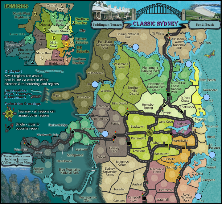
1 - The text size on the small, some of the names are a little hard to read. I believe for the most part that you have room to have a larger size, maybe an increase of one font size?
2 - Some of the territory names need to have the kerning adjusted, i.e. Penrith, it looks like Pennth on the large and on the small it is even worse. The names that have a "ri" are really bad. They all look like an "n"
3 - On the mini-map, can you place the bonus value beside the word City, and have the line going more to the center of that area?
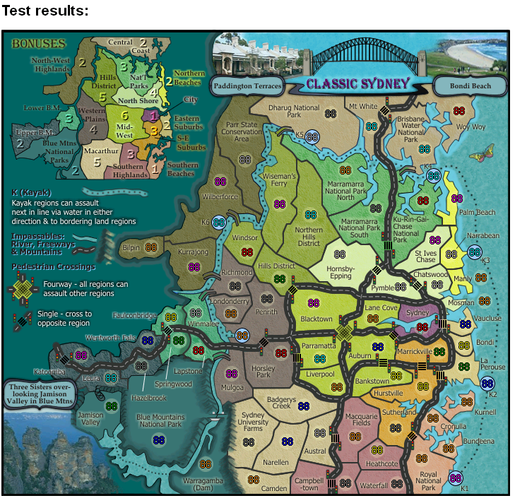
Please update the color blind test in the OP, with both of the major tests.


adam666 wrote:mate i love your new sydney map but mac fields-campbelltown-heathcote in the southern highlands
i live in hill top in the southern highlandes and i wasand
to see tha above put in the highlandes
just being a pain in the arse sorry
but on a good note sdyney port moseby and new zealand look great i cant wait till they r in beta cheers
adam


isaiah40 wrote:Would you happen to be looking for this??


cairnswk wrote:isaiah40 wrote:Would you happen to be looking for this??
Ah...at long last, thank-you O Lord


x-raider wrote:...
- It isn't clear in the legend whether the kayaks are part of a bonus.
- K7 near penrith is missing a name.
- The mountains are great but it looks a bit funny just underneath Leura.
- I like the way you've done the textures.
- Not sure if I said this before, but I really like the way the images have been done on this one.


Nola_Lifer wrote:Guess we are still on strike?


really ?cairnswk wrote:No, not really, foundry is just really really slowNola_Lifer wrote:Guess we are still on strike?


thenobodies80 wrote:A final note: maybe it's worth to write somewhere that K regions are not part of any bonus/regions since while checking the xml, for few secs i thought you had forgot to include few regions into the file!
Anyway it took just few secs to realize how they work, although I wouldn't be surprise if someone will come here to say that K regions look like they are part of the region bonus in which they are contained.
Nobodies


thenobodies80 wrote:Small map
I would move these a bit:
- Horsley Park, a couple of pixels to left so the 888 doesn't cover the small red light
- Austral, the same...
- Pimble, again the same thing, but this time move the number down
Large map
Some 888 aren't placed in the best place possible, but maybe it's just me. e.g.Liverpool, austral
Now, actually I can't think a way to change the next item on the list, but maybe you can.
I absolutely dislike campbelltown, the name on the left side and the number on the right, yes I can understand it's the same region but it's very very unclear.
In addition, if I try to find an explanation for that (since it's different than in any other palce on the map), i read into the legend Cross to opposite regions
But it's not in that way. I understand the space is tight there but i don't understand why you need that road there. It's useless, it gives to you only less free space to fill with the other things (name, number). Personally i would get rid of the road.Same thing for katoomba, where you can move the road a bit.
About that road, what about cut the road in katoomba within the "map border"? Did you tried? How it looks?
The xml looks ok
Nobodies


Users browsing this forum: No registered users