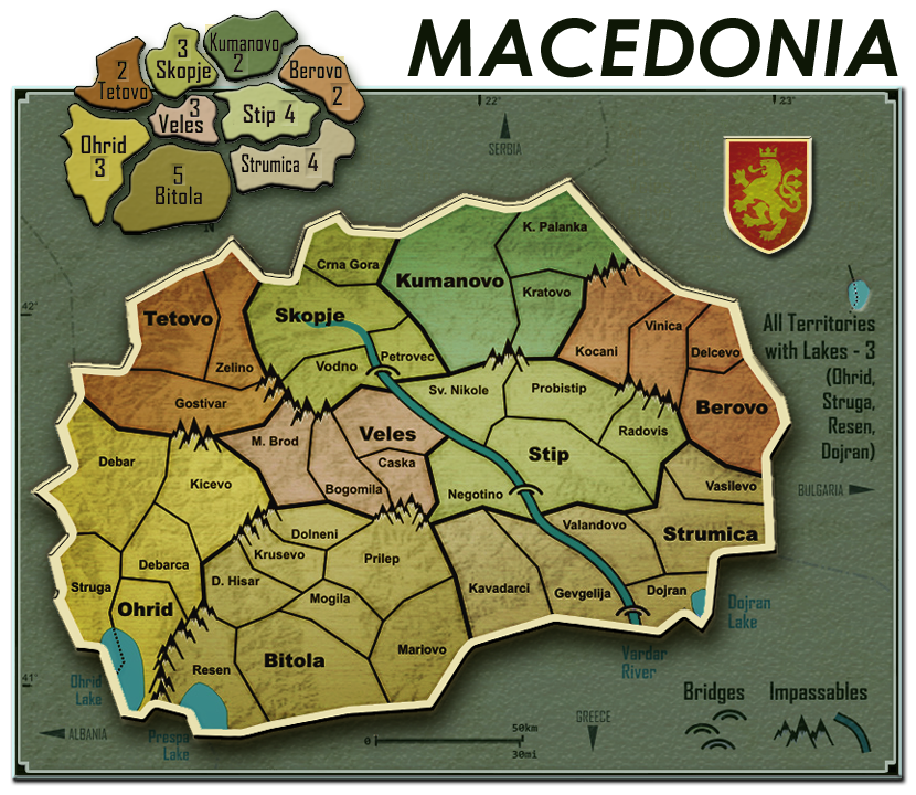
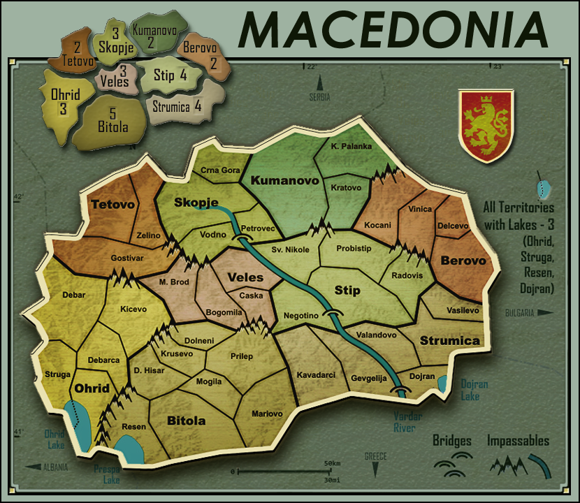
Macedonia map [Gp, Gr, X, BETA, Qnchd.]
Moderator: Cartographers
Re: Macedonia map [Gp]
1 troop may actually make a lot of difference in a small map... I'm not sure, the map may work as is, but it certainly would be more balanced if the central bonus areas would be fixed.

-

 natty dread
- Posts: 12877
- Joined: Fri Feb 08, 2008 8:58 pm
- Location: just plain fucked


Re: Macedonia map [Gp]
natty_dread wrote:1 troop may actually make a lot of difference in a small map... I'm not sure, the map may work as is, but it certainly would be more balanced if the central bonus areas would be fixed.
I think 1 troop would make particularly little difference in this map, since there are so many continents and so much potential for perimeter combination.
-

 Evil DIMwit
- Posts: 1616
- Joined: Thu Mar 22, 2007 1:47 pm
- Location: Philadelphia, NJ


Re: Macedonia map [Gp]
Agree with Evil DIMwit about mountains (btw thank you mate for the quick reply  )
)
Natty i don't understand your point here....how a single point can make a so big difference? You said that Asia on classic is a no-man land and i'm agree with this, but because it's hard to hold and because it has a "bad position", i don't think that a +8 Asia instead of +7 could change so much the gameplay...
And just we're talking about the classic map i must say that personally i consider that map far to be really balanced..What about Europe? Do you really think that +5 is a fair number?
I'd like to kick the man that chose that value,I don't know how many games i've lost against friends playing risk and trying to focus on that continent.](./images/smilies/eusa_wall.gif)
Said that i'd suggest to n.n. to take note of your advice and see if it should be applied later when the map will be tested during Beta stage.
Natty i don't understand your point here....how a single point can make a so big difference? You said that Asia on classic is a no-man land and i'm agree with this, but because it's hard to hold and because it has a "bad position", i don't think that a +8 Asia instead of +7 could change so much the gameplay...
And just we're talking about the classic map i must say that personally i consider that map far to be really balanced..What about Europe? Do you really think that +5 is a fair number?
I'd like to kick the man that chose that value,I don't know how many games i've lost against friends playing risk and trying to focus on that continent.
](./images/smilies/eusa_wall.gif)
Said that i'd suggest to n.n. to take note of your advice and see if it should be applied later when the map will be tested during Beta stage.
-

 thenobodies80
- Posts: 5400
- Joined: Wed Sep 05, 2007 4:30 am
- Location: Milan


Re: Macedonia map [Gp]
Back to GRAPHICS. 
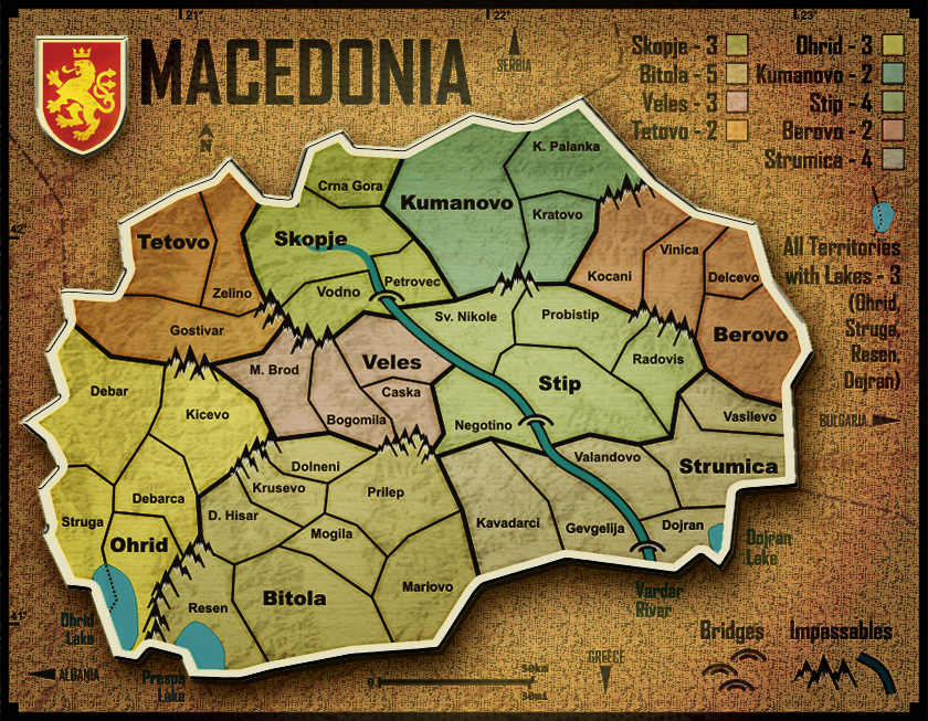
Kicking around some possibilities. Maybe this will give you an idea or two, ...maybe not.
I am always experimenting with new things that are an attempt to do something different from all of the other maps at CC. Unless you try, you will never come up with anything unique.
Also, I think the bonus legend would work better as a mini-map.
edit- Alt. background.

-

 porkenbeans
- Posts: 2546
- Joined: Mon Sep 10, 2007 4:06 pm


Re: Macedonia map [Gp]
From my experience, continents on the middle rarely are game deciding. Too hard to conquer, even harder to keep them. So I don't think that even if they bring +1 will affect the gameplay in some significant way. When this map is in beta we will see if it actually means something.
I don't mind is some of the questioned regions bring +1, but i don't think that is something important
I don't mind is some of the questioned regions bring +1, but i don't think that is something important
-

 kristijan_mk
- Posts: 37
- Joined: Thu Sep 03, 2009 7:40 am
- Location: Bitola/Skopje, Macedonia


Re: Macedonia map [Gp]
Why focus on just a +1 difference now, before the map even hits FF? I'd say leave them as is for now, if the changes need made later on during Beta, it's an easy fix.
The only way to find out if the bonuses are too small would be to play the map and test it out, so there's not much use speculating about it at the moment.
The only way to find out if the bonuses are too small would be to play the map and test it out, so there's not much use speculating about it at the moment.

Looking for a clan? Click here to send me a PM and find out how to join The Underworld! *Selective Recruitment*
-

 Orange-Idaho-Dog
- Posts: 555
- Joined: Sun Jan 14, 2007 12:41 pm
- Location: South Carolina


Re: Macedonia map [Gp]
If you wanted to speculate about ways to increase the bonus amount, you could look to one of our classic maps. World 2.1 has a way that you can increase your continent bonus when you pick up the extra "bonus" territs.Orange-Idaho-Dog wrote:Why focus on just a +1 difference now, before the map even hits FF? I'd say leave them as is for now, if the changes need made later on during Beta, it's an easy fix.
The only way to find out if the bonuses are too small would be to play the map and test it out, so there's not much use speculating about it at the moment.
You could do something here that similar. - you could use a "playable" mini-map.
If you secure the mini-map territ of the same bonus area, you are rewarded by receiving double that bonus amount.
I also think that a mini-map works better with this map. For one thing, it eliminates any "color Blind" issue.
and, it not only adds a few territs to the map, it brings a higher level of complexity, and strategy, to this game board.
[BigImg][/BigImg]

-

 porkenbeans
- Posts: 2546
- Joined: Mon Sep 10, 2007 4:06 pm


Re: Macedonia map [Gp]
A mini map is totally unnecessary. Regional bonus names are also territory names written in BIG LETTERS

-

 ghirrindin
- Posts: 129
- Joined: Sat Jan 12, 2008 9:34 pm
- Location: Urbana, IL


Re: Macedonia map [Gp]
The mini-map not only looks better than the bonus legend now, It quickly allows you to visualize on the map, exactly where, and how much, the bonuses are. Making the instructions "clearer". The little colored boxes do not lend themselves very well, to the overview of the bonus area relationships.ghirrindin wrote:A mini map is totally unnecessary. Regional bonus names are also territory names written in BIG LETTERS
The added territ count is a big plus as well.
But the icing on the cake, is without a doubt, got to be the higher level of complexity and strategy, that a "playable" mini-map brings to this party. Just because a map is small, does not mean that it needs to be "simple".
[quote="Evil DIMwit"]In fact, it's perfectly allowed, and encouraged, to offer gameplay improvements in the Graphics Workshop, just like it's permissible to give graphics advice in the Gameplay Workshop.
My feedback is concerning both GP. and GFX.

-

 porkenbeans
- Posts: 2546
- Joined: Mon Sep 10, 2007 4:06 pm


Re: Macedonia map [Gp]
Well, thanks guys !
First i will implement, Evil DIMwit's suggestion:
Second, i will implement the suggestion thenobodies80 made about exporting to png, hoping it would make improvements to readability:
Third, i really do not like what porkenbeans is doing with the map, not the mini-map nor the various background color and styles, yes, it could be in a different color and there could be a mini-map, on this map, i dont like it and i do not find his graphic suggestions usable here with the exception of maybe the border styling of the whole thing (the border of the map image itself not the territory borders) - but that i find, well, a borderline issue, i will try it though...
And last, bonuses - it seems to me like the prevailing opinion here is to try that one in the beta which is fine with me!
If of course the map gods insist of changing the bonuses earlier - i will comply.
So, the next thing for me is to make an update which will reflect the points i quoted here.
I hope to do it in the next couple of days.
Again, thank you all for the input!
First i will implement, Evil DIMwit's suggestion:
Also, I like how the mountains look, but can you extend the ends of the mountain ranges just a little bit so it doesn't look like, for example, Negotino might border Prilep, or Vinicia and Radovis, or K. Palanka and Kocani?
Second, i will implement the suggestion thenobodies80 made about exporting to png, hoping it would make improvements to readability:
I find that the names on the small version are still a little fuzzy, try to save the image as a png
Third, i really do not like what porkenbeans is doing with the map, not the mini-map nor the various background color and styles, yes, it could be in a different color and there could be a mini-map, on this map, i dont like it and i do not find his graphic suggestions usable here with the exception of maybe the border styling of the whole thing (the border of the map image itself not the territory borders) - but that i find, well, a borderline issue, i will try it though...
And last, bonuses - it seems to me like the prevailing opinion here is to try that one in the beta which is fine with me!
If of course the map gods insist of changing the bonuses earlier - i will comply.
So, the next thing for me is to make an update which will reflect the points i quoted here.
I hope to do it in the next couple of days.
Again, thank you all for the input!
Live long and prosper.
-

 n.n.
n.n.
- Posts: 156
- Joined: Mon Sep 03, 2007 4:47 am
- Location: Macedonia


Re: Macedonia map [Gp]
While I appreciate porkens effort I prefer the original style by n.n
-

 fumandomuerte
- Posts: 620
- Joined: Sat Dec 29, 2007 1:27 am
- Location: The Cinderella of the Pacific


Re: Macedonia map [Gp]
fumandomuerte wrote:While I appreciate porkens effort I prefer the original style by n.n
ditto.
The arrows used to point out non-playable countries seem unnecessary. Maybe make the font there a little bigger and see how it looks without the arrows. The degree markers on the top and bottom might be better with an "N" and "E" to denote hemisphere.
The small map is your biggest obstacle. The text is a bit blurry. you will likely have to delete those layers on the small map and redo them entirely on the small map itself. Especially if you're just scaling the large image down...
The only other thing that bothers me is the fact that the map is pretty generic.... and could use a slight bit of thematic overhaul - if the masses demand it... I know this is supposed to be modern Macedonia.... but I don't know a damn thing about the current country, and still don't. All I know is that Alexander the Great was born there and that whole story. Just a little something more added to bring a bit of flavor from Macedonia to push you over the top.


-

 RedBaron0
- Posts: 2657
- Joined: Sun Aug 19, 2007 12:59 pm
- Location: Pennsylvania


Re: Macedonia map [Gp]
Thanks redbaron, i noted your suggestions and will try to include them in next version.
Live long and prosper.
-

 n.n.
n.n.
- Posts: 156
- Joined: Mon Sep 03, 2007 4:47 am
- Location: Macedonia


Re: Macedonia map [Gp]
My reason for the illustration, was mainly to show that a mini-map, would work better for this map. The idea about using the mini-map for gameplay, was only meant as a suggestion to be considered. As was the layout, colors, backgrounds, and textures. All of that is just me having fun in photoshop. you can take or leave it as you wish. I only hope that the effort, might give you an idea or two.fumandomuerte wrote:While I appreciate porkens effort I prefer the original style by n.n
Oh yeah, I kinda like the way that border matting is looking. I will need to try that out, on a project or two.

-

 porkenbeans
- Posts: 2546
- Joined: Mon Sep 10, 2007 4:06 pm


Re: Macedonia map [Gp]
Long time no read...
All I can say is - Grand Job
some really good ideas and progress in the mountains and the river, and progress in all the graphics in general.
But, the last few pages are just nitpicking and wanting to change the original idea for no reason - as I see the last version will have more sharpness and will be ready for the stamp, so lets go, can't wait to play my country
-

 Pandemonium
- Posts: 102
- Joined: Tue Sep 18, 2007 8:01 am
- Location: Macedonia


Re: Macedonia map [Gp]
RedBaron0 wrote: The only other thing that bothers me is the fact that the map is pretty generic.... and could use a slight bit of thematic overhaul - if the masses demand it... I know this is supposed to be modern Macedonia.... but I don't know a damn thing about the current country, and still don't. All I know is that Alexander the Great was born there and that whole story. Just a little something more added to bring a bit of flavor from Macedonia to push you over the top.
Nah. This map has the shape of the country, its municipalities, a few of its lakes, and its coat of arms. What more do you need? I don't learn all that much about Great Britain, Japan (no offense, of course), Australia, or Madagascar when I play those maps. If you want to know more about modern Macedonia, crack a book! The map has a simple style, feel, and gameplay that I appreciate.

-

 ghirrindin
- Posts: 129
- Joined: Sat Jan 12, 2008 9:34 pm
- Location: Urbana, IL


Re: Macedonia map [Gp]
I'd definitely not encourage any radical overhaul of the map at this stage; there is really very little left to do! Stick with what you've got (apart from the couple of small changes nobodies suggested previously) 
The bonuses should be fine as they are, I don;t see any real reason to change them right now - although if there is major outcry when the map goes live, bumping them up isn't too much of a problem
The bonuses should be fine as they are, I don;t see any real reason to change them right now - although if there is major outcry when the map goes live, bumping them up isn't too much of a problem

PB: 2661 | He's blue... If he were green he would die | No mod would be stupid enough to do that
-

 MrBenn
- Posts: 6880
- Joined: Wed Nov 21, 2007 9:32 am
- Location: Off Duty


Re: Macedonia map [Gp]
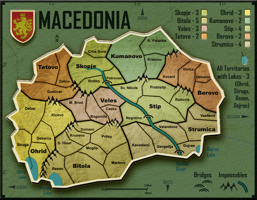
n.n. wrote:Hi, new versions...
Changes:
- territories names enlarged
- continent color boxes enlarged (bonuses section)
- changed "Lakes" label to "All Territories with Lakes"
- enlarged list of territories with lakes
- added border to lake icon above "All Territories with Lakes" label
- other minor graphic changes (lighter border burn, etc...)
We will make appropriate changes to the xml file too after the graphic discussion is over.
Version 1.9, Large:
Version 1.9, Small:
Waiting for comments...
(Maybe keep the smaller font for the Large version ?)
Hey n.n., before you come with the new version can you make a couple of color switches?
You have two green and two brown regions bordering each other. My suggestion is that you change colors between Skopje/Tetovo and Strumica/Berovo.
Waiting for the next update
-

 fumandomuerte
- Posts: 620
- Joined: Sat Dec 29, 2007 1:27 am
- Location: The Cinderella of the Pacific


Re: Macedonia map [Gp]
That does raise the question: has this map been run through the colour-blind filters? (I am going to be lazy today and not search back through the whole topic.) Admittedly, the heavy borders between zones (bonus areas) are clear, so the colours may not matter too much.
-

 ender516
- Posts: 4455
- Joined: Wed Dec 17, 2008 6:07 pm
- Location: Waterloo, Ontario


Re: Macedonia map [Gp]
The colours won't matter much, as long as there are no adjacent colours that are too similar to each other for the colour blind. The bolded region names is a good way to identify bonus areas.
Anyway, here goes:

Tetovo & Skopje are perhaps the only ones that could cause problems.
IMO the best solution would be swapping the colours of Tetovo & Strumica.
Anyway, here goes:

Tetovo & Skopje are perhaps the only ones that could cause problems.
IMO the best solution would be swapping the colours of Tetovo & Strumica.

-

 natty dread
- Posts: 12877
- Joined: Fri Feb 08, 2008 8:58 pm
- Location: just plain fucked


Re: Macedonia map [Gp]
just a stupid question
are all the bonus minuses
maybe just put a plus instead of hyphen sign
Skopje +3 instead of Skopje -3
are all the bonus minuses
maybe just put a plus instead of hyphen sign
Skopje +3 instead of Skopje -3
De gueules à la tour d'argent ouverte, crénelée de trois pièces, sommée d'un donjon ajouré, crénelé de deux pièces
Gules an open tower silver, crenellated three parts, topped by a apertured turret, crenellated two parts
Gules an open tower silver, crenellated three parts, topped by a apertured turret, crenellated two parts
-

 pamoa
pamoa
- Posts: 1242
- Joined: Sat Sep 01, 2007 3:18 am
- Location: Confederatio Helvetica


Re: Macedonia map [Gp]
well, i must agree, pluses are better !
(another day or two before new version...)
(another day or two before new version...)
Live long and prosper.
-

 n.n.
n.n.
- Posts: 156
- Joined: Mon Sep 03, 2007 4:47 am
- Location: Macedonia


Re: Macedonia map [Gp]
Check your colors, and think about a small thematic addition, and give it a try. It might not need it as it seems pretty good so far without much in this category of additions, but it never hurts to throw in another layer and see what it looks like, easy to delete if it sucks. 


-

 RedBaron0
- Posts: 2657
- Joined: Sun Aug 19, 2007 12:59 pm
- Location: Pennsylvania


Who is online
Users browsing this forum: No registered users

