ian.
CLASSIC CITIES: Moscow [Quenched]
Moderator: Cartographers
Re: CLASSIC CITIES: Moscow [26.6.12] V11-P7
![]() by iancanton on Wed Jun 27, 2012 1:00 am
by iancanton on Wed Jun 27, 2012 1:00 am
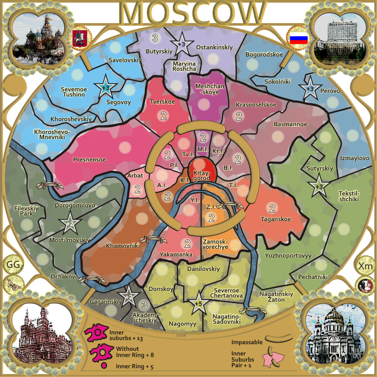
sorry for the delay. i confirm nolefan's conclusion that the gameplay is solid, so u can feel free to progress the graphics without fear that the borders need to change for gameplay reasons. the only additional suggestions i have are for the green bonus to be reduced from +4 to +3 and for the inner ring neutrals to be amended from n3 to n2, both to encourage more play in the middle; these do not require graphic changes.
ian.
ian.

-

 iancanton
- Foundry Foreman

- Posts: 2433
- Joined: Fri Jun 01, 2007 5:40 am
- Location: europe


Re: CLASSIC CITIES: Moscow [27.6.12] V12-P7
![]() by cairnswk on Wed Jun 27, 2012 2:37 am
by cairnswk on Wed Jun 27, 2012 2:37 am
koontz1973 wrote:cairnswk, these areas are now good in my opinion but you do need to polish them all up.
Title, good to see the whole thing now. But needs the polish.
Picture (top right) far better. Bottom rights sky is too light, darken that with some blue.
Bridges, some of the best and really work with this style.
The rest of the map, and that is everything, will need to be gone over with a fine tooth comb, changed altered and just generally brought up to standard. Sorry to be blunt about that.
koontz, i'll take a peak at these later....
iancanton wrote:sorry for the delay. i confirm nolefan's conclusion that the gameplay is solid, so u can feel free to progress the graphics without fear that the borders need to change for gameplay reasons. the only additional suggestions i have are for the green bonus to be reduced from +4 to +3 and for the inner ring neutrals to be amended from n3 to n2, both to encourage more play in the middle; these do not require graphic changes.
ian.
ian thanks for replying and no perceived delay.
adjustments above made in version 12.

* Pearl Harbour * Waterloo * Forbidden City * Jamaica * Pot Mosbi
-

cairnswk
- Posts: 11510
- Joined: Sat Feb 03, 2007 8:32 pm
- Location: Australia


Re: CLASSIC CITIES: Moscow [27.6.12] V12-P7
![]() by isaiah40 on Wed Jun 27, 2012 5:17 pm
by isaiah40 on Wed Jun 27, 2012 5:17 pm
Before I make any comments on this, I have one question. What style/theme are you going for?
-
isaiah40
- Posts: 3990
- Joined: Mon Aug 27, 2007 7:14 pm


Re: CLASSIC CITIES: Moscow [27.6.12] V12-P7
![]() by cairnswk on Wed Jun 27, 2012 5:38 pm
by cairnswk on Wed Jun 27, 2012 5:38 pm
isaiah40 wrote:Before I make any comments on this, I have one question. What style/theme are you going for?
Russian jewellry
* Pearl Harbour * Waterloo * Forbidden City * Jamaica * Pot Mosbi
-
cairnswk
- Posts: 11510
- Joined: Sat Feb 03, 2007 8:32 pm
- Location: Australia
Re: CLASSIC CITIES: Moscow [27.6.12] V12-P7
![]() by Nola_Lifer on Thu Jun 28, 2012 1:16 pm
by Nola_Lifer on Thu Jun 28, 2012 1:16 pm
cairnswk wrote:isaiah40 wrote:Before I make any comments on this, I have one question. What style/theme are you going for?
Russian jewellry
Faberge eggs?

-

Nola_Lifer
- Posts: 819
- Joined: Mon Oct 13, 2008 4:46 pm
- Location: 雪山


Re: CLASSIC CITIES: Moscow [27.6.12] V12-P7
![]() by cairnswk on Thu Jun 28, 2012 3:59 pm
by cairnswk on Thu Jun 28, 2012 3:59 pm
Nola_Lifer wrote:cairnswk wrote:...
Russian jewellry
Faberge eggs?
no.
* Pearl Harbour * Waterloo * Forbidden City * Jamaica * Pot Mosbi
-
cairnswk
- Posts: 11510
- Joined: Sat Feb 03, 2007 8:32 pm
- Location: Australia
Re: CLASSIC CITIES: Moscow [29.6.12] V12a-P8
![]() by cairnswk on Thu Jun 28, 2012 4:14 pm
by cairnswk on Thu Jun 28, 2012 4:14 pm
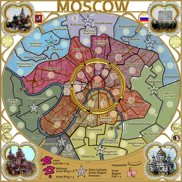
Version 12a
the title in gold.
the title in gold.
* Pearl Harbour * Waterloo * Forbidden City * Jamaica * Pot Mosbi
-
cairnswk
- Posts: 11510
- Joined: Sat Feb 03, 2007 8:32 pm
- Location: Australia
Re: CLASSIC CITIES: Moscow [26.6.12] V11-P7
![]() by cairnswk on Thu Jun 28, 2012 6:06 pm
by cairnswk on Thu Jun 28, 2012 6:06 pm
koontz1973 wrote:cairnswk, these areas are now good in my opinion but you do need to polish them all up.
Title, good to see the whole thing now. But needs the polish.
Picture (top right) far better. Bottom rights sky is too light, darken that with some blue.
Bridges, some of the best and really work with this style.
The rest of the map, and that is everything, will need to be gone over with a fine tooth comb, changed altered and just generally brought up to standard. Sorry to be blunt about that.
koontz, thanks for those...these are being worked on now...
* Pearl Harbour * Waterloo * Forbidden City * Jamaica * Pot Mosbi
-
cairnswk
- Posts: 11510
- Joined: Sat Feb 03, 2007 8:32 pm
- Location: Australia
Re: CLASSIC CITIES: Moscow [29.6.12] V12a-P8
![]() by isaiah40 on Thu Jun 28, 2012 7:40 pm
by isaiah40 on Thu Jun 28, 2012 7:40 pm
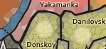
Russian Jewels?? My first thought on the playable area was stained glass, but doesn't look like stained glass.
The jewels around each picture, get rid of the glow or whatever it is around them.
There is some brown protruding out from underneath the frame area, top, top left and left side.
There is a little blip here:

The jewels around each picture, get rid of the glow or whatever it is around them.
There is some brown protruding out from underneath the frame area, top, top left and left side.
There is a little blip here:
-
isaiah40
- Posts: 3990
- Joined: Mon Aug 27, 2007 7:14 pm
Re: CLASSIC CITIES: Moscow [29.6.12] V12a-P8
![]() by koontz1973 on Mon Jul 02, 2012 6:23 am
by koontz1973 on Mon Jul 02, 2012 6:23 am
Like the title in gold, is the rest of the frame going to be like that?

-

koontz1973
- Posts: 6960
- Joined: Thu Jan 01, 2009 10:57 am


Re: CLASSIC CITIES: Moscow [29.6.12] V12a-P8
![]() by cairnswk on Mon Jul 02, 2012 6:26 am
by cairnswk on Mon Jul 02, 2012 6:26 am
koontz1973 wrote:Like the title in gold, is the rest of the frame going to be like that?
Not sure yet...if i can achieve that effect and it doesn't look too gory or unrealistic....who knows.
Plus i want to do a bit of experimenting in PS to see what i can develop there.
* Pearl Harbour * Waterloo * Forbidden City * Jamaica * Pot Mosbi
-
cairnswk
- Posts: 11510
- Joined: Sat Feb 03, 2007 8:32 pm
- Location: Australia
Re: CLASSIC CITIES: Moscow [29.6.12] V12a-P8
![]() by cairnswk on Thu Jul 19, 2012 7:25 pm
by cairnswk on Thu Jul 19, 2012 7:25 pm
also seeing what i can do with the diamonds...whether they will be good enough in CD vector or if the bitmpas will have to suffice for visisbility reasons.
* Pearl Harbour * Waterloo * Forbidden City * Jamaica * Pot Mosbi
-
cairnswk
- Posts: 11510
- Joined: Sat Feb 03, 2007 8:32 pm
- Location: Australia
Re: CLASSIC CITIES: Moscow [27.7.12] V13-P8
![]() by cairnswk on Thu Jul 26, 2012 5:49 pm
by cairnswk on Thu Jul 26, 2012 5:49 pm
isaiah40 wrote:Russian Jewels?? My first thought on the playable area was stained glass, but doesn't look like stained glass.
Now that you've said that, i have tried to apply a leaded glass effect on the outer regions to see what you'all think.
The jewels around each picture, get rid of the glow or whatever it is around them.
Removed, and have redone the diamonds around the pictures...with new contrast to make them a little more whitish diamonds
There is some brown protruding out from underneath the frame area, top, top left and left side.
There is a little blip here:
I beleive those have been fixed.
I'm still trying to work on the gold effects..it's not working well at present and may take some time.
For now...version 13...
* Pearl Harbour * Waterloo * Forbidden City * Jamaica * Pot Mosbi
-
cairnswk
- Posts: 11510
- Joined: Sat Feb 03, 2007 8:32 pm
- Location: Australia
Re: CLASSIC CITIES: Moscow [27.7.12] V13-P8
![]() by cairnswk on Thu Jul 26, 2012 6:46 pm
by cairnswk on Thu Jul 26, 2012 6:46 pm
oh, and, this has been downsized from 735x735 to 630x630px
* Pearl Harbour * Waterloo * Forbidden City * Jamaica * Pot Mosbi
-
cairnswk
- Posts: 11510
- Joined: Sat Feb 03, 2007 8:32 pm
- Location: Australia
Re: CLASSIC CITIES: Moscow [27.7.12] V13-P8
![]() by nolefan5311 on Thu Jul 26, 2012 9:26 pm
by nolefan5311 on Thu Jul 26, 2012 9:26 pm
This looks really good cairns!
-

nolefan5311
- Posts: 1768
- Joined: Mon Nov 22, 2010 11:51 am
- Location: Florida


Re: CLASSIC CITIES: Moscow [27.7.12] V13-P8
![]() by isaiah40 on Wed Aug 01, 2012 9:05 am
by isaiah40 on Wed Aug 01, 2012 9:05 am
I'm liking the leaded glass look on the outside regions, do the rest that way and I'll give you a better answer.
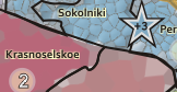
These two areas, the borders look like you did them twice and didn't quite get them exactly the same.

This one now goes up instead of down!
These two areas, the borders look like you did them twice and didn't quite get them exactly the same.
This one now goes up instead of down!
-
isaiah40
- Posts: 3990
- Joined: Mon Aug 27, 2007 7:14 pm
Re: CLASSIC CITIES: Moscow [27.7.12] V13-P8
![]() by cairnswk on Sun Aug 05, 2012 8:50 pm
by cairnswk on Sun Aug 05, 2012 8:50 pm
isaiah40 wrote:I'm liking the leaded glass look on the outside regions, do the rest that way and I'll give you a better answer.
Are they too small or too big for leaded glass?
This one now goes up instead of down!
Not sure what you mean here?
* Pearl Harbour * Waterloo * Forbidden City * Jamaica * Pot Mosbi
-
cairnswk
- Posts: 11510
- Joined: Sat Feb 03, 2007 8:32 pm
- Location: Australia
Re: CLASSIC CITIES: Moscow [27.7.12] V13-P8
![]() by sannemanrobinson on Mon Aug 06, 2012 7:06 am
by sannemanrobinson on Mon Aug 06, 2012 7:06 am
I don't really see leaded glass in it. Maybe if there are some colour variation within a bonus it would look more natural.
The gold ring looks good btw. Integration with the theme could possibly be that the ring was originally full but there are some gaps in it from wear and tear.
The gold ring looks good btw. Integration with the theme could possibly be that the ring was originally full but there are some gaps in it from wear and tear.
-
sannemanrobinson
- Posts: 255
- Joined: Mon Dec 20, 2010 6:35 am


Re: CLASSIC CITIES: Moscow [27.7.12] V13-P8
![]() by cairnswk on Tue Aug 07, 2012 3:41 pm
by cairnswk on Tue Aug 07, 2012 3:41 pm
OK.sannemanrobinson wrote:I don't really see leaded glass in it. Maybe if there are some colour variation within a bonus it would look more natural.
The gold ring looks good btw. Integration with the theme could possibly be that the ring was originally full but there are some gaps in it from wear and tear.
glad you like the gold ring, but what do you mean by the rest?
* Pearl Harbour * Waterloo * Forbidden City * Jamaica * Pot Mosbi
-
cairnswk
- Posts: 11510
- Joined: Sat Feb 03, 2007 8:32 pm
- Location: Australia
Re: CLASSIC CITIES: Moscow [27.7.12] V13-P8
![]() by sannemanrobinson on Tue Aug 07, 2012 5:36 pm
by sannemanrobinson on Tue Aug 07, 2012 5:36 pm
cairnswk wrote:glad you like the gold ring, but what do you mean by the rest?
If it is a gold ring on a window it is more logical if it was originally fult closed. If the edges of the gaps are not so round but broken pieces it might look more natural. Some cracks or dirt or pieces of lead might do the trick.
-
sannemanrobinson
- Posts: 255
- Joined: Mon Dec 20, 2010 6:35 am
Re: CLASSIC CITIES: Moscow [27.7.12] V13-P8
![]() by cairnswk on Tue Aug 07, 2012 5:44 pm
by cairnswk on Tue Aug 07, 2012 5:44 pm
sannemanrobinson wrote:cairnswk wrote:glad you like the gold ring, but what do you mean by the rest?
If it is a gold ring on a window it is more logical if it was originally fult closed. If the edges of the gaps are not so round but broken pieces it might look more natural. Some cracks or dirt or pieces of lead might do the trick.
Ah...now i understand what you mean...although for the image i'm not quite sure that's what i was aiming for
but we'll see.
* Pearl Harbour * Waterloo * Forbidden City * Jamaica * Pot Mosbi
-
cairnswk
- Posts: 11510
- Joined: Sat Feb 03, 2007 8:32 pm
- Location: Australia
Re: CLASSIC CITIES: Moscow [12.8.12] V14-P9 GFX
![]() by cairnswk on Sat Aug 11, 2012 4:24 pm
by cairnswk on Sat Aug 11, 2012 4:24 pm
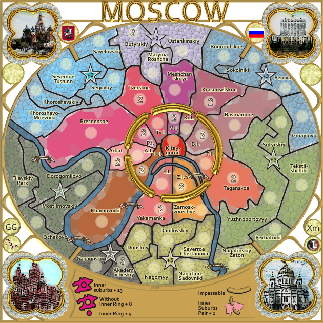
Version 14.
I'm mucking around with different textures at present and presentation.
I think this version might be the go moving forward.
Because i chose to update the map inline with the google map, the river has moved.
This caused a change in the layout of the olive regions below Yaramanka and also to the Ochakovo border.
I'm wondering if nolefan5311 will re-examine those regions to ensure to bonuses are correct, please.
I'll continue to update this version until all the mosaic look is complete around the map unless there is a huge negative backlash about it.
* Pearl Harbour * Waterloo * Forbidden City * Jamaica * Pot Mosbi
-
cairnswk
- Posts: 11510
- Joined: Sat Feb 03, 2007 8:32 pm
- Location: Australia
Re: CLASSIC CITIES: Moscow [12.8.12] V14-P9 GFX
![]() by x-raider on Sat Aug 11, 2012 5:19 pm
by x-raider on Sat Aug 11, 2012 5:19 pm
Looking good...
-

x-raider
- Posts: 248
- Joined: Tue Nov 17, 2009 5:32 am
- Location: Lost in the Complexities of the Undiscovered Universe


Re: CLASSIC CITIES: Moscow [12.8.12] V14-P9 GFX
![]() by Oneyed on Mon Aug 13, 2012 6:13 pm
by Oneyed on Mon Aug 13, 2012 6:13 pm
the mosaic looks nice. looking forward to see all map done in mosaic.
Oneyed
Oneyed
-

Oneyed
- Posts: 1058
- Joined: Sat Dec 10, 2011 12:29 pm


Re: CLASSIC CITIES: Moscow [12.8.12] V14-P9 GFX
![]() by cairnswk on Tue Aug 14, 2012 4:16 pm
by cairnswk on Tue Aug 14, 2012 4:16 pm
x-raider wrote:Looking good...
Oneyed wrote:the mosaic looks nice. looking forward to see all map done in mosaic.
Oneyed
the mosaic is done on the inner regions...the outer regions still to be completed....it's taking quite a while.
not sure about the street "vein" colour yet.
I've also placed in the latest update to V14 (pls refresh) the star bonus.
* Pearl Harbour * Waterloo * Forbidden City * Jamaica * Pot Mosbi
-
cairnswk
- Posts: 11510
- Joined: Sat Feb 03, 2007 8:32 pm
- Location: Australia
Who is online
Users browsing this forum: No registered users
|
|||||||
| Conquer Club is not associated with RISK online in any way. Copyright © 2006-2025 by Big Wham LLC | |||||||