cairnswk wrote:OK, i want this to succeed, so don't think i am hastling...
Never a hastle.
1. we had this issue in a previous map...can't remember which one it was...but the lack of black border on the sides of the river looks awkward, and unfinished.
I do not like the black border anyway. It is a half arsed job to get a reaction. Will play around with something but it is Jakarta you are thinking about.
2. your vanishing point is not consistent...you've got the top of the pyramid heading off into the sky while the bottom heads over to the sun
Two vanishing points, not unheard of. But with the pyramid in the foreground, it should go up, whilst the setting sun should go down.
3. the light from the setting sun is too intense and over takes the title, the font of which is quite pleasing.
Will fix.
4. the one part that looks perfect is the camel, although the shadow seems too long for the lowness of the sun.
Debatable, but will shorten it.
5. the shadow side of the big pyramid is darker than the shadow side of the small
Will fix.
6. i don't quite understand the light beacon on top the large pyramid...what is it meant to be there for?
Just a copy from a photo I saw. Quite liked it as it drew my eye towards it. But will remove.
7. the font for the terts, is quite hard to read.
Trying something different. Will see if I can get it to work, if not, will go towards a more traditional method.
8. some small glyphs are hard to make out.
First try, will keep on trying.
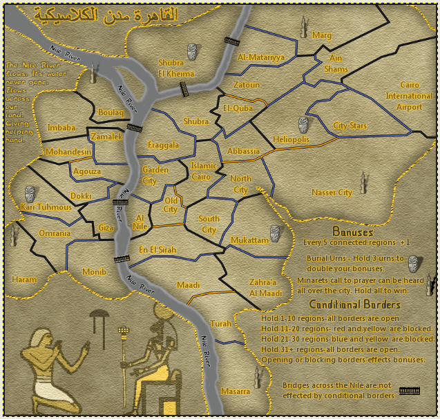
9. i think you need to add symbol to each of the explanations, either that or make a heading called Symbol Bonuses, and hold 4 of the same -3 listed underneath.
Rules will be finalised later. Then the explanations will go on more fully.
10. my eye is drawn to your sig. needs moving to the side and less intense.
sorry the list is so long, but these are just challenges to overcome, that's all.

Will move sig.
While I work on the map side of things, here is the background without the map itself.


