Conquer Club

[Abandoned] Massacre à Paris

Abandoned and Vacationed maps. The final resting place, unless you recycle.

Moderator: Cartographers

Forum rules
Please read the Community Guidelines before posting.

Re: Re: Massacre à Paris [1.12.12] V7-P3 Gameplay

Postby cairnswk on Sat Dec 01, 2012 2:37 am

koontz1973 wrote:
cairnswk wrote:Thank-you koontz for keeping as always the stuff upper lip...holding up the process...instead of getting this into workshop where players can see it the gameplay discussion area, you're going to hold it up for a few more days...congratuations...are you sure you didn't work for the Brits before WWI before the "parade ended"...sometimes the bueacracy never ceases to amaze me :roll:
no offense koontz, but holding up a map for the sake of process is simply plain stupid.


No it is not stupid. And I did not hold the map up for the sake of the process. I held this one up as I was not sure which way you where going with it so until I was, I kept it here as per the drafting room guidelines.
As for the playable image, you only provided bonuses 2 days ago and text that I could read yesterday, and finished that of with the update before your 88 tests. All done whilst I was asleep. I asked you a gameplay question about the starting advantage which you have answered with this:
Perhaps we need to minimise that somehow

You want ideas from us, but you have not given any indication of what your ideas would be, what your preference would be. I gave you the benefit of the doubt as you have made many many maps and gave you the sticky. I did this as soon as I had logged on.

So where in your opinion have I held this up for the sake of it?


koontz...yes i have done many maps, and because of the process of this foundry where everyone gets to have a say, i quite often now hold back on my opinions about how things should work, since my ideas may not always be the best for the map, and others e.g yourself, funkyterrance, DoomYoshi etc. in this map may have ideas that will enhance the playability of the map particarliy (since conditional border were discussed as one stage), and everyone seemed to have difficulty at how the connections worked since i failed to state clearly in everyone else's language their machanics.
I beleive i gave the main coditions for what my ideas were for the map at the start, and this has now been somewhat enhanced and i have had to improve the graphics towards same.
If i only provided the main conditions for the map while you were asleep, then now that they seem to be provided, holding it up does nothing for the discussion process.
So continue, if you want to hold it up... :)
Image
* Pearl Harbour * Waterloo * Forbidden City * Jamaica * Pot Mosbi
User avatar
Private cairnswk
 
Posts: 11510
Joined: Sat Feb 03, 2007 8:32 pm
Location: Australia

Re: Re: Massacre à Paris [1.12.12] V7-P3 Gameplay

Postby koontz1973 on Sat Dec 01, 2012 3:01 am

So continue, if you want to hold it up... :)

Thank you for giving me permission. =D> :P

And as always, I stickied when conditions warranted it and will move it 48 hours later as per my normal routine. I am not stopping you talking about game play or graphics while here. :) In fact, I encourage it as it means less work later for the game play and graphics mods. :)
Image
User avatar
Lieutenant koontz1973
 
Posts: 6960
Joined: Thu Jan 01, 2009 10:57 am

Re: Re: Massacre à Paris [1.12.12] V7-P3 Gameplay

Postby cairnswk on Sat Dec 01, 2012 3:02 am

koontz1973 wrote:
So continue, if you want to hold it up... :)

Thank you for giving me permission. =D> :P
...

oh you didn't need my permission !
Image
* Pearl Harbour * Waterloo * Forbidden City * Jamaica * Pot Mosbi
User avatar
Private cairnswk
 
Posts: 11510
Joined: Sat Feb 03, 2007 8:32 pm
Location: Australia

Re: Massacre à Paris [1.12.12] V7-P3 Gameplay

Postby Funkyterrance on Sat Dec 01, 2012 8:36 pm

Cairns, when I stated I was hopeful that the map would take color-blindness into consideration I mean in general. I'm not all that familiar with the drafting process so I didn't know whether or not once a change was made if it was permanent and tbh I still had a little trouble telling the black pants from the brown(?) pants. I just figured I would get my 2 cents in before the map was advanced to the next stage, causing you to get further agitated.

I still would appreciate a direct answer to this question:

Funkyterrance wrote: For instance, in the case of H01, CO2, CA, and HB, are all four of these terts considered adjacent?


If I knew the answer to this question I would have a better idea whether or not my fears of an unbalanced map were warranted. If the borders of certain bonus areas are 2 terts wide as opposed to 1 it would make a world of difference.
Image
User avatar
Colonel Funkyterrance
 
Posts: 2494
Joined: Wed Jan 19, 2011 10:52 pm
Location: New Hampshire, USA

Re: Re: Massacre à Paris [1.12.12] V7-P3 Gameplay

Postby Funkyterrance on Sat Dec 01, 2012 8:42 pm

I've got a suggestion that may be helpful: Make pavestones or something on the ground under the duelers so that it is obvious who can attack who. As it stands it could be a bit jumbled. Something like a dueler can attack any adjacent pavestone. It's just the sort of thing that could make the difference between someone trying or not trying out the map based on how easily read it is. If you don't know what I mean by pavestones I can try to clarify. :)
Image
User avatar
Colonel Funkyterrance
 
Posts: 2494
Joined: Wed Jan 19, 2011 10:52 pm
Location: New Hampshire, USA

Re: Massacre à Paris [1.12.12] V7-P3 Gameplay

Postby generalhead on Sat Dec 01, 2012 8:57 pm

Funkyterrance wrote:Cairns, when I stated I was hopeful that the map would take color-blindness into consideration I mean in general. I'm not all that familiar with the drafting process so I didn't know whether or not once a change was made if it was permanent and tbh I still had a little trouble telling the black pants from the brown(?) pants. I just figured I would get my 2 cents in before the map was advanced to the next stage, causing you to get further agitated.

I still would appreciate a direct answer to this question:

Funkyterrance wrote: For instance, in the case of H01, CO2, CA, and HB, are all four of these terts considered adjacent?


If I knew the answer to this question I would have a better idea whether or not my fears of an unbalanced map were warranted. If the borders of certain bonus areas are 2 terts wide as opposed to 1 it would make a world of difference.


It shows in the attack route in the legend how they can attack within the region and then cairns installed the asterisks to show how they can attack between regions. I am shore the asterisk are just temporary and will get changed once cairns works on graphics, but right now cairns is just trying to show game play. The attack routes and asterisks have made it pretty clear. It is pretty much you can attack the same color adjacent swordsman and you can attack the opposing color adjacent swordsman. adjacent would be like tic tac toe, up down and diagonal. That goes for in regions and across regions.
Sergeant generalhead
 
Posts: 806
Joined: Mon Apr 26, 2010 10:09 pm

Re: Massacre à Paris [1.12.12] V7-P3 Gameplay

Postby cairnswk on Sat Dec 01, 2012 9:16 pm

Funkyterrance wrote:Cairns, when I stated I was hopeful that the map would take color-blindness into consideration I mean in general. I'm not all that familiar with the drafting process so I didn't know whether or not once a change was made if it was permanent and tbh I still had a little trouble telling the black pants from the brown(?) pants. I just figured I would get my 2 cents in before the map was advanced to the next stage, causing you to get further agitated.

i don't beleive i got agitated over the CB issue since i was testing for it myself to see what colours would be working, so your questioning on this was not a hit at you.

I still would appreciate a direct answer to this question:

Funkyterrance wrote: For instance, in the case of H01, CO2, CA, and HB, are all four of these terts considered adjacent?


If I knew the answer to this question I would have a better idea whether or not my fears of an unbalanced map were warranted. If the borders of certain bonus areas are 2 terts wide as opposed to 1 it would make a world of difference.


Since i have now changed the" who can attack who re the border issues" in the above V7, i am not going to feed you terrance with an answer to this...please examine the map above and notice the legend wording and then apply it to the map. You might notice the wording on impassables (hint: wall between H01 and CA) and duelers marked with an asterisk (*C02 and *HB). Then come back with your answer.

Funkyterrance wrote:I've got a suggestion that may be helpful: Make pavestones or something on the ground under the duelers so that it is obvious who can attack who. As it stands it could be a bit jumbled. Something like a dueler can attack any adjacent pavestone. It's just the sort of thing that could make the difference between someone trying or not trying out the map based on how easily read it is. If you don't know what I mean by pavestones I can try to clarify. :)


That is a helpful suggestion, and were there more room in the small version i would probably consider doing something towards this.
However, I think it will clutter the ground appearance and make the map more intense than is needs to be graphic wise, and colourw-ise that could become another issue/road i don't want to travel...i would like to keep this as simply as possible...and we will all get there together to find a solution that fits all.
i beleive the current V7 with rectangles for the tert code and squares above it for army numbers may provide some better interpretation for you.
Image
* Pearl Harbour * Waterloo * Forbidden City * Jamaica * Pot Mosbi
User avatar
Private cairnswk
 
Posts: 11510
Joined: Sat Feb 03, 2007 8:32 pm
Location: Australia

Re: Massacre à Paris [1.12.12] V7-P3 Gameplay

Postby cairnswk on Sat Dec 01, 2012 9:26 pm

generalhead wrote:...It shows in the attack route in the legend how they can attack within the region and then cairns installed the asterisks to show how they can attack between regions. I am shore the asterisk are just temporary and will get changed once cairns works on graphics, but right now cairns is just trying to show game play. The attack routes and asterisks have made it pretty clear. It is pretty much you can attack the same color adjacent swordsman and you can attack the opposing color adjacent swordsman. adjacent would be like tic tac toe, up down and diagonal. That goes for in regions and across regions.

Spot on. :) but don't forget the impassables.
Image
* Pearl Harbour * Waterloo * Forbidden City * Jamaica * Pot Mosbi
User avatar
Private cairnswk
 
Posts: 11510
Joined: Sat Feb 03, 2007 8:32 pm
Location: Australia

Re: Re: Massacre à Paris [1.12.12] V7-P3 Gameplay

Postby Funkyterrance on Sun Dec 02, 2012 2:32 pm

Cool, I somehow missed the whole asterisk thing, thanks guys. :)
Smaller "bottlenecks" tend to lead to more unbalanced play but to me, now knowing the border widths, it looks like it could be ok. I suppose trying it out for 10 games or so will be the real test.
Image
User avatar
Colonel Funkyterrance
 
Posts: 2494
Joined: Wed Jan 19, 2011 10:52 pm
Location: New Hampshire, USA

Re: Massacre à Paris [1.12.12] V7-P3 Gameplay

Postby cairnswk on Sun Dec 02, 2012 2:47 pm

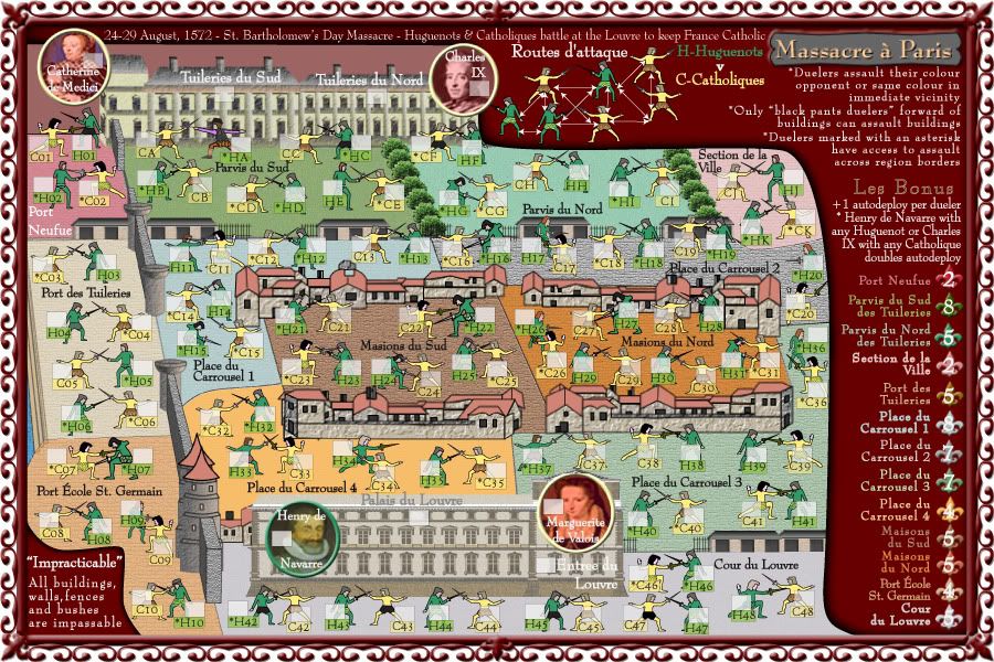
Version 7 - bumped
Click image to enlarge.
image
Image
* Pearl Harbour * Waterloo * Forbidden City * Jamaica * Pot Mosbi
User avatar
Private cairnswk
 
Posts: 11510
Joined: Sat Feb 03, 2007 8:32 pm
Location: Australia

Re: Re: Massacre à Paris [1.12.12] V7-P3 Gameplay

Postby Funkyterrance on Sun Dec 02, 2012 3:05 pm

Looks nice, much easier to read now.
Image
User avatar
Colonel Funkyterrance
 
Posts: 2494
Joined: Wed Jan 19, 2011 10:52 pm
Location: New Hampshire, USA

Re: Re: Massacre à Paris [1.12.12] V7-P3 Gameplay

Postby koontz1973 on Sun Dec 02, 2012 11:58 pm

And 2 days later we get this. :D
Image

See cairns, the anticipation of a stamp makes it all the more sweeter when you finally get it. ;)

But GL in the MFW.
Image
User avatar
Lieutenant koontz1973
 
Posts: 6960
Joined: Thu Jan 01, 2009 10:57 am

Re: Re: Massacre à Paris [1.12.12] V7-P3 Gameplay

Postby cairnswk on Mon Dec 03, 2012 12:25 am

koontz1973 wrote:And 2 days later we get this. :D
Image

See cairns, the anticipation of a stamp makes it all the more sweeter when you finally get it. ;)

But GL in the MFW.

Thank-you koontz....i would do if i could have but i couldn't so i'll have to keep criticizing. :twisted:
Image
* Pearl Harbour * Waterloo * Forbidden City * Jamaica * Pot Mosbi
User avatar
Private cairnswk
 
Posts: 11510
Joined: Sat Feb 03, 2007 8:32 pm
Location: Australia

Re: Re: Massacre à Paris [1.12.12] V7-P3 Gameplay

Postby koontz1973 on Mon Dec 03, 2012 12:37 am

Criticize all you like. It is like waters of a duck back. Image :P
Image
User avatar
Lieutenant koontz1973
 
Posts: 6960
Joined: Thu Jan 01, 2009 10:57 am

Re: Re: Massacre à Paris [1.12.12] V7-P3 Gameplay

Postby cairnswk on Mon Dec 03, 2012 12:43 am

koontz1973 wrote:Criticize all you like. It is like waters of a duck back. Image :P

My goodness, i have got you in a "good" mood :P
Image
* Pearl Harbour * Waterloo * Forbidden City * Jamaica * Pot Mosbi
User avatar
Private cairnswk
 
Posts: 11510
Joined: Sat Feb 03, 2007 8:32 pm
Location: Australia

Re: Re: Massacre à Paris [1.12.12] V7-P3 Gameplay

Postby Funkyterrance on Wed Dec 05, 2012 7:27 pm

Ok, I hate to be the one and it may be somewhat due to colorblindness but I have a hell of a time telling which duelers can attack the building without looking very carefully. Cairns, are you completely set on those colors for the pants and how adverse would you be to making them more contrasting for quicker scanning of the map? I think the black pants is a great idea but the other guys have dark pants as well so it takes some effort to make them out at this point.
Image
User avatar
Colonel Funkyterrance
 
Posts: 2494
Joined: Wed Jan 19, 2011 10:52 pm
Location: New Hampshire, USA

Re: Re: Massacre à Paris [1.12.12] V7-P3 Gameplay

Postby cairnswk on Wed Dec 05, 2012 11:55 pm

Funkyterrance wrote:Ok, I hate to be the one and it may be somewhat due to colorblindness but I have a hell of a time telling which duelers can attack the building without looking very carefully. Cairns, are you completely set on those colors for the pants and how adverse would you be to making them more contrasting for quicker scanning of the map? I think the black pants is a great idea but the other guys have dark pants as well so it takes some effort to make them out at this point.

NP terrance...there was a suggestion about changing the building guards to their proper uniform which may solve some part of this dilema....i'll see what i can do.
Image
* Pearl Harbour * Waterloo * Forbidden City * Jamaica * Pot Mosbi
User avatar
Private cairnswk
 
Posts: 11510
Joined: Sat Feb 03, 2007 8:32 pm
Location: Australia

Re: Re: Massacre à Paris [1.12.12] V7-P3 Gameplay

Postby Funkyterrance on Thu Dec 06, 2012 4:52 pm

cairnswk wrote:NP terrance...there was a suggestion about changing the building guards to their proper uniform which may solve some part of this dilema....i'll see what i can do.


Awesome. :)
I'm very much excited to try this map out.
Image
User avatar
Colonel Funkyterrance
 
Posts: 2494
Joined: Wed Jan 19, 2011 10:52 pm
Location: New Hampshire, USA

Re: Re: Massacre à Paris [14.12.12] V8-P3 Gameplay

Postby cairnswk on Thu Dec 13, 2012 4:17 pm

Funkyterrance wrote:
cairnswk wrote:NP terrance...there was a suggestion about changing the building guards to their proper uniform which may solve some part of this dilema....i'll see what i can do.


Awesome. :)
I'm very much excited to try this map out.

FT....i have coloured *HA in the colours of the guards and he has a balck hat. What can you see and is it distinct enough?
Click image to enlarge.
image
Image
* Pearl Harbour * Waterloo * Forbidden City * Jamaica * Pot Mosbi
User avatar
Private cairnswk
 
Posts: 11510
Joined: Sat Feb 03, 2007 8:32 pm
Location: Australia

Re: Re: Massacre à Paris [14.12.12] V8-P5 GP - Guards

Postby koontz1973 on Fri Dec 14, 2012 12:21 am

HA stands out a lot better.
Image
User avatar
Lieutenant koontz1973
 
Posts: 6960
Joined: Thu Jan 01, 2009 10:57 am

Re: Re: Massacre à Paris [14.12.12] V8-P5 GP - Guards

Postby cairnswk on Fri Dec 14, 2012 3:05 am

koontz1973 wrote:HA stands out a lot better.

you can see and i can see it but can FT see it better :)
Image
* Pearl Harbour * Waterloo * Forbidden City * Jamaica * Pot Mosbi
User avatar
Private cairnswk
 
Posts: 11510
Joined: Sat Feb 03, 2007 8:32 pm
Location: Australia

Re: Re: Massacre à Paris [14.12.12] V8-P5 GP - Guards

Postby koontz1973 on Fri Dec 14, 2012 3:20 am

cairnswk wrote:
koontz1973 wrote:HA stands out a lot better.

you can see and i can see it but can FT see it better :)

Don't care about FT, as long as I can see it and he cannot, should be some easy points for us. :lol:

But seriously, having another man their helps.
Image
User avatar
Lieutenant koontz1973
 
Posts: 6960
Joined: Thu Jan 01, 2009 10:57 am

Re: Re: Massacre à Paris [14.12.12] V8-P5 GP - Guards

Postby cairnswk on Fri Dec 14, 2012 4:18 am

koontz1973 wrote:Don't care about FT...

Just as I thought, selfish koontz! totally unsporting.
Image
* Pearl Harbour * Waterloo * Forbidden City * Jamaica * Pot Mosbi
User avatar
Private cairnswk
 
Posts: 11510
Joined: Sat Feb 03, 2007 8:32 pm
Location: Australia

Re: Re: Massacre à Paris [14.12.12] V8-P5 GP - Guards

Postby Funkyterrance on Sat Dec 15, 2012 3:36 pm

koontz1973 wrote:
cairnswk wrote:
koontz1973 wrote:HA stands out a lot better.

you can see and i can see it but can FT see it better :)

Don't care about FT, as long as I can see it and he cannot, should be some easy points for us. :lol:

But seriously, having another man their helps.


lolz!

Purple sleeves and black hat? Oh yeah, I can see it! If the rest of the guards of the buildings are going to have that same outfit it will be most excellently visible. Sorry koontz, looks like it will be an even playing field after all. :D

For future reference I thought I could add some colors that I generally get mixed up/can't distinguish. I do have a pretty common form of color-blindness so it may be useful:

Navy Blue/Black/Dark Grey: These all look more or less alike.
Pink/Light Grey: These tend to look identical a lot of the time.
Brown/Red/Black: Unless the brown is really light(tan) these all look pretty close as well.

The thing about partial colorblindness from what I can tell is that it's all about saturation. If color is on the light or dark side it makes it immensely harder if not impossible to tell the difference, depending on the level of saturation. For example, maps like Iberia are a piece of cake while something like Waterloo is quite challenging.
Image
User avatar
Colonel Funkyterrance
 
Posts: 2494
Joined: Wed Jan 19, 2011 10:52 pm
Location: New Hampshire, USA

Re: Re: Massacre à Paris [14.12.12] V8-P5 GP - Guards

Postby cairnswk on Sat Dec 15, 2012 3:55 pm

Funkyterrance wrote:
koontz1973 wrote:
cairnswk wrote:
koontz1973 wrote:HA stands out a lot better.

you can see and i can see it but can FT see it better :)

Don't care about FT, as long as I can see it and he cannot, should be some easy points for us. :lol:

But seriously, having another man their helps.


lolz!

Purple sleeves and black hat? Oh yeah, I can see it! If the rest of the guards of the buildings are going to have that same outfit it will be most excellently visible. Sorry koontz, looks like it will be an even playing field after all. :D

For future reference I thought I could add some colors that I generally get mixed up/can't distinguish. I do have a pretty common form of color-blindness so it may be useful:

Navy Blue/Black/Dark Grey: These all look more or less alike.
Pink/Light Grey: These tend to look identical a lot of the time.
Brown/Red/Black: Unless the brown is really light(tan) these all look pretty close as well.

The thing about partial colorblindness from what I can tell is that it's all about saturation. If color is on the light or dark side it makes it immensely harder if not impossible to tell the difference, depending on the level of saturation. For example, maps like Iberia are a piece of cake while something like Waterloo is quite challenging.


Thank-you FT. I'll put that in my bag of tricks for later reference! :)
Image
* Pearl Harbour * Waterloo * Forbidden City * Jamaica * Pot Mosbi
User avatar
Private cairnswk
 
Posts: 11510
Joined: Sat Feb 03, 2007 8:32 pm
Location: Australia

PreviousNext

Return to Recycling Box

Who is online

Users browsing this forum: No registered users

cron