PS: More detailed comments comming in a little while
[Abandoned] Research & Conquer
Moderator: Cartographers
Re: Research & Conquer (Layout V2 and 3 in P1 & P18)
Ooooooooooooooooooooooh 


PS: More detailed comments comming in a little while
PS: More detailed comments comming in a little while
Welcoming the long awaited Trench Warfare Setting (Previously Adjacent Attacks).
My Maps:
Research and Conquer - Civilization meets Conquer Club
Best score: 2,346 - Best position: #618 - Best percentile: 4.87%
My Maps:
Research and Conquer - Civilization meets Conquer Club
Best score: 2,346 - Best position: #618 - Best percentile: 4.87%
-

 OliverFA
- Posts: 2295
- Joined: Wed Jul 09, 2008 4:30 am
- Location: Somewhere in Spain


Re: Research & Conquer (DRAFT v0.8 in P1 & P19)
obviously you're gonna work on the actual playing area of the map, but i very much like the whole legend/lab area you've got set up. it looks very promising
-
 whitestazn88
- Posts: 3128
- Joined: Mon Feb 05, 2007 2:59 pm
- Location: behind you


Re: Research & Conquer (Layout V2 and 3 in P1 & P18)
TaCktiX wrote:Version 0.8
There it is. There's a lot of work to do, hence the Version 0.8. I posted it mainly to get the ball rolling on balancing things out, as we have the tripartite problem of balancing the research, balancing the claim to the rich center of the map, and balancing the ability to get to other players (though we're not aiming for equal access, that's ridiculous). For reference, everything is neutral (save the capital), M is Mine (and also neutral), C is Capital (starting position for each player).
To Do
- Add the legend in the bottom right
- Redraft numerous borders so they can fit names (albeit simple) and army circles
- Begin crafting the symbols for the map
- Add color to the map proper
- Finish the nonplayable "side countries" so the entire map's space is used
List o' Questions
Graphics/Understanding
Is the graphical style shown on the research good?Nice graphics, but there is too much white space around the map edges
Are the researches easy to understand?What is the difference between the laboratories and the top secret facilities
Gameplay
Should impassables be added and the overall setup of the map changed around? There should be a few more mines in the center, and the center mines should be placed slightly apart from each other. Also, the center should have some impassabled
Are the starts reasonably balanced whilst being asymmetric?The starting positions still seem too symmetrical. The only difference I see is that some have 3 borders and some have two
Any suggestions for balancing neutral counts?
Balancing the neutral counts can be done after the rest of the map is balanced
-
 Emperor_Metalman
- Posts: 78
- Joined: Fri May 25, 2007 5:45 pm


Re: Research & Conquer (DRAFT v0.8 in P1 & P19)
Just a quick question — why are there only 6 number slots? I will comment on everything else some other time 
.44
.44
-

 the.killing.44
- Posts: 4724
- Joined: Thu Oct 23, 2008 7:43 pm
- Location: now tell me what got two gums and knows how to spit rhymes


Re: Research & Conquer (DRAFT v0.8 in P1 & P19)
the.killing.44 wrote:Just a quick question — why are there only 6 number slots? I will comment on everything else some other time
.44
We got permission to do the map as a 6-player one instead of an 8. It works better for the current map size limitations.
Nice graphics, but there is too much white space around the map edges
I'm holding off on polishing the non-research areas into the final look, as the territories are very likely to change. No worries, those parts will look just fine in time.
What is the difference between the laboratories and the top secret facilities
It'll be covered in the (not there) legend. A Top Secret Facility has more neutrals, but a much fatter autodeploy when held. In general, the researches on the bottom are best gotten after a TSF is held.
There should be a few more mines in the center, and the center mines should be placed slightly apart from each other. Also, the center should have some impassabled
We'll take this into consideration. See below.
The starting positions still seem too symmetrical. The only difference I see is that some have 3 borders and some have two
We talked a lot about this, and we decided we wanted nearly identical starting areas. To satisfy the additional requirement of easily being able to attack other players (relatively), this impassable-less version came into existence. With some work on impassables like lakes, rivers, and the like, this can get fixed. Any and all suggestions for doing that would be appreciated, for coming up with territories off the top of one's head is not easy.
Balancing the neutral counts can be done after the rest of the map is balanced
I consider the neutral counts part of the balancing. There's no way we'll get perfect territory spacing or anything like that, and altering neutral numbers is the best way to effect balancing in those cases. So part and parcel there.
-

 TaCktiX
- Posts: 2392
- Joined: Mon Dec 17, 2007 8:24 pm
- Location: Rapid City, SD


Re: Research & Conquer (DRAFT v0.8 in P1 & P19)
The legend/title area look sweet. Nice work on that.
You mean to tell me that there's another explanation box thats going to be on the map? There's not much room left for territories after that. Could you box in the area where you're planning on putting that other box?
I don't like the layout of the land. I understand that you want starting positions equal, but I think it would look better if the land didn't look as "balanced". Does that make sense? It doesn't look like a land mass.
Also, the borders don't look good - I know they are just rough for placement, but the curving doesn't look right. Mix the straight lines in with the curves for a better look...
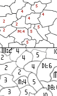
TaCktiX wrote:It'll be covered in the (not there) legend.
You mean to tell me that there's another explanation box thats going to be on the map? There's not much room left for territories after that. Could you box in the area where you're planning on putting that other box?
I don't like the layout of the land. I understand that you want starting positions equal, but I think it would look better if the land didn't look as "balanced". Does that make sense? It doesn't look like a land mass.
Also, the borders don't look good - I know they are just rough for placement, but the curving doesn't look right. Mix the straight lines in with the curves for a better look...


-

 RjBeals
- Posts: 2506
- Joined: Mon Nov 20, 2006 5:17 pm
- Location: South Carolina, USA


Re: Research & Conquer (DRAFT v0.8 in P1 & P19)
Great start Tack...
1 note I will make...
The 2 Conscription bonuses will make the map quite slow (i.e. like Conquerman)... and might be quite tricky to calculate as you will still have the 1 for 3 territories. Unless you add a whole new set of continents ontop of those too - thus will make the XML bigger (and slower)...
In other words The Territory matrix isn't available to be configured based on what you hold thus will have to be rewritten into continents...
Don't worry tho - it can be done.
Top Secret Facilites should only link to the second series of bonuses if you ask me...
i.e.
Research -> SA | SC | ZS | M | P
|
\/
Top Secret -> AR|OC|DD
C.

Highest score : 2297
-

 yeti_c
- Posts: 9624
- Joined: Thu Jan 04, 2007 9:02 am


Re: Research & Conquer (DRAFT v0.8 in P1 & P19)
This is my first real look at this map, and since I'm not privvy to any of the prior discussion about how it works I'm completely at a loss. Of course, 99% of the players of this map will not have read any of this either, so I'm your target audience. Are those territories in the legend? If so, what are they called? Do they attack each other? Can they be attacked by anything else? (If not, you're going to have stalemate games.) What's a homeland? And I assume the entire white area is incomplete, because nothing has territory names.
I see there is going to be another legend - good, because hopefully it will explain what I'm looking at.
As you guys proceed, make sure you aren't overlooking function for the sake of concept.
And visually the land looks very symmetrical - it can be balanced for gameplay without necessarily looking the same on each side.
-

 oaktown
- Posts: 4451
- Joined: Sun Dec 03, 2006 9:24 pm
- Location: majorcommand


Re: Research & Conquer (Layout V2 and 3 in P1 & P18)
The look of the Legend-ish stuff (For lack of better name) is very good currently (Heck its so good that Id love a tutorial on how you did it  ), but the middle needs more color
Also, this is very confusing currently, and unless you can explain things better for it then I can see this becoming more of a n00b farming map, even though (Last I knew) n00b farming is not allowed.
Cant wait to see how this ends up
Also, this is very confusing currently, and unless you can explain things better for it then I can see this becoming more of a n00b farming map, even though (Last I knew) n00b farming is not allowed.
Cant wait to see how this ends up
-
 bryguy
- Posts: 4381
- Joined: Tue Aug 07, 2007 8:50 am
- Location: Lost in a Jigsaw


Re: Research & Conquer (DRAFT v0.8 in P1 & P19)
Version 1 will be significantly delayed, as I am swamped under trying to finish my Senior Design project. Consider the land territories scrapped in their entirety (thanks for the suggestions that made that the best course of action). There WILL be a legend, which for sake of meeting my self-set 40 minute deadline several posts up got omitted.
I combined this tutorial with some judicious use of the Dodge tool and the Shift key for the pipe look. Each box has its own rust texture, the only addition I made is to add some Blur. The text has very basic outer glow effects on it for readability.
Heck its so good that Id love a tutorial on how you did it
I combined this tutorial with some judicious use of the Dodge tool and the Shift key for the pipe look. Each box has its own rust texture, the only addition I made is to add some Blur. The text has very basic outer glow effects on it for readability.
-

 TaCktiX
- Posts: 2392
- Joined: Mon Dec 17, 2007 8:24 pm
- Location: Rapid City, SD


Re: Research & Conquer (DRAFT v0.8 in P1 & P19)
I'm not fully convinced by the representation of the 'factory trees'... but will wait to see how it looks when it's in a more complete state before passing proper judgement 

PB: 2661 | He's blue... If he were green he would die | No mod would be stupid enough to do that
-

 MrBenn
- Posts: 6880
- Joined: Wed Nov 21, 2007 9:32 am
- Location: Off Duty


Re: Research & Conquer (DRAFT v0.8 in P1 & P19)
I have to say, I have been watching this develop from the original concept and I am really loving how it has been progressing. Great Job!!!
--Dolomite13
--Dolomite13
Where Have I Been? ... Testing a prototype board game that I co-designed called Alien Overrun!
-

 dolomite13
- Posts: 1379
- Joined: Mon Aug 18, 2008 5:54 pm


Re: Research & Conquer (DRAFT v0.8 in P1 & P19)
MrBenn wrote:I'm not fully convinced by the representation of the 'factory trees'... but will wait to see how it looks when it's in a more complete state before passing proper judgement
It's fairly simple. Laboratories can research anything below them, Top Secret Facilities can research anything to the right of them. I'll be adding some headings so that explaining that in legend is easy enough to understand.
-

 TaCktiX
- Posts: 2392
- Joined: Mon Dec 17, 2007 8:24 pm
- Location: Rapid City, SD


Re: Research & Conquer (DRAFT v0.8 in P1 & P19)
I could be way off but what I think is being implied is that it isn't easy to understand how you attack into the tech trees. If things were laid out with a little clearer borders and some arrows it might help. Here is a mockup I did based on that just as a brainstorming exercise. Hope you find it useful =)
--Dolomite13
http://farm4.static.flickr.com/3513/346 ... 090b_o.png
--Dolomite13
http://farm4.static.flickr.com/3513/346 ... 090b_o.png
Last edited by dolomite13 on Wed Apr 22, 2009 6:09 pm, edited 1 time in total.
Where Have I Been? ... Testing a prototype board game that I co-designed called Alien Overrun!
-

 dolomite13
- Posts: 1379
- Joined: Mon Aug 18, 2008 5:54 pm


Re: Research & Conquer (DRAFT v0.8 in P1 & P19)
Great! This looks much better than the first draft 
-
 Dublanous1
- Posts: 77
- Joined: Thu Sep 18, 2008 3:00 pm
- Location: NYC


Re: Research & Conquer (DRAFT v0.8 in P1 & P19)
Haha, I like this very much, but it's clear some of us play too much Age Of Empires  .
.
It's a bit hard to understand, but if I played it, I think I would understand .
.
It's a bit hard to understand, but if I played it, I think I would understand
MrBenn wrote:On an a side-note, as a child I used to have a recurring nightmare about being chased round a supermarket by a crocodile pushing a shopping trolley and wearing an "I ♥ Shopping" t-shirt...
-----Spanish Civil War: Vacationed
-

 Merker
- Posts: 124
- Joined: Tue May 13, 2008 4:26 am
- Location: Manjimup, Australia

Re: Research & Conquer (DRAFT v0.8 in P1 & P19)
I almost feel the size should be expanded, forcing players to research a ton before they conquer 
Or maybe just increase the size of any neutral barricades
Or maybe just increase the size of any neutral barricades
-

 sailorseal
- Posts: 2735
- Joined: Sun May 25, 2008 1:49 pm
- Location: conquerclub.com


Re: Research & Conquer (DRAFT v0.8 in P1 & P19)
C'mon Tack - keep the momentum up on this map...
C.
C.

Highest score : 2297
-

 yeti_c
- Posts: 9624
- Joined: Thu Jan 04, 2007 9:02 am


Re: Research & Conquer (DRAFT v0.8 in P1 & P19)
yeti_c wrote:C'mon Tack - keep the momentum up on this map...
C.
Give me a break, I just finished with the Project From Hell and 3 exams. That was eating my entire free time alive. Today I should finally get time to sit down and work on it.
-

 TaCktiX
- Posts: 2392
- Joined: Mon Dec 17, 2007 8:24 pm
- Location: Rapid City, SD


Re: Research & Conquer (DRAFT v0.8 in P1 & P19)
It's a wonderful map and it'd be nice if you could complete it, it introduces so many new aspects of gameplay to ConquerClub.
MrBenn wrote:On an a side-note, as a child I used to have a recurring nightmare about being chased round a supermarket by a crocodile pushing a shopping trolley and wearing an "I ♥ Shopping" t-shirt...
-----Spanish Civil War: Vacationed
-

 Merker
- Posts: 124
- Joined: Tue May 13, 2008 4:26 am
- Location: Manjimup, Australia

Re: Research & Conquer (DRAFT v0.8 in P1 & P19)
Hello guys!
In response to your concerns about this map being very difficult for new players (concerns which I think are very valid, not because TaCktiX design, but because of the combination of complex map+very few space) here are some actions to make it a bit less difficult:
- Place an instruction box saying:
--> "Research new technologies to enjoy their effects"
--> "To research a basic technology, attack it from your lab"
--> "Research your Top Secret Facility to gain access to advanced technologies"
--> "To research an advanced technology, attack it from your Top Secret Facility"
--> Research Doomsday Device to achieve victory!
- Add a box named "Reinforcements with 3 sections.
- First Section: "Minium Reinforcements"
--> "No tech: Minimum 3 reinforcements"
--> "With Standing Army: Minimum 6 Reinforcements"
--> "With Activated Reserves: Minimum 12 Reinforcements"
- Second section: "General Reinforcements"
--> "No tech: 1 army per each 3 territories"
--> "With Secret Conscription: 1 army per each 2 territories"
--> "With Open Conscription: 1 army per region"
- Third Section would be "Homeland Reinforcements:" saying:
--> "No tech:+4 armies for holding your homeland"
--> "With National Pride: +8 armies"
--> "No tech: +2 armies for holding your capital"
--> "With National Pride: +4 armies"
- Fourth Section would be "Foreign Homelands"
--> "No tech: +2 armies per foreign homeland"
--> "With Propaganda: +4 armies per foreign homeland"
--> "No tech: +1 army per foreign capital"
--> "With Propaganda: +2 armies per foreign capital"
- Fifth Section would be "Other Reinforcements"
--> With Mining: +X per mine
- Laboratories+Basic technologies should be in the same box to make clear their relationship (they can be separated inside the box). This would could have the caption "Basic Technologies"
- The same with Top Secret Facilites and Advanced technologies. They should be in the same box. It can be an horizontal box.
This box could habe the caption "Advanced Technologies"
- Each capital could have a flag icon, which would also be next to the "National Pride" tech
- The Mining tech and the mines will have the coal icon (this was suggested by MrBenn and I have been told by TacKtix he is following the suggestion)
- I would change those techs descriptions:
--> Standing Army and Activated Reserves: I would say "Minimum 6 reinforcements" and "Minimum 12 reinforcements"
--> National Pride: Homeland bonus doubled
--> Top Secret Facility: +X scientists autodeployed per turn
Well, that's all for now. I think it's quite a lot
By the way, I kind of like the idea of having an open land. Maybe not as open as it is now, but with a few impassables. If we are going to have so many reinforcements, land should be prety opened.
Welcoming the long awaited Trench Warfare Setting (Previously Adjacent Attacks).
My Maps:
Research and Conquer - Civilization meets Conquer Club
Best score: 2,346 - Best position: #618 - Best percentile: 4.87%
My Maps:
Research and Conquer - Civilization meets Conquer Club
Best score: 2,346 - Best position: #618 - Best percentile: 4.87%
-

 OliverFA
- Posts: 2295
- Joined: Wed Jul 09, 2008 4:30 am
- Location: Somewhere in Spain


Re: Research & Conquer (DRAFT v0.8 in P1 & P19)
TaCktiX wrote:yeti_c wrote:C'mon Tack - keep the momentum up on this map...
C.
Give me a break, I just finished with the Project From Hell and 3 exams. That was eating my entire free time alive. Today I should finally get time to sit down and work on it.
Momentum = Mass * Velocity
C.

Highest score : 2297
-

 yeti_c
- Posts: 9624
- Joined: Thu Jan 04, 2007 9:02 am


Re: Research & Conquer (DRAFT v0.8 in P1 & P19)
Layout version 2 looks a bit more organic, while version three is a bit more geometrical/sterile, but a bit less confusing. I like layout 2, but it depends on the feel you want.
Check out my map in the making: Testosterone VS Estrogen
http://www.conquerclub.com/forum/viewtopic.php?f=241&t=85196
http://www.conquerclub.com/forum/viewtopic.php?f=241&t=85196
-

 mattosaurus
- Posts: 73
- Joined: Thu Feb 26, 2009 1:38 pm
- Location: North Carolina


Re: Research & Conquer (DRAFT v0.8 in P1 & P19)
Don't let this die! Come on guys 
-

 sailorseal
- Posts: 2735
- Joined: Sun May 25, 2008 1:49 pm
- Location: conquerclub.com


Re: Research & Conquer (DRAFT v0.8 in P1 & P19)
sailorseal wrote:Don't let this die! Come on guys
Thanks for your support sailorseal
I think that now that we have the map territories I will start with the XML.
I know that the map will change a lot, and that impassables still need to be placed. But I also know that the territories themselves won't change, so I can start coding all the continent bonuses. This will move the map forward.
Welcoming the long awaited Trench Warfare Setting (Previously Adjacent Attacks).
My Maps:
Research and Conquer - Civilization meets Conquer Club
Best score: 2,346 - Best position: #618 - Best percentile: 4.87%
My Maps:
Research and Conquer - Civilization meets Conquer Club
Best score: 2,346 - Best position: #618 - Best percentile: 4.87%
-

 OliverFA
- Posts: 2295
- Joined: Wed Jul 09, 2008 4:30 am
- Location: Somewhere in Spain


Who is online
Users browsing this forum: No registered users


