Conquer Club

[Abandoned] Alamo

Abandoned and Vacationed maps. The final resting place, unless you recycle.

Moderator: Cartographers

Forum rules
Please read the Community Guidelines before posting.

Re: Alamo map [21/10] Pg1

Postby koontz1973 on Sun Oct 21, 2012 11:39 am

GH, here are a few things to get your background colours dealt with and a way to get your lines sorted.
Here are 5 pictures to help you get going on sorting it all out. You have layers in GIMP (I hope you are using this). Use layers to the max. As this is your first map, have a layer for everything. From small dots to large swaths of colour.
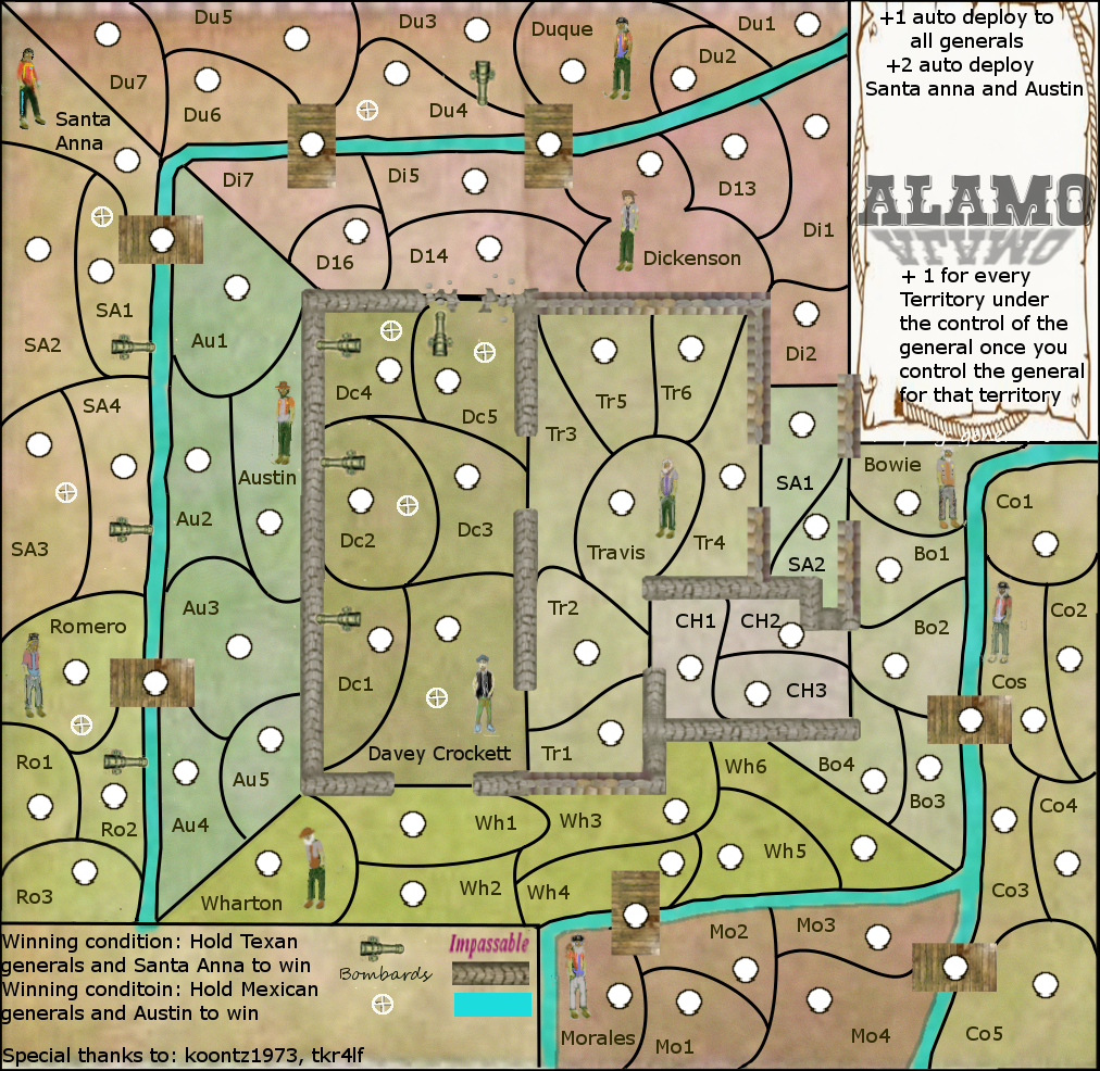
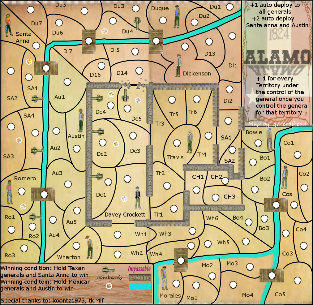
This first one will give you a colour palette to work from. All I did was use the gradient tool with the same colour (dark and light). Find a set of colours you like this way and stick to them. As you are going for a historical map, it would be nice to see them from the left side of this. Some different shades can be used like for water but a good rule is to see if you can stay in one area of the palette.
Image
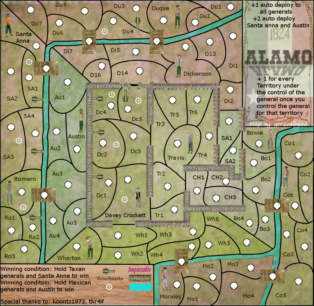
In this second one, all I did was lower the opacity of the colour layer. It brings out the layer below but it changes the colours as you have now added the colour from the layer below. Do not worry, colours can be changed later. But the big benefit of this is it allows the texture from the layer below to show through.
Image
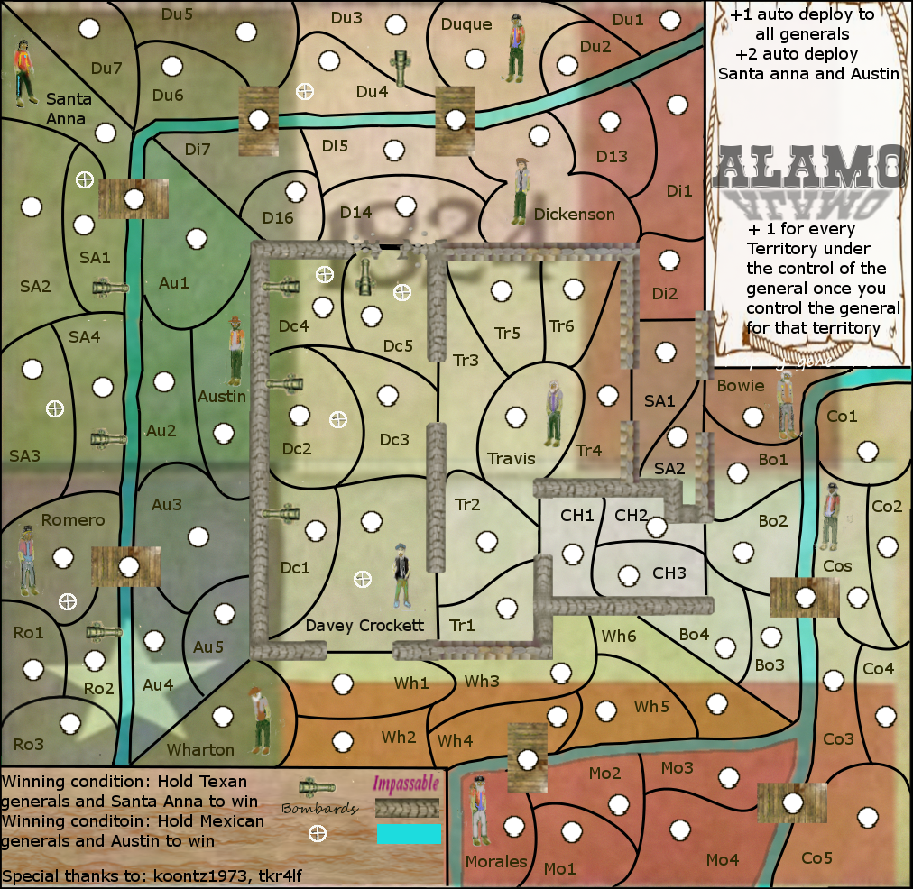
Now this is where things can get interesting, but give great results for a little work. Duplicate the layer with the colour on. You can do this by clicking on the layer so a box pops up. On the duplicated layer, add some noise (I see you have done this). Now go to filters and find emboss under distort. You will get a box with slides in. By moving these around you can get some bumps and valleys of varying light/darkness. It will be in black and white. The next two pics show you the difference between the layer opacity.
Image
Image
Lastly, this is the background paper I used. It is the same paper I used in the Alternative history map.
Image

Now for lines.
When you do you lines, thicker ones use the Circle Fuzzy (03) (5+5) at 100% size. For thinner lines like borders between territories go for the same brush but set it at around 85%. You can change the size of the brush in the paint brush tab under scale. Make sure you use the paint brush at all times. Later, we can go through ink and what not but for now, use this.

GH, I know this is a lot of info for you but the only way to get better is to go ahead and do it. Practise makes for a better map. Keep posting and I will help. I will leave it to you and tk for the historical parts of the map. ;) But I will warn you, the GP mods will check up on the facts.
Image
User avatar
Lieutenant koontz1973
 
Posts: 6960
Joined: Thu Jan 01, 2009 10:57 am

Re: Alamo map [21/10] Pg1

Postby Seamus76 on Sun Oct 21, 2012 12:27 pm

MagnusGreeol wrote:Salut General & Koontz,,
Bravo for Your ideas and involvement both of You,, General- I say it's a great plan,,,,And after reading what Koontz has to say,,I'd say Conquer Club Members are lucky to have Him,,,Seriously Big Helper,,,I can't give info like that,,,But I'll back You General ,,Do what Koontz suggest and hopefully We see each-other at >>>>>--------THE-ALAMO-----------> LOL2U Both---- In Life & WAR----------->>>>--------MAG-OUT--------->


So true!!

Now for lines.
When you do you lines, thicker ones use the Circle Fuzzy (03) (5+5) at 100% size. For thinner lines like borders between territories go for the same brush but set it at around 85%. You can change the size of the brush in the paint brush tab under scale. Make sure you use the paint brush at all times. Later, we can go through ink and what not but for now, use this.


There are a couple of ways to do this of course. I use the Path Tool, and then Stroke them. This allows you to change the size based on pixels, it also allows you to use patterns, colors, etc. But most importantly change them around and re-stroke them as need be. Very easy. Just use the layer groups and stroke the right layer. I do one for each region, etc.

Good luck, and let me know if you have a questions or there is anything I can do to help.
ImageImageImage
User avatar
Sergeant 1st Class Seamus76
 
Posts: 1574
Joined: Fri Feb 25, 2011 5:41 pm
Location: Atlanta, GA

Re: Alamo map [21/10] Pg1

Postby generalhead on Sun Oct 21, 2012 12:42 pm

koontz1973, tkr4lf, and Seamus76 all this information is great. You guys have been a great help. I am new to Gimp, but am learning a lot. I appreciate you being patient with me. I will practice the techniques that you requested koonts. I am still working on tk suggestions as he had some great ones. Seamus76 I appreciate the offer as seeing as you have made an awesome map and are on your way to a second one. Sorry I don't use the quote box, but I have not learned that technique yet. All of this will take time, but I am working hard. I will try and get you a revised map asap.
Sergeant generalhead
 
Posts: 806
Joined: Mon Apr 26, 2010 10:09 pm

Re: Alamo map [21/10] Pg1

Postby MagnusGreeol on Sun Oct 21, 2012 5:28 pm

I have to up-date My post,,,Refer back to My first message,,and add TK and Seamus to the list of gratitude....Salute-----) Brothers
User avatar
Major MagnusGreeol
 
Posts: 1499
Joined: Mon Aug 15, 2011 5:39 pm
Location: Ā„- ā™Ž BOSTONIA ā™Ž -Ā„

Re: Alamo map [22/10] Pg1

Postby generalhead on Mon Oct 22, 2012 12:33 am

"Boss Man" or tg
Can you tell me if this game play is possible and if you think that it is worded correctly. ty
Also do you think I should add roads. I am having trouble deciding where to put them. I don't think it would add anything to game play but I do think it will advance the look of the map. hmmm. I will keep staring and see if I can come up with something
do you think I should add trees or greenery, or do you think it is cluttered enough. I don't think that the Alamo was real woodsy.
do my commanders look realistic?
Last what issues do you see that I should work on next?
Ty, you guys are great!

I need to make the ch2 territory bigger
I need to fix an edge line on the west river
I need to check the the line around morales, it looks lighter
fix line top au3 au2

Game play questions
I know that Bowie and Santa Anna receiving +2 deployment should start out as neutrals, but would all of the commanders start as neutrals?
Would the cannons also start as neutrals?
Last edited by generalhead on Tue Oct 23, 2012 6:39 am, edited 1 time in total.
Sergeant generalhead
 
Posts: 806
Joined: Mon Apr 26, 2010 10:09 pm

Re: Alamo map [22/10] Pg1

Postby tkr4lf on Mon Oct 22, 2012 1:02 am

It's late here, so I'm going to wait to comment in depth until tomorrow.

For now, I will say that you should post the latest update at the end of your thread too, preferably in the post that you're asking feedback for, that way it's easier to look at the map and read the questions all on the same page, instead of having to jump back and forth from this post to the first post. Also, you should update the thread title to include which page the current map is on, in addition to page 1 (which it should always be on).
User avatar
Major tkr4lf
 
Posts: 1976
Joined: Thu Nov 06, 2008 11:35 am
Location: St. Louis

Re: Alamo map [22/10] Pg1

Postby generalhead on Mon Oct 22, 2012 1:12 am

Ah, good point, ty

"Boss Man" or tg
Can you tell me if this game play is possible and if you think that it is worded correctly. ty
Also do you think I should add roads. I am having trouble deciding where to put them. I don't think it would add anything to game play but I do think it will advance the look of the map. hmmm. I will keep staring and see if I can come up with something
do you think I should add trees or greenery, or do you think it is cluttered enough. I don't think that the Alamo was real woodsy.
do my commanders look realistic?
Last what issues do you see that I should work on next?
Ty, you guys are great!

I need to make the ch2 territory bigger
Tr3 is missing a dot
I need to fix an edge line on the west river
I need to check the the line around morales, it looks lighter
commander in the key is mis-spelled with two c's
i need to change the word army in the key to territories

Game play questions
I know that Bowie and Santa Anna receiving +2 deployment should start out as neutrals, but would all of the commanders start as neutrals?
Would the cannons also start as neutrals?

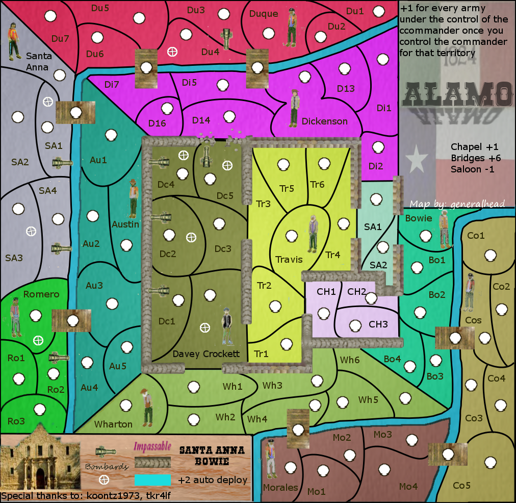
For game play I was trying to make it so you didn't get a bonus until you held one commander and one territory in his region. Once you hold the commander for every territory in the bonus after you receive a plus one. so if you hold one commander and two in that bonus region you would receive plus two. if you held two commander and one in each region you would receive a plus two. I would think that the commanders would all have to start as neutral due to if they didn't the bonus count would be way too high.
Newest verstion Alamol Draft:
Click image to enlarge.
image
Sergeant generalhead
 
Posts: 806
Joined: Mon Apr 26, 2010 10:09 pm

Re: Alamo map [22/10] Pg3

Postby tkr4lf on Mon Oct 22, 2012 12:40 pm

Looking better.

As far as roads, I don't think adding them in would be necessary. But since it's most likely going to be a purely aesthetic addition, it doesn't matter either way. Do them if you want to. I don't think it would clutter it too much, but of course, we'd have to see it to know for sure. Either way, up to you.

I don't think it needs trees either. I think the Alamo walls and the river is enough for impassables. Plus, you're right, it was pretty open as far as I know, not many woods and the like.

The commanders look okay. You may need to replace them or polish them later, I don't know.

Some thoughts on the commanders:
It seems odd that there are only 5 Mexican commanders but 6 Texian commanders. The Mexican force was something like 2-3 thousand troops, while the Texians had something like 300ish troops. I understand the reasoning for having all the commanders, since it's part of your bonus structure, but maybe some other way can be used to keep the bonus structure but still get rid of all but maybe Crockett, Bowie and Austin. And they should be in the fort, not on the outside. It wouldn't make sense to try to defend the fort from outside of it. Maybe you can expand the Alamo just a little bit, maybe by making the surrounding areas (Wharton, Austin, Bowie, Dickenson) slightly smaller. Then there could be room to have 3 different sections that would fit a commander each. Or something. But it does seem odd that such a larger force has 1 less commander than the Texians.

As for the auto-deploy situation, I would think all the commanders should have an auto-deploy. Making Santa Anna and one of the Texian commanders as a +2 though to signify that they were the leaders makes sense as well though. I would lean toward making the +2 Texian commander Austin instead of Bowie. While they shared command of the fort, Bowie soon relinquished control to Austin since he was confined to bed because of his illness.


The cannons...I would get rid of the cannon in Duque's area and put it in Morales' area. I would also take one from Santa Anna's area and add it and maybe even an extra one to Cos' area, since the cannons were placed to the South, East and Southeast if I remember correctly. It didn't mention anything about cannons to the north. Should probably also add a cannon in the Alamo on the south wall, since there were some located there.

As for graphics...just keep working on them. The borders still need work. The walls still need to be corrected, with palisade in the Northeast/east and south central areas.

Overall, nice improvements. Still lots of work to do, but it's getting there.
User avatar
Major tkr4lf
 
Posts: 1976
Joined: Thu Nov 06, 2008 11:35 am
Location: St. Louis

Re: Alamo map [22/10] Pg3

Postby generalhead on Mon Oct 22, 2012 6:28 pm

It will be done!
I had already thought about making the Alamo bigger.
you are right on the too many Texan commanders
What do you think about a win scenario hold all Mexican commanders for one round to win
Some of the walls are wooden post ( the north east wall. east wall and central southern wall. It does look a lot like the stone though, I might have to change that.
Sergeant generalhead
 
Posts: 806
Joined: Mon Apr 26, 2010 10:09 pm

Re: Alamo map [22/10] Pg3

Postby tkr4lf on Mon Oct 22, 2012 6:43 pm

generalhead wrote:What do you think about a win scenario hold all Mexican commanders for one round to win

I tend to like win conditions, so I'm biased, but I think it's a good idea. However, it should incorporate part of the Alamo, too. Just holding all Mexican commanders shouldn't be enough, they should have to take an (or a couple) important parts of the fort, too.

It could be cool to have 2 different win conditions, one for the Mexicans, and one for the Texians. Something like for the Mexicans, hold all Mexican commanders and 2 different strategic parts of the Alamo, for the Texians, hold the entire Alamo and Santa Anna. I don't know, just throwing ideas out there so you can think on it and come up with something cool.


generalhead wrote:Some of the walls are wooden post ( the north east wall. east wall and central southern wall. It does look a lot like the stone though, I might have to change that.

Ah, I didn't even notice them. Yeah, they're too similar. Try to get them looking like actual palisade, if possible. I'm not all that great with graphics, so I can't help with that part. Maybe Koontz knows a way, or maybe you can find a royalty-free image of them online somewhere that you can use.
User avatar
Major tkr4lf
 
Posts: 1976
Joined: Thu Nov 06, 2008 11:35 am
Location: St. Louis

Re: Alamo map [22/10] Pg3

Postby generalhead on Mon Oct 22, 2012 7:11 pm

tk you are awesome. I love the win conditions that you described.
I will check around for some more images for the palisades.
I don't know who is in charge on medals, but I would like to request that we are co-mapmakers on this and that we both get a medal if that is ok with you and whomever is in charge of the medals. You are a big a part of making this map as I am. I don't know if koonts can answer this. If you agree I will put your name in as the map maker also. And also isntall it on the map too next to made by. I know there can be two map makers per map, but I don't know the conditions.
Sergeant generalhead
 
Posts: 806
Joined: Mon Apr 26, 2010 10:09 pm

Re: Alamo map [22/10] Pg3

Postby tkr4lf on Mon Oct 22, 2012 8:14 pm

That's not necessary. I just really like the idea and figure if I want to see it get made, then I should help out however I can.

If you're really wanting to do it, I guess I don't have any objections to it. But I would check on things first to see that it's ok, since I'm not really contributing anything towards graphics, just ideas.

If you want though, I could take a look and see if I can get your borders a bit clearer. That's one of the few areas that I can make look ok. I have natty's tutorial down fairly well, I just never went any further with learning GIMP and haven't had the patience to stick it out and learn it, so I'm useless with anything more advanced than the basics. PM me if you're interested, and I'll tell you how to get your .xcf file to me so I can look at it and see what I can do.
User avatar
Major tkr4lf
 
Posts: 1976
Joined: Thu Nov 06, 2008 11:35 am
Location: St. Louis

Re: Alamo map [22/10] Pg3

Postby Seamus76 on Mon Oct 22, 2012 10:22 pm

You definitely have a long way to go, but stay with it and this will come together nicely. I like where tk is going, and it's nice to have people devote so much time to helping others, =D>. Keep in mind you will also need someone to help put your xml together, unless you are planning to do that yourself. If you need someone that 2nd medal will be a good incentive.

I would be careful this doesn't turn into a replica of Rorke's Drift though. It reminds me a lot of that map with the layout (nothing you can do about that), and potential win conditions, etc. For me I would like less of a cartoonish look and more of a historic map. Possibly using the background koontz posted earlier you could put together something that had a old-time look and feel, and was built more off a realistic battle map. Easier said than done I know, but your skills will come together quicker than you can imagine. Just stick with it, and keep asking questions.
ImageImageImage
User avatar
Sergeant 1st Class Seamus76
 
Posts: 1574
Joined: Fri Feb 25, 2011 5:41 pm
Location: Atlanta, GA

Re: Alamo map [22/10] Pg3

Postby koontz1973 on Mon Oct 22, 2012 10:48 pm

Shopping list time.
Wait till you have your next daft up before you look but going OK so far. Just do not over do it and get map fatigue. If you need a days rest, take it. Remember, a month can go by without a draft.
show


EDIT: As for the comment about this turning into another Rorke's Drift, do not worry about that as it is a good map. But it took around 7 months to get it into play. Keep this up and you should get to play this next year. :lol:
Image
User avatar
Lieutenant koontz1973
 
Posts: 6960
Joined: Thu Jan 01, 2009 10:57 am

Re: Alamo map [22/10] Pg3

Postby generalhead on Mon Oct 22, 2012 11:42 pm

:lol: I love you koontz. I knew this would not be a short one hour trip. I am packed to head around the world.
and again with the info, you are amazing! :D
Sergeant generalhead
 
Posts: 806
Joined: Mon Apr 26, 2010 10:09 pm

Re: Alamo map [22/10] Pg3

Postby generalhead on Mon Oct 22, 2012 11:49 pm

seamus76, did you mean something like one of these? I think I like the top one the best, but I don't know where my flags went I will have to put them back in
Click image to enlarge.
image
Click image to enlarge.
image
Click image to enlarge.
image
Click image to enlarge.
image
Sergeant generalhead
 
Posts: 806
Joined: Mon Apr 26, 2010 10:09 pm

Re: Alamo map [22/10] Pg3

Postby Seamus76 on Mon Oct 22, 2012 11:59 pm

=D> , nicely done. I can see a huge difference in your skills already, just being able to pull those images together and posting them so quickly. If you want a laugh check out the first draft of my Tribal War - Florida map in the Viewing Gallery. I actually thought it would be playable at that point, but after 15 months the foundry did it's work turning the map into something worthy of the site.

Personally I like the last one, with the light, muted tones. It gives me more of an old-time western feel when I look at it.
ImageImageImage
User avatar
Sergeant 1st Class Seamus76
 
Posts: 1574
Joined: Fri Feb 25, 2011 5:41 pm
Location: Atlanta, GA

Re: Alamo map [22/10] Pg3

Postby tkr4lf on Tue Oct 23, 2012 12:15 am

Nice job.

I like the first and the last one best.

Just need to get those commanders sorted out now so we can work on gameplay a bit more.
User avatar
Major tkr4lf
 
Posts: 1976
Joined: Thu Nov 06, 2008 11:35 am
Location: St. Louis

Re: Alamo map [22/10] Pg3

Postby generalhead on Tue Oct 23, 2012 12:27 am

10-4 Fellas, Ty
Sergeant generalhead
 
Posts: 806
Joined: Mon Apr 26, 2010 10:09 pm

Re: Alamo map [22/10] Pg3

Postby Wingnut 16ga on Tue Oct 23, 2012 7:17 am

Impressive generalhead....I like the thought of having two win conditions. Maybe I missed it but did you decide not to have the auto deploy?....it's not shown in the latest maps that you posted
User avatar
Cook Wingnut 16ga
 
Posts: 139
Joined: Fri Jan 08, 2010 8:49 am
Location: 1st floor of a 2 story out house
4

Re: Alamo map [22/10] Pg3

Postby tkr4lf on Tue Oct 23, 2012 8:31 am

Wingnut 16ga wrote:Impressive generalhead....I like the thought of having two win conditions. Maybe I missed it but did you decide not to have the auto deploy?....it's not shown in the latest maps that you posted

It's at the top-right.
User avatar
Major tkr4lf
 
Posts: 1976
Joined: Thu Nov 06, 2008 11:35 am
Location: St. Louis

Re: Alamo map [22/10] Pg3

Postby generalhead on Tue Oct 23, 2012 9:21 pm

Ty wing, I still have a lot of adjustment. I probably won't post a new map for a couple of days
Sergeant generalhead
 
Posts: 806
Joined: Mon Apr 26, 2010 10:09 pm

Re: Alamo map [27/10] Pg3

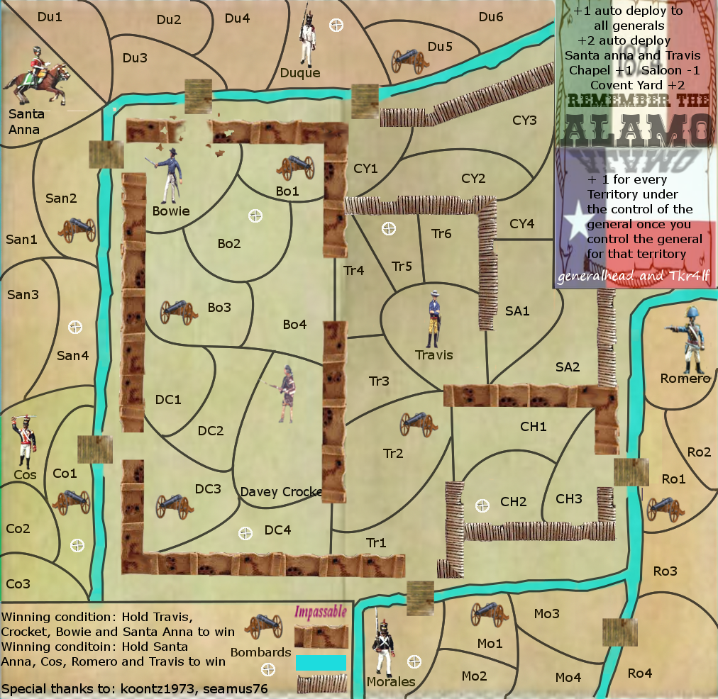
Postby generalhead on Sat Oct 27, 2012 8:23 pm

Here is my newest update, It is better but I am sure it still needs a lot of work. If you could help point those out as most of you have a finer eye for map details due to I am new at this. Thank you in advance.
Click image to enlarge.
image

  1. I will go back and see if I have covered all of the details already given
  2. I have a bridge that needs to be adjusted
  3. the water borders need work
  4. Some of my palisades need blending
  5. Davey Crocketts name needs moved up
  6. Remove white mark below Santa Anna
  7. turn Mo1 cannon to the right
  8. see about a back drop for the bottom key
  9. blue bleeding into bottom key

questions
Do the bridge connections look o.k.?
Is everything to scale?
Do the Alamo walls look o.k.?
Is my bonus layout even for game play?
Are the keys Legible and understandable?
Sergeant generalhead
 
Posts: 806
Joined: Mon Apr 26, 2010 10:09 pm

Re: Alamo map [27/10] Pg4

Postby Seamus76 on Sat Oct 27, 2012 10:45 pm

You're moving in the right direction, and your skills are getting better, but like you said there is still a lot to be done.

The "men" look better, but there is some inconsistency with them, from a uniform perspective. Morales, Duque, Romero all look different. It might be better to use the same guy, but flip and rotate, etc. to make the differences.

I think the legend flags/backgrounds need to be a little lighter and more in the background, possibly lighten the opacity. I also think you can find a good old-time font that fits a little better, and compliments the "Remember the Alamo" text.

Possibly think about lightening the territory borders. It's a little chaotic to my eyes with all of the lines. Good use of the Path Tool it looks like, but keep all of places they touch nice and tight. ex. where DC3, DC4, and Crocket meet.

It took me a little while to figure out where the Chapel, Saloon, and Covent Yard were. You need to explain that better, poss. change the legend to include something like Chapel (CH) +1, Saloon (SA) +1, etc. Along those lines it's not really obvious who the generals are, so you'll need to work on that.

For me, as for your questions, just keep working on them all. There is a lot you can do with this map. Keep up the hard work.
ImageImageImage
User avatar
Sergeant 1st Class Seamus76
 
Posts: 1574
Joined: Fri Feb 25, 2011 5:41 pm
Location: Atlanta, GA

Re: Alamo map [27/10] Pg4

Postby generalhead on Sat Oct 27, 2012 11:28 pm

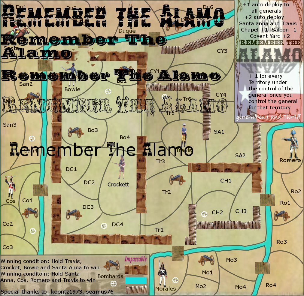
I went through all of the western fonts at dafont and these are the best ones in the western section, I will keep looking though.
Click image to enlarge.
image
Sergeant generalhead
 
Posts: 806
Joined: Mon Apr 26, 2010 10:09 pm

PreviousNext

Return to Recycling Box

Who is online

Users browsing this forum: No registered users