Conquer Club

*[Abandoned] Papua New Guinea

Abandoned and Vacationed maps. The final resting place, unless you recycle.

Moderator: Cartographers

Forum rules
Please read the Community Guidelines before posting.

Re: Papua New Guinea [26 Nov 2011][Pg. 2]

Postby natty dread on Mon Dec 26, 2011 5:33 pm

ndrs wrote:I was planning on giving it a board game feeling with a deck of cards, some dices, etc. A couple of turned over cards could hold the region bonuses and so on.


Eh, the map you have does not look like a board game. You would have to redraw it to make it look like one if you really want to puruse this style change.

Your current image just looks like someone somehow took a physical manifestation of a vector graphics image and set it on top of a plank.
Image
User avatar
Sergeant 1st Class natty dread
 
Posts: 12877
Joined: Fri Feb 08, 2008 8:58 pm
Location: just plain fucked

Re: Papua New Guinea [26 Nov 2011][Pg. 2]

Postby perchorin on Mon Dec 26, 2011 6:52 pm

natty_dread wrote:
ndrs wrote:I was planning on giving it a board game feeling with a deck of cards, some dices, etc. A couple of turned over cards could hold the region bonuses and so on.


Eh, the map you have does not look like a board game. You would have to redraw it to make it look like one if you really want to puruse this style change.

Your current image just looks like someone somehow took a physical manifestation of a vector graphics image and set it on top of a plank.

I have to agree, lose the table and go back to the clean cool image we voted for please!
Image
Silvanus wrote:perch is a North Korean agent to infiltrate south Korean girls
User avatar
Major perchorin
 
Posts: 1859
Joined: Mon Sep 04, 2006 8:19 am
Location: Busan, South Korea

Re: Papua New Guinea [26 Nov 2011][Pg. 2]

Postby pamoa on Tue Dec 27, 2011 11:01 am

the wood effect is not bad
I understood it as some wooden ship deck or an wooden surf board
I like the twist it gave to the theme of the map

please keep your great title font
negative borders are better
getting rid of all the hatched zone would be better
dotted line are worse
De gueules à la tour d'argent ouverte, crénelée de trois pièces, sommée d'un donjon ajouré, crénelé de deux pièces
Gules an open tower silver, crenellated three parts, topped by a apertured turret, crenellated two parts
User avatar
Cadet pamoa
 
Posts: 1242
Joined: Sat Sep 01, 2007 3:18 am
Location: Confederatio Helvetica

Re: Papua New Guinea [26 Nov 2011][Pg. 2]

Postby ndrs on Tue Dec 27, 2011 12:32 pm

Ok, yes, I agree about the wood and will remove it. A clean looking graphic style is what I was after from the beginning and I should return to that.

pamoa wrote:the wood effect is not bad
I understood it as some wooden ship deck or an wooden surf board
I like the twist it gave to the theme of the map

please keep your great title font
negative borders are better
getting rid of all the hatched zone would be better
dotted line are worse


Thanks for your input :)

Glad you liked the header type, it's a keeper. I hand drew it after a vintage papua new guinea postage stamp. :)

I added the hatched zones so they would be easier to define in the legend. It was either that or add more colours. I tried that as well but it looked kind of tutti frutti...

The dotted lines are only placeholders in this stage, I'll try something different.
Colonel ndrs
 
Posts: 181
Joined: Tue Oct 26, 2010 9:34 am
Location: Malmö, Sweden

Re: Papua New Guinea [26 Nov 2011][Pg. 2]

Postby koontz1973 on Tue Dec 27, 2011 1:00 pm

ndrs, glad to see this still going. Please go back to the old layout but with these new graphics. With your dotted lines, try making them a solid line with the same colour underneath or you will get these slight differences. I do like the lines, and it is in keeping with the style.

Are you going to put the stats back in?
Image
User avatar
Lieutenant koontz1973
 
Posts: 6960
Joined: Thu Jan 01, 2009 10:57 am

Re: Papua New Guinea [26 Nov 2011][Pg. 2]

Postby gimil on Wed Dec 28, 2011 8:38 pm

I kinda of like the feel of the wood. Not sure why but I do like it.

Looking forward to seeing more of this one mate.
What do you know about map making, bitch?

natty_dread wrote:I was wrong


Top Score:2403
User avatar
Corporal 1st Class gimil
 
Posts: 8599
Joined: Sat Mar 03, 2007 12:42 pm
Location: United Kingdom (Scotland)

Re: Papua New Guinea [26 Nov 2011][Pg. 2]

Postby BoganGod on Thu Dec 29, 2011 10:20 am

Like this a lot, a tie in could be including part of the western solomon islands. Bouganville being ethnically solomon islander not papua new guinean.
Image
Corporal BoganGod
 
Posts: 5873
Joined: Mon Apr 07, 2008 7:08 am
Location: Heaven's Gate Retirement Home

Re: Papua New Guinea [26 Nov 2011][Pg. 2]

Postby ndrs on Thu Dec 29, 2011 2:38 pm

gimil wrote:I kinda of like the feel of the wood. Not sure why but I do like it.

Looking forward to seeing more of this one mate.

Thanks gimil. I think the wood looked good but was probably uncalled for. Maybe I'll to two versions to test it out.

BoganGod wrote:Like this a lot, a tie in could be including part of the western solomon islands. Bouganville being ethnically solomon islander not papua new guinean.

Thanks Bogan. I could possibly add more land as a mini map in the upper left corner, but I think it could look cluttered?
And gameplay-wise it makes sense with a small +1 bonus in the east.
Anyway, I don't know if I have much say in the gameplay category. ;)
Colonel ndrs
 
Posts: 181
Joined: Tue Oct 26, 2010 9:34 am
Location: Malmö, Sweden

Re: Papua New Guinea [29 Nov 2011][Pg. 3] Everything added (

Postby ndrs on Thu Dec 29, 2011 4:58 pm

Click image to enlarge.
image


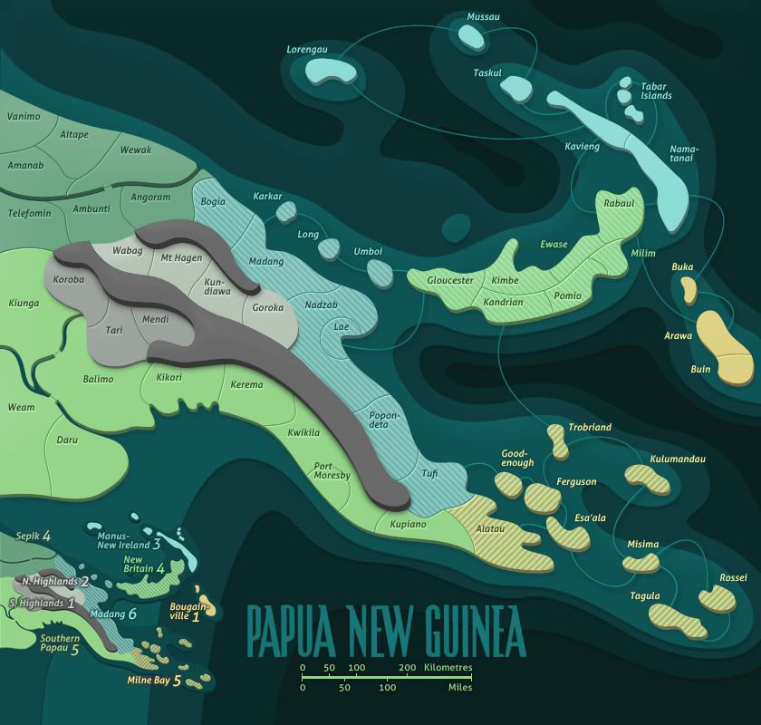
V2. Added/changed:
- Region names
- Bunus legend (minimap)
- Solid strokes for water attack paths (wanted them stand out a bit less, became cluttered with the region names)
Last edited by ndrs on Tue Jan 10, 2012 8:48 pm, edited 4 times in total.
Colonel ndrs
 
Posts: 181
Joined: Tue Oct 26, 2010 9:34 am
Location: Malmö, Sweden

Re: Papua New Guinea [29 Nov 2011][Pg. 3] Everything added (

Postby natty dread on Thu Dec 29, 2011 5:00 pm

Looks good to me. If no one has any complaints I'd say it's time to go for the small map.
Image
User avatar
Sergeant 1st Class natty dread
 
Posts: 12877
Joined: Fri Feb 08, 2008 8:58 pm
Location: just plain fucked

Re: Papua New Guinea [29 Dec 2011][Pg. 3] Everything added (

Postby perchorin on Thu Dec 29, 2011 8:01 pm

Personally I still like the original version better, the one that had the national statistics where the legend is and the tert bonuses integrated into the map itself. Just my two cents.
Image
Silvanus wrote:perch is a North Korean agent to infiltrate south Korean girls
User avatar
Major perchorin
 
Posts: 1859
Joined: Mon Sep 04, 2006 8:19 am
Location: Busan, South Korea

Re: Papua New Guinea [29 Dec 2011][Pg. 3] Everything added (

Postby cairnswk on Thu Dec 29, 2011 9:56 pm

Looking good, i myself like the minimalist style after making so may congested maps.

suggestions for addition:
1. your signature
2. does anyone think that "impassables" are needed in the legend
3. the stats i think need to be re-inserted somewhere - it was one of those things that made this map "different" even though they are of no consequence to gameplay

suggestion for change
1. i'd like to see Bougainville in the mini map un-hyphenated
2. the title and km guage could be split up and placed at the top of the map on either side - that would allow the full "bougainville" and not make the bottom of the map so cluttered.
3. move the mini map south a fraction so it is not so close to the main playing area - more eye space.

Nice work. :)
Image
* Pearl Harbour * Waterloo * Forbidden City * Jamaica * Pot Mosbi
User avatar
Private cairnswk
 
Posts: 11510
Joined: Sat Feb 03, 2007 8:32 pm
Location: Australia

Re: Papua New Guinea [29 Dec 2011][Pg. 3] Everything added (

Postby natty dread on Fri Dec 30, 2011 3:25 am

cairnswk wrote: does anyone think that "impassables" are needed in the legend


I don't think so, there's only one type of impassable and it's pretty obvious as is.

cairnswk wrote:the stats i think need to be re-inserted somewhere - it was one of those things that made this map "different" even though they are of no consequence to gameplay


Agree with this.
Image
User avatar
Sergeant 1st Class natty dread
 
Posts: 12877
Joined: Fri Feb 08, 2008 8:58 pm
Location: just plain fucked

Re: Papua New Guinea [29 Dec 2011][Pg. 3] Everything added (

Postby ndrs on Fri Dec 30, 2011 9:13 am

perchorin, cairnswalk, natty_dread – thanks guys :)

At this point I don't feel that a clarification of the impassables is needed, but if the community thinks otherwise, perhaps I could simply add the word "impassable" on top of the ridge?

I'll think of a way to fit the stats in there over the next few days.
Colonel ndrs
 
Posts: 181
Joined: Tue Oct 26, 2010 9:34 am
Location: Malmö, Sweden

Re: Papua New Guinea [29 Dec 2011][Pg. 3] Everything added (

Postby AndyDufresne on Fri Dec 30, 2011 10:03 am

Looking forward to this, I really like it. I'll echo the stats comments as well.


--Andy
User avatar
Corporal 1st Class AndyDufresne
 
Posts: 24935
Joined: Fri Mar 03, 2006 8:22 pm
Location: A Banana Palm in Zihuatanejo

Re: Papua New Guinea [29 Dec 2011][Pg. 3] Everything added (

Postby isaiah40 on Fri Dec 30, 2011 11:47 am

cairnswk wrote:Looking good, i myself like the minimalist style after making so may congested maps.

suggestions for addition:
1. your signature
2. does anyone think that "impassables" are needed in the legend
3. the stats i think need to be re-inserted somewhere - it was one of those things that made this map "different" even though they are of no consequence to gameplay

1. Should add this
2. Yes they are needed.
3. 100% in agreement here

cairnswk wrote:suggestion for change
1. i'd like to see Bougainville in the mini map un-hyphenated
2. the title and km guage could be split up and placed at the top of the map on either side - that would allow the full "bougainville" and not make the bottom of the map so cluttered.
3. move the mini map south a fraction so it is not so close to the main playing area - more eye space.

Nice work. :)

1. This would make it easier to read.
2. Or, move the title to the top, the scale down to the bottom right, then you can place the stats where the title is now.
3. In agreement here also.
Lieutenant isaiah40
 
Posts: 3990
Joined: Mon Aug 27, 2007 7:14 pm

Re: Papua New Guinea [29 Dec 2011][Pg. 3] Everything added (

Postby natty dread on Fri Dec 30, 2011 11:51 am

isaiah40 wrote:2. Yes they are needed.


Well, when this topic last came up in the London thread, I got the impression that impassables don't need to be explicitly explained when they're obvious ones like mountains and rivers, especially when they're made in the style as they are in this map, where the territories divided by them do not touch each other.

I think we should have some clear guidelines about this, do we need to always explain impassables in all cases, or is there some times when they don't need explanation...
Image
User avatar
Sergeant 1st Class natty dread
 
Posts: 12877
Joined: Fri Feb 08, 2008 8:58 pm
Location: just plain fucked

Re: Papua New Guinea [29 Dec 2011][Pg. 3] Everything added (

Postby isaiah40 on Fri Dec 30, 2011 11:56 am

natty_dread wrote:
isaiah40 wrote:2. Yes they are needed.


Well, when this topic last came up in the London thread, I got the impression that impassables don't need to be explicitly explained when they're obvious ones like mountains and rivers, especially when they're made in the style as they are in this map, where the territories divided by them do not touch each other.

I think we should have some clear guidelines about this, do we need to always explain impassables in all cases, or is there some times when they don't need explanation...

I believe they should.

ndrs wrote:At this point I don't feel that a clarification of the impassables is needed, but if the community thinks otherwise, perhaps I could simply add the word "impassable" on top of the ridge?

Personally, I think this can be done easily enough as it will be in front of you when you are looking at that area of the map.
Lieutenant isaiah40
 
Posts: 3990
Joined: Mon Aug 27, 2007 7:14 pm

Re: Papua New Guinea [29 Dec 2011][Pg. 3] Everything added (

Postby DiM on Fri Dec 30, 2011 12:02 pm

natty_dread wrote:I think we should have some clear guidelines about this, do we need to always explain impassables in all cases, or is there some times when they don't need explanation...


i think the general consensus is that if an impassable looks like a mountain/forest/river then it's optional to explain it in the legend. however if that impassable is something else or if it is designed in a non-traditional manner then it must be explained.


in this case while the impassable is a mountain it actually looks just like a darker terit so it should be explained.
not sure about the rivers though. i think those look pretty classic and are very easy to recognize as impassable.

PS: while i do recognize both mountains and rivers as impassables and i would certainly need no explanation we must take into account the people that just joined this site and have no idea what this game is all about. to them even the concept of rivers and mountains as impassables might be something unknown as the classic risk map has no mountains or rivers.
“In the beginning God said, the four-dimensional divergence of an antisymmetric, second rank tensor equals zero, and there was light, and it was good. And on the seventh day he rested.”- Michio Kaku
User avatar
Major DiM
 
Posts: 10415
Joined: Wed Feb 14, 2007 6:20 pm
Location: making maps for scooby snacks

Re: Papua New Guinea [29 Dec 2011][Pg. 3] Everything added (

Postby thenobodies80 on Fri Dec 30, 2011 12:06 pm

Impassables need to be added only when they are not very obvious (for various reasons).
Personally I would like to see them always on a map to not have problems in future.

And yes we're going to add a clear explanation in the guidelines about this. ;)
User avatar
Sergeant 1st Class thenobodies80
 
Posts: 5400
Joined: Wed Sep 05, 2007 4:30 am
Location: Milan

Re: Papua New Guinea [29 Dec 2011][Pg. 3] Everything added (

Postby natty dread on Fri Dec 30, 2011 12:11 pm

DiM wrote:to them even the concept of rivers and mountains as impassables might be something unknown as the classic risk map has no mountains or rivers.


The classic risk map lacks a lot of things we have on CC maps :lol:

Anyway, in terms of the classic risk map, territories connect when they either touch each other or are connected by a line. This is a fairly universal theme on the graphics of all CC maps as well.

In this case, both the mountains and rivers separate the territories from touching each other, from which one could form the argument that in terms of classical risk, they clearly represent borders which aren't passable.

Another way to think about it would be to think of the oceans in the risk map as prototypical impassables. When you extend this thought to rivers being just oceans that are shaped differently (in graphical terms), rivers at the very least should be pretty obvious.

All that said however, I can see the point about the mountain possibly looking like a territory to some, although I do think the lack of an army number should be a clear indication that it isn't... so I'm not opposed to marking the mountain as an impassable. However, the rivers should definitely be clear enough as they are.
Image
User avatar
Sergeant 1st Class natty dread
 
Posts: 12877
Joined: Fri Feb 08, 2008 8:58 pm
Location: just plain fucked

Re: Papua New Guinea [29 Dec 2011][Pg. 3] Everything added (

Postby natty dread on Fri Dec 30, 2011 12:12 pm

On second thought, now that I think of it even further... if the mountains are marked as impassables, then the rivers probably should too... otherwise, it might give the impression that rivers are passable, when they are not explicitly mentioned as impassables while other impassables are.
Image
User avatar
Sergeant 1st Class natty dread
 
Posts: 12877
Joined: Fri Feb 08, 2008 8:58 pm
Location: just plain fucked

Re: Papua New Guinea [29 Dec 2011][Pg. 3] Everything added (

Postby ndrs on Fri Dec 30, 2011 1:01 pm

natty_dread wrote:On second thought, now that I think of it even further... if the mountains are marked as impassables, then the rivers probably should too... otherwise, it might give the impression that rivers are passable, when they are not explicitly mentioned as impassables while other impassables are.


Good point. There's also the risk that the ridge will look like a territory even more if I add an "impassable"-text to it.

I think I'll solve the issue by adding a text beneath the minimap that says: "Mountain ridges & unbridged rivers are impassable". No graphics should be needed.
Colonel ndrs
 
Posts: 181
Joined: Tue Oct 26, 2010 9:34 am
Location: Malmö, Sweden

Re: Papua New Guinea [29 Dec 2011][Pg. 3] Everything added (

Postby ndrs on Fri Dec 30, 2011 1:05 pm

On another note, could someone please explain how the territory distribution is calculated?
Colonel ndrs
 
Posts: 181
Joined: Tue Oct 26, 2010 9:34 am
Location: Malmö, Sweden

Re: Papua New Guinea [29 Dec 2011][Pg. 3] Everything added (

Postby natty dread on Fri Dec 30, 2011 1:12 pm

ndrs wrote:On another note, could someone please explain how the territory distribution is calculated?


What do you mean?
Image
User avatar
Sergeant 1st Class natty dread
 
Posts: 12877
Joined: Fri Feb 08, 2008 8:58 pm
Location: just plain fucked

PreviousNext

Return to Recycling Box

Who is online

Users browsing this forum: No registered users