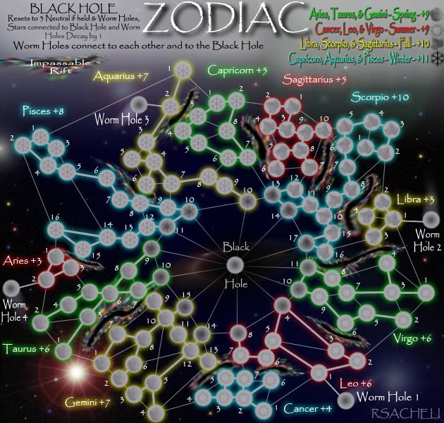
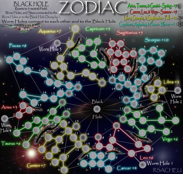
- Click image to enlarge.

[Abandoned] - Zodiac Map
Moderator: Cartographers
-
 rsacheli
- Posts: 180
- Joined: Sat Jun 30, 2007 10:02 pm
- Location: Im your neighbor... I have 100 armies with me... What are you going to do?


Re: Zodiac Map(v6.4.1 on First post and page 14)
rsacheli wrote:ender516 wrote:Perhaps the wording should be "Locations adjacent to the black hole decay by 1 each turn."
This still doesn't convey the message that the wormholes are connected as well... I did change it a little, but can change it again if still confusing
I DISAGREE WITH THE 13th Zodiac and will NOT include it!
UPDATE will be posted shortly
Good choice, it'll just mess everything up if you did include it.
I still think you could change the explanation of which territories decay on the map. Maybe say something similar to what ender mentioned already, like "All territories adjacent to the Black Hole loses 1 army each turn."
TheSaxlad wrote:The Dice suck a lot of the time.
And if they dont suck then they blow.
-

 Joodoo
- Posts: 1639
- Joined: Fri Mar 21, 2008 12:19 am
- Location: Greater Toronto, Canada


Re: Zodiac Map(v6.4.2 on First post and page 16)
Probally way too late in the day but i'll put my 2 cents worth in i thought the idea of the maps was to make them slightly educational or as close to real lay out
While the star signs libra aries etc are fine the planets are meant to move through zodiac
If the sun lands on leo for example makes the person a leo for purposes of reading the drivel in the news papers
The other areas you could have have put sextiles trians square etc like a proper chart making it informative instead of lets just throw some worm holes in for the craic and doing a bit of research
Map does look good though and i suspect i'm way to late for any notice to be taken of my post good luck with the rest of it

-

 tyche73
- Posts: 302
- Joined: Mon Oct 22, 2007 12:48 pm
- Location: cork ireland


Re: Zodiac Map(v6.4.1 on First post and page 14)
Joodoo wrote:I still think you could change the explanation of which territories decay on the map. Maybe say something similar to what ender mentioned already, like "All territories adjacent to the Black Hole loses 1 army each turn."
Connected to, adjacent to... Mean the same thing less confusion in my opinion with connected... Maybe change decays by 1 to loses 1?
-
 rsacheli
- Posts: 180
- Joined: Sat Jun 30, 2007 10:02 pm
- Location: Im your neighbor... I have 100 armies with me... What are you going to do?


Re: Zodiac Map(v6.4.2 on First post and page 16)
The wording you have now is:
The problems I have with this are:
- BLACK HOLE Resets to 3 Neutral & Decays connected (including Worm Holes) by 1.
The problems I have with this are:
- You are omitting a word, which makes it less easily understood:
- BLACK HOLE Resets to 3 Neutral & Decays connected territories (including Worm Holes) by 1.
- You are using decay as an active transitive verb: "BLACK HOLE Decays <something>" (sorry if I sound like a grammar Nazi) which is not common usage in general and particularly here on Conquer Club. Usually we say "<something> decays".
- If you can find space, to avoid complaints later on by those not as experienced with Conquer Club maps, try to add "if held" to the phrase about the black hole resetting to 3 neutral.
- BLACK HOLE Resets to 3 Neutral If Held & Stars and Worm Holes connected to it decay by 1.
-

 ender516
- Posts: 4455
- Joined: Wed Dec 17, 2008 6:07 pm
- Location: Waterloo, Ontario


Re: Zodiac Map(v6.4.2 on First post and page 16)
the legend has to convey four things here:
WORMHOLES connect to each other and to the BLACK HOLE;
the BLACK HOLE resets to 3 neutral if held;
WORMHOLES reset to 1 neutral if held; and
stars that are connected to the black hole or to a wormhole decay by 1 each turn.
the decaying stars must be given some sort of visual quality that is different from normal stars, so that players can identify them instantly. perhaps u can do this in a rough way just now, then ask for suggestions in the graphics workshop after u have the gameplay stamp.
ian.
-

 iancanton
- Foundry Foreman

- Posts: 2431
- Joined: Fri Jun 01, 2007 5:40 am
- Location: europe


Re: Zodiac Map(v6.4.2 on First post and page 16)
I'm wondering if you could mute the colors of the decay territories a bit to separate them a tad more? (Sorry, I know this is a graphics tweak)
Beckytheblondie: "Don't give us the dispatch, give us a mustache ride."
Scaling back on my CC involvement...
Scaling back on my CC involvement...
-

 Victor Sullivan
- Posts: 6010
- Joined: Mon Feb 08, 2010 8:17 pm
- Location: Columbus, OH


Re: Zodiac Map(v6.4.2 on First post and page 16)
Editted legend... Added visual distinction to Territs connected to BH
-
 rsacheli
- Posts: 180
- Joined: Sat Jun 30, 2007 10:02 pm
- Location: Im your neighbor... I have 100 armies with me... What are you going to do?


Re: Zodiac Map(v6.4.2 on First post and page 16)
the stars connected to the wormholes also need to decay, otherwise aries and libra become more secure than ever, while being able to use the wormholes to attack other bonuses.
ian.
ian.
-

 iancanton
- Foundry Foreman

- Posts: 2431
- Joined: Fri Jun 01, 2007 5:40 am
- Location: europe


-
 rsacheli
- Posts: 180
- Joined: Sat Jun 30, 2007 10:02 pm
- Location: Im your neighbor... I have 100 armies with me... What are you going to do?


Re: Zodiac Map(v6.4.4 on First post and page 16)
I think the gameplay- with the suggestions of ian's that you incorporated- is finally ready. Just one more thing before a stamp, and that's some wording in the legend which is a bit awkward.
"BLACK HOLE
Resets to 3 neutral if held & Worm Holes,
Stars connected to Black Hole and Worm
Holes Decay by 1."
It seems like you're stating the decay about Worm Holes twice, possibly, with all of the compound clauses and carriage returns. Here's what I suggest:
"BLACK HOLE
Resets to 3 neutral if held. Worm Holes,
and Stars connected to either Worm
Holes or the Black Hole Decay by 1."
-- Marshal Ney
"BLACK HOLE
Resets to 3 neutral if held & Worm Holes,
Stars connected to Black Hole and Worm
Holes Decay by 1."
It seems like you're stating the decay about Worm Holes twice, possibly, with all of the compound clauses and carriage returns. Here's what I suggest:
"BLACK HOLE
Resets to 3 neutral if held. Worm Holes,
and Stars connected to either Worm
Holes or the Black Hole Decay by 1."
-- Marshal Ney
-

 MarshalNey
- Posts: 781
- Joined: Mon Sep 28, 2009 9:02 pm
- Location: St. Louis, MO


-
 rsacheli
- Posts: 180
- Joined: Sat Jun 30, 2007 10:02 pm
- Location: Im your neighbor... I have 100 armies with me... What are you going to do?


Re: Zodiac Map(v6.4.5 on First post and page 16)
As per ian's request, I hereby deem this puppy ready for Graphics.

Congratulations rsacheli
-- Marshal Ney

Congratulations rsacheli
-- Marshal Ney
-

 MarshalNey
- Posts: 781
- Joined: Mon Sep 28, 2009 9:02 pm
- Location: St. Louis, MO


Re: Zodiac Map(v6.4.5 on First post and page 16)
Yay! I love puppies! Now time for Graphics:
-Sully
- The entire top part of the map - the legend, the title - needs to be changed. The fonts are simply not working for me or this map.
- The rifts - they look blurry and stretched, and I think they can be done away with completely. Just nudge the close areas apart a bit.
- The icons on the territories need to be more prevalent. I can barely tell those are daisies on the Spring territories.
- Also, since you got rid of the color paired bonuses, might as well line them up with the seasons or something.
- Experiment with different backgrounds. This one's okay, but I think you can do better

-Sully
Beckytheblondie: "Don't give us the dispatch, give us a mustache ride."
Scaling back on my CC involvement...
Scaling back on my CC involvement...
-

 Victor Sullivan
- Posts: 6010
- Joined: Mon Feb 08, 2010 8:17 pm
- Location: Columbus, OH


Re: Zodiac Map(v6.4.5 on First post and page 16)
don't forget to give to leo 1, libra 1, aquarius 2 and aries 2 the same dark look as the other decaying stars!
ian.
ian.
-

 iancanton
- Foundry Foreman

- Posts: 2431
- Joined: Fri Jun 01, 2007 5:40 am
- Location: europe


Re: Zodiac Map(v6.4.5 on First post and page 16)
Victor Sullivan wrote:Yay! I love puppies! Now time for Graphics:
- The entire top part of the map - the legend, the title - needs to be changed. The fonts are simply not working for me or this map.
- The rifts - they look blurry and stretched, and I think they can be done away with completely. Just nudge the close areas apart a bit.
- The icons on the territories need to be more prevalent. I can barely tell those are daisies on the Spring territories.
- Also, since you got rid of the color paired bonuses, might as well line them up with the seasons or something.
- Experiment with different backgrounds. This one's okay, but I think you can do better
-Sully
I love the font... I can play with it tho...
The rifts do suck... that I agree with...
Ill play with the icons a bit... (they are roses not daisies)
The colors i think should stay as is... it helps to distinguish between the constellations from the one next to it...
Ill play with the background...
iancanton wrote:don't forget to give to leo 1, libra 1, aquarius 2 and aries 2 the same dark look as the other decaying stars!
ian.
Good catch! forgot them...
-
 rsacheli
- Posts: 180
- Joined: Sat Jun 30, 2007 10:02 pm
- Location: Im your neighbor... I have 100 armies with me... What are you going to do?


Re: Zodiac Map(v6.4.5 on First post and page 16)
I got some suggestions to hopefully make this map more attractive.
1) get rid of the impassable rifts... those places don't have links anyway, why do they need rifts
2) Change the background to something plain. This is competing witht he glow of the stars too much.
3) find a way to draw an outline of the animals the constellations represent around the stars
4) rename black hole Earth. The constellations revolve around the earth, not a black hole.
5) change the font... its a bit icky.
Sketchblog [Update 07/25/11]: http://indyhelixsketch.blogspot.com/
Living in Japan [Update 07/17/11]: http://mirrorcountryih.blogspot.com/
Russian Revolution map for ConquerClub [07/20/11]: viewtopic.php?f=241&t=116575
Living in Japan [Update 07/17/11]: http://mirrorcountryih.blogspot.com/
Russian Revolution map for ConquerClub [07/20/11]: viewtopic.php?f=241&t=116575
-

 Industrial Helix
- Posts: 3462
- Joined: Mon Jul 14, 2008 6:49 pm
- Location: Ohio


Re: Zodiac Map(v6.4.5 on First post and page 16)
Industrial Helix wrote:5) change the font... its a bit icky.
I agree! That font must go.

-

 natty dread
- Posts: 12877
- Joined: Fri Feb 08, 2008 8:58 pm
- Location: just plain fucked


Re: Zodiac Map(v6.4.5 on First post and page 16)
I am working on this... taking my time to get it looking right... please bear with me...
-
 rsacheli
- Posts: 180
- Joined: Sat Jun 30, 2007 10:02 pm
- Location: Im your neighbor... I have 100 armies with me... What are you going to do?


Re: Zodiac Map(v6.4.5 on First post and page 16)
NP, as long as we know it is being worked on.
-
 isaiah40
- Posts: 3990
- Joined: Mon Aug 27, 2007 7:14 pm


Re: Zodiac Map(v6.4.5 on First post and page 16)
Ok, I give up... I cant figure anything out with the background... I can change the black hole image if its too much... ill dim the background a bit if thatll help but I like the starry background...
I contemplated the black hole being a Star or earth but a decay doesnt make sense... I dont want to change that... this was discussed the first time I started this map... and the constellations are stationary... the earth revolves around the sun... and the zodiac of your birth is the constellation that is behind the sun...
There is not enough room for the animals and I will not use someone elses drawings... plus it would cause this to become much too cluttered...
I love the Font but will look at alternates...
rifts are gone... they were put in originally because a few of the stars are kinda close but dont have a connection...
-
 rsacheli
- Posts: 180
- Joined: Sat Jun 30, 2007 10:02 pm
- Location: Im your neighbor... I have 100 armies with me... What are you going to do?


Re: Zodiac Map(v6.4.5 on First post and page 16)
personally, I think some things just shouldn't be a risk map. I have no suggestions on what you could do to improve this. A cluster gray circles with a black background.
Well really, I would suggest using the new large map size to expand this out a bit, and show the animal outlines at least.
Well really, I would suggest using the new large map size to expand this out a bit, and show the animal outlines at least.

-

 RjBeals
- Posts: 2506
- Joined: Mon Nov 20, 2006 5:17 pm
- Location: South Carolina, USA


Re: Zodiac Map(v6.4.5 on First post and page 16)
RjBeals wrote:personally, I think some things just shouldn't be a risk map. I have no suggestions on what you could do to improve this. A cluster gray circles with a black background.
Well really, I would suggest using the new large map size to expand this out a bit, and show the animal outlines at least.
and do what with the small size? unless its changed... there is big and small sure the big may be able to have the pics... but small would not...
-
 rsacheli
- Posts: 180
- Joined: Sat Jun 30, 2007 10:02 pm
- Location: Im your neighbor... I have 100 armies with me... What are you going to do?


Re: Zodiac Map(v6.4.5 on First post and page 16)
by new map size, i think rj means supersize. u will need to go to the drafting room to seek foundry approval for a supersize map.
viewtopic.php?f=127&t=136363
ian.
MrBenn wrote:Bigger and Better
For as long as I can remember, the Foundry community has been pushing for bigger maps. It gives me great satisfaction to announce that the bigger and better future is now upon us! The Foundry Foreman has now been vested with power from the highest authority (lackattack) to allow maps that exceed the current standard guidelines.... I hereby present you with Supersize Maps!
Maps of SuperSize must be worthy of needing the additional space (ie they shouldn't be unnecessarily big); mapmakers will be required to suggest their intended image sizes during the design brief stage, with permission to exceed the standard guidelines in exceptional cases to be granted by the Foundry Foreman. (In exceptionally-exceptional circumstances, there is the further potential for flexibility)
- Standard maximum sizes: 630x600 pixels for a small map and 840x800 pixels for a large map.
- SuperSize limits: 1000x800 pixels for a small map, and 1400x1200 pixels for a large map
viewtopic.php?f=127&t=136363
ian.
-

 iancanton
- Foundry Foreman

- Posts: 2431
- Joined: Fri Jun 01, 2007 5:40 am
- Location: europe


Re: Zodiac Map(v6.4.5 on First post and page 16)
rsacheli wrote:I love the Font but will look at alternates...
Seriously, dude, Papyrus is awful.
Go to http://www.dafont.com/ and find something unique that says "space" and "stars", rather than an overused, misplaced font that says "Egyptian scroll".
-

 lostatlimbo
- Posts: 1386
- Joined: Wed Mar 28, 2007 3:56 pm
- Location: Portland, OR


Who is online
Users browsing this forum: No registered users


