[Abandoned] - Korea
Moderator: Cartographers
Re: Korea [D] — v8.2 on p13 › bombardments p14
now that this is in the main foundry, i would like to see this get off the ground (literally) i think that the image is too flat, maybe a little bevel or emboss, and also some texture
-
 LED ZEPPELINER
- Posts: 1088
- Joined: Tue Nov 25, 2008 10:09 pm


Re: Korea [D] — v8.2 on p13 › bombardments p14
Please change the borders. I think that they look out of place. Nice job!
-

 sailorseal
- Posts: 2735
- Joined: Sun May 25, 2008 1:49 pm
- Location: conquerclub.com


Re: Korea [D] — v8.2 on p13 › bombardments p14
sailorseal wrote:Please change the borders. I think that they look out of place. Nice job!
.44
-

 the.killing.44
- Posts: 4724
- Joined: Thu Oct 23, 2008 7:43 pm
- Location: now tell me what got two gums and knows how to spit rhymes


Re: [Adv.]Korea — v8.2 on p13 › what next before [D]?
the.killing.44 wrote:MrBenn wrote:I think you've earned this at last:
Welcome to the Foundry Proper! Onwards and upwards....
Thanks so very much for that
.44
i have been waiting for you to get this
GREAT JOB .44
-
 tlane
tlane
- Posts: 309
- Joined: Wed Oct 22, 2008 7:11 pm
- Location: NYC - sint maarten(sometimes)


Re: Korea [D] — v8.2 on p13 › bombardments p14
i bet were all very super proud of him (i know i am) but i think the best thing right now is to be discussing the gameplay of the map. I was thinking that maybe you could assign a specific airplaine to a specifc target (same with the missles
-
 LED ZEPPELINER
- Posts: 1088
- Joined: Tue Nov 25, 2008 10:09 pm


Re: Korea [D] — v8.2 on p13 › bombardments p14
The bonuses in the north are very overpowered and need to be merged or reduced.
1. The Yellow bonus is 3 territories with only 2 borders yet it is worth 2. How easy is it to drop 2 out of 3 territories and take it?
2. The bonus right beneath it seems a bit more justified with 3 border territories, you can leave that be, although half of the fighting on the map will occur in these two areas if you do not reduce the top bonus.
3. 4 territories worth 3? Overpowered as well with 2 places to defend. This can be solved by moving the bombardment to a territory which is inside the continent.
Other two bonuses seem pretty fair.
The gist is: reduce the yellow bonus to 1, and move the bombardment left one territory in the green bonus.
I highly doubt that owning 1 less troop for a bonus is going to kill you when the total amount is 20/21 troops.
The water connections could still be improved. Have you considered drawing a straight line, then bending it?
-

 The Neon Peon
- Posts: 2342
- Joined: Sat Jun 14, 2008 12:49 pm


Re: Korea [D] — v8.2 on p13 › bombardments p14
The Neon Peon wrote:The bonuses in the north are very overpowered and need to be merged or reduced.
i think the reason he did the bonuses the way he did is so that each side (north and south, separated by the dmz) would have the same amount of bounuses
tlane
-
 tlane
tlane
- Posts: 309
- Joined: Wed Oct 22, 2008 7:11 pm
- Location: NYC - sint maarten(sometimes)


Re: [Adv.]Korea — v8.2 on p13 › what next before [D]?
LED ZEPPELINER wrote:The Neon Peon wrote:Subtract 1 from every northern bonus, you made them too high.
then the north and the south bonuses (if all territs are held) would not be the same, which was the plan. They have to be the same, otherwise if somebody takes north korea and another takes sough korea, and their building up, South Korea will get more troops and win
yes i already said that
-
 LED ZEPPELINER
- Posts: 1088
- Joined: Tue Nov 25, 2008 10:09 pm


Re: Korea [D] — v8.2 on p13 › bombardments p14
And might both of you please re-read my post?
You need to reduce one northern bonus by 1 troop for the reasons I explained.
You need to reduce one northern bonus by 1 troop for the reasons I explained.
-

 The Neon Peon
- Posts: 2342
- Joined: Sat Jun 14, 2008 12:49 pm


Re: Korea [D] — v8.2 on p13 › bombardments p14
Yep, gotcha Neon. I reduced the top one by 1, but right now I'd rather hold off on bonus discussion the bombardments which could (and probably) will alter the value of regions.
As for assault lines, I'm fooling around with things …

I think those look good, no?
.44
As for assault lines, I'm fooling around with things …

I think those look good, no?
.44
-

 the.killing.44
- Posts: 4724
- Joined: Thu Oct 23, 2008 7:43 pm
- Location: now tell me what got two gums and knows how to spit rhymes


Re: Korea [D] — v8.2 on p13 › bombardments p14
Those look much better, but I noticed that there is no shoreline around the continent in those images. I hope you have not removed it.
-

 The Neon Peon
- Posts: 2342
- Joined: Sat Jun 14, 2008 12:49 pm


Re: Korea [D] — v8.2 on p13 › bombardments p14
The Neon Peon wrote:Those look much better, but I noticed that there is no shoreline around the continent in those images. I hope you have not removed it.
Just hidden while I do the connections. v9 with revised key up soon …
.44
-

 the.killing.44
- Posts: 4724
- Joined: Thu Oct 23, 2008 7:43 pm
- Location: now tell me what got two gums and knows how to spit rhymes


Re: Korea [D] — v8.2 on p13 › bombardments p14

Small v9
UPDATES
- shoreline goes around all land
- new key … I'm leaning towards liking it but there's more dead space … problem?
- new assault routes … personally I like them alot
- H-B. bonus now +1
TO-DO
- clean up missiles + planes
- XML (in process now)
.44
-

 the.killing.44
- Posts: 4724
- Joined: Thu Oct 23, 2008 7:43 pm
- Location: now tell me what got two gums and knows how to spit rhymes


Re: Korea [D] — v9 p1 › new routes+key & bombardment talk p15
looks great!
i don't know if Kangwon D. is +5
What formula to calculate it?
DMZ begins neutral every round?
Good for simulating the korean division but i thnk that 5 could be better...
i don't know if Kangwon D. is +5
What formula to calculate it?
DMZ begins neutral every round?
Good for simulating the korean division but i thnk that 5 could be better...
-

 thenobodies80
- Posts: 5400
- Joined: Wed Sep 05, 2007 4:30 am
- Location: Milan


Re: Korea [D] — v9 p1 › new routes+key & bombardment talk p15
thenobodies80 wrote:DMZ begins neutral every round?
I think its at the beginning of everybody's turn
i like it without saying mountains are impassable, because i think that is just a givin'
also, maybe put a box around your minimap, and it looks like its cut off a little on the side
-
 LED ZEPPELINER
- Posts: 1088
- Joined: Tue Nov 25, 2008 10:09 pm


Re: Korea [D] — v9 p1 › new routes+key & bombardment talk p15
LED ZEPPELINER wrote:also, maybe put a box around your minimap, and it looks like its cut off a little on the side
Yes, cut off. But please do not put a box around it.
-

 The Neon Peon
- Posts: 2342
- Joined: Sat Jun 14, 2008 12:49 pm


Re: Korea [D] — v9 p1 › new routes+key & bombardment talk p15
thenobodies80 wrote:looks great!
i don't know if Kangwon D. is +5
What formula to calculate it?
WM's bonus calculator. Like I said:
the.killing.44 wrote:… but right now I'd rather hold off on bonus discussion the bombardments which could (and probably) will alter the value of regions.
thenobodies80 wrote:DMZ begins neutral every round?
Good for simulating the korean division but i thnk that 5 could be better...
Yeah, somewhere from 5-7 sounds good.
LED ZEPPELINER wrote:thenobodies80 wrote:DMZ begins neutral every round?
I think its at the beginning of everybody's turn
No, nobodies has it right. As soon as the owner of the region starts his turn the round after he took it, it goes neu.
The Neon Peon wrote:LED ZEPPELINER wrote:also, maybe put a box around your minimap, and it looks like its cut off a little on the side
Yes, cut off. But please do not put a box around it.
Yeah, you're right about being cut off. And a box won't fit the map well, IMO.
Thanks, and keep 'em coming!
.44
-

 the.killing.44
- Posts: 4724
- Joined: Thu Oct 23, 2008 7:43 pm
- Location: now tell me what got two gums and knows how to spit rhymes


Re: Korea [D] — v10 p15 › new routes+key & bombardment talk p15
Update time ftw
Version 10:

UPDATES:
TO-DO
.44
Version 10:

UPDATES:
- fixed up minimap
- added some grunge
TO-DO
- better mountains?
- large
- XML in progress
-

.44
-

 the.killing.44
- Posts: 4724
- Joined: Thu Oct 23, 2008 7:43 pm
- Location: now tell me what got two gums and knows how to spit rhymes


Re: Korea [D] — v10 p15 › new routes+key & bombardment talk p15
way better with the grunge/texture
-
 LED ZEPPELINER
- Posts: 1088
- Joined: Tue Nov 25, 2008 10:09 pm


Re: Korea [D] — v10 p15 › new routes+key & bombardment talk p15

I'm still not sold on the mountains. Howabout try a different approach. Here's the style I used in centerscape. I think they would look good on this map as well:
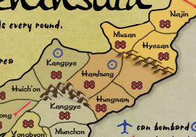
I do like the color pallet on the map. It's sort of earth tones, and looks good.
The outer line/glow around the land looks bad. Right now, it's hardly visible, but it looks sloppy. Could you work on that?
I would prefer you use a different symbol for the capitals, rather than just a star. Is there something Korean style you can find?
The borders look bad. Like it took about 2 minutes to quickly draw some lines. There's no pop to them. No pizazz. And I can see where you stopped and started again. Like they don't flow too smoothly.
The legend (to me) looks messy also. It might just be the Korean borders, but perhaps it could be improved?
On a positive note, the map is progressing nicely. Good work killing.44.

-

 RjBeals
- Posts: 2506
- Joined: Mon Nov 20, 2006 5:17 pm
- Location: South Carolina, USA


Re: Korea [D] — v10 p15 › new routes+key & bombardment talk p15
RjBeals wrote:I would prefer you use a different symbol for the capitals, rather than just a star. Is there something Korean style you can find?
you could use the flags, the north korean one is like an inverse CC symbol and the south one is a blue and red yin and yang (or at least i think)
-
 LED ZEPPELINER
- Posts: 1088
- Joined: Tue Nov 25, 2008 10:09 pm


Re: Korea [D] — v10 p15 › new routes+key & bombardment talk p15
I'll be getting the mountains from Rj sometime this week … so that should take care of the mountains unless someone likes others/has a different idea.
Me too
I've gotten mixed messages about this: some want it to go, some like it to stay, some just don't like the looks. I wouldn't mind any of those.
How about I put this by/behind/in the tert of the capitals and their #s?
주요한
Means "Capital"
Fixed. Might add glow?

 how so?

.44
RjBeals wrote:I do like the color pallet on the map. It's sort of earth tones, and looks good.
Me too
RjBeals wrote:The outer line/glow around the land looks bad. Right now, it's hardly visible, but it looks sloppy. Could you work on that?
I've gotten mixed messages about this: some want it to go, some like it to stay, some just don't like the looks. I wouldn't mind any of those.
RjBeals wrote:I would prefer you use a different symbol for the capitals, rather than just a star. Is there something Korean style you can find?
How about I put this by/behind/in the tert of the capitals and their #s?
주요한
Means "Capital"
RjBeals wrote:The borders look bad. Like it took about 2 minutes to quickly draw some lines. There's no pop to them. No pizazz. And I can see where you stopped and started again. Like they don't flow too smoothly.
Fixed. Might add glow?

RjBeals wrote:The legend (to me) looks messy also. It might just be the Korean borders, but perhaps it could be improved?
 how so?
RjBeals wrote:On a positive note, the map is progressing nicely. Good work killing.44.
.44
-

 the.killing.44
- Posts: 4724
- Joined: Thu Oct 23, 2008 7:43 pm
- Location: now tell me what got two gums and knows how to spit rhymes


Re: Korea [D] — v10 p15 › new routes+key & bombardment talk p15
When I look at the airplane icons, I see people. I don't think I'm crazy...that much.
--Andy
--Andy
-

 AndyDufresne
- Posts: 24935
- Joined: Fri Mar 03, 2006 8:22 pm
- Location: A Banana Palm in Zihuatanejo


Re: Korea [D] — v10 p15 › new routes+key & bombardment talk p15
AndyDufresne wrote:When I look at the airplane icons, I see people. I don't think I'm crazy...that much.
--Andy
 … I see seals, if I really try, but no people.
Monkeys and Humans See Differently, Experts Say
Bijal P. Trivedi
National Geographic On Assignment
November 26, 2003
Monkeys and their human cousins don't necessarily see the world the same way, according to new research from the Peruvian Amazon and a clever experiment from a lab in Scotland.
In fact, some monkeys, even within the same species, see things differently from one another. The research suggests that various forms of sight may confer a range of survival advantages.
…
Anyway I'll probably use the "ink"-like mountains from Rj's recent tutorial.
.44
-

 the.killing.44
- Posts: 4724
- Joined: Thu Oct 23, 2008 7:43 pm
- Location: now tell me what got two gums and knows how to spit rhymes


Who is online
Users browsing this forum: No registered users

