SuicidalSnowman wrote:As for the map itself, I am just offering my commentary as a player. I think the map has beautiful graphics, but I doubt I will play very many games on it. When playing, I don't want to have to strain to figure out where boundaries are or how bonuses work, or to read the text.
While I don't really care who takes credit for it, the lightened example is, for me, much easier to read.
I very much appreciate your comments
I completely agree that having to be close up to the screen to have to read things is a problem
not being able to read important information such are the mythos which contains important info on one way secrets
I don't use the same computer for internet that i do my adobe. The one i use is 10 year old computer monitor the map itself is very dark and lot darker then on the laptop.
I can still read everything perfectly but since i've spend so much time looking at the map i don't notice things in the same light as a fresh viewer. I understand that Brightness is an issue but in no way is it for the overall map
Only key spots as you've stated below and is 100% more helpful of a suggestion than just screwing with the flattened image causing everything to be out of whack and causing more issues in the long run so as you are more helpful in pointing out the issues lets address and fix the issues
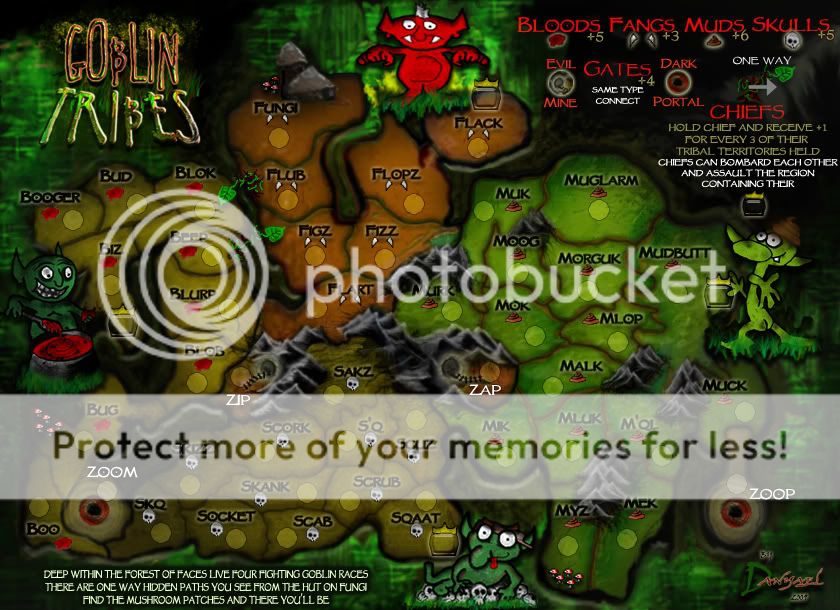
Some examples where I am struggling with the current version are the bonus descriptions in the top right, the poem in the bottom left, territories myz, mek, boo, booger, bug, fungi, sqk, skizz, and socket, among others. I find myself having to lean closer to my monitor to fully get an idea of what is going on, where the borders are, etc.
just in case you are not looking at the most up to date image
Version 16- Click image to enlarge.

First off the poem
Yes it actual is harder to read since i did the adjust in the background and I noticed that its layer and font is not set to what it should be will work on its clarity
In a previous version i blacked out the background to improve the clarity but I must of erased that layer with out noticing i will work on improving it so its clear what it say
But i apologize you must at least read it once its important knowledge

(i hate reading too)
Now lets address the territs
Myz and Mek are the only ones I'm puzzle with. Do you Struggle to see the territ names or borders?
Has for The Territs around Zoom these are very dark compared to most of the map
I think some of the problem is the darkness around the impassable forest area(its casted shadow) mainly under it and then having the font so close to it make the names a little harder to make out as boo and bug have extra grit on the land i think if i make its opacity less this will improve its clarity ten fold
Same thing was added to booger blok and bud there fore I'll tweek the grit there too
Fungi I think the name is the only thing that is tough to see this is because the hobhouse's shadow is overlapping it This is cause from the house being on a higher layer then the name easy layer move will fix this thanks for pointy that one out as it was a step I overlooked
I hope these are what Causes the issues with the overall darkness in theses areas
I believe that all of the borders are prominent enough to see the connections
If layed back 3-4 feet from the moniter they aren't as easy to tell but when in a forest your not familiar with you can get lost and deeper you get harder it is too see where to go so a closer look is needed to find the right path I like that about this map
I hope that makes sense as well remeber Goblins are tricky and they are are tricky bunch
As for the legend I'll make the font colour a touch more of a true red
As i am very colour blind I have an easier time seeing the true colours on black hen on white
thus it might not be a true red and this making it darker or harder to read for people with perfect eyes so i'll adjust its colour better hopefully improving the legibility(once again as its important info)
Thank you for indicating the main problems as said this is helpful as some people posts are not. So i'll fix these little Problems and in the next update please let me Know if it is clearer
because I in the long run this will improve the map and still not throw off the overall feel
I am not skilled in computer graphics and illustration myself, however as a practical lay person who enjoy CC games, the lighter version demonstrated is MUCH easier to read. To me, it also still manages to capture much of the atmosphere.
Also, my laptop automatically adjusts the screen brightness for optimal conditions. Even then, with scaling through all the options, I still find the dark version unnecessarily hard to read.
No need to explain as a layman player of the game your comments are needed in the foundry
Because they are precise and helpful. Yes its a darker map and not everyone is into that and i have no problem in excepting this. I don't want it super bright but I do not want it to be unplayable due to this. Since I believe its not unplayable as is, minor tweaks in the areas mentioned will help out and improve your issues
I also think that in today's lexicon, you might change the names of Skank and Skizz to something with a little less adult connotations.
I DO think the naming is otherwise very intuitive.
Also, you might want to make the legend for the one way attacks a little bit clearer. Perhaps rotate the graphic in the legend to show that the arrow is facing the same direction as the leaf.


As some English words have a Bad or dirty meaning it all depends on the persons interpretation not the actual word.
As Skank is mainly a term used to refer to a slut or hooker this is not the meaning i think of when skank is said
Its more along the line of the style of dancing ska fans refer to as Skankin
and this makes me think of black suited thin tie goblins skanking it up
and i don't even know what Skizz would refer too i thought i made it up
as i see why some people would have a problem i think they should just suck it up or grow up and stop having a dirty mind
I'll rotate the one way arrow but i think it demonstrates the direction properly
"one way from tree to leaf tip"
So i don't see how the rotation will improve anything but I'll give it a try
Thanks for your input keep an eye out the next update will address your concerns
P.S pork made a bright version and compared it to another edit of the same version making it darker then it was This causes confusion

 )
)