[Abandoned] Guatemala
Moderator: Cartographers
Re: guatemala(v8)
![]() by jleonnn on Fri Aug 27, 2010 10:26 pm
by jleonnn on Fri Aug 27, 2010 10:26 pm
ok... I'm really out of time with school and everything... I'll try to get it done by monday. so I'll redraw the border with the path tool and split the territ into two, got it.
-
 jleonnn
- Posts: 1808
- Joined: Tue Jan 06, 2009 5:11 am
- Location: The Communist Republic of Aoria


Re: guatemala(v8)
![]() by RedBaron0 on Fri Aug 27, 2010 10:31 pm
by RedBaron0 on Fri Aug 27, 2010 10:31 pm
ah.... ya know I could probably help you out graphically since I've got Photoshop, and I'm generally ok with it. Drop me a line if you'd like the graphical help. It's your map though, whatever you wanna do. And just so you know either way, you can save in GIMP as a .psd file so you can transfer your work from GIMP to Photoshop seamlessly.


-

RedBaron0
- Posts: 2657
- Joined: Sun Aug 19, 2007 12:59 pm
- Location: Pennsylvania


Re: guatemala(v8)
![]() by RedBaron0 on Fri Aug 27, 2010 10:48 pm
by RedBaron0 on Fri Aug 27, 2010 10:48 pm
sure, the email in my profile is the one I use most.
-
RedBaron0
- Posts: 2657
- Joined: Sun Aug 19, 2007 12:59 pm
- Location: Pennsylvania
Re: guatemala(v8)
![]() by RjBeals on Wed Sep 01, 2010 9:37 pm
by RjBeals on Wed Sep 01, 2010 9:37 pm
you can try sumopaint
http://www.sumopaint.com/app/
it's free online - more for artistic painting but may work for maps?.
http://www.sumopaint.com/app/
it's free online - more for artistic painting but may work for maps?.

-

RjBeals
- Posts: 2506
- Joined: Mon Nov 20, 2006 5:17 pm
- Location: South Carolina, USA


Re: guatemala(v8)
![]() by natty dread on Thu Sep 02, 2010 1:13 am
by natty dread on Thu Sep 02, 2010 1:13 am
I wouldn't use an online graphics editor...
The problem with online apps is always the bottleneck of your internet connection.
The problem with online apps is always the bottleneck of your internet connection.

-

natty dread
- Posts: 12877
- Joined: Fri Feb 08, 2008 8:58 pm
- Location: just plain fucked


Re: guatemala(v8)
![]() by haoala on Thu Sep 02, 2010 9:57 am
by haoala on Thu Sep 02, 2010 9:57 am
one of the things I think needs a quick fixing is the italicised times new roman-like font
will be looking forward to this map comng out!
will be looking forward to this map comng out!
Gain the upper hand
-

haoala
- Posts: 295
- Joined: Tue Feb 27, 2007 7:58 am
- Location: Directly opposite the South of Napo


Re: guatemala(v8)
![]() by RjBeals on Thu Sep 02, 2010 6:51 pm
by RjBeals on Thu Sep 02, 2010 6:51 pm
personally I think this map has a long long way to go, graphically. I'm not bashing jleonnn in any sense. We all have to learn software, and he's stuck with it this far. But it's the same song and dance we've fought with for years. jleonnn - I would recommend digging up some graphic tutorials, working on the pixilated borders, color pallet (yellow and orange side by side are basically the same color), font, negative space.... you get the drift. In fact - if you want to learn, just start over and use this map as a reference only.
but the good news, I'm not a member who has any say on whether you move into the forge or not. just my 2 cents. sorry.
but the good news, I'm not a member who has any say on whether you move into the forge or not. just my 2 cents. sorry.
- Click image to enlarge.
-
RjBeals
- Posts: 2506
- Joined: Mon Nov 20, 2006 5:17 pm
- Location: South Carolina, USA
Re: guatemala(v8)
![]() by jleonnn on Fri Sep 03, 2010 4:44 am
by jleonnn on Fri Sep 03, 2010 4:44 am
k, thnx... OK Sep hols are here, 1 week no school. I should get the time for some cartography.
-
jleonnn
- Posts: 1808
- Joined: Tue Jan 06, 2009 5:11 am
- Location: The Communist Republic of Aoria
Re: guatemala(v8)
![]() by thenobodies80 on Fri Sep 03, 2010 7:52 am
by thenobodies80 on Fri Sep 03, 2010 7:52 am
RjBeals wrote:but the good news, I'm not a member who has any say on whether you move into the forge or not. just my 2 cents. sorry.
But you rarely speak nonsense
-

thenobodies80
- Posts: 5400
- Joined: Wed Sep 05, 2007 4:30 am
- Location: Milan


Re: guatemala(v8)
![]() by jleonnn on Sat Sep 04, 2010 5:52 am
by jleonnn on Sat Sep 04, 2010 5:52 am
On the contrary, your knowledge of the art of cartography is infinite. BTW I hafta go off for 1 month next week. So I will get the new version done in 2 days.
-
jleonnn
- Posts: 1808
- Joined: Tue Jan 06, 2009 5:11 am
- Location: The Communist Republic of Aoria
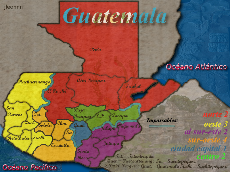
Re: guatemala(v9)
![]() by jleonnn on Tue Sep 07, 2010 9:40 am
by jleonnn on Tue Sep 07, 2010 9:40 am
DONE
OK, I did the whole map over using the path tool. In my opinion I think it's way less pixelated.
Version 9
OK, I did the whole map over using the path tool. In my opinion I think it's way less pixelated.
Version 9
- Click image to enlarge.
-
jleonnn
- Posts: 1808
- Joined: Tue Jan 06, 2009 5:11 am
- Location: The Communist Republic of Aoria
Re: guatemala(v9)
![]() by natty dread on Tue Sep 07, 2010 10:12 am
by natty dread on Tue Sep 07, 2010 10:12 am
Sorry, but it is still pixelated... it looks better at some places, but at others you can clearly see the pixelation...
Are you making the borders on a separate layer from the land area?
Are you making the borders on a separate layer from the land area?
-
natty dread
- Posts: 12877
- Joined: Fri Feb 08, 2008 8:58 pm
- Location: just plain fucked
Re: guatemala(v9)
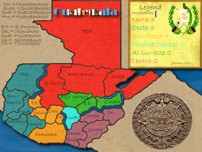
![]() by Industrial Helix on Tue Sep 07, 2010 11:11 am
by Industrial Helix on Tue Sep 07, 2010 11:11 am
Wow... bright. Might want to desaturate those colors a tad.
The borders look better but there's some pixelation in areas.
And as cool as the Aztec calendar is, it seems out of place.
The borders look better but there's some pixelation in areas.
And as cool as the Aztec calendar is, it seems out of place.
Sketchblog [Update 07/25/11]: http://indyhelixsketch.blogspot.com/
Living in Japan [Update 07/17/11]: http://mirrorcountryih.blogspot.com/
Russian Revolution map for ConquerClub [07/20/11]: viewtopic.php?f=241&t=116575
Living in Japan [Update 07/17/11]: http://mirrorcountryih.blogspot.com/
Russian Revolution map for ConquerClub [07/20/11]: viewtopic.php?f=241&t=116575
-

Industrial Helix
- Posts: 3462
- Joined: Mon Jul 14, 2008 6:49 pm
- Location: Ohio


Re: guatemala(v9)
![]() by Victor Sullivan on Tue Sep 07, 2010 2:55 pm
by Victor Sullivan on Tue Sep 07, 2010 2:55 pm
Industrial Helix wrote:Wow... bright. Might want to desaturate those colors a tad.
The borders look better but there's some pixelation in areas.
And as cool as the Aztec calendar is, it seems out of place.
I agree. I think the font should be changed, too, as it is a tad difficult to read. Also, the abbreviations seem rather excessive. You think you could shrink that number from 9 to like 3 or 4? And another thing (sorry!), are there better ways you could rearrange/rename the "continents" (though that may be more of a gameplay thing)? Cuz right now you just have "North" and "West" and other ones named solely on their position on a map. Are there various terrain regions or political regions you could name the bonus areas after?
-Sully
Beckytheblondie: "Don't give us the dispatch, give us a mustache ride."
Scaling back on my CC involvement...
Scaling back on my CC involvement...
-

Victor Sullivan
- Posts: 6010
- Joined: Mon Feb 08, 2010 8:17 pm
- Location: Columbus, OH


Re: guatemala(v9)
![]() by Industrial Helix on Tue Sep 07, 2010 5:12 pm
by Industrial Helix on Tue Sep 07, 2010 5:12 pm
You know... i think that pixelation on the borders might be another layer from the previous borders.
Sketchblog [Update 07/25/11]: http://indyhelixsketch.blogspot.com/
Living in Japan [Update 07/17/11]: http://mirrorcountryih.blogspot.com/
Russian Revolution map for ConquerClub [07/20/11]: viewtopic.php?f=241&t=116575
Living in Japan [Update 07/17/11]: http://mirrorcountryih.blogspot.com/
Russian Revolution map for ConquerClub [07/20/11]: viewtopic.php?f=241&t=116575
-
Industrial Helix
- Posts: 3462
- Joined: Mon Jul 14, 2008 6:49 pm
- Location: Ohio
Re: guatemala(v9)
![]() by RjBeals on Tue Sep 07, 2010 8:21 pm
by RjBeals on Tue Sep 07, 2010 8:21 pm
better - but you used the pen tool - meaning vector paths? What the hell are these pixel's hanging out in the borders for?

-
RjBeals
- Posts: 2506
- Joined: Mon Nov 20, 2006 5:17 pm
- Location: South Carolina, USA
Re: guatemala(v9)
![]() by jleonnn on Tue Sep 07, 2010 11:39 pm
by jleonnn on Tue Sep 07, 2010 11:39 pm
Yes I used a separate border from the land one... I'll try again
-
jleonnn
- Posts: 1808
- Joined: Tue Jan 06, 2009 5:11 am
- Location: The Communist Republic of Aoria
Re: guatemala(v9)
![]() by jleonnn on Tue Sep 07, 2010 11:42 pm
by jleonnn on Tue Sep 07, 2010 11:42 pm
RjBeals wrote:better - but you used the pen tool - meaning vector paths? What the hell are these pixel's hanging out in the borders for?
Wat are you talking about?
-
jleonnn
- Posts: 1808
- Joined: Tue Jan 06, 2009 5:11 am
- Location: The Communist Republic of Aoria
Re: guatemala(v9)
![]() by RjBeals on Wed Sep 08, 2010 1:44 pm
by RjBeals on Wed Sep 08, 2010 1:44 pm
Make sure when you stroke the path, it's on it's own layer. And the color territory layer is beneath it. Make sure the colors bleed underneath the borders.
-
RjBeals
- Posts: 2506
- Joined: Mon Nov 20, 2006 5:17 pm
- Location: South Carolina, USA
Re: guatemala(v9)
![]() by jleonnn on Wed Sep 08, 2010 8:44 pm
by jleonnn on Wed Sep 08, 2010 8:44 pm
k... cuz I everytime I bucket fill, some white spots apear near the border.
-
jleonnn
- Posts: 1808
- Joined: Tue Jan 06, 2009 5:11 am
- Location: The Communist Republic of Aoria
Re: guatemala(v10)
![]() by jleonnn on Thu Sep 09, 2010 9:59 pm
by jleonnn on Thu Sep 09, 2010 9:59 pm
VERION 10
I added a black layer and lowered the opacity, should be slightly darker now.
I merged the layers and redrew some of the most pixelated areas, tell me exactly which part you think is pixelated plz.
I changed the font and size, but I don't think there are any political names.
- Click image to enlarge.
IndustrialHelix wrote:Wow... bright. Might want to desaturate those colors a tad.
I added a black layer and lowered the opacity, should be slightly darker now.
natty_dread wrote:Sorry, but it is still pixelated... it looks better at some places, but at others you can clearly see the pixelation...
Are you making the borders on a separate layer from the land area?
I merged the layers and redrew some of the most pixelated areas, tell me exactly which part you think is pixelated plz.
Victor Sullivan wrote:I agree. I think the font should be changed, too, as it is a tad difficult to read. Also, the abbreviations seem rather excessive. You think you could shrink that number from 9 to like 3 or 4? And another thing (sorry!), are there better ways you could rearrange/rename the "continents" (though that may be more of a gameplay thing)? Cuz right now you just have "North" and "West" and other ones named solely on their position on a map. Are there various terrain regions or political regions you could name the bonus areas after?
-Sully
I changed the font and size, but I don't think there are any political names.
Last edited by jleonnn on Thu Sep 09, 2010 10:01 pm, edited 1 time in total.
-
jleonnn
- Posts: 1808
- Joined: Tue Jan 06, 2009 5:11 am
- Location: The Communist Republic of Aoria
Re: guatemala(v10)
![]() by the.killing.44 on Thu Sep 09, 2010 10:01 pm
by the.killing.44 on Thu Sep 09, 2010 10:01 pm
What graphics program are you using?
-

the.killing.44
- Posts: 4724
- Joined: Thu Oct 23, 2008 7:43 pm
- Location: now tell me what got two gums and knows how to spit rhymes


Who is online
Users browsing this forum: No registered users
|
|||||||
| Conquer Club is not associated with RISK online in any way. Copyright © 2006-2025 by Big Wham LLC | |||||||