While you have valid concerns that I intend to fix (the aether clouds need to be a little more convincing, the terrain burn needs to be slightly stronger, the smudgework in the bottom right is supposed to actually say something intelligible, chiefly), I believe you and I have fundamental differences in how this map should look.
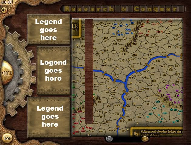
having a bland map of the teritories is a "deliberate stylistic choice" and apparently so is having an overpowering legend with a texture so strong it make everything hard to see.
you claim you want a "steampunk driven early tv" but readability stood in your way so your didn't do that either.
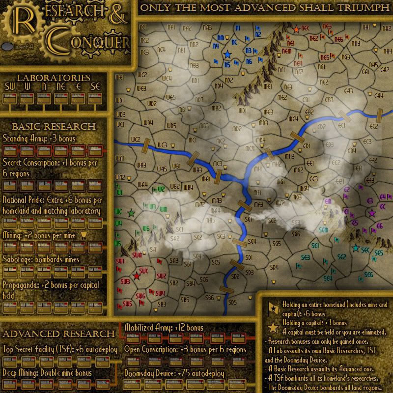
- I don't see the basis for the legend texture being overpowering to the point of being unreadable. Everything is obviously color-different from the background, especially the text. I have never had anyone else complain about readability of the legend at any point.
- I went with a different idea for "steampunk TV," being a plausible use (by steampunk standards) of some aetheric gas with some coloring. The effect could use some strengthening, but I have to temper it against making the map disappear. As stated in the gameplay guidelines, any graphical glitz cannot be at the expense of gameplay understandability.
you have flat hand drawn mountains that don't fit at all with the 3d rivers and bridges but apparently that's called "slight anachronism stew"
- I un-depthed the river, only maintaining its border. The reason it looks so similar is that there really isn't much difference effect-wise. It IS a 2D river now.
should i even bother to mention that you have shadows in all directions?
- I deliberately moved the bridge shadows to be advantageous for each direction. I tried one universal direction to start, and on 2/3 the bridges it wasn't possible to tell there was a shadow at all. I could always switch the bridge shadow 180 degrees so that they all are getting reflected from a light in the center. (Actually, I think I'll do that).
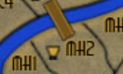
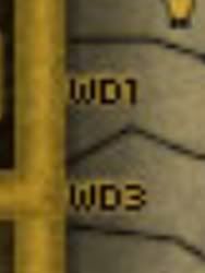
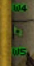
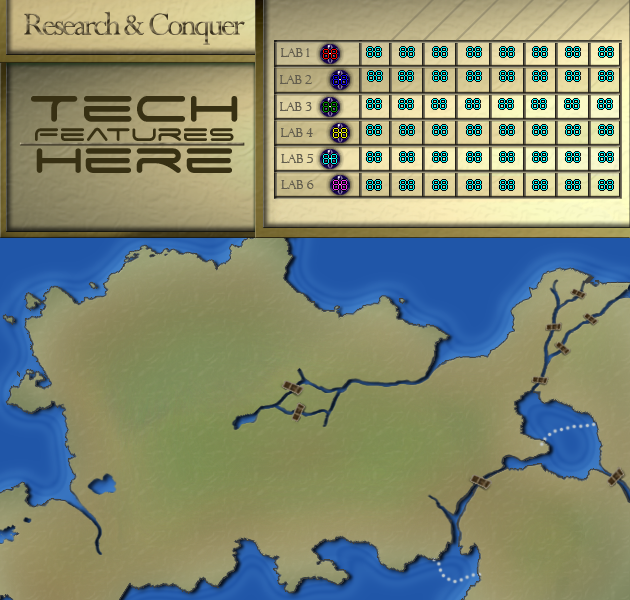
or that triple digits (88+colour code) won't fit in many terits on the small map?
- The 888's do obscure borders, but they do not obscure WHAT the border is with, nor any other 888, game symbol, or territory name. This has been known and passed off on by everybody for quite some time. I realize it's an edge case, but I'd prefer to maintain the current territory density until we find out in the requisite beta testing (totally new concept, we have no idea if it's actually balanced) that it's too much gameplay-wise. I would rather have too much and need to remove some, than too little and have to figure out how to put more in.
or that some borders are simply wrong?
- Which borders are wrong? It's a quick fix if they're around, but I don't see any.
i'd better not because basically your attitude towards any kind of improvement that requires more than 30 seconds of work is summed up very well here:
- There's a difference between work to support what I've already done and improve it for the better (which is what I am doing), and revamping the entire thing to suit a totally different graphical style. I am not going to do a total revamp because one person in the entire development of this map has had severe issues with it. That's why I said flat "no," and I'm fairly certain I'm justified in saying that.
PS: the reason i'm so vocal about this is that i think the idea of the map is bloody great but the gfx don't even begin to match up to that. and i'm afraid that this map will sit at the bottom getting very few plays because of that. which will be a shame.
a classic map can get away with poor graphics because the gameplay is simple and people will know right away if it plays well or not.
with a weird gameplay you need top notch graphics to even stand a chance because nobody is willing to spend a lot of time looking at an ugly image while trying to decipher the gameplay. they'll just give up and leave so you need great graphics to hook them with something until they realise the true potential of the gameplay.
- We have different approaches to this map. A lot of other people have said it looks beautiful, understandable, and a really good theme. While I respect your opinion, I'm going to have to kindly disagree with you.
For everyone else, expect an update later today.


