Conquer Club

[Abandoned] - Portugal Gfx Revamp

Abandoned and Vacationed maps. The final resting place, unless you recycle.

Moderator: Cartographers

Forum rules
Please read the Community Guidelines before posting.

[Abandoned] - Portugal Gfx Revamp

Postby gimil on Thu Sep 08, 2011 5:39 pm

ImageImage

Hi foundry goers,

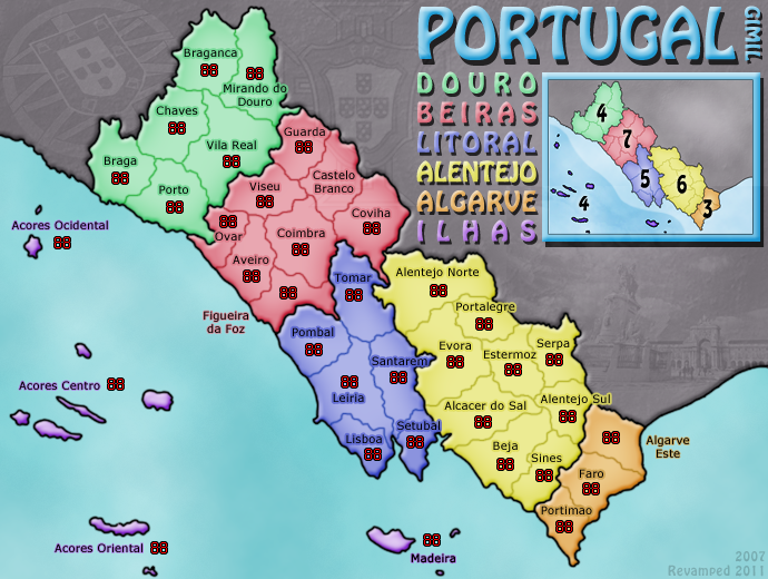
After a rather long map making hiatus. I have finally decided to get back into map making, deciding to REVAMP my very first map PORTUGAL in order to get my photoshopping muscles warmed up again. I decided to maintain the same theme and colouring with the aim of making an overall cleaner and fresher finished product. This is a graphical REVAMP only (with game play remaining unchanged). So without further ado, here is my first draft with a list of possible discussion areas and aspects I am as of yet not satisfied with. Any and all comments, feedback and general whinging is welcome!

Ver. 5
Click image to enlarge.
image


Ver. 4
http://i25.photobucket.com/albums/c64/G ... ugal-5.png

Ver. 3
http://i25.photobucket.com/albums/c64/G ... ugal-4.png

Ver. 2
http://i25.photobucket.com/albums/c64/G ... ugal-3.png

Ver. 1
http://i25.photobucket.com/albums/c64/G ... ugal-2.png
What do you know about map making, bitch?

natty_dread wrote:I was wrong


Top Score:2403
User avatar
Corporal 1st Class gimil
 
Posts: 8599
Joined: Sat Mar 03, 2007 12:42 pm
Location: United Kingdom (Scotland)

Re: Portugal [REVAMP]

Postby DiM on Thu Sep 08, 2011 5:42 pm

i like the current map more.
and i hate revamps.
ā€œIn the beginning God said, the four-dimensional divergence of an antisymmetric, second rank tensor equals zero, and there was light, and it was good. And on the seventh day he rested.ā€- Michio Kaku
User avatar
Major DiM
 
Posts: 10415
Joined: Wed Feb 14, 2007 6:20 pm
Location: making maps for scooby snacks

Re: Portugal [REVAMP]

Postby gimil on Thu Sep 08, 2011 5:44 pm

DiM wrote:i like the current map more.
and i hate revamps.

I know ;)
What do you know about map making, bitch?

natty_dread wrote:I was wrong


Top Score:2403
User avatar
Corporal 1st Class gimil
 
Posts: 8599
Joined: Sat Mar 03, 2007 12:42 pm
Location: United Kingdom (Scotland)

Re: Portugal [REVAMP]

Postby DiM on Thu Sep 08, 2011 5:47 pm

go back to doing the 3rd feudal.
ā€œIn the beginning God said, the four-dimensional divergence of an antisymmetric, second rank tensor equals zero, and there was light, and it was good. And on the seventh day he rested.ā€- Michio Kaku
User avatar
Major DiM
 
Posts: 10415
Joined: Wed Feb 14, 2007 6:20 pm
Location: making maps for scooby snacks

Re: Portugal [REVAMP]

Postby Kabanellas on Thu Sep 08, 2011 5:48 pm

I'd love to see Portugal oriented/placed as it should - in the North-South axis. You have the space for it...
Major Kabanellas
 
Posts: 1482
Joined: Fri Feb 27, 2009 12:21 pm
Location: Porto, Portugal

Re: Portugal [REVAMP]

Postby gimil on Thu Sep 08, 2011 5:51 pm

Kabanellas wrote:I'd love to see Portugal oriented/placed as it should - in the North-South axis. You have the space for it...


The original draft of the old map was properly orientated. But the community deemed that it felt to liner and after a while this version was settled. Perhaps we could compensate, re orientate it back slight, and add a compass to show that it is off?
What do you know about map making, bitch?

natty_dread wrote:I was wrong


Top Score:2403
User avatar
Corporal 1st Class gimil
 
Posts: 8599
Joined: Sat Mar 03, 2007 12:42 pm
Location: United Kingdom (Scotland)

Re: Portugal [REVAMP]

Postby Kabanellas on Thu Sep 08, 2011 5:57 pm

Image

somthing like this should work, in term of positioning ... I guess

Legend could be placed on the bottom-left corner....
Major Kabanellas
 
Posts: 1482
Joined: Fri Feb 27, 2009 12:21 pm
Location: Porto, Portugal

Re: Portugal [REVAMP] update p.1

Postby Kabanellas on Thu Sep 08, 2011 6:00 pm

I couldn't picture Ben's England map with England laid down :)
Major Kabanellas
 
Posts: 1482
Joined: Fri Feb 27, 2009 12:21 pm
Location: Porto, Portugal

Re: Portugal [REVAMP]

Postby gimil on Thu Sep 08, 2011 6:01 pm

Kabanellas wrote:somthing like this should work, in term of positioning ... I guess

Legend could be placed on the bottom-left corner....


This sort of overhaul wasn't really what I had planned...*gulp*.

I am not resistant to the idea though. Actually I like it. But I don't want to commit to it until I hear the opinions of others.

(It is alot of work to commit to from a single request).
What do you know about map making, bitch?

natty_dread wrote:I was wrong


Top Score:2403
User avatar
Corporal 1st Class gimil
 
Posts: 8599
Joined: Sat Mar 03, 2007 12:42 pm
Location: United Kingdom (Scotland)

Re: Portugal [REVAMP] update p.1

Postby gimil on Thu Sep 08, 2011 6:03 pm

Kabanellas wrote:I couldn't picture Ben's England map with England laid down :)


I am Scottish, so I don't mind the English lying down 8-[.
What do you know about map making, bitch?

natty_dread wrote:I was wrong


Top Score:2403
User avatar
Corporal 1st Class gimil
 
Posts: 8599
Joined: Sat Mar 03, 2007 12:42 pm
Location: United Kingdom (Scotland)

Re: Portugal [REVAMP] update p.1

Postby Kabanellas on Thu Sep 08, 2011 6:10 pm

gimil wrote:
Kabanellas wrote:I couldn't picture Ben's England map with England laid down :)


I am Scottish, so I don't mind the English lying down 8-[.


:D :D :D :D
Major Kabanellas
 
Posts: 1482
Joined: Fri Feb 27, 2009 12:21 pm
Location: Porto, Portugal

Re: Portugal [REVAMP]

Postby Kabanellas on Thu Sep 08, 2011 6:12 pm

gimil wrote:(It is alot of work to commit to from a single request).


I know ...but honestly, that's the reason why I only played this map once..... but then again I live there so I'm certainly more sensible to that. :)
Major Kabanellas
 
Posts: 1482
Joined: Fri Feb 27, 2009 12:21 pm
Location: Porto, Portugal

Re: Portugal [REVAMP] update p.1

Postby QoH on Thu Sep 08, 2011 6:16 pm

Is this only graphics revamp? Because I"d like to see game play changed so that when you start out, it's with only 11 territories, not 12. Gives way too much of an advantage to the player going first.

But I really like the new style!
Image
Please don't invite me to any pickup games. I will decline the invite.
Major QoH
 
Posts: 1817
Joined: Fri Aug 20, 2010 12:37 pm

Re: Portugal [REVAMP]

Postby chapcrap on Thu Sep 08, 2011 9:59 pm

DiM wrote:go back to doing the 3rd feudal.

3rd Feudal? I just jizzed in my pants.

Also, I like Portugal how it is. No offense Kab. I like the aspect. I know it's not a proper cartography look, but it just feels better to me.
Lieutenant chapcrap
 
Posts: 9686
Joined: Sun Feb 03, 2008 12:46 am
Location: Kansas City

Re: Portugal [REVAMP] update p.1

Postby Victor Sullivan on Thu Sep 08, 2011 9:59 pm

I think a minimap like Portugal*** could rea- Oh, wait... :mrgreen:

I think the map could use some texture, the simple glow/gradient effect on the territories isn't quite working for me. Also, I think the uneven kerning for each of the bonus area names just looks awkward to me. And I think you should consider using more than just one font. It's a bit over-used and cheapens the overall look of the map.

-Sully
User avatar
Corporal Victor Sullivan
 
Posts: 6010
Joined: Mon Feb 08, 2010 8:17 pm
Location: Columbus, OH

Re: Portugal [REVAMP]

Postby Victor Sullivan on Thu Sep 08, 2011 10:00 pm

DiM wrote:go back to doing the 3rd feudal.

And yes, you better get back to doing this soon! :P

-Sully
User avatar
Corporal Victor Sullivan
 
Posts: 6010
Joined: Mon Feb 08, 2010 8:17 pm
Location: Columbus, OH

Re: Portugal [REVAMP] update p.1

Postby natty dread on Fri Sep 09, 2011 12:12 am

Personally, I think revamping portugal is a grand idea. And aligning the country in the right direction would be good as well.

Also, this

QoH wrote:Is this only graphics revamp? Because I"d like to see game play changed so that when you start out, it's with only 11 territories, not 12. Gives way too much of an advantage to the player going first.


Adding some neutrals to make the starting territories golden would be good as well.
Image
User avatar
Sergeant 1st Class natty dread
 
Posts: 12877
Joined: Fri Feb 08, 2008 8:58 pm
Location: just plain fucked

Re: Portugal [REVAMP] update p.1

Postby natty dread on Fri Sep 09, 2011 12:14 am

Also, if you're going to do a revamp, I suggest rethinking the style a bit more than what you have on the 1st page now - it's almost indistinguishable in style from the current map.
Image
User avatar
Sergeant 1st Class natty dread
 
Posts: 12877
Joined: Fri Feb 08, 2008 8:58 pm
Location: just plain fucked

Re: Portugal [REVAMP] update p.1

Postby TaCktiX on Fri Sep 09, 2011 2:53 am

I don't see a need for this revamp at all. The original isn't ZOMGTEHOWNZGRAPHICZOFAWESUMZ, but so what? It's clean, it's easy to read, and it's not an eyesore. I'm going to echo several others in saying that your time is better spent with new concepts, not by dredging up a past that doesn't need improvement. For reference, remember the original Brazil vs. the current one. THAT one needed a revamp, this one doesn't.
User avatar
Corporal 1st Class TaCktiX
 
Posts: 2392
Joined: Mon Dec 17, 2007 8:24 pm
Location: Rapid City, SD

Re: Portugal [REVAMP] update p.1

Postby gimil on Fri Sep 09, 2011 5:04 am

QoH wrote:Is this only graphics revamp? Because I"d like to see game play changed so that when you start out, it's with only 11 territories, not 12. Gives way too much of an advantage to the player going first.

But I really like the new style!


Where would you suggest I add a neutral (would only need one to sort out 2 and 3 player games)?.

Victor Sullivan wrote:I think a minimap like Portugal*** could rea- Oh, wait... :mrgreen:

I think the map could use some texture, the simple glow/gradient effect on the territories isn't quite working for me. Also, I think the uneven kerning for each of the bonus area names just looks awkward to me. And I think you should consider using more than just one font. It's a bit over-used and cheapens the overall look of the map.

-Sully


I like the vibrant crisp look on the map. Having textures I think would ruin this, unless it was something really, really subtle. Also, what makes the legends text awkward? It is neat and square. You have a point though on the font, I think I have overused it, I think I will change the territory font to something different, just to mix it up.


natty_dread wrote:Also, if you're going to do a revamp, I suggest rethinking the style a bit more than what you have on the 1st page now - it's almost indistinguishable in style from the current map.


A you see natty, thats the point I want the map to look and feel the same. But cleaned up and modernised to a better standard. I like the feel, colouring and style to the old map and want to carry this over to the revamp.
What do you know about map making, bitch?

natty_dread wrote:I was wrong


Top Score:2403
User avatar
Corporal 1st Class gimil
 
Posts: 8599
Joined: Sat Mar 03, 2007 12:42 pm
Location: United Kingdom (Scotland)

Re: Portugal [REVAMP] update p.1

Postby gimil on Fri Sep 09, 2011 5:05 am

I know many of you don't want to see a REVAMP and think my time may be better spent elsewhere. But at the end of the day this is my map and I am not happy with the quality of the current portugal map. I want to improve it and bring it up to a higher standard.
What do you know about map making, bitch?

natty_dread wrote:I was wrong


Top Score:2403
User avatar
Corporal 1st Class gimil
 
Posts: 8599
Joined: Sat Mar 03, 2007 12:42 pm
Location: United Kingdom (Scotland)

Re: Portugal [REVAMP] update p.1

Postby Bruceswar on Fri Sep 09, 2011 5:19 am

I say go for it. A revamp will be good. As for up and down. I say leave it like it is. Looks good.
Highest Rank: 26 Highest Score: 3480
Image
User avatar
Corporal Bruceswar
 
Posts: 9713
Joined: Sun Dec 23, 2007 12:36 am
Location: Cow Pastures

Re: Portugal [REVAMP] update p.1

Postby koontz1973 on Fri Sep 09, 2011 6:17 am

gimil, after looking at both maps, old and new, I can understand your need to redo this, as you say, it will get you back into the swing of things and get some rust of your fingers before you start a completely new map.

A few things that you can do with the new map would be...
To try and get all of the name inside the territs (not sure if you can squeeze them all in but it would be good to see). You should have the space.
Can you place a background into Spain, that huge grey block which you have carried over has always bugged me. The old version looks tatty while the new one has some texture, but not enough to make it interesting.
With the islands, I know they are small and may look out of scale if you make them larger, but what about having the army numbers on the islands instead of floating in the sea.
Image
User avatar
Lieutenant koontz1973
 
Posts: 6960
Joined: Thu Jan 01, 2009 10:57 am

Re: Portugal [REVAMP] update p.1

Postby gimil on Fri Sep 09, 2011 7:14 am

koontz1973 wrote:To try and get all of the name inside the territs (not sure if you can squeeze them all in but it would be good to see). You should have the space.

I will try and do this when I update the font on the territory's. I plan on having smaller font (similar to the older map) in the next update.

Can you place a background into Spain, that huge grey block which you have carried over has always bugged me. The old version looks tatty while the new one has some texture, but not enough to make it interesting.

Yes, I plan on this, just haven't decided what to put there yet!

With the islands, I know they are small and may look out of scale if you make them larger, but what about having the army numbers on the islands instead of floating in the sea.

Any particular reason for this other than personal preference? I think having the number between the islands is tidier.


Cheers for your feedback, Koontz.
What do you know about map making, bitch?

natty_dread wrote:I was wrong


Top Score:2403
User avatar
Corporal 1st Class gimil
 
Posts: 8599
Joined: Sat Mar 03, 2007 12:42 pm
Location: United Kingdom (Scotland)

Re: Portugal [REVAMP] update p.1

Postby natty dread on Fri Sep 09, 2011 11:34 am

How about classic Risk-type territories? You know, instead of black/dark lines separating territories, separate them by differences in lightness, in a mosaic like thing...

The map is small enough, with few enough bonuses and territories, that you could probably pull it off... I think it could work for the map.
Image
User avatar
Sergeant 1st Class natty dread
 
Posts: 12877
Joined: Fri Feb 08, 2008 8:58 pm
Location: just plain fucked

Next

Return to Recycling Box

Who is online

Users browsing this forum: No registered users