Page 1 of 2
Put here your comments / critics / bug reports to new maps.

Posted:
Thu Mar 23, 2006 10:08 amby Marvaddin
Well, this morning we have 3 new maps to play: Brazil, Canada, and Europe.
If you find something wrong, or want comment, do a constructive criticism, hmm... this is the right place.
My first criticism, (and single one until now): small version of Europe map is smaller than it should be. The link:
http://www.conquerclub.com/maps/Europe.S.jpg

Posted:
Thu Mar 23, 2006 10:49 amby johnnyrotten
Also, with the Europe map, the haze around the territory names needs to be got rid of.

Posted:
Thu Mar 23, 2006 11:39 amby Loder
In Game 10018 Daz39 said:
2006-03-23 09:53:38 - Daz39: ok why can't moscow attack NW russia????
Those two regions appear to be adjacent but from what I gather Daz couldn't attack from one to the other.

Posted:
Thu Mar 23, 2006 4:29 pmby supermarcol
Europe map, Israel to Egypt, problem there

Posted:
Thu Mar 23, 2006 4:49 pmby johnnyrotten
also on europe map sweden to denmark, cant attack

Posted:
Thu Mar 23, 2006 5:07 pmby Augusta
Its a bit irretating to have to go all around Africa to take out Egypt when it clearly borders Israel
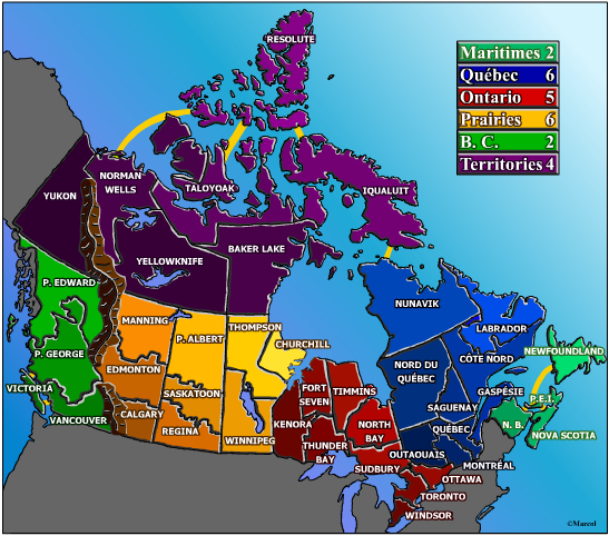
also - the Canadian map is just a mess - dont play it is my advice
Brazil looks fun though, just started playing it and so far so good


Posted:
Thu Mar 23, 2006 5:22 pmby HighBorn
yay new maps.. and yes canada is a mess

Posted:
Thu Mar 23, 2006 5:32 pmby Nobunaga
... Europe... Absolute eye candy, man. It's a beautiful thing. (haven't played on it yet). Glad to see some great work is getting done here.

Posted:
Thu Mar 23, 2006 5:41 pmby johnnyrotten
Yes. it does look beautiful, but the xml needs a lot of going through to remove the (numerous) glitches...

Posted:
Thu Mar 23, 2006 5:42 pmby supermarcol
how is canada map a mess?

Posted:
Thu Mar 23, 2006 5:51 pmby Aladriel
supermarcol wrote:how is canada map a mess?
The "bubbles" where the army numbers go.. I think they just mess with my head. They made my eyes go all wonky. And none of the groups of territories stay the same shade of color. I'm sure this was supposed to denote some kind of geographical change, but with some of the territories being so small and compact it makes it harder to tell what belongs to what.
I haven't the faintest idea how to fix these things though.


Posted:
Thu Mar 23, 2006 5:59 pmby supermarcol
would you like the map better like this?
I'll try to make something like that but better.

Posted:
Thu Mar 23, 2006 6:01 pmby Aladriel
That one is definitely much more clear! The bold colors really help!

Posted:
Thu Mar 23, 2006 6:06 pmby thegrimsleeper
Actually, marcol, that looks awesome.

Posted:
Thu Mar 23, 2006 6:10 pmby johnnyrotten
Grim could you please remove the haze from around the territory names on the Europe map? It makes the writing hard to read, and covers up borders and attack routes... plus I think the xml file will really need a good going over...
Re: Put here your comments / critics / bug reports to new ma

Posted:
Thu Mar 23, 2006 6:18 pmby Patroclus
Marvaddin wrote:Well, this morning we have 3 new maps to play: Brazil, Canada, and Europe.
If you find something wrong, or want comment, do a constructive criticism, hmm... this is the right place.
I think Marvaddin is actually Lack......

Ahhhhhh......, Just kidding, Lack. I wouldn't wanna be bounced for THAT comment!

Europe Map

Posted:
Thu Mar 23, 2006 6:31 pmby Aladriel
I know someone's already mentioned the haze, but I'm also thinking the dark blue of the waters are making it hard to see some of the darker colors of the map. They all kind of blend in. The map is just a little too dark all around. Maybe?

Posted:
Thu Mar 23, 2006 6:43 pmby thegrimsleeper
All in good time, j-rotten. The map just went live this morning, and I won't even get back home where I can work on Photoshop for another 4 hours. Then, I will do all that I can this evening to improve the map, and I've already fixed everything that's been addressed in the .xml file.
aladriel, I assume you're looking at the smaller map, which for whatever reason came out much darker when i resized it. It's been addressed that the smaller version should be larger, so maybe a larger image will solve the problem... but of course this also means another 3 hours of work on the xml file, which may not get done until some time this weekend. anyhow, that's where it's at, so you guys don't feel like i'm abandoning you.

Posted:
Thu Mar 23, 2006 7:38 pmby Aladriel
thegrimsleeper wrote:
aladriel, I assume you're looking at the smaller map, which for whatever reason came out much darker when i resized it. It's been addressed that the smaller version should be larger, so maybe a larger image will solve the problem... but of course this also means another 3 hours of work on the xml file, which may not get done until some time this weekend. anyhow, that's where it's at, so you guys don't feel like i'm abandoning you.
Grim.. definitely don't feel like you're abandoning! I understand there's a life outside of here!

I also noticed that I was attacked from Denmark to Sweden, but I can't attack Denmark from Sweden.

Posted:
Thu Mar 23, 2006 9:02 pmby supermarcol
Ok so I'm thinking this for the final version how is it? I'll still have to redo all the numbers so it'll take a couple of days


Posted:
Thu Mar 23, 2006 9:58 pmby thegrimsleeper
Is it just me, or is this thread really cluttered and random?
I think I liked it better when people were posting their problems and props in the map's thread. But hey, it could just be my OCD acting up...


Posted:
Thu Mar 23, 2006 10:09 pmby HighBorn
yeah ill still post any problems i have personally in the thread the map is in...

Posted:
Thu Mar 23, 2006 10:20 pmby Marvaddin
"Brazil looks fun though, just started playing it and so far so good

"
Thanks, Augusta

"I think Marvaddin is actually Lack......

"
Yeah, Marvaddin and lackattack are multis and are banned from playing together again


Supermarcol: yeah, I think the numbers should be in the territory and the names on the sea, for those small countries. It will be much better. I dont know that much about Canadian geography, so, Maritimes are the continent of the east coast, or of the west coast?? Joking, its in the east coast, right? But we men only see 16 colors, so both Maritimes and B.C. are green. Could you change the color of Maritimes (or B.C.)?? Only a suggestion.

Posted:
Thu Mar 23, 2006 10:22 pmby supermarcol
they're worth the same anyway


Posted:
Fri Mar 24, 2006 12:42 amby hay_txa
can't fortify from sweden to denmark

please fix this!!
