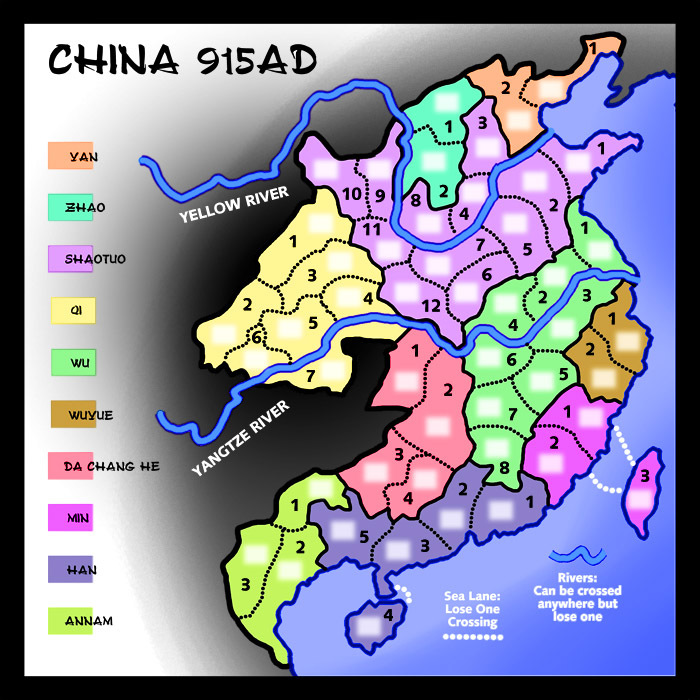
I've offered many such maps and gotten some quenched but the map-generating process is just too slow for me. I have cartographer's ADD. I need to move fast so this forum and system just doesn't work for me. No one's fault but my own.
But I like making maps and when I ran across an interesting one in an historical atlas I said to myself, "That would make a good CC map," so I toyed around.
Making my first map in about two years reminded me of an issue that I wish to raise in this thread. It seems to me that CC is evolving toward more and more complex maps with fancy coding and complicated gameplay and busy graphics explicating convoluted rules with lots of text. I understand. People who play a lot can get bored with simple maps. But when I played a lot what I enjoyed was figuring out the best strategy and tactics and that works on simple maps better than complex ones. In fact the simpler the map the more sheer skill comes into play. At least that's the way I see it. Lots of skill is required to win on the most complex maps but it's of a different sort. I'm just a simple guy.
So when I made this new map I made it very simple. One special rule. Minimal text. Simple graphics. Light tert colors so the troops can be read easily. No extraneous graphics to add "feel" or "atmosphere". Easy to figure out which tert is which. Border and shading simple and designed to focus attention on what's important. Gorgeous? No. Art? No. Easily playable? Yes.
Again: no way am I going to propose this map for actual use. That's why I'm posting in "Foundry Discussions" instead of "Drafting Room". I just want to know if there are any significant number of CCers who prefer simple maps to complex ones. Are there more folks like me out there?
A few years ago I proposed a Ukraine map. I let it drop because of my carto-ADD but, I suppose because of the war, others have picked it up. Great. On that thread Shannon Apple recently wrote: "An 'ordinary' map that is clean and well made is better than an abomination laden with photoshop effects. There are some really terrible older maps on here that suffer from some of that 'let's slap a few effects and ugly fonts on this plain map so that it isn't plain.' There are some gorgeous older maps too. But there are few of them that I would love to get at and fix because they annoy me." What I'm wondering is how many players like Shannon are there? Is there an appetite for simple, clean, easy-to-read, easy-to-play maps? Like, I hope, this one...

Note: I did this quickly and am a bit out of practice. Some of the dotted line borders need fixing and the key to regions could be made larger if spaced less generously on the vertical. Lots of other improvements could be made but I'm only posting this to start a discussion about simple vs. complex, not as a proposed map. And BTW, the reason I used numbers instead of text names for terts is that figuring out so many with historical accuracy from the year 915 would be next to impossible and because with all those weird names players would have to spend time searching for terts. Ordered numbers may not be ideal but at least they make play easier.


