- Click image to enlarge.

Glow or shadow ?
Moderator: Cartographers
34 posts
• Page 1 of 2 • 1, 2
Glow or shadow ?
![]() by porkenbeans on Fri Sep 17, 2010 2:09 am
by porkenbeans on Fri Sep 17, 2010 2:09 am
Also, if you want to make it stand out even more, put an inside glow on the edge of the light colored item, and an inside shadow on the edge of the dark colored item.

-

 porkenbeans
- Posts: 2546
- Joined: Mon Sep 10, 2007 4:06 pm


Re: Glow or shadow ?
![]() by natty dread on Fri Sep 17, 2010 7:26 am
by natty dread on Fri Sep 17, 2010 7:26 am
Um, ok I guess?
So just out of curiosity, what's the difference between drop shadow and outer glow, if they are the same colour? I don't know about these photoshop things.
In paint.net I mostly use drop shadow or object outline, which both let you choose any colour for the shadow/outline. There's usually little difference in them, but in some situations one is better than the other.

-

natty dread
- Posts: 12877
- Joined: Fri Feb 08, 2008 8:58 pm
- Location: just plain fucked


Re: Glow or shadow ?
![]() by porkenbeans on Fri Sep 17, 2010 11:35 am
by porkenbeans on Fri Sep 17, 2010 11:35 am
A drop shadow and outer glow are similar, but not entirely the same. Their transfer modes are pre-set to their own specs. So, each one is quickly adaptable to its purpose. Drop shadow is suited for black or dark colors, while outer glow is suited for white or light colors. Drop shadow also has the added capability of choosing distance, and direction.natty_dread wrote:Um, ok I guess?
So just out of curiosity, what's the difference between drop shadow and outer glow, if they are the same colour? I don't know about these photoshop things.
In paint.net I mostly use drop shadow or object outline, which both let you choose any colour for the shadow/outline. There's usually little difference in them, but in some situations one is better than the other.
The above also applies to inner glow, and inner shadow.
Last edited by porkenbeans on Fri Sep 17, 2010 5:11 pm, edited 1 time in total.
-
porkenbeans
- Posts: 2546
- Joined: Mon Sep 10, 2007 4:06 pm
Re: Glow or shadow ?
![]() by RedFlyingGolf on Fri Sep 17, 2010 11:43 am
by RedFlyingGolf on Fri Sep 17, 2010 11:43 am
Thanks for the tip.

High score: 1991 Captain
Achieved November 21th, 2010
-

RedFlyingGolf
- Posts: 177
- Joined: Sat Aug 28, 2010 1:22 pm
- Location: You wish you knew.


Re: Glow or shadow ?
![]() by MrBenn on Sat Sep 18, 2010 4:04 pm
by MrBenn on Sat Sep 18, 2010 4:04 pm
While you're right about the brightness/darkness of the shadow or glow that you use, you can actually use any colour as a glow or shadow. The real difference between the two is directional...
A glow will extend equally from the edge of your layer (or inside if you're using an inner glow).
A shadow will follow a direction depending on your 'lightsource', and can drop outside your layer, or inside it.
Here are some examples of outer/inner glow/shadow:
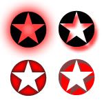
A glow will extend equally from the edge of your layer (or inside if you're using an inner glow).
A shadow will follow a direction depending on your 'lightsource', and can drop outside your layer, or inside it.
Here are some examples of outer/inner glow/shadow:

PB: 2661 | He's blue... If he were green he would die | No mod would be stupid enough to do that
-

MrBenn
- Posts: 6880
- Joined: Wed Nov 21, 2007 9:32 am
- Location: Off Duty


Re: Glow or shadow ?
![]() by porkenbeans on Sat Sep 18, 2010 8:38 pm
by porkenbeans on Sat Sep 18, 2010 8:38 pm
Another difference is that You can do an inner glow on the center, instead of the edge.MrBenn wrote:While you're right about the brightness/darkness of the shadow or glow that you use, you can actually use any colour as a glow or shadow. The real difference between the two is directional...
A glow will extend equally from the edge of your layer (or inside if you're using an inner glow).
A shadow will follow a direction depending on your 'lightsource', and can drop outside your layer, or inside it.
Here are some examples of outer/inner glow/shadow:
-
porkenbeans
- Posts: 2546
- Joined: Mon Sep 10, 2007 4:06 pm
Re: Glow or shadow ?
![]() by ender516 on Mon Sep 20, 2010 12:31 pm
by ender516 on Mon Sep 20, 2010 12:31 pm
Nice to see some examples and definitions of these terms that are so commonly used around here. I would like to note that pork is right, the ones marked correct do stand out, as they appear to float above their background. The ones below almost look like tunnels receding into the page, with darkness or light at the far end.
-

ender516
- Posts: 4455
- Joined: Wed Dec 17, 2008 6:07 pm
- Location: Waterloo, Ontario


Re: Glow or shadow ?
![]() by porkenbeans on Mon Sep 20, 2010 2:21 pm
by porkenbeans on Mon Sep 20, 2010 2:21 pm
Thank you ender, The reason that I made this small tut. is because I see people using outer glow in an effort to make something stand out. This is not always the right choice, as it is more a case of increasing the contrast between the object and the background, that "makes something stand out". So if the object is a lighter shade than the background, then you should use a drop shadow. An outer glow is the way to go if the object is darker than the background. You want to create a sharp edge of contrast.ender516 wrote:Nice to see some examples and definitions of these terms that are so commonly used around here. I would like to note that pork is right, the ones marked correct do stand out, as they appear to float above their background. The ones below almost look like tunnels receding into the page, with darkness or light at the far end.
Also this contrast can be created by not only shadow or glow, but also with texture/pattern, size, color, shape etc. This is the opposite of camouflage. anything that is different from the background will help in this effort.
-
porkenbeans
- Posts: 2546
- Joined: Mon Sep 10, 2007 4:06 pm
Re: Glow or shadow ?
![]() by MrBenn on Mon Sep 20, 2010 6:34 pm
by MrBenn on Mon Sep 20, 2010 6:34 pm
porkenbeans wrote:The reason that I made this small tut. is because I see people using outer glow in an effort to make something stand out. This is not always the right choice, as it is more a case of increasing the contrast between the object and the background, that "makes something stand out". So if the object is a lighter shade than the background, then you should use a drop shadow. An outer glow is the way to go if the object is darker than the background. You want to create a sharp edge of contrast.
You need to avoid confusing the use of the words glow and shadow; they're a bit like different models of cars. You can have either one in a light or dark colour, and while they may have some similarities they handle differently. This is why I posted the examples of how glow/shadow are different... look at the shape of them
It doesn;t matter which effect you end up using; what is important is the colour you choose!
PB: 2661 | He's blue... If he were green he would die | No mod would be stupid enough to do that
-
MrBenn
- Posts: 6880
- Joined: Wed Nov 21, 2007 9:32 am
- Location: Off Duty
Re: Glow or shadow ?
![]() by porkenbeans on Tue Sep 21, 2010 1:09 pm
by porkenbeans on Tue Sep 21, 2010 1:09 pm
Yes, I understand all of that. My point was, how to choose between a light, or dark shade. Where I come from, a shadow denotes a dark shade, while a glow denotes a light shade. Weather you choose to use a dark glow or a light shadow is up to you, but the crux of my advice is correct. Is it not ?MrBenn wrote:porkenbeans wrote:The reason that I made this small tut. is because I see people using outer glow in an effort to make something stand out. This is not always the right choice, as it is more a case of increasing the contrast between the object and the background, that "makes something stand out". So if the object is a lighter shade than the background, then you should use a drop shadow. An outer glow is the way to go if the object is darker than the background. You want to create a sharp edge of contrast.
You need to avoid confusing the use of the words glow and shadow; they're a bit like different models of cars. You can have either one in a light or dark colour, and while they may have some similarities they handle differently. This is why I posted the examples of how glow/shadow are different... look at the shape of them
It doesn;t matter which effect you end up using; what is important is the colour you choose!
-
porkenbeans
- Posts: 2546
- Joined: Mon Sep 10, 2007 4:06 pm
Re: Glow or shadow ?
![]() by natty dread on Tue Sep 21, 2010 1:16 pm
by natty dread on Tue Sep 21, 2010 1:16 pm
We should really come up with some generic term for all these effects, since people use different software and the effects are named differently...
-
natty dread
- Posts: 12877
- Joined: Fri Feb 08, 2008 8:58 pm
- Location: just plain fucked
Re: Glow or shadow ?
![]() by the.killing.44 on Tue Sep 21, 2010 1:19 pm
by the.killing.44 on Tue Sep 21, 2010 1:19 pm
porkenbeans wrote:Yes, I understand all of that. My point was, how to choose between a light, or dark shade. Where I come from, a shadow denotes a dark shade, while a glow denotes a light shade. Weather you choose to use a dark glow or a light shadow is up to you, but the crux of my advice is correct. Is it not ?MrBenn wrote:porkenbeans wrote:The reason that I made this small tut. is because I see people using outer glow in an effort to make something stand out. This is not always the right choice, as it is more a case of increasing the contrast between the object and the background, that "makes something stand out". So if the object is a lighter shade than the background, then you should use a drop shadow. An outer glow is the way to go if the object is darker than the background. You want to create a sharp edge of contrast.
You need to avoid confusing the use of the words glow and shadow; they're a bit like different models of cars. You can have either one in a light or dark colour, and while they may have some similarities they handle differently. This is why I posted the examples of how glow/shadow are different... look at the shape of them
It doesn;t matter which effect you end up using; what is important is the colour you choose!
Well, you're advising people to use only glow for light and shadow for dark, so no, not really.
-

the.killing.44
- Posts: 4724
- Joined: Thu Oct 23, 2008 7:43 pm
- Location: now tell me what got two gums and knows how to spit rhymes


Re: Glow or shadow ?
![]() by MrBenn on Tue Sep 21, 2010 1:51 pm
by MrBenn on Tue Sep 21, 2010 1:51 pm
natty_dread wrote:We should really come up with some generic term for all these effects, since people use different software and the effects are named differently...
Personally, I believe that Photoshop terms should be the de facto standard
Yes, I understand all of that. My point was, how to choose between a light, or dark shade. Where I come from, a shadow denotes a dark shade, while a glow denotes a light shade. Weather you choose to use a dark glow or a light shadow is up to you, but the crux of my advice is correct. Is it not ?[/quote]porkenbeans wrote:It doesn;t matter which effect you end up using; what is important is the colour you choose!
The technical term for the effect that extends from the outer edge of your layer is called "glow". If it extends outwards, it's called "outer glow". If it extends inwards, it's called "inner glow".
The shade of the "glow" that you use should be referred to in terms of the colour, brightness, saturation, opacity, etc. By using the terms "glow" and "shadow" instead of "light" and "dark", you have left yourself open to misinterpretation.
PB: 2661 | He's blue... If he were green he would die | No mod would be stupid enough to do that
-
MrBenn
- Posts: 6880
- Joined: Wed Nov 21, 2007 9:32 am
- Location: Off Duty
Re: Glow or shadow ?
![]() by natty dread on Tue Sep 21, 2010 2:01 pm
by natty dread on Tue Sep 21, 2010 2:01 pm
Personally, I believe that Photoshop terms should be the de facto standard
What is this "Photoshop" you speak of? Do they sell cameras or something?
-
natty dread
- Posts: 12877
- Joined: Fri Feb 08, 2008 8:58 pm
- Location: just plain fucked
Re: Glow or shadow ?
![]() by porkenbeans on Tue Sep 21, 2010 2:18 pm
by porkenbeans on Tue Sep 21, 2010 2:18 pm
MrBenn wrote:natty_dread wrote:We should really come up with some generic term for all these effects, since people use different software and the effects are named differently...
Personally, I believe that Photoshop terms should be the de facto standardYes, I understand all of that. My point was, how to choose between a light, or dark shade. Where I come from, a shadow denotes a dark shade, while a glow denotes a light shade. Weather you choose to use a dark glow or a light shadow is up to you, but the crux of my advice is correct. Is it not ?porkenbeans wrote:It doesn;t matter which effect you end up using; what is important is the colour you choose!
The technical term for the effect that extends from the outer edge of your layer is called "glow". If it extends outwards, it's called "outer glow". If it extends inwards, it's called "inner glow".
The shade of the "glow" that you use should be referred to in terms of the colour, brightness, saturation, opacity, etc. By using the terms "glow" and "shadow" instead of "light" and "dark", you have left yourself open to misinterpretation.[/quote]I use the old 7.0 so maybe that is the reason for this difference in terms. I do not understand exactly what you are saying. Are you saying that a drop shadow should be called a glow ?
In the 7.0 software, there are "inner glow", "outer glow", "drop shadow" and inner shadow settings. The glow settings are default set, to a very light, pale yellow. while the shadow settings are preset to black. you can change these colors to anything that you want, but are preset for a reason. That is to give you a quick way to make the effect.
Sense the glow settings are preset to light yellow, and the shadow settings are set to black, this tells me that the photoshop terminology denotes shadow as dark, and glow as light. I can get behind that, and it makes perfect sense to me.
edit- I think that you messed up a tag or something Mr B.
Last edited by porkenbeans on Tue Sep 21, 2010 2:53 pm, edited 1 time in total.
-
porkenbeans
- Posts: 2546
- Joined: Mon Sep 10, 2007 4:06 pm
Re: Glow or shadow ?
![]() by natty dread on Tue Sep 21, 2010 2:32 pm
by natty dread on Tue Sep 21, 2010 2:32 pm
Well the photoshop terms can be confusing to me... in paint.net, Glow is a totally different effect, one that affects the colours of the picture... and Drop Shadow can be set to any colour but also either directional or following the edges, and to make this even more confusing, let's throw in Outline and Trail as well 
When you guys speak in photoshop terms, it doesn't even make sense to me.
When you guys speak in photoshop terms, it doesn't even make sense to me.
-
natty dread
- Posts: 12877
- Joined: Fri Feb 08, 2008 8:58 pm
- Location: just plain fucked
Re: Glow or shadow ?
![]() by porkenbeans on Tue Sep 21, 2010 2:39 pm
by porkenbeans on Tue Sep 21, 2010 2:39 pm
Outline sounds like a "stroke" to me. Trail ? I can not even guess what that is.natty_dread wrote:Well the photoshop terms can be confusing to me... in paint.net, Glow is a totally different effect, one that affects the colours of the picture... and Drop Shadow can be set to any colour but also either directional or following the edges, and to make this even more confusing, let's throw in Outline and Trail as well
When you guys speak in photoshop terms, it doesn't even make sense to me.
-
porkenbeans
- Posts: 2546
- Joined: Mon Sep 10, 2007 4:06 pm
Re: Glow or shadow ?
![]() by natty dread on Tue Sep 21, 2010 3:07 pm
by natty dread on Tue Sep 21, 2010 3:07 pm
porkenbeans wrote:Outline sounds like a "stroke" to me. Trail ? I can not even guess what that is.natty_dread wrote:Well the photoshop terms can be confusing to me... in paint.net, Glow is a totally different effect, one that affects the colours of the picture... and Drop Shadow can be set to any colour but also either directional or following the edges, and to make this even more confusing, let's throw in Outline and Trail as well
When you guys speak in photoshop terms, it doesn't even make sense to me.
I'll show you..

in all except trail you can choose colour. Trail uses the colour of the object.
-
natty dread
- Posts: 12877
- Joined: Fri Feb 08, 2008 8:58 pm
- Location: just plain fucked
Re: Glow or shadow ?
![]() by porkenbeans on Tue Sep 21, 2010 4:21 pm
by porkenbeans on Tue Sep 21, 2010 4:21 pm
Interesting, it seems that "outline" IS a stroke with a direction option. This allows you the opportunity to create a 3-D (relief) as opposed to a disconnected "drop" shadow. The "trail" is similar to the outline, but it has a gradient (feathered) edge.natty_dread wrote:porkenbeans wrote:Outline sounds like a "stroke" to me. Trail ? I can not even guess what that is.natty_dread wrote:Well the photoshop terms can be confusing to me... in paint.net, Glow is a totally different effect, one that affects the colours of the picture... and Drop Shadow can be set to any colour but also either directional or following the edges, and to make this even more confusing, let's throw in Outline and Trail as well
When you guys speak in photoshop terms, it doesn't even make sense to me.
I'll show you..
in all except trail you can choose colour. Trail uses the colour of the object.
-
porkenbeans
- Posts: 2546
- Joined: Mon Sep 10, 2007 4:06 pm
Re: Glow or shadow ?
![]() by natty dread on Tue Sep 21, 2010 4:36 pm
by natty dread on Tue Sep 21, 2010 4:36 pm
Interesting, it seems that "outline" IS a stroke with a direction option. This allows you the opportunity to create a 3-D (relief) as opposed to a disconnected "drop" shadow. The "trail" is similar to the outline, but it has a gradient (feathered) edge.
Well, actually you can adjust the feathering on all of these effects. The difference in Trail is that it uses the colour of the object, like this:

(I made the Trail layer darker so you can tell it apart from the object)
-
natty dread
- Posts: 12877
- Joined: Fri Feb 08, 2008 8:58 pm
- Location: just plain fucked
Re: Glow or shadow ?
![]() by the.killing.44 on Tue Sep 21, 2010 4:37 pm
by the.killing.44 on Tue Sep 21, 2010 4:37 pm
Hey pork, so since the color overlay defualt color is this color, it should only be used as such, amirite?
-
the.killing.44
- Posts: 4724
- Joined: Thu Oct 23, 2008 7:43 pm
- Location: now tell me what got two gums and knows how to spit rhymes
Re: Glow or shadow ?
![]() by porkenbeans on Tue Sep 21, 2010 4:46 pm
by porkenbeans on Tue Sep 21, 2010 4:46 pm
You do not understand my point 44. Or you do, but are trying to be obnoxious. For a color overlay, my guess for the reason that they choose red, is because it is at the beginning of the spectrum, and they had to pick one color or another. The reason that they picked off-white for glow, and black for shadow is not a mystery to me. And, I do not see why it should be, to you or anyone else.the.killing.44 wrote:Hey pork, so since the color overlay defualt color is this color, it should only be used as such, amirite?
That is unless you live in a world of White shadows and black glows. Maybe you are from bizzarro world ?
These are only presets that we are talking about here. They are set to these defaults to make it quicker and easier to apply these effects. You are not limited to the preset settings. And, I never said that you were.
-
porkenbeans
- Posts: 2546
- Joined: Mon Sep 10, 2007 4:06 pm
Re: Glow or shadow ?
![]() by gimil on Fri Oct 08, 2010 8:21 am
by gimil on Fri Oct 08, 2010 8:21 am
Hi, pork,
I only just looked at this post. The point you are making seems to be fine enough but I don't think you should really be telling people what NOT to do in your 'don't do this' part of the post. I have plenty of times used dark glows under dark colours. It isn't always about contrast sometimes a little dark shadow can make a dark object stick out from a dark ground that are of a similar saturation with a slightly darker colour without having to overpower that map with a contrasting colour like you suggest.
Just something I wanted to point out.
What do you know about map making, bitch?
Top Score:2403
natty_dread wrote:I was wrong
Top Score:2403
-

gimil
- Posts: 8599
- Joined: Sat Mar 03, 2007 12:42 pm
- Location: United Kingdom (Scotland)


Re: Glow or shadow ?
![]() by porkenbeans on Fri Oct 08, 2010 12:47 pm
by porkenbeans on Fri Oct 08, 2010 12:47 pm
I do not understand just what you mean. Perhaps you could supply an illustration ?gimil wrote:Hi, pork,
I only just looked at this post. The point you are making seems to be fine enough but I don't think you should really be telling people what NOT to do in your 'don't do this' part of the post. I have plenty of times used dark glows under dark colours. It isn't always about contrast sometimes a little dark shadow can make a dark object stick out from a dark ground that are of a similar saturation with a slightly darker colour without having to overpower that map with a contrasting colour like you suggest.
Just something I wanted to point out.
FYI, It is not that I am trying to tell people what "NOT" to do. Just merely trying to help people to understand how to go about using glows or shadows to make something "stand out".
It is not important which one you use, What is important is creating the contrast. THAT IS THE MAIN THING HERE. A light colored object will stand out more if you use a drop shadow. When I say the term "drop shadow", I am referring to a dark color. When I use the term "glow", I am referring to a "light" color. In photoshop these transfer modes are preset in this manner, so as to give you a quick way to add these effects. If however, you want to go in manually and change the color of a "glow" to something dark, that is perfectly kosher. Same thing for changing a shadow to a light color.
The main crux of this tutorial is- How to decide between light or dark, for the effect.
-
porkenbeans
- Posts: 2546
- Joined: Mon Sep 10, 2007 4:06 pm
Re: Glow or shadow ?
![]() by natty dread on Sat Oct 09, 2010 6:19 am
by natty dread on Sat Oct 09, 2010 6:19 am
I think he's saying he has used a dark glow on a dark object, and that there are times when you do not want to add that much contrast, but still need to distinguish an object from it's background.
Come to think of it, I think I have also used a dark shadow on a dark object somewhere. It all depends on the application...
Come to think of it, I think I have also used a dark shadow on a dark object somewhere. It all depends on the application...
-
natty dread
- Posts: 12877
- Joined: Fri Feb 08, 2008 8:58 pm
- Location: just plain fucked
34 posts
• Page 1 of 2 • 1, 2
Who is online
Users browsing this forum: No registered users
|
|||||||
| Conquer Club is not associated with RISK online in any way. Copyright © 2006-2025 by Big Wham LLC | |||||||